• Recent
  • Tags
  • Popular
  • Users
  • Groups
  • Search
  • Register
  • Login
Society of Visual Storytelling

SVSLearn Forums

  • Register
  • Login
  • Search
  • Recent
  • Tags
  • Popular
  • Users
  • Groups
  • Search

Critique Time! Constructive Suggestion

Sketchbook
6
25
1.2k
Loading More Posts
  • Oldest to Newest
  • Newest to Oldest
  • Most Votes
Reply
  • Reply as topic
Log in to reply
This topic has been deleted. Only users with topic management privileges can see it.
  • AngelinaKizz
    AngelinaKizz @Kori Jensen last edited by 13 Sept 2022, 03:08

    @Kori-Jensen 65FDAA8D-FA18-4CB5-8BAC-7E8A5DF85964.jpeg

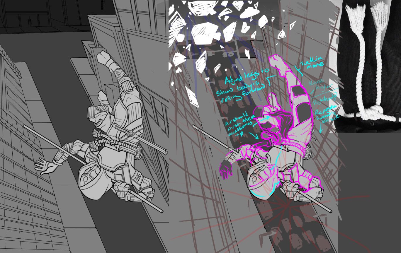
    Here’s a super rough draw over, in the current perspective grid you have laid out, the buildings would be tall without a road seen. I hope that makes sense.

    www.evarartistry.com
    www.Instagram.com/evarartistry/

    Kori Jensen 1 Reply Last reply 13 Sept 2022, 04:32 Reply Quote 0
    • willicreate
      willicreate last edited by 13 Sept 2022, 03:43

      It's awesome that you're challenging yourself with a complex composition. A few things stand out.

      • I think what's confusing is on the initial take the body motion looks like he's falling headfirst. But with the background, it looks like he's tumbling into a position of being parallel with the ground, but the position of the lower half doesn't match the movement of the upper.
      • The arm and hand positions look off. I can only recommend to have a photograph taken of someone performing the pose.
      • The feet look a tad long. Could use some foreshortening.
      • The area between the hood and chestplate bothers me. Seems odd to have the cloth tucked under the corner of the plate.
      • The rope belt looks tied like a thin string opposed to a thick rope. Plenty of references online.
      • Your point perspective gird isn’t setup properly. The boxes should be wider towards the camera, smaller at a distance. I saw two points perspective in an earlier image. Are you utilizing three point perspective?
      Kori Jensen 1 Reply Last reply 13 Sept 2022, 04:42 Reply Quote 1
      • Kori Jensen
        Kori Jensen @AngelinaKizz last edited by 13 Sept 2022, 04:32

        @AngelinaKizz Very interesting so you are suggesting that I utilize the vanishing point to extend to the edge of the page instead of a T-intersection at the end?

        https://daddydudeler.wixsite.com/portfolio

        AngelinaKizz 1 Reply Last reply 13 Sept 2022, 12:21 Reply Quote 0
        • Kori Jensen
          Kori Jensen @willicreate last edited by 13 Sept 2022, 04:42

          @willicreate I am trying to utilize that two point perspective as much as I can, but I think I might have gotten a bit confused. I think this next time around I am going to put 2 color points. As for the body, I get what you mean about the position of the top and bottom of the body. I wish a possessed the skill to do that, but at this point I haven't tried it just yet. I love the way he looks at the moment. I don't mind the size of his rope, but next time I'll add another wrap around to add some body to it. I agree with the feet, but in a way, to me it adds a bit more length to the legs and does not look too, human... if that makes sence.

          https://daddydudeler.wixsite.com/portfolio

          1 Reply Last reply Reply Quote 0
          • Asyas_illos
            Asyas_illos last edited by 13 Sept 2022, 04:48

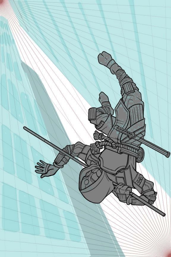
            @AngelinaKizz this is what my mind was seeing also

            Asyasewardillos@gmail.com
            www.Instagram.com/asyas_illos/
            https://asyasewardillos.wixsite.com/mysite

            1 Reply Last reply Reply Quote 1
            • AngelinaKizz
              AngelinaKizz @Kori Jensen last edited by 13 Sept 2022, 12:21

              @Kori-Jensen not quite. It would be better suited that your buildings be vertical instead of horizontal.

              www.evarartistry.com
              www.Instagram.com/evarartistry/

              1 Reply Last reply Reply Quote 1
              • willicreate
                willicreate last edited by 14 Sept 2022, 00:53

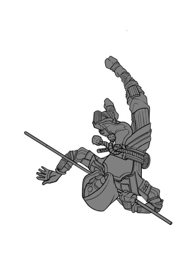
                A draw over to go with my notes from yesterday.
                Untitled-10.jpg

                Kori Jensen 1 Reply Last reply 15 Sept 2022, 06:14 Reply Quote 1
                • Kori Jensen
                  Kori Jensen @willicreate last edited by 15 Sept 2022, 06:14

                  @willicreate I think I have most of your edits rectified, what do you think?ninja.jpg

                  https://daddydudeler.wixsite.com/portfolio

                  1 Reply Last reply Reply Quote 1
                  • willicreate
                    willicreate last edited by 15 Sept 2022, 17:11

                    @Kori-Jensen Yeah, I think the image better informs the direction the character is falling towards. Looking forward to the finish piece.

                    1 Reply Last reply Reply Quote 1
                    • Kori Jensen
                      Kori Jensen last edited by 16 Sept 2022, 04:53

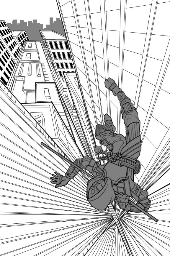
                      I hope you like the line art so far. What do you guys think of the city scape? I am going to be adding the broken glass very soon, I just wanted you're guys input 🙂 THANK YOU SO MUCH FOR YOUR HELP SO FAR!ninja.jpg

                      https://daddydudeler.wixsite.com/portfolio

                      1 Reply Last reply Reply Quote 0
                      22 out of 25
                      • First post
                        22/25
                        Last post