Spread feedback
-
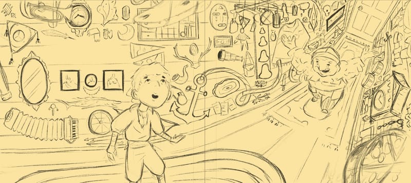
Need to get some spreads in my portfolio so here’s the sketch I’ve been working on for a new piece. I’ve left some room for text on both pages.
I really want this space to feel chaotic but wonderful at the same time. The main thing I’d love to hear from you all is if there is anything that isn’t working compositionally or feels too distracting. One particular object I keep coming back to is the anchor. I feel like it stands out maybe a bit too much but I intentionally placed in partially in the gutter to obscure it a bit. Let me know what you think!
-
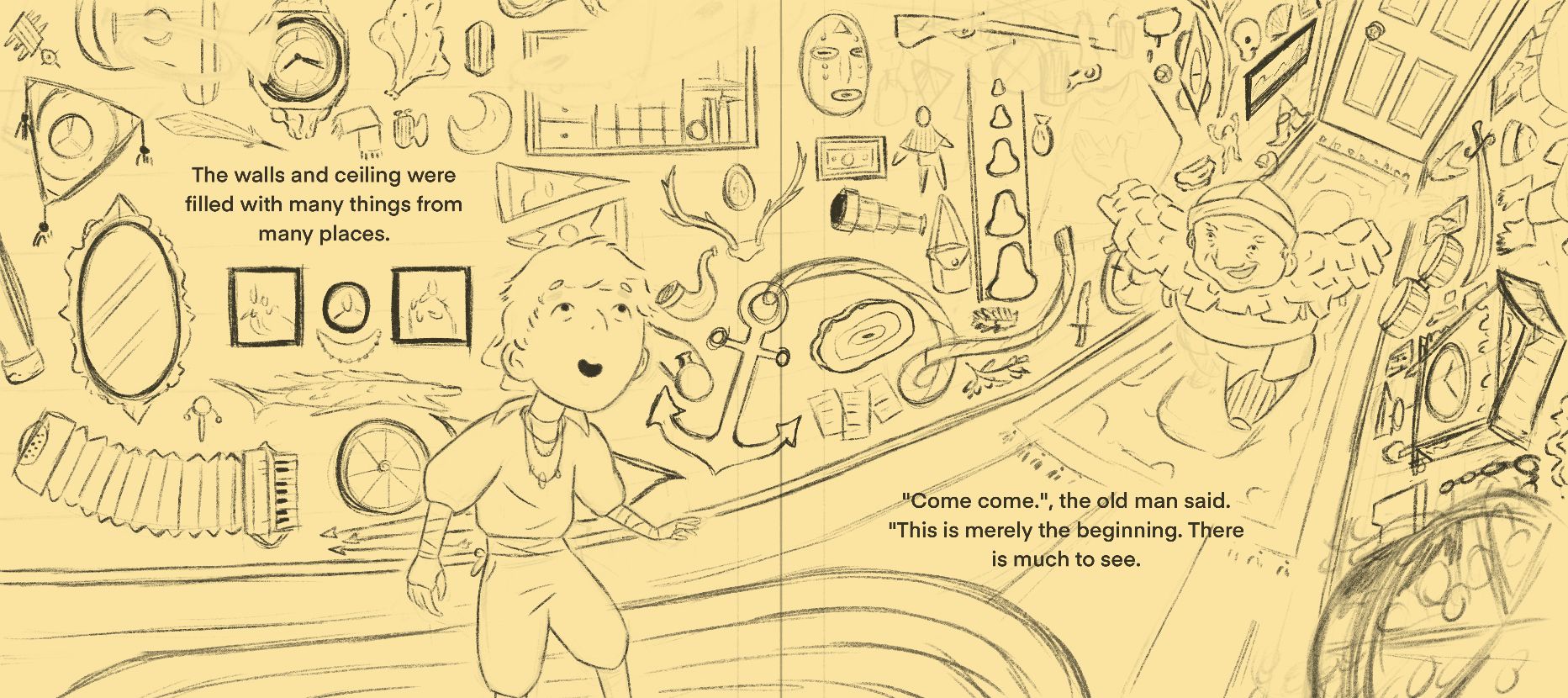
@Griffin-McPherson it looks good to me, the anchor didn’t stand out all. The only that does catch my eye, is the boys hand, the position looks awkward to me. Is he throwing something upwards or catching something with the hand on the right?
-
Also the two square pictures above his shoulder totally looks like a face, maybe that was intentional though? Could be easily remedied with color though.
-
@Asyas_illos yeah the hand looks weird at the moment. It’s more of a placeholder than what it will actually look like. As for the pictures looking like a face I think you’re right. I added in the necklace earlier but it makes it look too much like a face
-
I think this is definitely going in the right direction. If you want it to look a little more chaotic, I'd just add more overlap into the pieces on the walls. I do feel like the perspective twists a little too much going into the right side page towards the door, kinda like two camera angles have been stitched together at the gutter (telephoto long lens on the left and fish eye wide lens on the right).
-
@ajillustrates technically it’s totally breaking perspective and doesn’t make sense but I really enjoy bending and breaking the rules of perspective. I’m more concerned with if it looks wrong rather than if it’s technically wrong.
-
@Griffin-McPherson I would say that at the moment the composition has good potential but we can't judge yet. To really judge if the composition works, you will need to put the values in (grayscale), which means the light and shadow and local value. You can do it very roughly, just to see what works.
Typically, the eyes goes for areas of high contrast, or the odd ball (a white object on a black background). Hence if your characters are bright and the background is darker, the eyes will be attactred by them.
Btw, I really like your work on 3D perspective and how you bent space
")
-
@Griffin-McPherson Then you're good to go on the perspective

-
@Griffin-McPherson It would be great to make sure the characters' silhouettes aren't too embroiled with the busy background. Clear a small space around the characters so they can stand out, and they don't look like they have objects coming out of their heads or torsos
Make sure you clear space for the text too! Art directors will be looking for that.vanessastoilova.com
instagram.com/vanessa.stoilova/Check out my Youtube channel for tips on how to start your career in illustration! www.youtube.com/c/ArtBusinesswithNess
-
@NessIllustration I have space cleared on the left page where there’s the blanket spot on the wall and on the right page it’s the space between the two rugs. I will fade out that area like on the left page to make it clear that it’s room for text.
I do intend to make the characters stand out against the chaotic background. The background is busy enough that I think can reduce it to just a couple values, that way the more vibrant character will stand out against it while still making your eyes wander over the walls to see what is scattered throughout. That’s the goal at least
-
@Griffin-McPherson Considering text size, if you want it to be at a legible size for children, it doesn't look like you have enough space there for a full sentence.
vanessastoilova.com
instagram.com/vanessa.stoilova/Check out my Youtube channel for tips on how to start your career in illustration! www.youtube.com/c/ArtBusinesswithNess
-
@NessIllustration here’s how it looks with some text. This is 20pt font which falls within the 16-24 range that is typically used. I tried to match the text size if the books I have around and this is pretty close or even a bit bigger I think.
-
@Griffin-McPherson Oh okay I see now! Works nicely though a bit cramped, but that's the point
-
@Griffin-McPherson This is looking great! And his left hand looks better. It might still be a bit on the small side, compared to the other one, but maybe that's intentional, given the wacky perspective? (Which I love, BTW!) I agree that adding some value will help us evaluate more. I think you could make it feel chaotic without the chaos overwhelming the characters if you make the objects in the background all fairly equal in value while having contrast where you want our eye to go.
Instagram: https://www.instagram.com/kirsten.mcgonigal.art/
Portfolio Site: www.kirstenmcgonigalart.com -
@Griffin-McPherson love all the detail! As previously mentioned, a value study will really help us see your intended focal point and will help with the storytelling.
As @NessIllustration mentioned, the text is cramped. Looking at it from a book design perspective, I would like to see more room left for the text. Consider nudging the text on the right a little further away from the gutter. If you could make a blank space on the flooring, moving the edge of the rug back a bit, that might help.
Are you intending for the piece to have a skewed perspective? It looks as if the left side of the illustration has a different POV than the right side. It's giving me Alice in Wonderland vibes. If that's your intention, well done!
Is the boy the main character? You may want to also consider making him a little bigger and bringing him a little more forward in space. He is similar in size to other elements, which doesn't help him stand out. Being cut off at the knee also feels a little awkward.
That being said, I love the storytelling and expressions on the characters' faces. And again, all that detail is awesome! Looking forward to seeing where you go with it!
illustrator - author - smiley person
mbaileyart.com
instagram.com/mbaileyart/ -
@kirsten-mcg nah it’s definitely small right now. Also still doesn’t look quite right but hands are the worst so I’ll worry about saving that for later lol
-
@Melissa_Bailey you’re right, that’s an awkward cut off for the boy so I’ll try making him a bit bigger and have the cut off at mid thigh.
Skewed and wonky and weird is what I’m going for, Alice in wonderland is a good descriptor!
This piece was actually inspired by Miyazaki’s graphic novel, *Shuna’s Journey. *His stories are always so full of strange magic and have a feeling of otherworldliness to them so I’m trying to create a bit of that same magic and strangeness with this piece. -
@Melissa_Bailey adjusted the text and made the boy bigger which definitely looks better. I actually realized I misunderstood what you said. I adjusted the text on the left to be farther away from the gutter but after realizing this I shifted the text on the right away from the gutter as well. Let me know if that’s working!
-
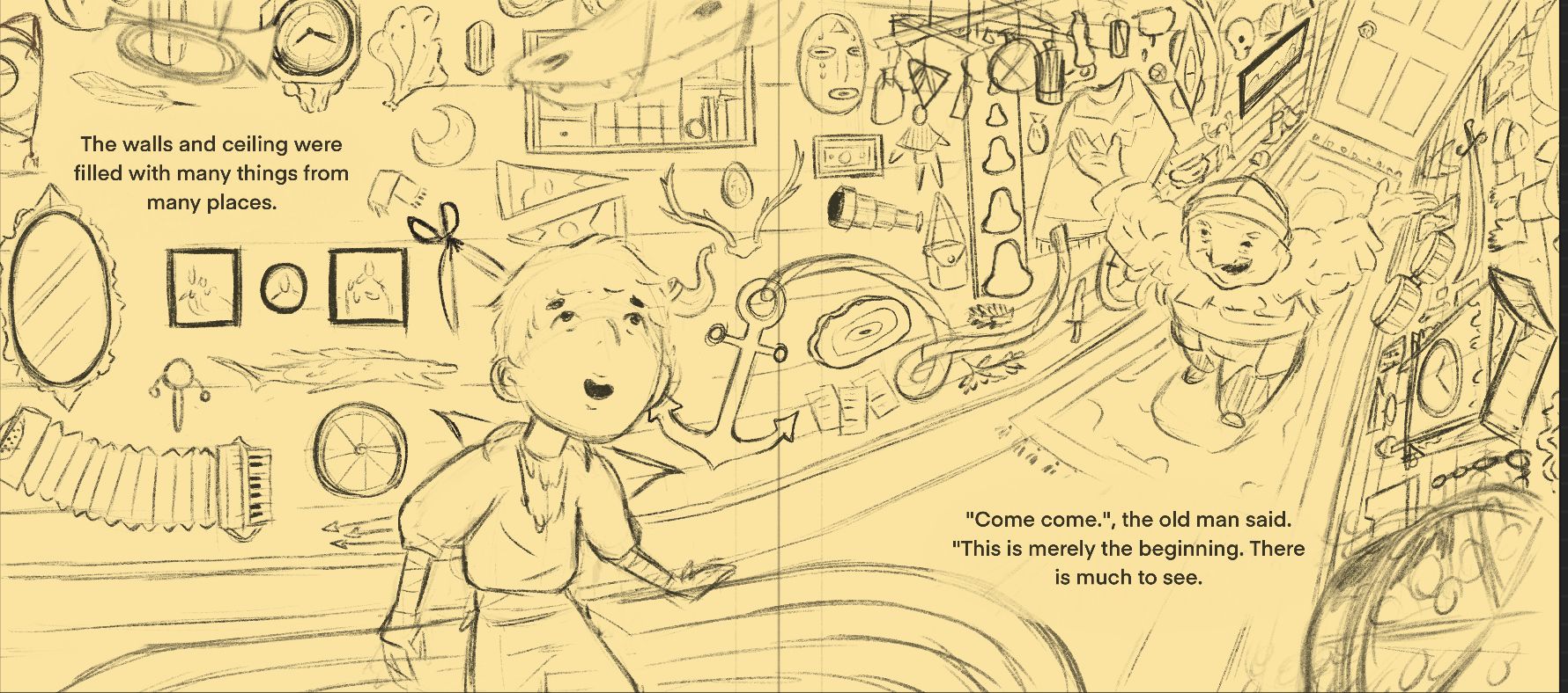
@Griffin-McPherson This is a great improvement, but a few other things could be done to clarify further. @Melissa_Bailey had a great suggestion to get the rugs out of the way - they don't have to overlap the text, and this way you won't have to worry about them at coloring.
The immediate surroundings of the characters could be cleared out to make the silhouettes pop.
I applied those changes to show you an example, and also took a shot at the hands. I think the boy had his thumb on the wrong side, and the old man's right hand would look better with the fingers arching the other way, like his other hand:
vanessastoilova.com
instagram.com/vanessa.stoilova/Check out my Youtube channel for tips on how to start your career in illustration! www.youtube.com/c/ArtBusinesswithNess
-
@NessIllustration this is just my rough sketch so I usually don’t worry about hands at this stage because they can take me so long to get right, but I agree with those changes! I do intend on leaving space around the silhouettes but I’ll probably do it by fading out the edges rather than erasing them to give it a softer look. I’ll move those rugs too, that does look cleaner!