Spread feedback
-
@Griffin-McPherson yes, the bigger boy looks better!
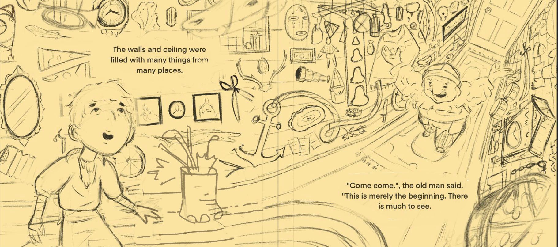
Here's a thought: moving the text on the left back to the center (it was fine where it was; sorry I wasn't clear that I was talking about the text on the right). And then move the boy over to the left a bit more. He looks like he will be close to the gutter. Moving him a little farther away from the action on the right side might create a better flow as well, since our eye will go to him first and the way he's positioned will lead us through the rest of the illustration.
Hope you don't mind, I took a screenshot to demonstrate those adjustments & give you a visual:
illustrator - author - smiley person
mbaileyart.com
instagram.com/mbaileyart/ -
@Melissa_Bailey oh nooo I do like that but now I have to decide if it’s worth restarting the final line drawing and rearranging things


I may have to think about this a bit. Thanks again for the great suggestions! -
@Griffin-McPherson since I'm not the one who has to do extra work, it's worth it!

illustrator - author - smiley person
mbaileyart.com
instagram.com/mbaileyart/ -
@Melissa_Bailey a strong argument
-
@Griffin-McPherson this is also a possible real client scenario... haha. All the best!
-
I love the idea, the warped perspective is a really cool idea. One thing I'd work on is sketching in a perspective grid so that each item on the wall follows that warping perspective as it goes down the hallway. Even though the perspective is intentionally wacky, the items still need to follow the overall warped lines for it to look right.
Such a cool idea! Can't wait to see it.