SVS Virtual Studio MARCH 2023
-
@von_Nimmermehr This is so cute! Love it.

-
@Asyas_illos Wow you have more snow there than we do in CO!!! Adorable snowman! That hat! OMG so cute

-
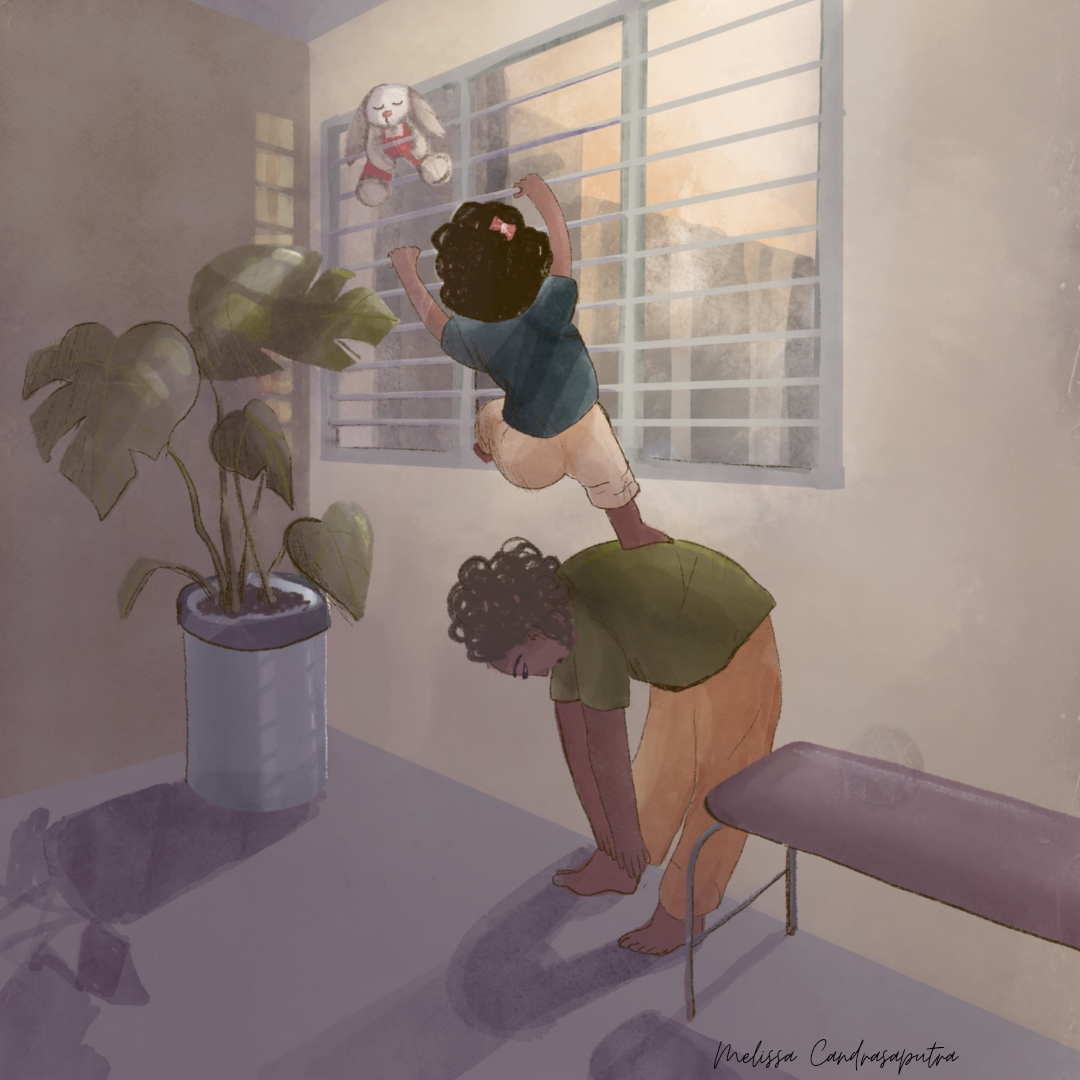
"Saving Ruby" I don't know why I am drawn to illustrating mundane things like my bland public housing flat window. The interesting part is that I did not set out to make an illustration. I started the sketching and art making process as an attempt to study rhythm in visual form, so as to translate it into the broader understanding of rhythm to help me come to terms with the lack of regularity my life is having right now.
I went into it a bit more in my March newsletter - which was frantically drafted at dawn in a hotel room because I was so caught up with the busyness of my brother's wedding prep and family visiting. So, yes, I caught at least one error after hitting send. Oh well.
-
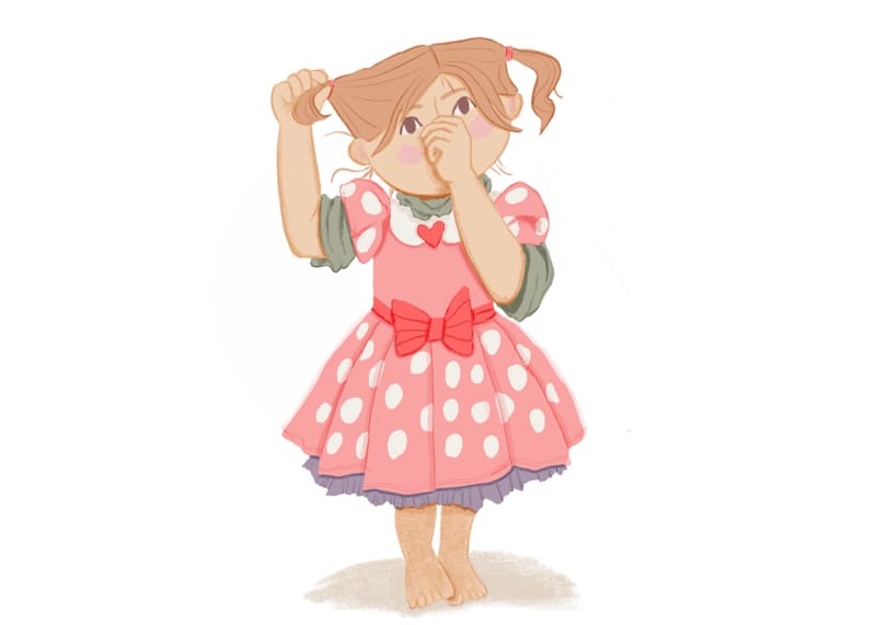
This is based on my three year old daughter. I struggled a lot with drawing her hand in front of her face but it feels so good to be drawing again after so many months not being able to. I think being back to drawing has a lot to do with selfauthoring.com if any of you have heard of that.
Anyway, have a great day!!

-
@Lisa-Clark Cute!!
-
This post is deleted! -
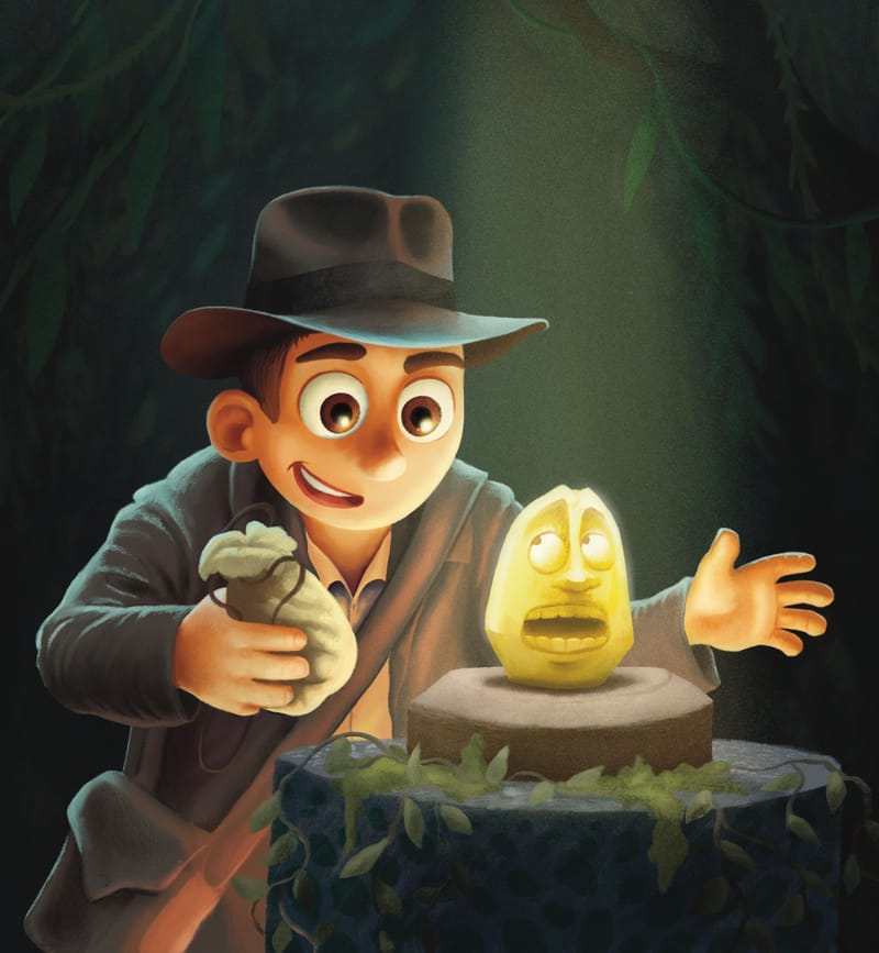
Was rewatching the Indiana Jones movies with my wife and thought it would be fun to give it the kidlit treatment! I just got the maxpack gouache brushes (sooo good). If you're using procreate, definitely check them out.
-
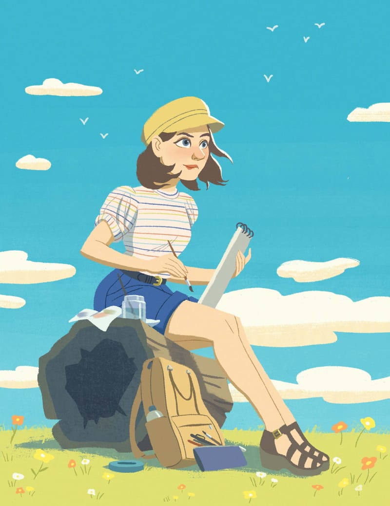
An artist self portrait that I was asked to make for the SCBWI Mid-Atlantic Spring Highlighter.
-
Gosh, it's been forever since I've posted work here. Last year I just had my head down all year working on storytelling. We'll see if it helped!
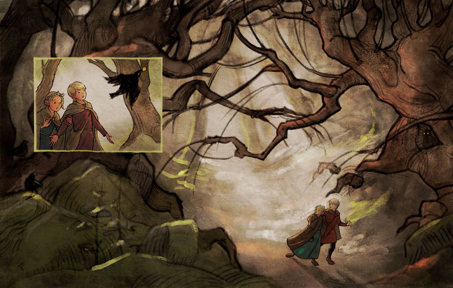
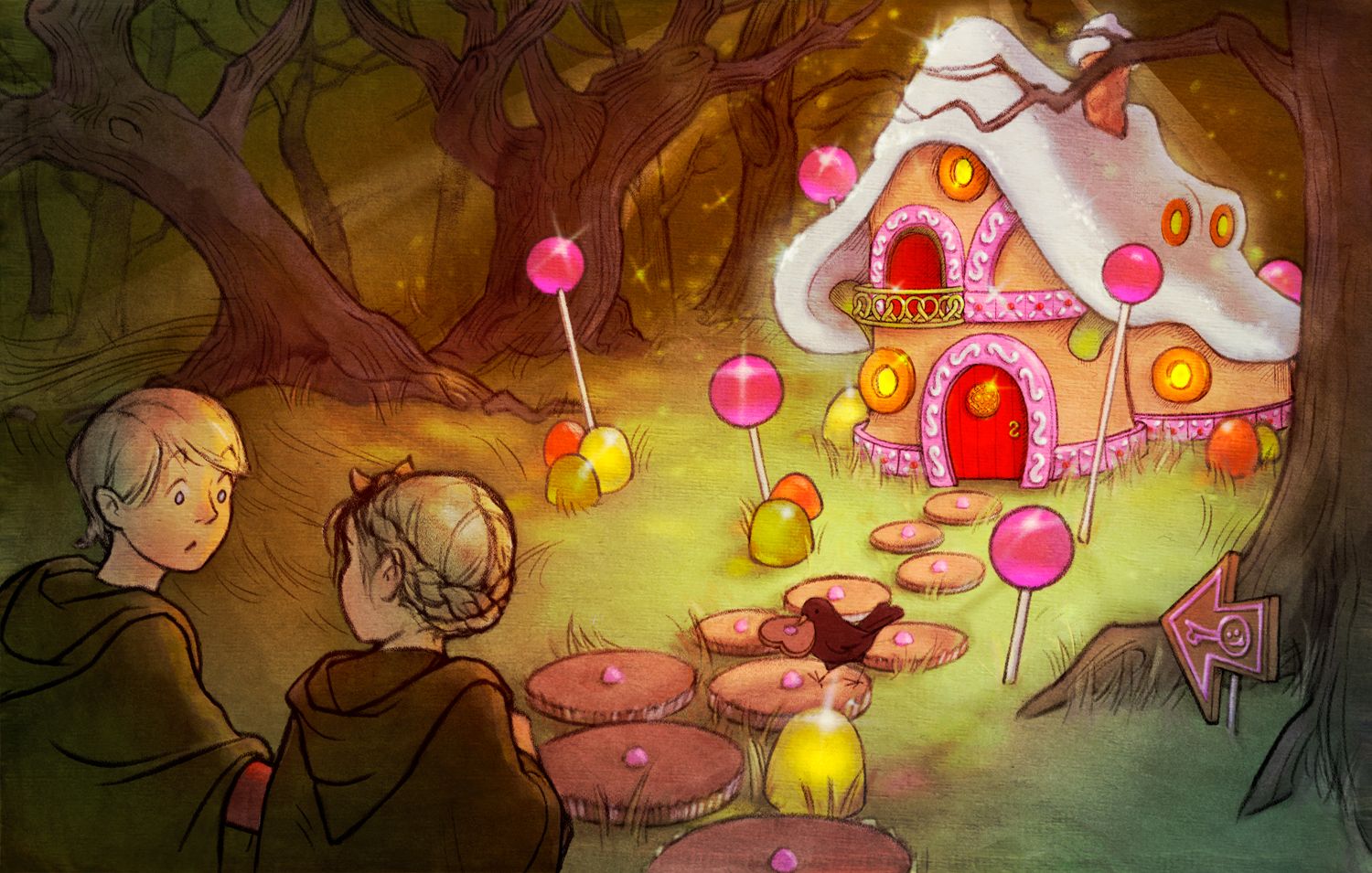
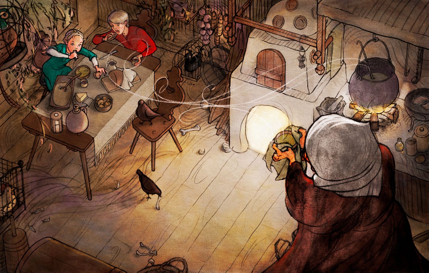
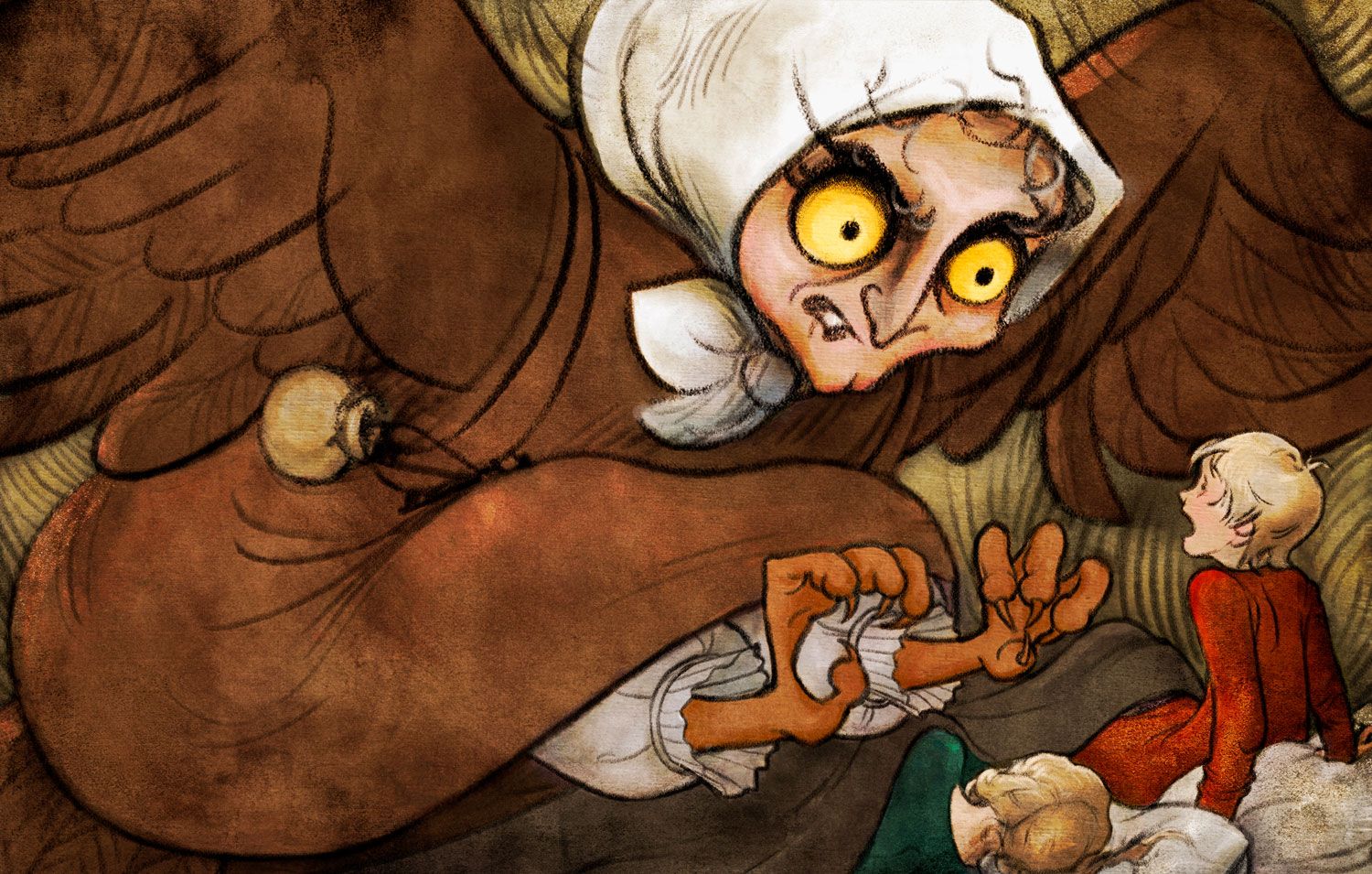
Anyway, I just finished or revised five illustrations for my CBPro Hansel and Gretel project, so here they are. These are the versions without text, but it's easy to guess what they are. They're finished, but critiques are still welcome. I can always learn!
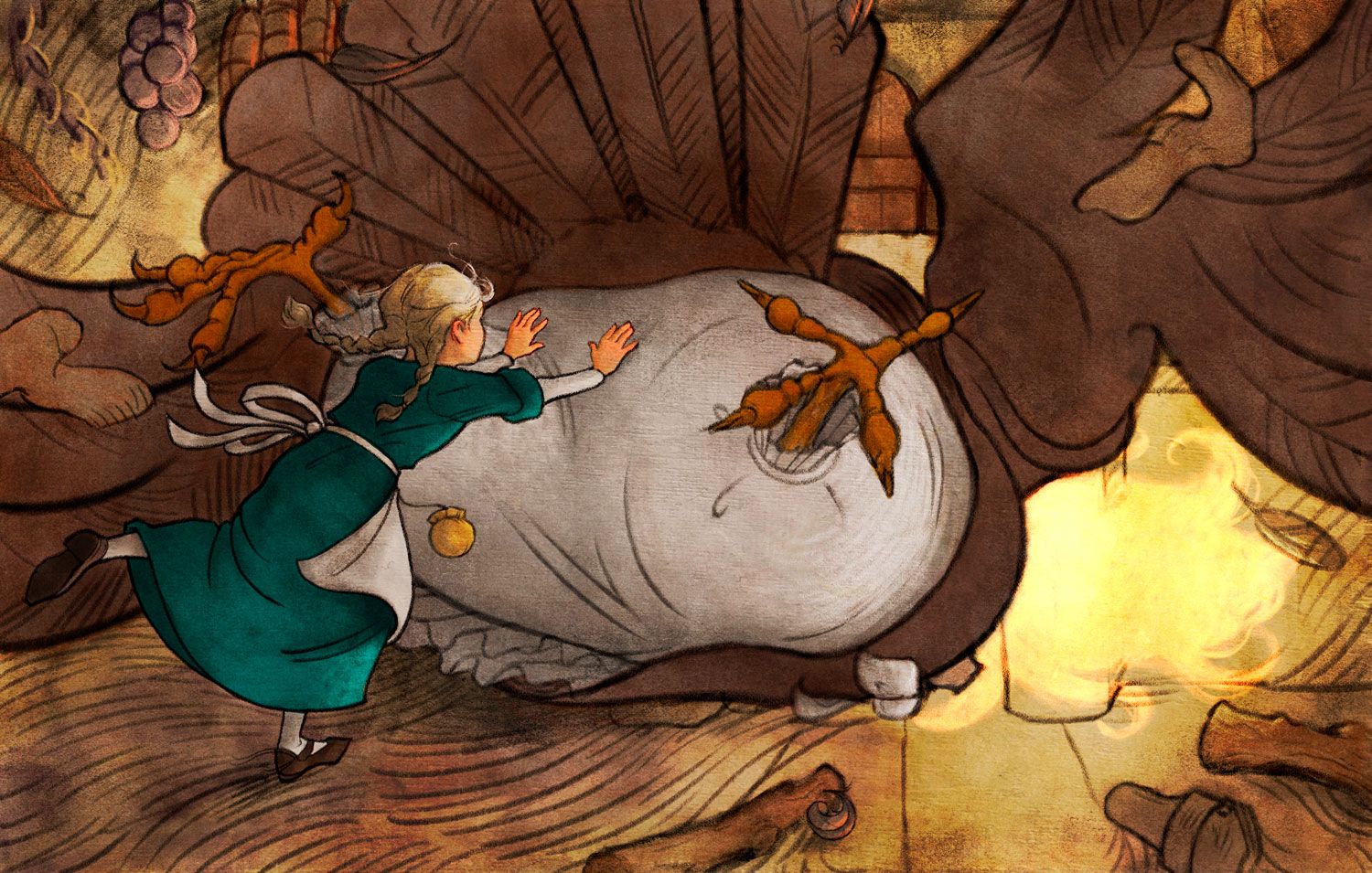
-
@LauraA this is so good!especially the colors

-
@LauraA, your illustrations are beautiful, I love the soft colours and line work. However I do have one critique since you said you were open to it. While your backgrounds and characters for the most part are drawn in a naturalistic style (perspective, forms turning in space, drapery etc) the characters' expressions are drawn in a super stylized cartoon/comic strip style (short hand 2d mouth shapes, eyebrow shapes, some extreme squash and stretch) to me, this doesn't fit with the style of the rest of the illustrations. Is this an intentional choice for how you want your style to look or is it because you struggle with more naturalistic expressions?
-
@LauraA Those are beautiful, well done. Will be checking out your Instagram.

-
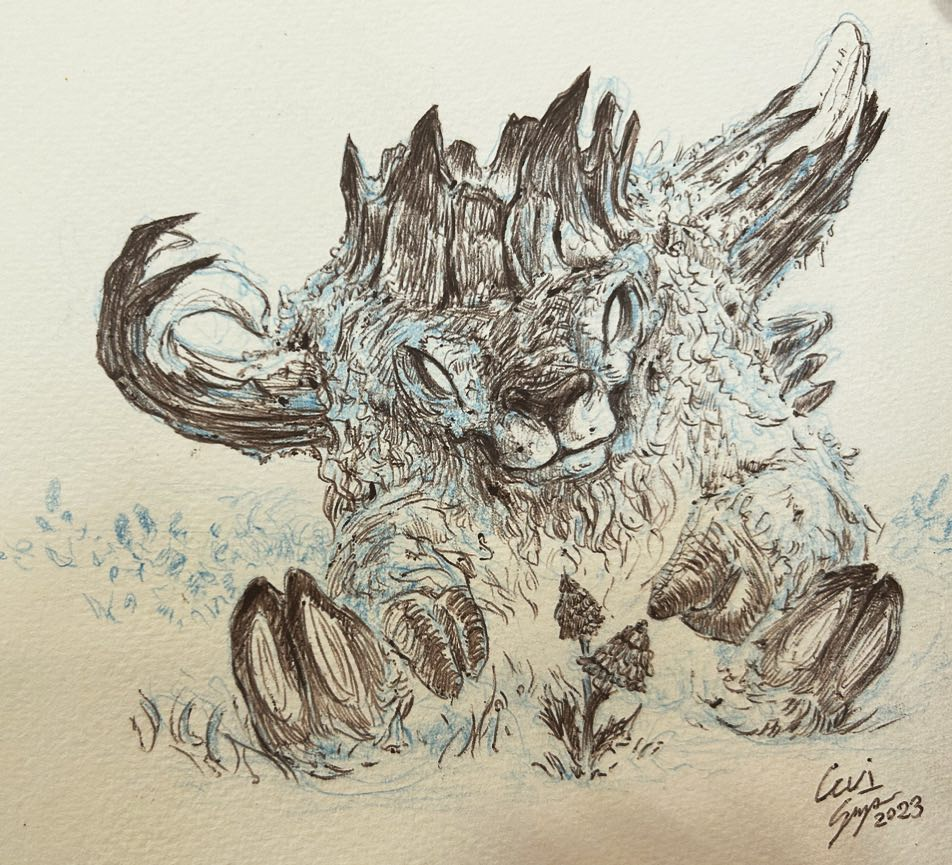
Here is another tree troll I did as I continue to work these creatures out in my head and figure out what part I'd like them to play in a story of some kind. I do know there will be all types of these Tree Trolls, some quite small, some as large as a massive bear and some much, much, MUCH larger than that. Something I quite enjoy about trolls is the variety in which you can design with them.

-
@Mimi-Simon It's definitely a stylistic thing. All the characters started out more naturalistic and evolved over time. I just liked exaggerating them a bit to make them more expressive. This may be the way my whole style is going, but I can't quite tell yet. Do you think they are incompatible?
-
@LauraA I think exaggerating is totally an important thing in all illustration. I may have worded my critique wrong to make it sound like that was bad. Its more like, to me I see two radically different styles in your illustrations between the expressions and everything else. I think the way the expressions are drawn are so different that it comes off more like you didn't put care into the expressions as apposed to the expressions are exaggerated. I think the problem is more that the features are drawn in a 2d shorthand way (similar to what you often see in manga) rather than that they are too exaggerated. If you take a look at for example expression sheets from tangled the disney movie they are super exaggerated but they use real perspective and the features move in a naturalistic way as apposed to turning into abstract 2d shapes. I think something along those lines would work really well for your style thats already super naturalistic and beautiful. your work also reminds me a bit of trina schart hyman so you could take a look at how she draws faces and expressions as well.
-
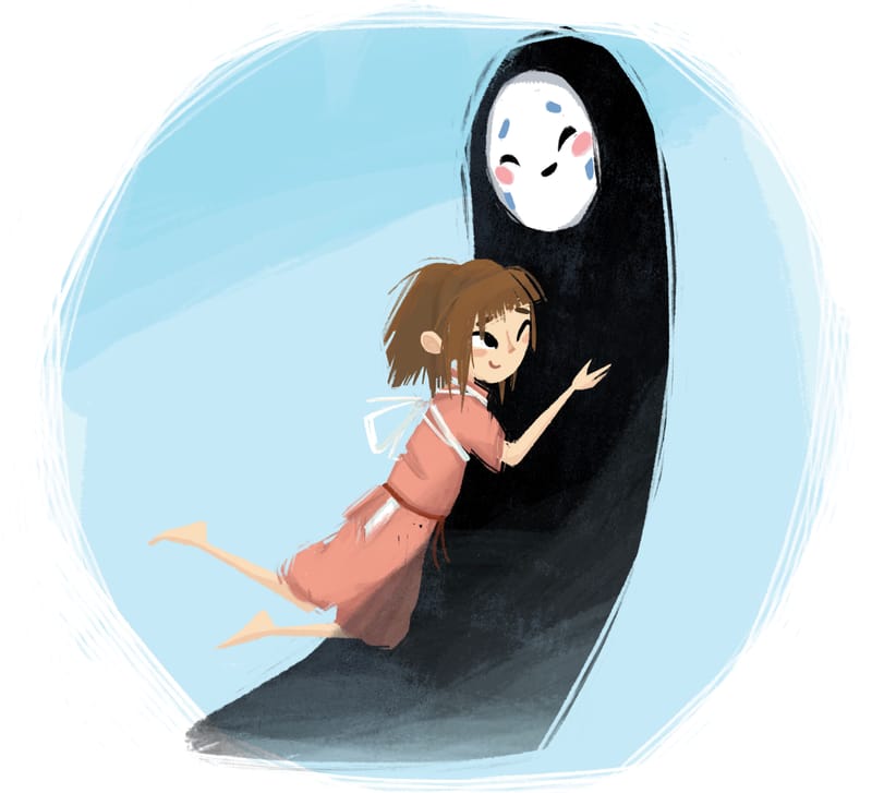
My version of an Instagram dtiys post by @MarcRobinson his is awesome go check it out!
-
@Mimi-Simon Oh, Trina Schart Hymann is my idol!!! I used to draw faces like hers in high school, and in fact, I used to be an oil portraitist. But an oil portraitist does not an illustrator make, everyone kept telling me my style was nostalgic, and I perceived this to mean my style was out of date.
Thus this is sort of an experimental period in which I am trying to figure out how to work faster, concentrate more on story, and update my style, which in turn may lead to consistency problems. I'll take this feedback into consideration as I keep working it out. Thank you!
-
@LauraA this make a lot of sense. Inconstancy in style means you are growing and learning new things. I'm definitely looking forward to where your'e headed.
-
@Blitz55 Dude your style is great. I love it.
-
@Tom-Harshberger Thanks man, I really appreciate that.
