Feedback/critiques on a couple new pieces...
-
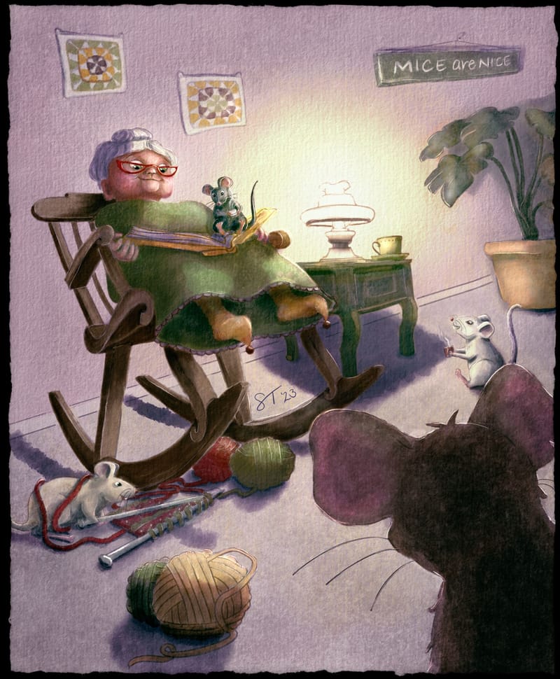
Hi everyone! I'm working on my portfolio and trying to keep in mind suggestions from the Power Portfolio Critique I had. (By the way, I highly recommend this!) Anywhooo... I just finished these two new pieces and would love any feedback, thoughts for improvement, etc. One of the things I struggled with was the perspective of both the table and the pot for the plant on the "Mice are Nice" image. I've worked it a few times, but not sure if it's accurate now?
Sara Therese
https://sarathereseart.com
Instagram: @sarathereseart -
On the mice image, it feels like a very unflattering angle to draw grandma. Have you tried a couple of others, e.g. side profile etc?
On quick glance, the flower pot stands out the most to me as being not in perspective. The base needs to be more curved if you are taking this angle. Are you able to show your perspective guidelines for this piece?
-
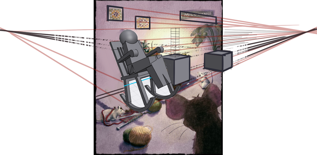
@Sara-Therese-Art these are very nice. For the top image It looks to me like the horizon line is tilting down to the left for some of the objects. I tried to see how it would look if the vanishing point on the left were raised to the level of the vanishing point on the right with a quick sketch/model. I think we would see the top of the side table and the potted plant. Not sure about the lamp…it depends on how tall it is but it is very likely we would not see up into the bottom of the light shade. I think that the vertical lines on the items on the wall being tilted gives the room a feeling of leaning away from us. If they were straight up and down it would feel less uneasy for me. The “Mice are Nice” sign on the wall is the main thing though that is throwing off the perspective for me. The right side vanishing point for it is very high from the rest of the room. I am wondering if deeper shadows under the book to show the form of her lap would give a better feel to the pose. More like she is conforming to the shape of the chair? Here is my quick draw/model over to show more what I am thinking.
-
@Sara-Therese-Art I had a feeling the flower pot wasn't quite right and the table was bothering me too. Thanks for confirming. I'll try curving the base a bit more to fit with the angle of view.
-
@Kevin-Longueil This was so helpful! I really appreciate the thought and time you took to help. I think the changes you mention will make for a better image, so I'm very grateful.
-
Your work is so much FUN! Rather than looking at the "accuracy" of your perspective, I'd start with your vantage point. If you are drawing as from a mouses perspective on the floor, then you would be looking UP at almost everything. And if you're looking up, then the horizon line would be very LOW on the page (a mouse's eye line). I think this one change could open a "whole new perspective".
")
-
@TheresaMuth Yes, good point. Full disclosure I normally use perspective lines (the Procreate perspective drawing guide drawing assist layer is a great help) but I thought I could be clever and wing it this time around. I obviously ran into problems. The original point of view was going to be from the floor up but as I struggled I decided I'd just change it to have the mouse sitting on a table.
 Oh my gosh, how lazy was that?! Anyway, I'll make the changes @Kevin-Longueil mentioned and I should probably draw in the table edge that he's sitting on so that it's clear. Lesson learned! I'm not at the point in my journey to be winging my perspectives just yet!