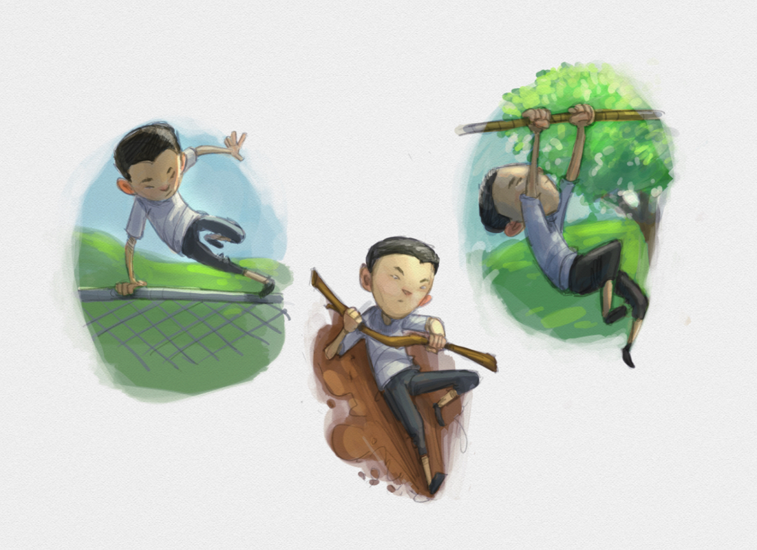
Practice drawing characters
-
@natiwata Really nice image!! I think you should paint this one! If you do however, I would put the dog a little higher so his neck isn't cut where it is... That's the only issue I see with composition! Great characters
")
-
Really terrific sketches!
-
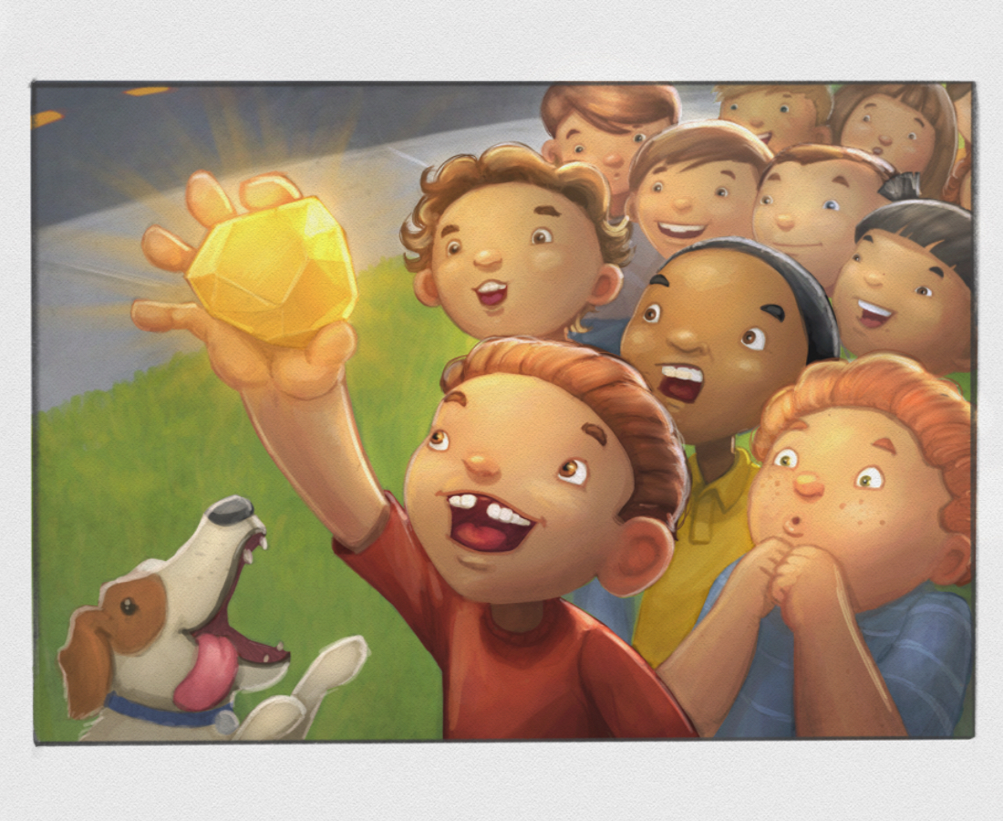
I love the expression of the boy in the lower corner! Ohhh!
-
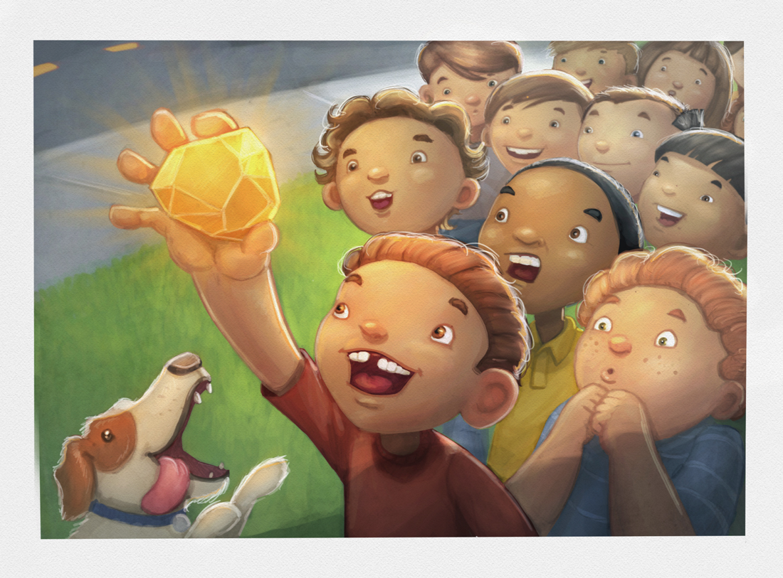
@natiwata This is progressing very well! I like the angle and your choice of having no kids behind the hand/gem. Between that and all the eyes leading it draws the readers attention right to the focus.
-
@Charlie-Eve-Ryan @Jason-Kellogg @Rob-Smith @Camila-Barrera-Daza @BradAYou Thank you for the comments!
@NoWayMe - Thanks for the feedback, good catch with moving the dog up a bit.
@Russ-Van-Dine - I agree the dog's eye could be more pronounced, I'll add that when I paint it. I had tried his paw on the boy and didn't get it quite right, but perhaps I'll try it again, thanks for the suggestion!
-
Update!
-
Super nice work!
-
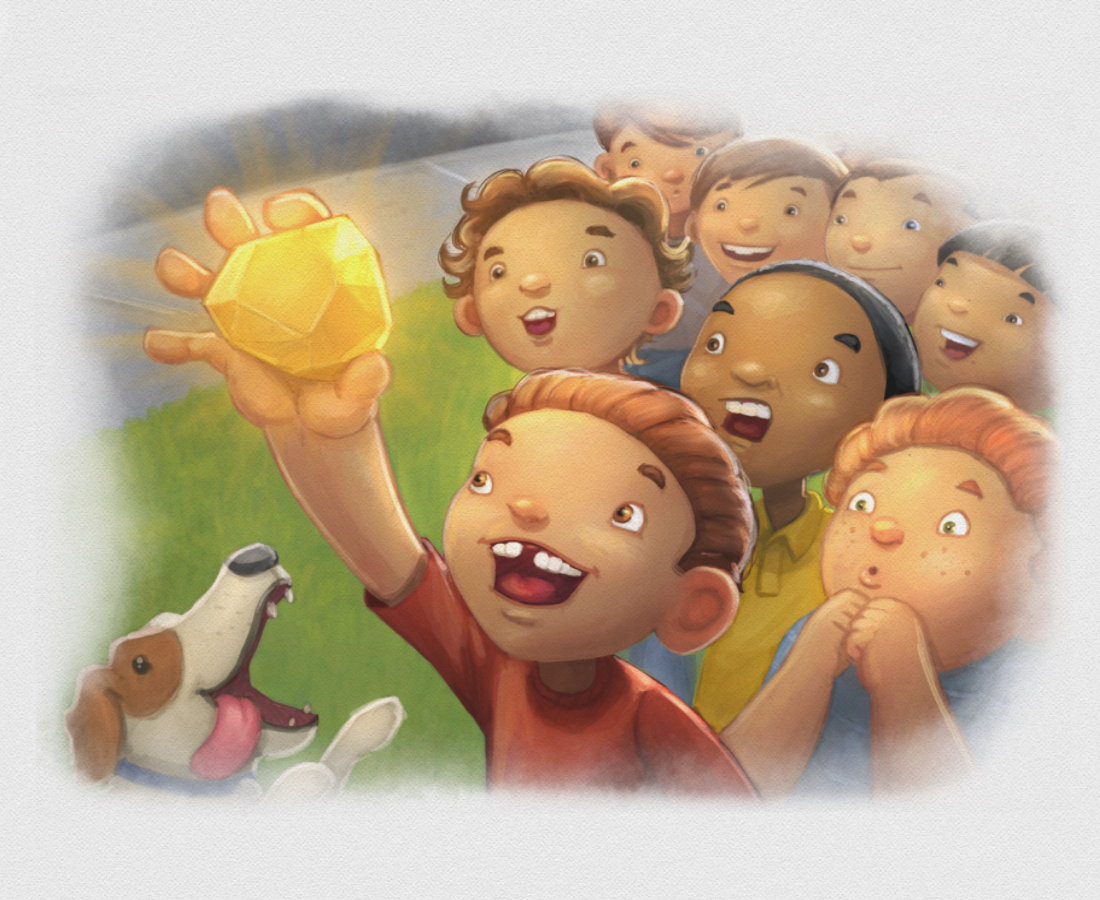
@evilrobot thank you! You think this works better as a vignette?
Nat Iwata
www.iwataillustration.com -
l love it.
-
Thats very cool!
-
Wow! love it! (I prefer the NOT vignetted version)
-
Wow, just great! Thanks for sharing
-
@natiwata Super nice as usual Nat! - really nice composition - i like the non-vingette also - i just wanted to see what it would look like if i saturated parts of the gold and the boy to make him pop more - i think i went a bit too far but i thought maybe the boy should pop a tiny bit more than he does? maybe not - possibly just a few more hard edged lines on him? - something though i think - here is the one i did the quick cut/paste/adjust on -
-
@natiwata What if you did it like they are coming out of the vignette instead of just erasing borders?
-
Thanks @Kevin-Longueil , I will try and warm things up a bit to make that gold stand out more!
@Jin-Kus I like that idea for the vignette, thanks
-
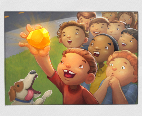
Lunch break update!
Nat Iwata
www.iwataillustration.com -
This is awesome it really makes me want to see the rest of the story. And I like the full image rather than vignette.
-
@natiwata love this piece and all of the great facial expressions you have going on. My only comment would be that the boy in the yellow shirt - his one eye is not really positioned right and it appears to be looking further above the golden nugget that his other eye. I am referring to what would be his left eye. I think if you moved the pupil/iris down inside the eye shape it would line up with the direction his other eye is looking and towards the nugget.
-
Very nice illustration! I love the expressions...especially they red-headed boy's. I do agree with Rich, the yellow shirted boy isn't looking at the nugget. I also feel the boy holding the nugget isn't looking at it either. The nugget looks to me like it is more in front of his face than to the right where his eyes are looking. This piece really is amazing!
-
Thanks for the comments guys, I agree about the eyes but needed new eyes to see the problem, so thank you!!!
Did a warmup earlier this morning trying to get some action poses with a character and hit some color keys as well based on the beautiful sunshine today.