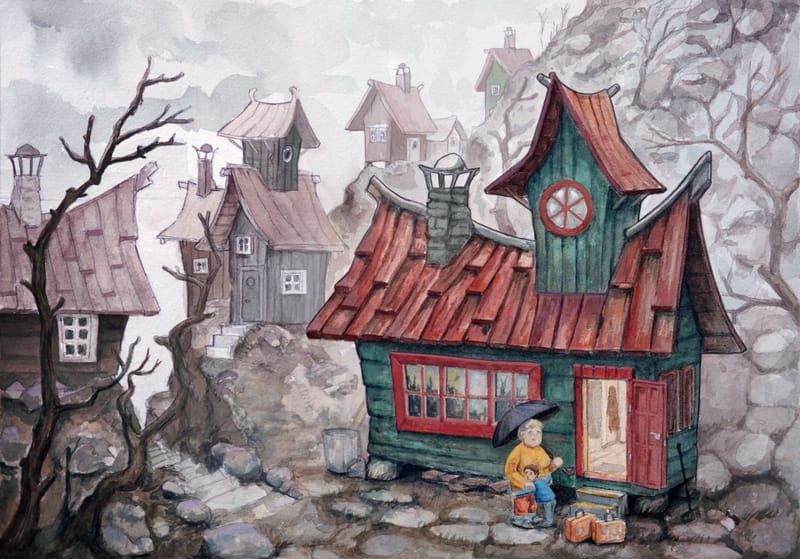
WIP Watercolor for The Witches by Roald Dahl
-
@Arthur-Campling I would do less detail to the background if it's not too late to change. Especially the furthest house. The area around the house I would make a little more vibrant and detailed and make add more to the house. Are you thinking of inking over it? I think the house would look great if you went over the line work with a dip pen.
-
Thanks, everyone, for all your feedback. This forum is really awesome! Since I ruined the original, I couldn't try all the feedback I received, but I want to learn and understand what went 'wrong' or how it could be improved. So I worked on it digitally. This isn't really what I want to do in the future. I want my watercolors to be done when I put down the brush, with maybe some tiny adjustments to details and colors, but not like I did here. Anyway, here is how it looks now!
In my most recent paintings, I have started to do a wet-in-wet wash before blocking in colors (which I did not do here), and this has helped tremendously whith values, details and tones.
-
@Arthur-Campling very nice! Quite a leap forward in that you managed to create unity overall while separating the foreground house simultaneously!
-
@Arthur-Campling you cleaned it up nice, sorry the original didn’t work out. I’ve heard artists like Lee White will do color studies before going into the final piece. Like thumbnails. Doing more of those might help catch value stuff in the future.
-
The only thing that’s left is a tiny bit more detail of the characters, at least their faces. Also LOVE the detail in the reflection of the windows
 very nice touch
 -
@kayleenartlover lol you are totally right, they dont have any eyes
 In the future I think I need to work on a larger paper then this, then the faces would have been easier. I did this on a 30x40 cm (12x16 inch) and should have done it on my larger 40x60 (18x24 inch) papers.
 -
@Arthur-Campling what type of paper and weight? Hot press or cold? Do you mount it on a sturdy illustration board or stretch it?
My favorite size to work analog 30 to 40 years ago was 20 x 30 inches. Now I work 12 x 18, 13 x 19, and 15 x 20 inches.
-
I use Arches hot pressed 300 grams, never really tried anything else as I have understood it's one of the best papers for illustrations. I've tried all kinds of ways to mount it. What I do now is I soak the paper for maybe 10-15 minutes, put it on a 10 mm plywood board, staple it around the edges, and then also use gum tape to keep the edges from buckling. I have tried using standard masking tape, but it always loses grip from the water. I have heard that high-grade painter's masking tape is a good option, so maybe I need to try that. Gum tape is a nuisance to get off, so I usually just cut off the edges.
-
@Arthur-Campling
I use the blue wide painters tape and it works very well for me. Keep in mind my pieces aren’t very large, 17X8 lately so I don’t know about larger pieces. -
@Larue Yes, I'm going to get hold of that tape. For smaller pieces or when I'm not doing a large wash, it's usually fine just to tape it. It's when I soak it and do a lot of wet washes that things need to be tight!