May Third Thursday - bouncing ideas
-
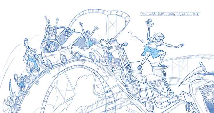
The line drawing is awesome. On the first side of the spread there is that big empty space with the clouds in the middle. (It almost looks like an area left there on purpose for text) You could put some of that fake text in there and i think that would solve the whole problem. Or you might start your roller coasters of characters from the bottom corner there. I did a quick dirty Photoshop warp to see how it might look. There would still be a little gap there but you would be taking up more of the page and we'd get to see those characters a little larger.Anyway it looks great there just seems to be something need in the middle there. 
-
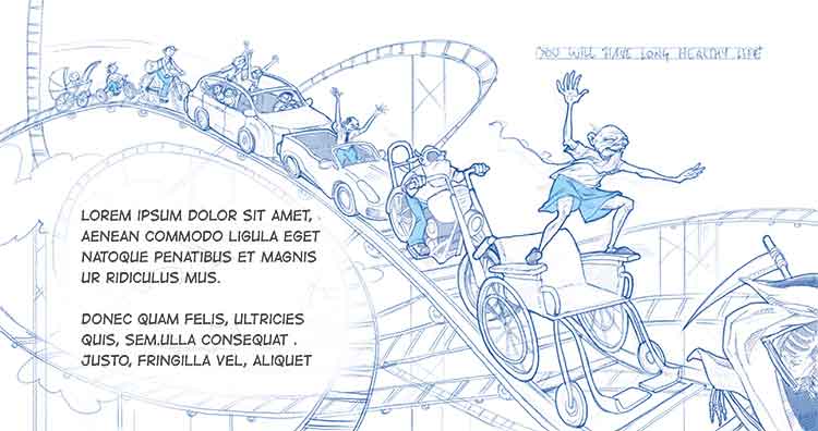
@evilrobot Wow, the warped drawing does look cool! It would mean re-drawing a bunch of stuff, but may yield a much stronger piece indeed. I will give it some serious thinking. Or put in some dummy text...Would you think that would make it more interesting as a children´s book piece?
I am doing color studies right now, so still some time to think before I start the painting.... -
To me I got the impression that it is a children's book spread and the way everything wraps around and leads my eye it's telling me "look right here, this is where the text goes" So I think that if that's what you meant that area for then you have it perfect already. You just need to make sure to leave a white area when you are coloring so the text will be easy to read. I don't think you need to put the text in the actual image just leaving the white will let us know that's what the space is for. It could also work really good for an editorial piece about growing old so lots of possibilities with this piece.
-
@evilrobot I think this is awesome, everything about it!! I love that you use that blue color on his pants in every image of him. I know this is picky and certainly not necessary but you might find a way to use that color on him in the baby carriage (perhaps a hat) and the one with him driving his family. Just a thought. I can't wait to see this finished!! I loved the mermaid too and hope that you will finish 3 or 5 as a portfolio piece!
-
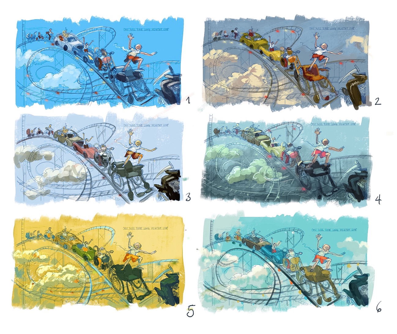
Going through color thumbs while I think about your suggestions on the drawing. As usual, I could do tenths of these, I love playing with color schemes
")
-
@smceccarelli I like #5
-
Wow hard to say. I love #5 it's a different direction than I think anyone would expect with the yellow sky and I love that. #4 is super interesting but it's drawing too much attention to those clouds in the dead space again. I think #3 is working the best if the goal is to have us looking at the old man first.
-
#5 or #6
-
@smceccarelli There is something really special about #5 - it is striking!
-
@smceccarelli This is such a great drawing! For me i think there are things about number 6 that make it stand out - i keep wanting to move the clouds to the right for some reason on 1 through 5 - i think in 6 the contrast is lower between the clouds and the sky and there are clouds on the right hand side of the composition too which seems to lessen their importance on the left hand side of the composition (in a good way it think) - i like the suggestion that there is a cloud in the very upper left corner in number 6 also - i think that adds a lot to the composition for me - they are all very nice though and the things i like about 6 could be added to any of the other if they seemed important - looking forward to seeing the next step!
-
Thank you all for your thoughtful feedback! I am doing six more, trying different color of sky. I am also thinking about adding a distinct sense of sunset, to suggest a sunny life evening - that would pick up on the warmer tones that everybody likes in 5. And definitely I need to do something with those clouds and changing the composition around. I will probably try to place the text on the left, as suggested, and put some clouds on the top right to balance it out.
-
Your linework is so nice and its a fun idea. I like number 6 the best and I like your idea of trying out number 5 in new ways. What i like about number 6 is that the characters stand out as they are warm on a cold background. I wonder what it would look like combining 2's characters with 6's background?
-
Absolutely fantastic work!
I like #5 too, but my favorite is # 6
")
Your work is very impressive (not just this piece!), you have very strong draftman skills!
noemiegionetlandry.squarespace.com
noemie_illustration on Instagram -
@NoWayMe Thank you - I did choose number 6 in the end, but I will add a sense of evening light raking through, which comes from more color thumbs I did later. I liked many others (including the yellow one!), but I think the sunny evening sky supports the story better.
Thank you for your positive feedback - this is by far the best compliment you can make for me
I have made a conscious choice two or three years ago that my main strengths as an artist would be drawing skills and the control of light and color. The road is still long and steep, but that is where I have been concentrating my training and practice, so this feedback makes me particularly happy - thank you!! -
@smceccarelli This is amazing! I love the drawing and all of your color ideas. Very well done.
-
I love this concept! Nice work on the colors. I find #4 very attractive but for the message of that piece I would go for more "shouting" colors like red, orange, yellow, particularly for the vehicles, as in #2. #5 has very fun colors, but for me the attention is drawn too much to the background.
I am sure the final piece will look wonderful. -
So, finished - not perfect....
I changed the pose of the old guy, so that he takes up more space. Nobody of the people I asked noticed the Grim Reaper running away at the front (I had cropped it heavily), so I extended the canvas to draw it out nearly in full. And used the blank space on the left to position the text.
Too saturated?Feedback and suggestions are highly welcome!

-
@smceccarelli This looks so great! i did notice the Grim Reaper in the original - i hope you don't mind me saying i thought it was perfect before - it is such a positive image - i really like the symbolism of the sun not hitting the wheelchair and Death but it does really changes the mood for me - i though the way you alluded to the Grim Reaper in the earlier version was just right - maybe if he was tipping his hat or otherwise engaged in a friendly act it would keep things positive - but all things do move to one great ending - i think too that before the focal point was in a really ideal spot on the page (the man surfing his wheelchair was focal for me) - The Grim Reaper has become part of the focal point adding a lot of visual weight to the right - maybe the text balances it out though - i really like that you have placed the fortune right on the image - it looks great - anyways... this painting looks awesome and really does not need any changes - just sharing some thoughts
good luck Thursday! -
@Kevin-Longueil I think you are right, Kevin! I will play with the crop tomorrow and see if I can get the composition re-balanced. It is definitely unbalanced now.
-
Really nice image @smceccarelli I have enjoyed looking at your whole process on this one.