Society of Visual Storytelling

    SVSLearn Forums

    • Register
    • Login
    • Search
    • Recent
    • Tags
    • Popular
    • Users
    • Groups
    • Search

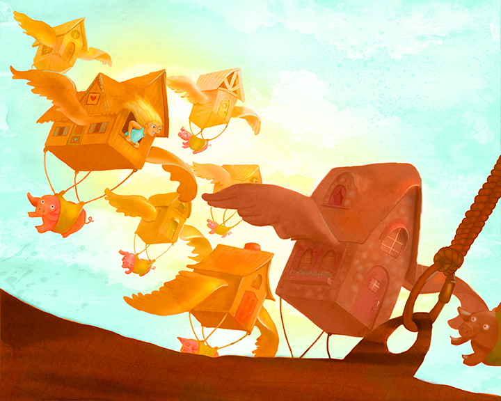
    Flying Pigs WIP, Feedback appreciated!

    Illustration
    9
    17
    4112
    Loading More Posts
    • Oldest to Newest
    • Newest to Oldest
    • Most Votes
    Reply
    • Reply as topic
    Log in to reply
    This topic has been deleted. Only users with topic management privileges can see it.
    • Maile McCarthy
      Maile McCarthy last edited by

      I've been pushing (digital) paint around on this one for a while now, and it just feels like it's missing something. Any suggestions?

      upload-eefd7488-3f6b-4be3-a1a6-b700645fa335

      Twitter @MaileMcCarthy
      www.mailemccarthyillustration.com

      Fabienne Maile McCarthy 2 Replies Last reply Reply Quote 2
      • Steve Young
        Steve Young last edited by

        Wow fun and bright, nice going!

        Never give up, always push yourself two steps further than you believe you can go.

        1 Reply Last reply Reply Quote 0
        • Jiří Kůs
          Jiří Kůs last edited by

          Ha, awesome 😃
          What might help could be shifting the focal point toward the character. Even though you made the character sharp blue to bring more attention to it, it is still fighting a tough fight with the leading building, And since it seems to me you wanted to depict a character flying somewhere in these crazy houses, there should be biggest contrast around the main character instead of the leading house.

          Follow me on
          https://www.instagram.com/yiri_kus/
          http://yirikus.tumblr.com/
          https://www.facebook.com/yirikus/

          1 Reply Last reply Reply Quote 0
          • S
            Shannon Perkins last edited by

            I agree with Jiří Kůs' advice. I'd like to see the character more as the focus as well.

            While I like your color palette of gold, amber and teal, everything has a fairly high level of saturation and is fighting for dominance. You're starting to do it with some of the houses in the background, but I think things need to be pushed a little more. The girl in the house is getting lost because her skin is the same color and value as the house, and her hair not much different.

            I also feel like the composition is being cut in half at a diagonal, with the upper-right side being empty, and all the objects in the bottom-left. Just a little shifting of elements can solve it.

            You have a nice sense of color, and a fun whimsical style and concepts. I like the smooth, almost watercolor-like transition in the painting of the houses. Keep up the good work!

            http://shannonreneeperkins.tumblr.com/

            1 Reply Last reply Reply Quote 0
            • Fabienne
              Fabienne @Maile McCarthy last edited by

              @Maile-McCarthy What a wonderful idea! I like your bright and warm colors. Feels just like summer… ^^
              I accord with Jiří Kůs' and Shannon's advice and I have some ideas, too.
              At first glance I thought the house in front (on the bottom line) is a landing place/field or something like that. Shorten the house to 1/3 maybe increase the airiness. Because I'm not good with words I draw my notes – hope you don't mind.

              Bildschirmfoto 2015-08-04 um 09.39.35.jpg

              1 Reply Last reply Reply Quote 0
              • Leontine
                Leontine last edited by

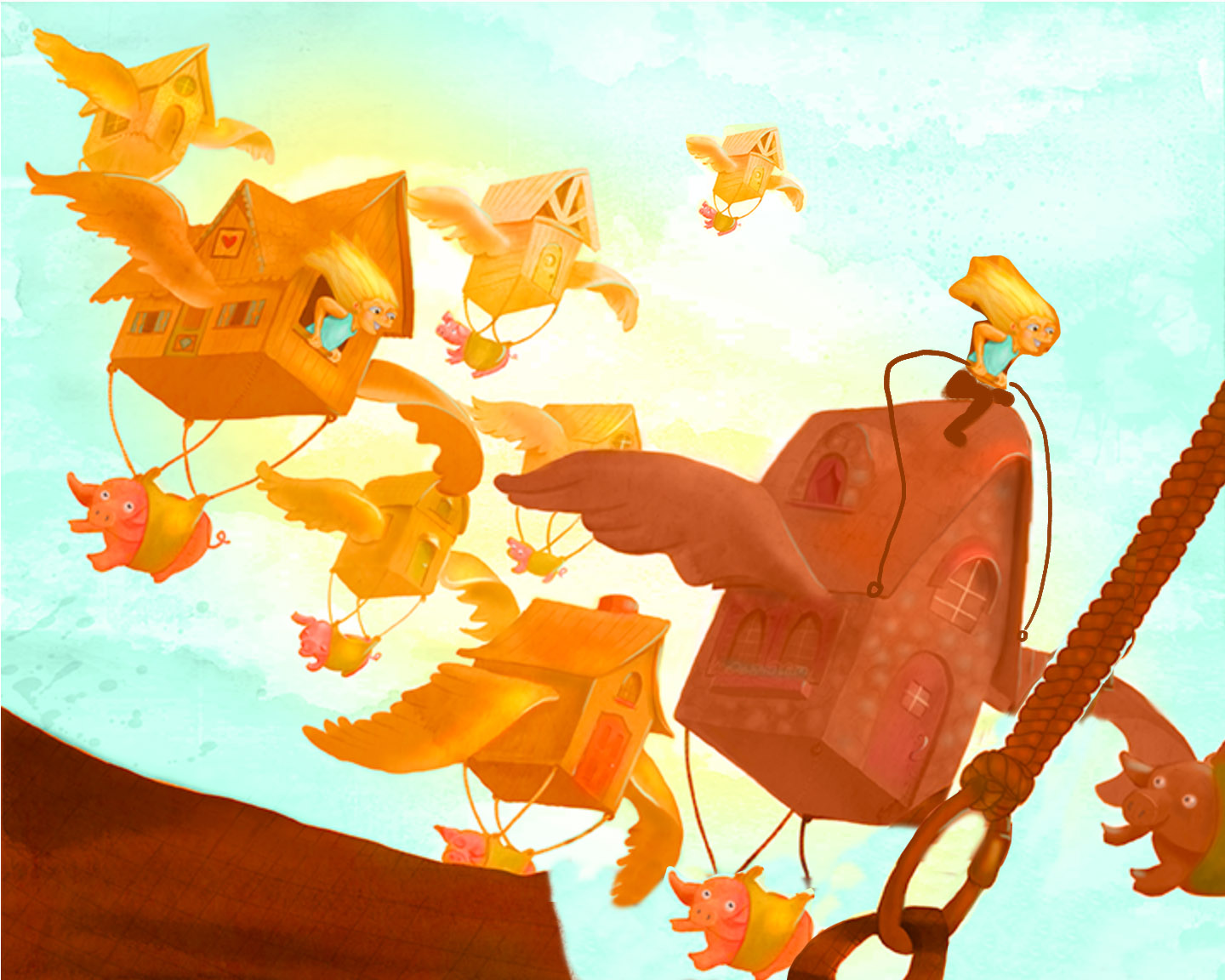
                I love the composition and the brightness! Its really fun to watch! More focus on the character is a very good idea! Keep up the good work Maile!

                Leontine
                "A picture is worth a thousand words."

                https://leontineillustrator.com
                https://www.instagram.com/leontine.illustrator/
                http://www.facebook.com/leontineillustration

                1 Reply Last reply Reply Quote 0
                • Maile McCarthy
                  Maile McCarthy @Maile McCarthy last edited by

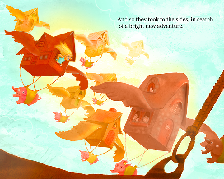
                  Hi everyone. Thank you for the feedback! Here's my update.

                  I added text to the image. Did that fix the feeling that the top was too empty, or do you still think it needs more?

                  upload-d2e53675-251b-4be8-8a79-097a08a4a308

                  @Jiří-Kůs @Shannon-Perkins (and everyone, really), Thanks for pointing out the contrast/focal point issues with the girl. I worked on this a bunch, and I think it's a lot better in the new version. I did keep everything really saturated. Not sure if that's working or not.

                  @Fabienne Thanks for the paint over. That helped a lot. I like the space you created moving the foreground element down. (I also really liked the girl sitting on top of the house-- I didn't keep it, but I did add some more kids to the other windows. I think I might render them out a little more).

                  @Leontine-Gaasenbeek Thanks for the feedback. It's super helpful to hear that multiple people are having the same issues.

                  Twitter @MaileMcCarthy
                  www.mailemccarthyillustration.com

                  1 Reply Last reply Reply Quote 1
                  • Lee Holland
                    Lee Holland last edited by

                    Looks great to me, Really fun.

                    https://www.facebook.com/pages/Lee-Holland-illustration/285517801577676?
                    https://www.instagram.com/lee_holland_illustration/
                    http://lholla56.wix.com/lee-holland

                    Maile McCarthy 1 Reply Last reply Reply Quote 0
                    • Maile McCarthy
                      Maile McCarthy @Lee Holland last edited by

                      @Lee-Holland Thanks 🙂

                      Twitter @MaileMcCarthy
                      www.mailemccarthyillustration.com

                      1 Reply Last reply Reply Quote 0
                      • Leontine
                        Leontine last edited by

                        Well done, its so much fun to watch!

                        Leontine
                        "A picture is worth a thousand words."

                        https://leontineillustrator.com
                        https://www.instagram.com/leontine.illustrator/
                        http://www.facebook.com/leontineillustration

                        1 Reply Last reply Reply Quote 0
                        • Fabienne
                          Fabienne last edited by

                          Superb! There is so much to explore!
                          Only one point: Which house is in the front? Shouldn't be the kids-house darker, because it's closer to the viewer?

                          Maile McCarthy 1 Reply Last reply Reply Quote 0
                          • Maile McCarthy
                            Maile McCarthy @Fabienne last edited by

                            @Fabienne Yes, I see that now. The front one definitely needs to be darker. I'll go update it. Thank you!

                            Twitter @MaileMcCarthy
                            www.mailemccarthyillustration.com

                            1 Reply Last reply Reply Quote 0
                            • Dan Tavis
                              Dan Tavis last edited by

                              Awesome work at creating action in this piece Maile! The incline of the houses really adds a great line of motion.

                              1 Reply Last reply Reply Quote 0
                              • Jiří Kůs
                                Jiří Kůs last edited by

                                Great , I was immediately looking at the character 🙂

                                Follow me on
                                https://www.instagram.com/yiri_kus/
                                http://yirikus.tumblr.com/
                                https://www.facebook.com/yirikus/

                                Maile McCarthy 1 Reply Last reply Reply Quote 0
                                • Maile McCarthy
                                  Maile McCarthy @Jiří Kůs last edited by

                                  @Jiří-Kůs @Dan-Tavis Thanks so much!

                                  Twitter @MaileMcCarthy
                                  www.mailemccarthyillustration.com

                                  1 Reply Last reply Reply Quote 0
                                  • S
                                    Shannon Perkins last edited by

                                    I like the update, much easier to see the character, and the atmospheric perspective you used on the farthest house really adds a sense of depth. Also, having the text in there fills in that empty space I mentioned earlier. Picture books need that open space for text, earlier I was looking at it from a stand-alone piece. Good work!

                                    http://shannonreneeperkins.tumblr.com/

                                    1 Reply Last reply Reply Quote 0
                                    • Isaac Vargas Cardenas
                                      Isaac Vargas Cardenas last edited by

                                      This is really nice, I like it very much 🙂

                                      1 Reply Last reply Reply Quote 0
                                      • First post
                                        Last post