Swift_SCBWI September prompt and beyond
-
Sorry for mixing up things in this post. I got sidetracked and since I am always working on many projects at the same time, I flow from one to the other without structure sometimes...
So I changed the title of the topic, as I am going to continue with the air-trike illustration and try to submit it to the SCBWI prompt of August-September, which is "Swift".
Meanwhile, as I was developing some characters for this illustration, it evolved into a full lineup, and I really liked the characters, so I am probably going to use them for more than one illustration. No real story at the moment, only got the goodies and the badies sorted out....and the fact that Bruise and his sidekick Coco really want to get hold of Donky for some unclear purpose. I still need to design their flying vehicle (which will be named "Flytrap").
Glad to hear thoughts or suggestions for storylines!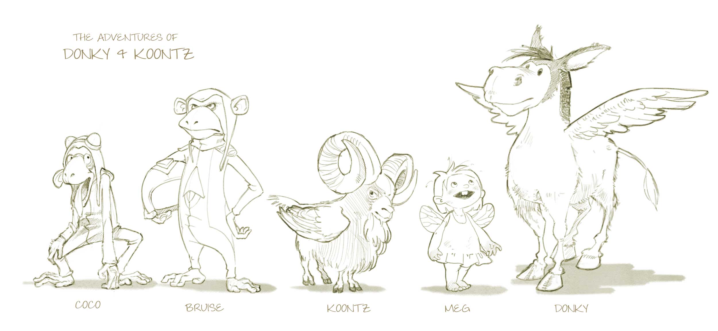
-
Wow I love it - they all look really fun and interesting! My eye is really drawn to the donkey...love his face and little wings! I also like the way the goat is very effectively crossed with a bird..even the goaty bits have a bird-like feel to them. Great work!
-
I don't think I've ever seen a mountain goat/ ram with wings...lol....these are really awesome. I think you got something here. Nice work.
-
great stuff, I could become a big fan...
-
Wow, I love your drawing; it looks really good! The rendering with digital watercolor is just beautiful!
-
Line-work done. Only six days for rendering...not a lot, but I will try.
Feedback more than welcome!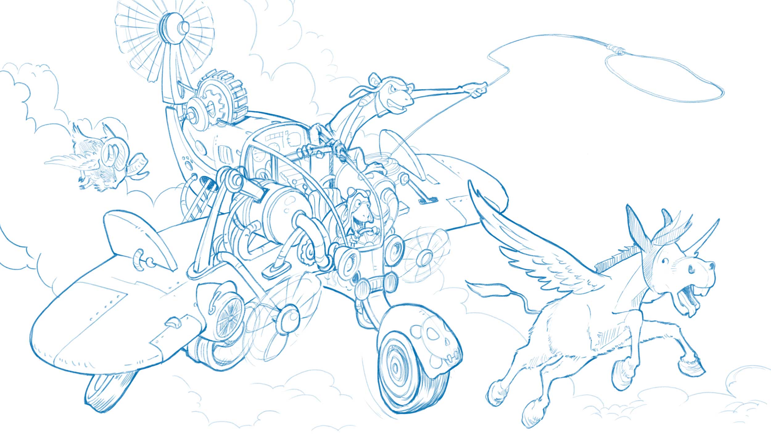
-
@smceccarelli ......wow!
-
@smceccarelli Some amazing work on this! I really need take a cue from you and work on some of these more complex compositions. Again just fantastic work.
-
@smceccarelli I feel like a broken record when I comment on your work - but once again - WOW!!!! You are amazingly talented!!!
-
love this!
-
Love this...
-
I agree with everyone else, your work is amazing! I love the characters, the gestures, and the overall composition. It is sure to be a really fantastic piece.
But since you asked for feedback, I will add some thoughts....the main thing that I wonder about, is whether it is deliberate that the closest wing has the jet engine, the turbine thing and the wheel under it, while the other wing doesn't? It also looks very slightly more curved at the wingtip, even taking the perspective into account...but of course that could be deliberate, or it could just be me seeing it like that, when it's not (please ignore if you don't think so!). And of course this is a very nit-picking level amongst such lovely drawing. Will look forward to the coloured version!
-
@Dulcie Very well caught! I decided to eliminate all the stuff from the back wing so as to keep it clearer behind Donky. I keep second-guessing wether that was a good decision or not. On the one hand, I think asymmetry in a odd vehicle like this is to be expected. On the other hand, it is noticeably dis-balanced. But there is something wrong with the perspective of the back wing, I agree with you. I will look at it with fresh eyes tomorrow before I start rendering and see how to correct it.
-
Great work as usual! My thoughts: The front tire looks a bit off to me, I think the fender should overlap the tire in the back - it's reading flat to me instead of 3-D. I also think the loop of the rope should be just a bit closer to Donky to increase the tension of him about to be caught. Can't wait to see the finished result.
-
@smceccarelli beautiful work! I love it!!
-
Amazing! Love it!
-
Really great work. Can't wait to see this painted.
-
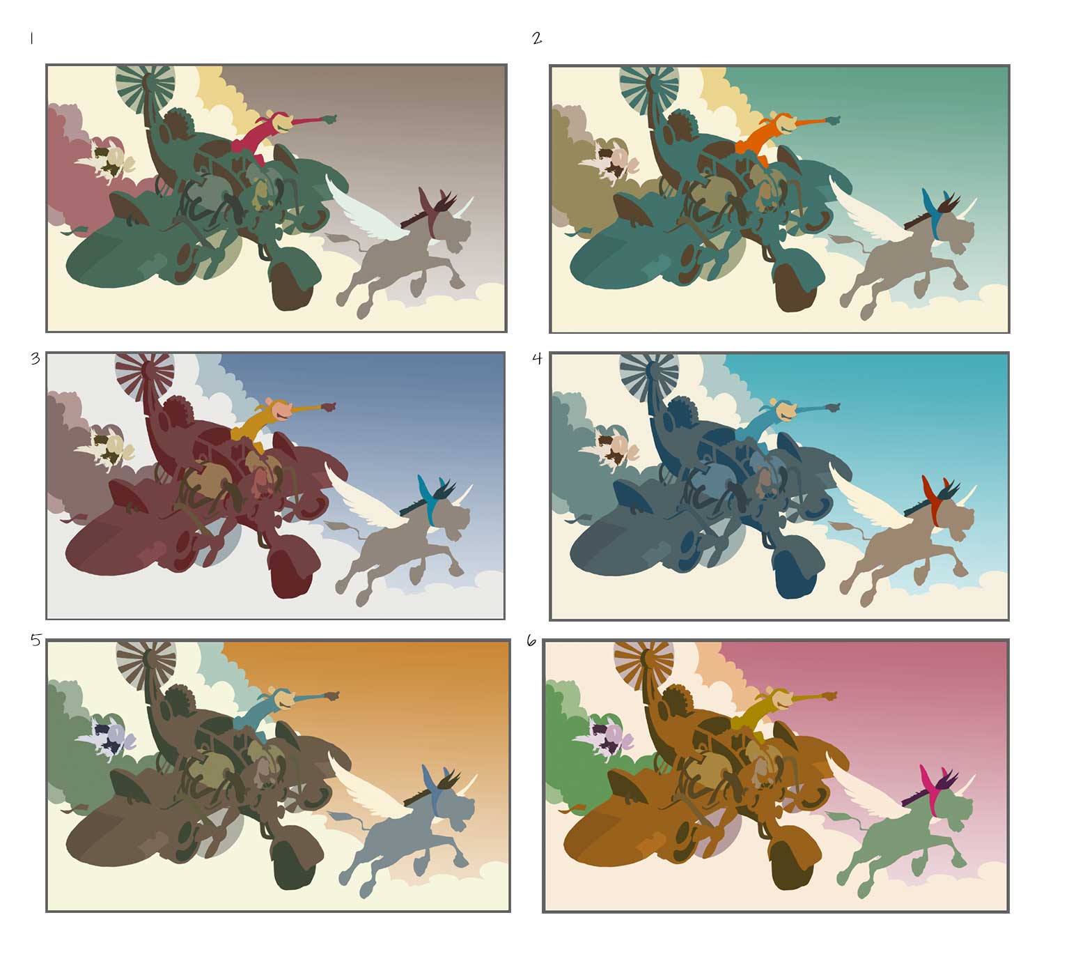
Thank you for the feedback everybody! I have corrected the drawing as per @Dulcie and @Rebecca-Hirsch suggestions. I think I am happy with the value structure, but now is color time! Which scheme? Unfortunately need to decide fast - I have studio time in the next few hours...
-
I like #5 and #2 best...very difficult to pick between those...followed by #4. I like that in #5 the plane is brown - lends itself well to a rough piratey look, and the blue monkey on yellow is nice contrast... then with #2 you also have the monkey in bright orange against the green...overall it is a pleasing colour set but still different. With #4 I like it, it looks very much like midday, bright sunshine, a bit cleaner...it is nice but I think the slightly warmer palettes suit this better.
I wouldn't choose #1 because of the grey sky, and in #6 the pink sky is a bit distracting...though with your skills you could undoubtedly make any of these colour schemes work
")
-
@smceccarelli I really like #2 followed by #5.