100 trees challenge
-
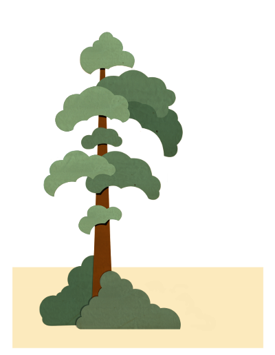
Today I tried something else and played a bit with a different style. I gave it a paper texture and a more handcrafted look. Do you have any preference when you compare the last two trees?
-
@Jana cut paper look, definitely! I like the shape and style of your first tree best so far though - that, but with the cut paper look
 Also - what if you gave the final rendered trees more detail/texture? I'm liking your original sketches better than the final for that exact reason. Like on the first tree sketch, I like how there's vertical lines that give it some life. Maybe I'm not the best one to give advice though - I really don't care for the digital look. I'd take "hand-drawn looking" any day.
 -
@DanetteDraws Hi, Danette! Thanks for your very valuable feedback. Yes, the first one is still one of my favorites, too.

I was scratching my head about the same things you did, particularly to put some more appeal and life to it. Right now I am experimenting on how I can get more details into these images. I am bit lost in that... I guess I will pick up your idea to work on the first tree again.
Do you know the work of Mary Blair? I am going back and forth through her pieces and try to find the secret how she got so much emotion with her super stylized trees. She was the best...
Thanks again for checking in.
-
@Jana You're welcome!
I just looked at some of Mary Blair's work on Google images - I think you've started on the right path. She's got really striking bold flat shapes. But then the difference is, she keeps the outline of the shape flat but then fills it with texture that adds interest and dimension. I think the juxtaposition of the flat shape with the added subtle texture makes it quite sophisticated. You might try taking natural texture images (ones you've made/scanned in yourself, or start with ones that someone else made online that are free/for a nominal charge) then applying them to your tree 'shapes' in Photoshop with different blending modes.
-
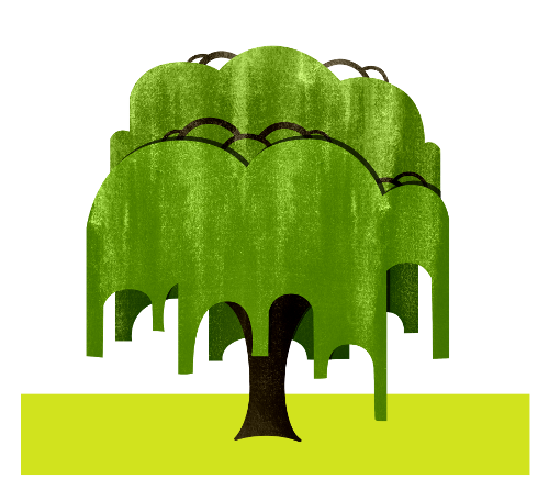
How about this? To emphasize the paper cut style, I deleted the line art. To add more interest to the big green areas, I added some more tecture.
-
@Jana I like it! One thing I would do though is apply the texture to each "shape" or "cut paper piece" rather than the whole foliage area as a whole. It would look more realistic. Right now the back part of the tree at the top has the texture running down and directly into the front bottom part of the green. The texture should be offset so that each "piece" looks like a different cut piece of paper.
-
@DanetteDraws You are totally right. I will try that out. Thanks!

-
@Jana I like them all. My favorite is number three. Looks like a queen with a royal and elegant attitude.
-
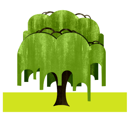
@DanetteDraws Hi, Danette! I followed your advice and treated the different levels as separate papers. I also lightened up the front part a tiny bit. I think it got a more stapled character now.
-
I Love your bold graphic shapes. The texture that you added to your tree really helped. It gave your design a lot of charm. I also agree that Mary is the best

-
@ShereeNorthrup Thanks, Sheree.

I just finished another variation of one of my trees. I guess I need to vary the texture a bit more. Looks to me a bit too evenly textured. What do you guys think?
I am eager now to produce my own watercolor texture. That way I can fabricate the texture which would fit best. So far, I have used free textures which I found online.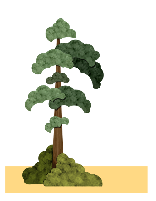
-
This is a fabulous idea. You are going to have a great collection when you are finished Jana!
-
@Jana more variation in the texture would add a lot. I think that your own watercolor texture is a wonderful idea.
-
Here comes tree number five. For my fairy tale project I need an apple tree meadow, so I am trying some more apple trees.
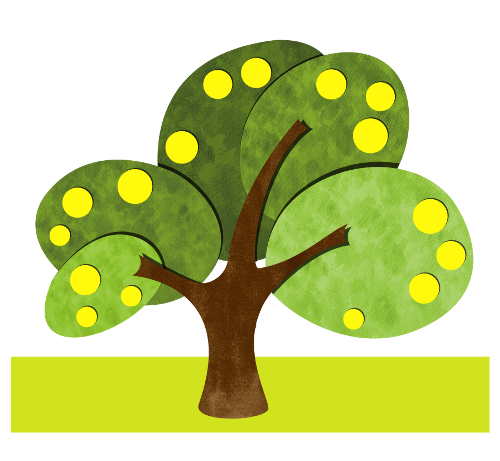
-
Just after uploading I noticed that the texture looks a bit dirty. I tried to change that a bit.
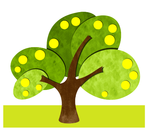
-
Another apple tree...
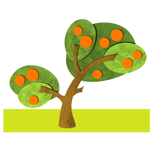
-
I think they are all looking great so far.
-
I absolutely love your challenge! Loving all those trees so far. My favorite tree is your first tree with the paper cut style and texture. Keep up the awesome work!
-
Thanks @Lee-Holland and @drawingmelee ! You are motivating me a lot.
Actually I planned to finish ten trees after this weekend, but I noticed this challenge will take for ever!
But I finished eight which I sum up here:
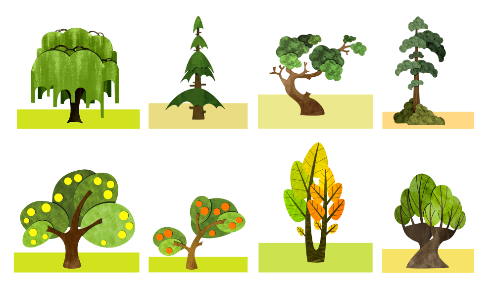
Thanks all your feedback so far.
-
@Jana These are nice Jana! The last two look especially nice to me. I was thinking about what you said about Mary Blair - i love Mary Blair too - i think that if you cut and paste a tree of hers onto a blank canvas it will be nice but it will not have that emotion that it had in the composition (i'm sure i am stating the obvious here) Her trees have a relationship to the scene or the characters in the scene - edges often seem soft except when they are guiding your eye to the main focal point like a bunch of fingers saying "look here then look here and when you are done start over here again" - here colors seem to evoke a mood too - so i think maybe if you were trying to get to the same place as Mary Blair with the trees you could add a figure with a neutral expression and try to evoke a mood through color and composition while only using trees as your tools - anyways.... i am really enjoying seeing your trees!