Something is just not right with this piece I did, but idk what.
-
Idk what it is I don't like about this, but I can just tell that it isn't working out. I'm also considering scrapping my style and starting from scratch. I think the sort of rendering I am doing requires a bit too much accuracy to pull it off. Idk.
Any thoughts?
-
I really like it. Here are my thoughts.
-
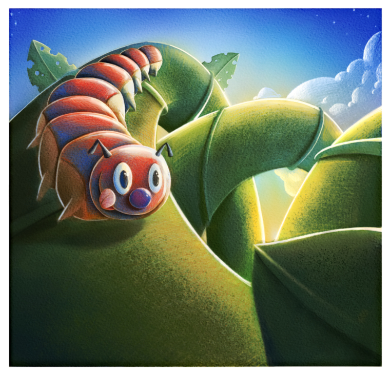
You are indicating the caterpillar going on this methodical journey, travelling the vine and eating each leaf it comes across, but I feel you aren't taking it far enough. I think it would be more interesting if you added more leaves all along the vine that have been munched on. I think it's more impactful to imagine the caterpillar making it's way along this twisting vine, munching on all the leaves. How far has it travelled, how much further is it going to go? When you just have two leaves, it doesn't suggest much of a journey.
-
I think you could add more atmospheric perspective going back. You've done a good job of showing that with the leaves, but not so much on the vine. I would lighten the vine as it goes back in space, mixing in the blues of the sky or maybe yellow bleed light from the sun.
-
You've done a good job of describing a cylindrical form in the background part of the vine, but it flattens out considerably on the portion that the caterpillar is on and the portion closest to us.
For what it's worth, I really like your style, but it's totally up to you if you want to change it.
-
-
Another quick suggestion would be to add a little sparkle point on the highlight of the foreground leaf, indicating that the caterpillar is really looking forward to munching on it.
-
The rendering style is lovely! Beautiful color and texture in this and I love how you've laid it out.
For me I am not very attracted to the face of the caterpillar. But the colors are really great on him. I wonder if the leaf in front of him could be brighter so we see he is going for it. The sun coming through more.
One other thing is it doesn't look like he is following the path of the vie very well, and it leaves it feeling flat.
Hope that helps!This is a great piece, and I love this style! After sticking with it (if it's what you love) you'll be a lot faster and won't feel quite as daunting!
-
@Eric-Castleman Hi, I like your rendering style It's really great, So I don't think it's the style.
What I think is throwing you off the moment is that everything is smooth I would want to contrast the smoothness of the plant against the character by making it furry or spiky...
And as for changing styles, I did that at the beginning of this year to shift the type of work I get from cartoon thick line style to a more traditional looking art style more suited to the children's picture book market.
-
Everyobodys comments have been really spot on. I am now seeing the clear issues here. Good eye everyone!
-
I love your style too! What if you gave him eyebrows and/or eyelids. The eyes look a little zoned out. I think he needs a little more expression.
-
@holleywilliamson good call! I was thinking sbout eyebrows, but didn't know if antennas were in the eyebrow family
")
-
Love the colors and composition.
I believe you can get better results if you blur every thing that is not the focus and reduce the contrast.
Eyes are too big and face very symmetrical. a few changes will make it look more organic.
-
@eric-castleman your style is very unique and it's still developing as you produce more work. Your style is very definitively yours in my opinion and I think the more you produce it will just continue to develop in a cool way like it has been. You have real cool shapes and big solid ones at that that interplay well with each other. You also have good tone and just a uniqueness that I can't really describe that I really like. Your already producing cool stuff but just like all of us as you get down the road putting in work your development is going be great and I look forward to seeing it.