Comic page critique?
-
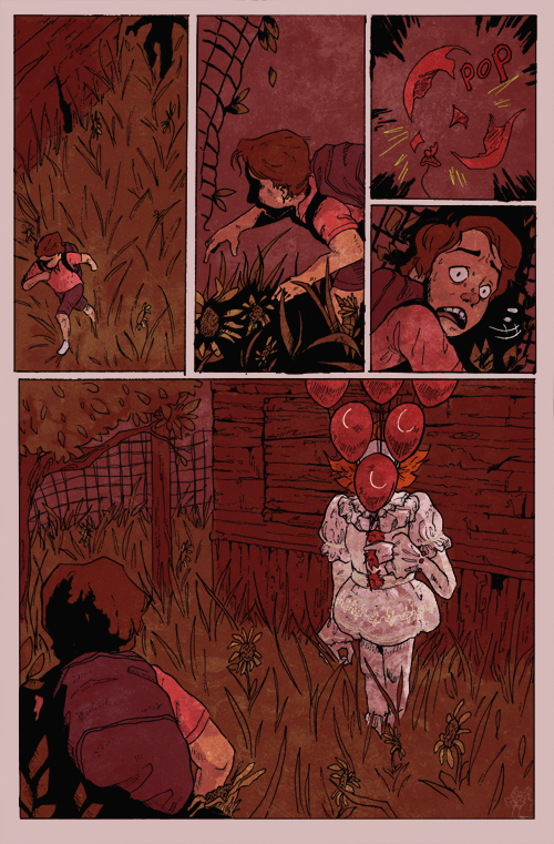
Hey guys! I really want to become a comic book illustrator and I was hoping I could get some feedback on a recent page I did. It's a scene from IT (2017). If someone could just list off any thoughts, suggestions, or things they liked I'd appreciate it so so much!
-
I think this looks excellent! Nice building up of suspense and a good pay off. The style is really attractive, his expression is great. My only question is in the top left panel, the silhouette in the right corner- is that supposed to be Pennywise or one of the kids? If it's Pennywise- the figure doesn't look menacing enough. If it's one of the kids, it works as is.
-
Very well done overall. The second panel needs more clarity as to what is happening. When I first looked at it, I thought the kid had fallen next to a fence, but now I see his is hunched over, perhaps walking thru low brush. Hard to see his leg at the bottom of that panel. Otherwise, very nice!
-
@tessw Thank you so much! The silhouette was supposed to be a form Pennywise took to scare Eddie but I guess that should have been more clear. So you figure next time I should make the figure clearer and more menacing? Or in a different shot all together? Thanks again for the help!
-
Hi Quinn,
I realllllly love the color, linework and the fear in his eyes when looking back. You have a promising career as a comic book illustrator
Now for the critique (and I'll preface this by saying I have not seen the movie IT).
-
I'm confused why the boy is so shocked when the balloon pops because in the first panel the clown is literally right behind him. Wouldn't he hear him? (Obviously, this could be easily explained if I just watched the movie, but as an outsider, this just seems weird) My suggestion would be to take out the clown shadow in the first panel.
-
Maybe adding a bit more contrast to the last panel, the clown will be extra shocking and show the sense of hopelessness the kid feels.
Overall, great work! I'd love to see more!
-
-
@tombarrettillo Thank you! Okay I'll work on clarity! I was trying to go for a heavily shaded look but I see what you mean, it is hard to understand. Thank you again for the suggestion!
-
@aaron-e-davis Thank you so much, I really appreciate that!
I see what you mean about the clown being right behind the boy in the first panel. In this scene he's being chased but maybe I should have left him out in that case, cause I can definitely see what you're saying.
And okay more contrast, gotcha! I'm just trying out this shading method so I was hesitant in some panels but I can see what you mean in regards to suspense.
Again, thank you so much for the thoughts! -
@quinnkimberly I think it should look more menacing. Maybe if it's shadow was cast on the ground? Longer legs? Pointier fingers? I haven't seen the new movie, but if I remember correctly from the book, there were two kids in this particular scene- so I wasn't sure. If there are panels before these, that might clear things up, but I'm kind of wanting that figure in the corner to be scarier. Right now it looks like it could just be another kid, trying to catch up, and then I'm left to wonder where he is after that.
-
@tessw Ah okay, yeah I could have made him more menacing. I have yet to read the book so I was unaware that there was another kid in this scene, so I can see your confusion a lot better now. And I only did 1 page, there aren't any other panels. I'm trying to practice simplifying scenes.
-
@quinnkimberly If it's just based off of the movie, it might work then. Now that I think of it, I don't think Pennywise even took a clown form in the parallel book scene, so it might be a moot point. If it's for an audience who's seen the movie, it might be clear enough.