Would love to give a critique
-
@julian-beresford It's so cute!
-
Hi there,
If you are still reviewing work, I would love this one to be done! Thanks!!
-
@bdyanne Thank you for letting me give you some suggestions on your art!
-
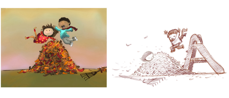
I would get rid of the background. You should have a reason for every element in your image. Since your background doesn't help tell the story I think it's actually a distraction - "why are they in the middle of a large empty field?" Creating a vignette allows the viewer to fill in the blank.
-
If you strongly define some leaves - you need to strongly define the leaves behind them. Another way to handle a complex form like a leaf pile is to keep it less defined and let the viewer's imagination fill in the blanks.
-
I think you need to give your characters something to jump from - I gave them a sliding board but it could be a number of objects or forms. The way you have it - makes them look like they're floating since children can't jump that high.
-
Use reference to draw a believable pose - I roughed this out but if you find photo reference of children "jumping down" or "jumping off" (google search) you'll tell a better visual story. Pay attention to fabric folds and body positioning.
Thanks again!
Will
SVS Instructor
http://willterry.com/ -
-
@Marsha-Kay-Ottum-Owen Thanks allot
-
Hi Will ,
@Will-Terry
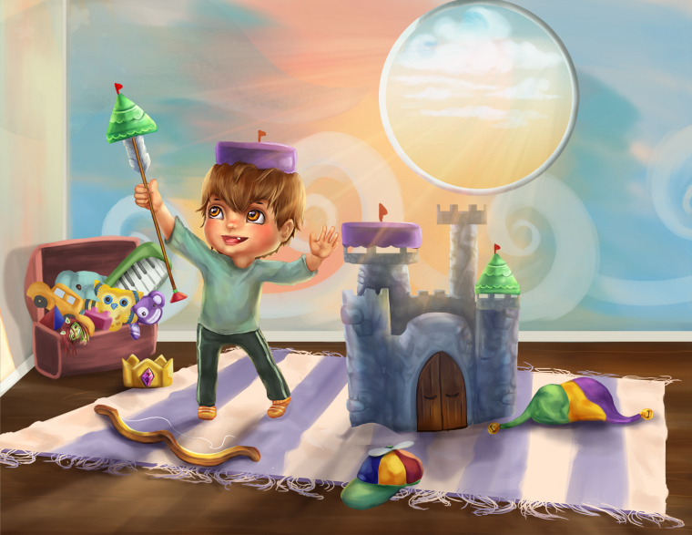
Thank you for starting this thread. I thought about posting this today anyway. After I saw that you have started a critique thread makes things easier. This is a project I have planned for 2018. I have been working on this painting for 2 days and I feel like there is something missing that would make this whole painting more interesting. Even though there are a few objects I find it is bland. I am wondering if it's the color variations in the toys, or is it not balanced? I'm not sure. Everyone's critique is welcome!Thank you
-
@amphailin Cute picture
") I am having one problem and that is the sphere above the castle. I think if you moved it to the right a bit it would feel more balanced. Even though there is a pattern to the background it still seems to be a wide "blank" area on the right that could be nicely broken up if you moved it over. Also, one other thing s that the toy trunk seems a bit too close to the corner, like it wouldn't really fit. Maybe bringing the floor line up a bit along the back?
I am having one problem and that is the sphere above the castle. I think if you moved it to the right a bit it would feel more balanced. Even though there is a pattern to the background it still seems to be a wide "blank" area on the right that could be nicely broken up if you moved it over. Also, one other thing s that the toy trunk seems a bit too close to the corner, like it wouldn't really fit. Maybe bringing the floor line up a bit along the back? -
@eric-castleman Hi Eric,
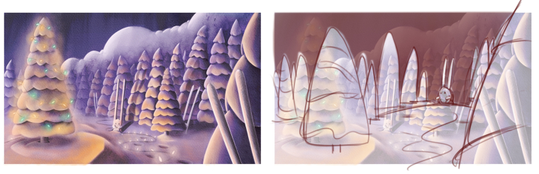
Since @Lee-White already critiqued this one I thought I'd try to talk about different things other than color.
I love the feel of this one since as you probably know I love snow!
Here's what I would change:
-
I would get rid of the clouds - I always try to avoid white on white objects - this way your white snow covered trees can silhouette against the dark sky.
-
I would gap the trees so the white rabbit can silhouette against the dark sky as well - the other non-essential rabbits can blend in with the trees.
-
I would try to vary the shape patterns in your trees - I sort of indicated it in the main tree. Yours are so uniform that the pattern is so dominant in your illustration I think it becomes distracting.
-
I would move your main tree out a bit to really hit that rule of thirds.
Thanks for sharing!
Will
SVS Instructor
http://willterry.com/ -
-
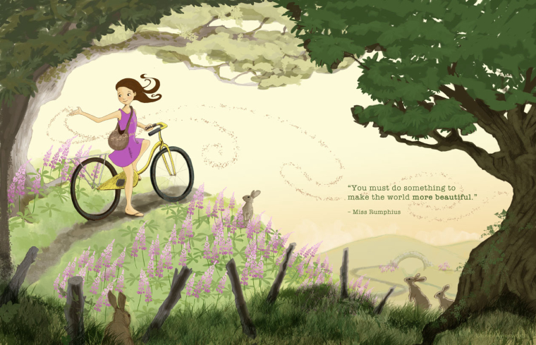
Thank you for posting this! It's a really nice piece and I especially appreciate your deliberate attention to the composition!
Here's what I would change:
-
Your piece is so light and airy - I think your foreground is too dark and doesn't match the middle and background. Black often scares some children's book editors and art directors.
-
If you lighten up the foreground a little you can add in some detail that I think is needed to match the level of detail in your main character. If you set a precedent for detail in the middle ground - the foreground has to have even more detail.
-
The hill that the girl is on terminates in the middle of your composition - by extending it you'll hit the third better AND give her a better chance of riding out the hill when she continues. Remember that the ground cover needs to overlap that trail as it goes out of sight.
-
Your girl is drawn well but it could be even better and this is where art buyers are going to scrutinize your image the most. Her hand seems a little large -I know right? knit picking but that's how perfect it needs to be.
-
I wasn't reading her seed bag at first until I zoomed in. "If it ain't shape - it ain't" - shape gives your viewer the quickest "read" into the story you're trying to tell.
Thank you!
Will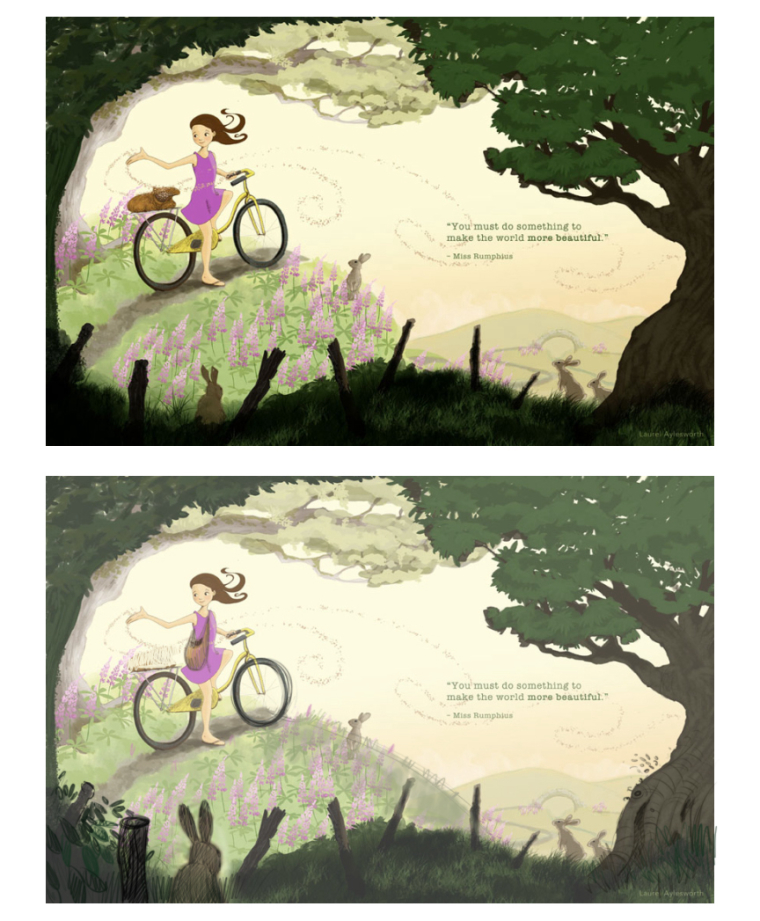
SVS Instructor
http://willterry.com/ -
-
@will-terry This is so great! Thank you very much for your time on this. I was worried about the foreground looking foreboding, which didn't match my composition idea, so lightening it up will definitely help. Yup, she's got a spatula for a hand - lol. I also love how you enlarged the foreground bunny as it draws in the eye more. I think someone else on the forum mentioned the abrupt ending of the hill, but I didn't understand it at the time -- but now I get it. Thank you thank you!
-
@andyg I really like how this is rendered.
-
Would love a critique on this one. Something not quite right
-
@will-terry you’re the man!!
-
@eric-castleman Thank you Eric - I really have fun with these
-
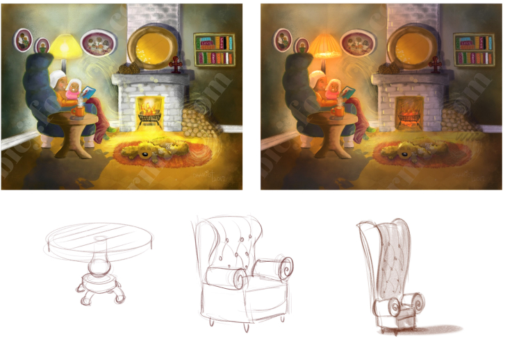
@blessings Thank you for allowing me to critique your work!
Overall you really captured the nurturing sharing time of parent and child!
Here's what I would change:
-
I think two main light sources often cancel each other out. It's easier to have one main light source and perhaps a second tiny one - if the fire has burned down you won't have shadows canceling out.
-
I would turn the chair more towards the viewer in a 3/4 view like the one I drew. I think it would help bring us into their world and fit the room better.
-
If you get good reference you can draw what I call "authentic objects" - that is - objects that have a specific construction from a specific period. When you're not sure how an object is constructed - making it up often takes your viewer out of the story you're telling. Instead of glancing past a table or chair - your viewer is confronted with a non-essential item that demands further inspection because that viewer is unfamiliar with the way you drew it. This isn't to say you can't have fun stylizing an object but it still needs to remind us of a specific object.
Thank you!
Will
SVS Instructor
http://willterry.com/ -
-
@will-terry Thanks @Will-Terry I like your chair idea for sure.
 And thank you abundantly for offering a free critique and taking time out of your busy day. I won’t soon forget it.
 -
I would love some constructive critiquing on a piece I'm working on for my portfolio called 'Accommodating Dragon'.
This is a quick digital painting I did a couple of years ago:
I love the idea and decided to rework it. Here is the new sketch with a preliminary start at a value study (though I hadn't planned to push the values quite as much as they appear here):
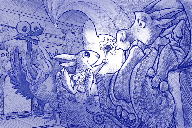
Before I put more hours into it and start the final rendering I'd love some feedback on the composition and what I've got started with values. I was thinking of going with a similar colour scheme as the old painting.
Any and all feedback is greatly appreciated!!

~ Pam~ Pam
www.PamBoutilier.com -
 Here's the revised version.
 -
@laurel-aylesworth I really love all the changes - This is a really nice piece!
-
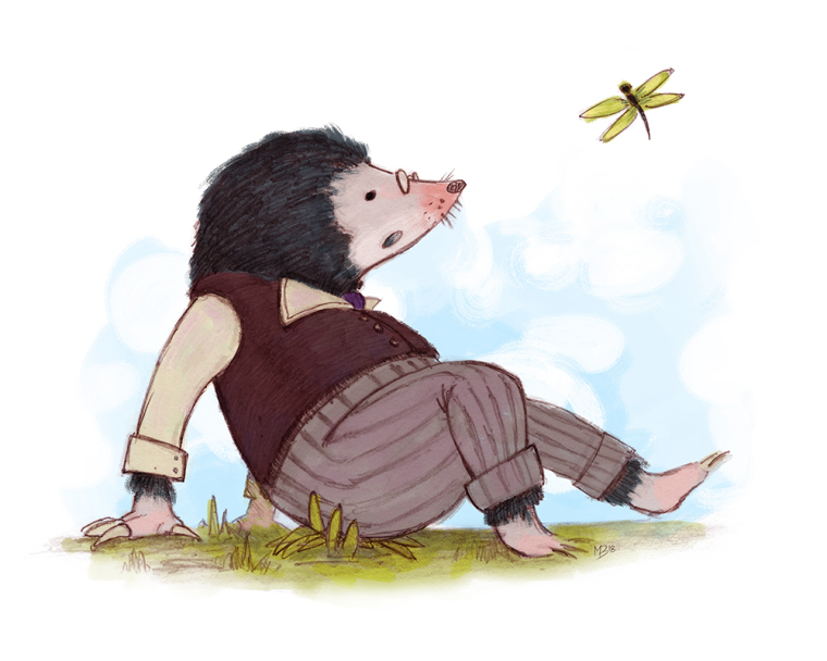
Hi Will, I've only just returned to the forums after a long absence and I saw your post offering critique. I fear I might be too late (if so, totally cool). Here's my take on Mole from Wind in the Willows. Cheers!!
-
Trying to decide on shirt/shoe colors? Thoughts?
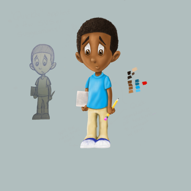
Main character for book that has just been edited! It will be published this year 2018!