Society of Visual Storytelling

    SVSLearn Forums

    • Register
    • Login
    • Search
    • Recent
    • Tags
    • Popular
    • Users
    • Groups
    • Search

    Old and New WIP

    Artwork
    18
    32
    4845
    Loading More Posts
    • Oldest to Newest
    • Newest to Oldest
    • Most Votes
    Reply
    • Reply as topic
    Log in to reply
    This topic has been deleted. Only users with topic management privileges can see it.
    • QuietYell
      QuietYell SVS OG @Gary Wilkinson last edited by

      @gary-wilkinson Since I brought up Toys R Us... Here's a nice timeline of the company's history on USAToday. It doesn't effect your awesome artwork, but I found it interesting and thought you and others might too:

      https://www.usatoday.com/story/money/business/2018/03/09/toys-r-us-timeline-history-nations-top-toy-chain/409230002/

      Scott Monaco | QuietYell.com
      IG/FB/LI: @QuietYell
      IG-2: @QuietYellSketches
      TW/PIN/BEH/DEVART: @ScottMonaco
      SCBWI: http://bit.ly/1r8Dmqr

      1 Reply Last reply Reply Quote 0
      • Gary Wilkinson
        Gary Wilkinson last edited by

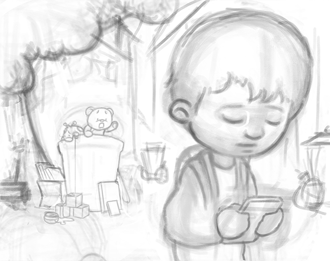
        I thought I would work in a little of the toys r us theme as @QuietYell mentioned, especially as I did a couple of Christmas work sessions with them in my younger days 😛

        Working on the values at this stage (the boy need lightning up a bit more and there are still other lightining issues that need fixing) and going to add color later. The main key light will be as indicated by the arrows and there will be a warm fill light to the right and cold one to the left with a rim light to make the shadowed objects pop a bit more.

        If there are any big issues that you are noticing that I am not, please give your advice or if there are any other suggestions then it would be appreciated. Thanks

        0_1521121187291_Old and New 2.jpg

        www.garywilkinsonart.com
        www.instagram.com/gwillustration/
        www.twitter.com/GWillustration

        Johanna Kim 1 Reply Last reply Reply Quote 6
        • K
          Kat SVS OG last edited by

          Just a thought (and maybe not helpful as I'm not an expert by a longshot) but devices give off a cool light. I wonder if that might present a challenge if you light the right side warmly. If it were cool, it might also make a statement about how cold/impersonal devices can be versus the heartwarming teddy bear. The trash can could still be is shadows or muted colors.

          And I agree with @stringfellowart, this is heartbreaking - poor teddy! - but it's great to evoke emotions, right?!

          1 Reply Last reply Reply Quote 1
          • evilrobot
            evilrobot SVS OG last edited by

            Great concept and story telling! Love this.

            http://www.palacioillustration.com/

            https://www.scbwi.org/illustrator-gallery/illustrator-detail/?illustrator_id=84142

            https://www.pinterest.com/evilrobot2/pins/

            https://twitter.com/MyEvilRobot

            1 Reply Last reply Reply Quote 0
            • Johanna Kim
              Johanna Kim SVS OG @Gary Wilkinson last edited by

              @gary-wilkinson Looks solid so far. Wonderful idea, so sad for Teddy! Looking forward to seeing it develop further.

              http://www.johannakim.com
              http://instagram.com/johannahkim/

              1 Reply Last reply Reply Quote 0
              • Lee White
                Lee White SVS Team SVS Instructor Pro SVS OG last edited by

                I love this concept! very fun!

                I'd like to suggest possibly exploring your composition and trying to make a more dynamic illustration out of it. The purely horizontal/side view makes me think there might be some better options out there.

                SVS Faculty Instructor
                www.leewhiteillustration.com

                1 Reply Last reply Reply Quote 1
                • Gary Wilkinson
                  Gary Wilkinson last edited by Gary Wilkinson

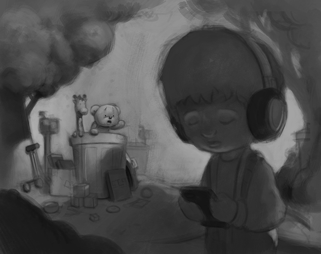
                  thanks for the advice everyone. @Kat Ye I think you are right with the cool digital light and warm light for the toys @QuietYell also touched on that earlier and I think it would probably work well.

                  @Lee-White going for the horizontal view was mainly a mix of time saving to avoid painting in a background. Also as it was evolving I was thinking the empty space in the middle could be used to add some kind of text or title for editorial work, something like "The Death of Toys".

                  Tried out a more dynamic angle and I guess I could probably get away with doing a high exposed background to avoid adding so many background elements. Working on my own book this month so trying to find the time where possible 😛

                  Any thoughts on which angle I should go for?

                  0_1521166658896_old new angle change.jpg

                  www.garywilkinsonart.com
                  www.instagram.com/gwillustration/
                  www.twitter.com/GWillustration

                  Lee White Jon Anderson nasvikdraws 3 Replies Last reply Reply Quote 7
                  • Lee White
                    Lee White SVS Team SVS Instructor Pro SVS OG @Gary Wilkinson last edited by

                    @gary-wilkinson I definitely like this new angle better. Which one do you like better?

                    SVS Faculty Instructor
                    www.leewhiteillustration.com

                    1 Reply Last reply Reply Quote 1
                    • Jon Anderson
                      Jon Anderson SVS OG @Gary Wilkinson last edited by

                      @gary-wilkinson I gotta go with @Lee-White on this one. I thought the idea was strong the first time around but after seeing your new comp and moving the camera I'm totally sold on it. I don't know how to explain it other than that the new layout feels like I'm immersed in that world instead of looking through a window.

                      instagram.com/jonandersonillu

                      1 Reply Last reply Reply Quote 0
                      • Jason Bowen
                        Jason Bowen SVS OG last edited by

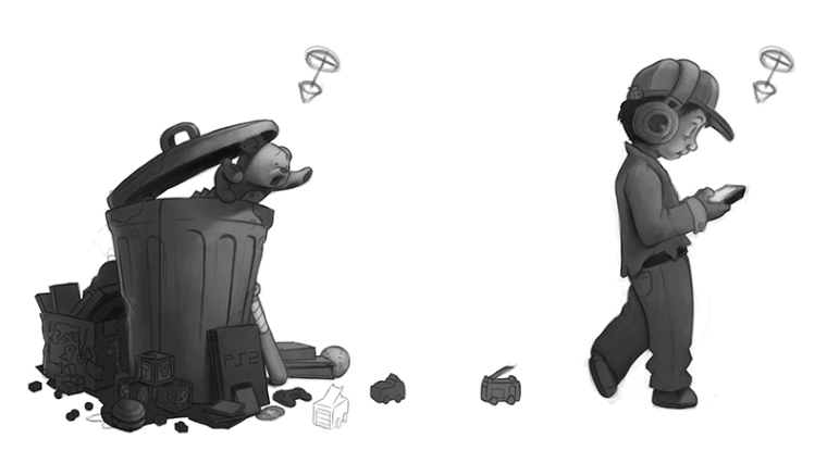
                        I really like the bear in the first one and the ps2, good memories :)... I think the first one looks like it would make a cool animation. the second one looks like you could play with the boys expression more.

                        https://www.instagram.com/jasonbowenoils/

                        1 Reply Last reply Reply Quote 0
                        • Sarah LuAnn
                          Sarah LuAnn SVS OG last edited by

                          I like the strong silhouette in the first, I feel like the gesture of the bear was a much quicker read as well as the hunched-over-the-phone posture. The new one does have a lot more depth to it though, and you feel the distance to the bear and other old toys. Really, you could go either way. (Though the judge of the contest has spoken, so if winning is your aim thats not something to ignore...;-) )

                          sarahluann.com

                          1 Reply Last reply Reply Quote 2
                          • nasvikdraws
                            nasvikdraws @Gary Wilkinson last edited by

                            @gary-wilkinson Like the new angle. Do you think it looks good if you mirror the boy so he is looking at the other direction, away from the bear?

                            www.instagram.com/nasvikdraws
                            www.facebook.com/nasvikdraws

                            1 Reply Last reply Reply Quote 0
                            • Gary Wilkinson
                              Gary Wilkinson last edited by

                              Just got back into this piece. @Lee-White I'm not 100% sure which one I like to be honest. As others mentioned, I do like the silhouette of the bear in the first style, but I like the the depth and energy of the second angle. I think I will go with the 2nd style though as it feels like it is more of a storytelling piece.

                              @nasvikdraws I flipped the boy, although im not sure if it now reads more that he is simply abandoning the toys, whereas the other direction could be seen as he isn't paying them any attention at all. Which direction do you think fits better?

                              I am thinking of how to do the background and i'm probably going to do a faded out street scene with other trashcans scattered about. I was also thinking whether to add a garbage truck parked next to the bin but it might make it a little too busy.

                              Probably going to use what I have as the base for the drawing and redraw it to fix certain issues. Not giving up on this one 😛

                              0_1521514162240_old new angle change2.jpg

                              www.garywilkinsonart.com
                              www.instagram.com/gwillustration/
                              www.twitter.com/GWillustration

                              1 Reply Last reply Reply Quote 1
                              • Gary Wilkinson
                                Gary Wilkinson last edited by

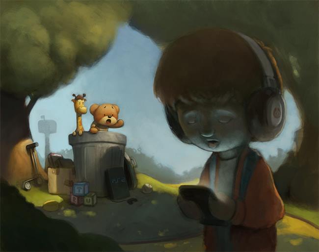
                                Flipped the boy, returned his headphones and started work on lighting the scene. Also added a giraffe to keep the toys r us reference as part of the piece, still quite a lot to work on and I think I can get away with over exposing the background so I don't have to paint it with much detail 😛

                                0_1521560416878_old new angle change3sm.jpg

                                www.garywilkinsonart.com
                                www.instagram.com/gwillustration/
                                www.twitter.com/GWillustration

                                Jason Bowen BichonBistro nasvikdraws 3 Replies Last reply Reply Quote 8
                                • Jason Bowen
                                  Jason Bowen SVS OG @Gary Wilkinson last edited by

                                  @gary-wilkinson That looks great!

                                  https://www.instagram.com/jasonbowenoils/

                                  1 Reply Last reply Reply Quote 1
                                  • BichonBistro
                                    BichonBistro @Gary Wilkinson last edited by

                                    @gary-wilkinson wow, love this

                                    https://www.instagram.com/bichonbistro
                                    http://www.heartfeltimpressions.com
                                    https://www.facebook.com/patty.burke.9655
                                    https://twitter.com/BichonBistro

                                    1 Reply Last reply Reply Quote 1
                                    • nasvikdraws
                                      nasvikdraws @Gary Wilkinson last edited by

                                      @gary-wilkinson I see what you mean. This does read better. 😉 Looks great

                                      www.instagram.com/nasvikdraws
                                      www.facebook.com/nasvikdraws

                                      1 Reply Last reply Reply Quote 1
                                      • Zavellart
                                        Zavellart last edited by

                                        Oh I love this concept. I wonder if Toy Story 4 will use a theme like this.

                                        1 Reply Last reply Reply Quote 1
                                        • QuietYell
                                          QuietYell SVS OG last edited by

                                          @Gary-Wilkinson Looking great! Even more rich & immersive now! Gives tangibility to & personal association with the story/emotions.

                                          BTW, Sorry I've been silent & haven't responded - Been on ultra-go-mode these couple weeks, but everyone has added awesome comments (as usual!!!). Excited to see this one continue to finish out!

                                          Also, not that you need it, but if you want one more small concept element, there is news that KBToys is seeking to fill the void of ToysRUs in some way. They have a little soldier/drummerboy that could be starting to run after the boy.

                                          https://www.linkedin.com/pulse/kb-toys-coming-back-wow-what-response-from-toy-industry-ellia-kassoff/

                                          http://money.cnn.com/2018/03/20/news/companies/kb-toys-toys-r-us/index.html

                                          https://nerdist.com/kb-toys-return-replace-toys-r-us/

                                          Scott Monaco | QuietYell.com
                                          IG/FB/LI: @QuietYell
                                          IG-2: @QuietYellSketches
                                          TW/PIN/BEH/DEVART: @ScottMonaco
                                          SCBWI: http://bit.ly/1r8Dmqr

                                          1 Reply Last reply Reply Quote 0
                                          • Gary Wilkinson
                                            Gary Wilkinson last edited by

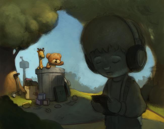
                                            Thanks for all your comments, still trying to find the time to get it done, but slowly working on it and learning how to overcome certain challenges. Started laying out the colors and I think I am going to have the background filled with a silhouette of trash hinting at the discarded toys of old. Lot's of work left to do on it, but I'm happy that @Lee-White recommended changing the angle of the scene. Although it's a more challenging scene I have grown to like it more and I think it will be a good image for my portfolio when/if it's done.

                                            The things I feel I still need to do for this piece are to adjust and add more toys in front of the trash can, finish the sky and detailing the bear to give him a little more punch. A few things i'm a little stuck up on are the color of the sky and how to paint the boy. My first painting of the sky had it quite blue, but I pulled it more to grey to create a more sombre mood, I'm wondering whether to bring the blues back out and also whether I should add clouds. I am also going to revert the boy back a little more towards the earlier rendering to adjust his expression, and to fix the color and light on his face which I think I took too far as well as fixing his hair. I really want the eye to be pulled towards the abandoned toys and for the composition to flow well based on the lighting and position of the objects.

                                            Let me know if anything jumps out to you that you feel is wrong or should be added/taken away 🙂

                                            0_1521776591628_tempd.jpg
                                            0_1521776193202_tempd2.jpg

                                            www.garywilkinsonart.com
                                            www.instagram.com/gwillustration/
                                            www.twitter.com/GWillustration

                                            Chip Valecek Eli 2 Replies Last reply Reply Quote 9
                                            • First post
                                              Last post