Society of Visual Storytelling

    SVSLearn Forums

    • Register
    • Login
    • Search
    • Recent
    • Tags
    • Popular
    • Users
    • Groups
    • Search

    March WIP

    Artwork
    11
    26
    3631
    Loading More Posts
    • Oldest to Newest
    • Newest to Oldest
    • Most Votes
    Reply
    • Reply as topic
    Log in to reply
    This topic has been deleted. Only users with topic management privileges can see it.
    • Gary Wilkinson
      Gary Wilkinson @Jon Anderson last edited by

      @jon-anderson the updated version feels a lot more balanced and I like the new pose of the little the frog, but his legs seem a little off to me. Is there a story behind this idea or a message to convey? i like that the little frog is sharing his excitement of technology with his dad (?) but the headphones create a kind of a divide between thier interaction.

      It would quite nice to see a little more
      going on with the dad in the new version (his pose and expression work in the old one, but seems a little disconnected with the new)

      It's a complete change of story, but one thing that popped into mind when looking at this is what if you reversed their props and gave the book to the little one and a tablet to the older one.

      www.garywilkinsonart.com
      www.instagram.com/gwillustration/
      www.twitter.com/GWillustration

      Jon Anderson 1 Reply Last reply Reply Quote 1
      • lmrush
        lmrush Pro SVS OG last edited by

        Your lines are so strong and it is such a lovely image. What about a different camera angle? Like maybe up over Old frogs shoulder looking down so we can see what is on little frogs page. Yours is great this is just something to consider.

        Lisa Rush
        www.lisarushgallery.com
        www.facebook.com/ArtbyLisaRush/
        www.instagram.com/lisarush11/

        1 Reply Last reply Reply Quote 1
        • Jon Anderson
          Jon Anderson SVS OG @Gary Wilkinson last edited by

          @gary-wilkinson Thank you for the suggestions. I actually like the idea of swapping the book and tablet as a take on the younger generation sort of rediscovering things of old. I see the other things you pointed out about the legs, headphones and pose. I'll tweak those a bit more so that, as you mentioned, there's a bit more connectivity between the dad and son. I don't have a settled story at this point other than "family" though with switching stereotypes certainly sets up one. Thank you for that idea!

          @lmrush I thought an over the shoulder scene would be really cool, maybe even from a birds eye view through the trees but decided to save that for another picture intending to do a few scenes revolving around the elder frog and the bench. Something about the dangers and monotony of the straight on angle enticed me to take on the challenge. Thank you for your kind words and suggestion!

          instagram.com/jonandersonillu

          1 Reply Last reply Reply Quote 1
          • Jon Anderson
            Jon Anderson SVS OG last edited by

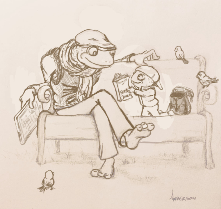
            Tweaked some of the things that were mentioned. How does this fare? Thanks for all the help! (Something happened to my layers so I apologize for the ghosting)
            0_1520704050317_Frog_2.jpg

            instagram.com/jonandersonillu

            holleywilliamson Johanna Kim 2 Replies Last reply Reply Quote 6
            • holleywilliamson
              holleywilliamson SVS OG @Jon Anderson last edited by

              @jon-anderson wow this last image is so much better! The dad's gesture is so much more dynamic and makes him connecting to the kid!

              https://www.instagram.com/holleywilliamsonart/
              http://holleywilliamson.com

              1 Reply Last reply Reply Quote 1
              • evilrobot
                evilrobot SVS OG last edited by

                Love it. Great job.

                http://www.palacioillustration.com/

                https://www.scbwi.org/illustrator-gallery/illustrator-detail/?illustrator_id=84142

                https://www.pinterest.com/evilrobot2/pins/

                https://twitter.com/MyEvilRobot

                1 Reply Last reply Reply Quote 1
                • djlambson
                  djlambson last edited by

                  I like this a lot..I love the great interest and feeling between the two. Lots of love here..

                  https://www.instagram.com/deborahlambson_art/
                  https://deborahlambson.com/folio

                  1 Reply Last reply Reply Quote 1
                  • Johanna Kim
                    Johanna Kim SVS OG @Jon Anderson last edited by

                    @jon-anderson Oooh, I'm liking how this illo is developing. The way you've used body language to have all the characters engaging with each other is making this a very strong piece already.

                    http://www.johannakim.com
                    http://instagram.com/johannahkim/

                    1 Reply Last reply Reply Quote 1
                    • Jon Anderson
                      Jon Anderson SVS OG last edited by Jon Anderson

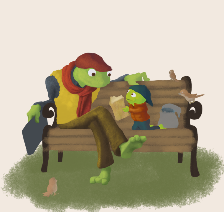
                      I wanted to post a progress update. I had a time working out my values and I anticipate working it out more as far as the bench is concerned but I've been bouncing around not trying to spend to much time in one area and bring the piece along as a whole. I still have many of the details to work out but I figure I'm at the stage where if something is screaming "fix me!" I better get to it now than later. I know the cap on the little frog, who I've taken to calling Hopper Jones, needs the twist downward to match the perspective. My biggest struggle is with color. So, if you notice something that isn't working or needs tweaking I'm open to suggestions.
                      0_1521305301614_Frog_2_P.png

                      instagram.com/jonandersonillu

                      nasvikdraws 1 Reply Last reply Reply Quote 1
                      • nasvikdraws
                        nasvikdraws @Jon Anderson last edited by

                        @jon-anderson Looks great. I really like the idea. I am struggling with color usually so please consider this. The only thing I see is a bit distracting is the yellow vest on papa frog. Otherwise great

                        www.instagram.com/nasvikdraws
                        www.facebook.com/nasvikdraws

                        1 Reply Last reply Reply Quote 1
                        • Jon Anderson
                          Jon Anderson SVS OG last edited by

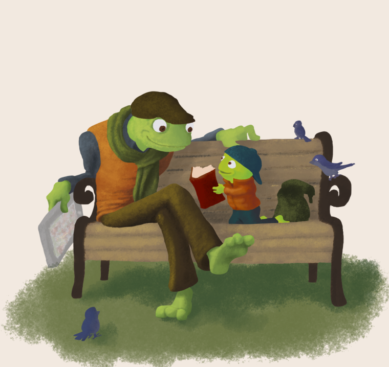
                          Tweaked a little more. After saving and exiting PS I noticed the tablet may need to be a slightly darker value. I tilted the boy's hat and changed some colors and values to hopefully produce more color balance. I still have a ways to go but I feel like it's finally turning the corner and approaching that final 20% mark.
                          0_1521613292451_Frog_2_P.png

                          instagram.com/jonandersonillu

                          1 Reply Last reply Reply Quote 2
                          • Jon Anderson
                            Jon Anderson SVS OG last edited by

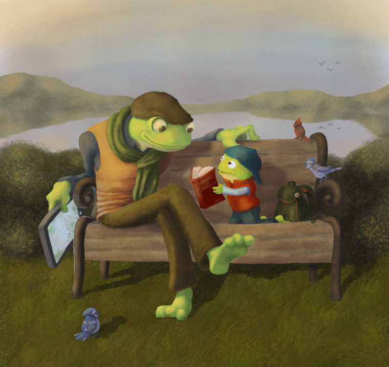
                            Down to the final details. I know I have a long way to go in my ability but I certainly feel like I've leveled up this month working through this illustration.
                            0_1522299241717_Frog_2_P_2.png

                            instagram.com/jonandersonillu

                            Gary Wilkinson Jason Bowen Eli 3 Replies Last reply Reply Quote 3
                            • Gary Wilkinson
                              Gary Wilkinson @Jon Anderson last edited by

                              @jon-anderson It's developing really well! I think you could probably push your lights and warm colors a lot more due to the time of day (golden hour-sunset). You are showing some quite strong shadows so you would need that added brightness to explain those. Also your greens are very strong in comparison to how the light is affecting other colors in the image, so you could either tone those down or bring other areas into the same range.

                              I like the simplicity in your background, but those birds in the distance are a bit distracting, as are their and the mountain reflections in the water. I think at those distances, unless they are dragons are not going to be so large. Just a thought, but have you thought about having even less in the background and making it more of a vignette?

                              www.garywilkinsonart.com
                              www.instagram.com/gwillustration/
                              www.twitter.com/GWillustration

                              Jon Anderson 1 Reply Last reply Reply Quote 2
                              • Jon Anderson
                                Jon Anderson SVS OG @Gary Wilkinson last edited by

                                @gary-wilkinson Thank you so much for the feedback! I see what you mean about the contrast with the shadows and the sunset. I'll try to work that out. I agree about the birds and will remove them. They were a late night thought that when you wake up the next morning you can't help but shake your head and ask, "what was I thinking? " As for the background itself I probably should have left it alone and may take it out. My goal from the beginning was to do a vignette but then as I began painting I kept adding things in to try and fill up the page. I didn't design or thumbnail a background early on so trying to add it so late just isn't working.

                                instagram.com/jonandersonillu

                                1 Reply Last reply Reply Quote 0
                                • tazzyartist
                                  tazzyartist last edited by

                                  Great job! Adding to what the previous poster said, I think it might look nice to leave everything past the bushes in the background out. Otherwise it's really cute! I love their expressions.

                                  www.instagram.com/tazzyartist
                                  thalimart.daportfolio.com

                                  1 Reply Last reply Reply Quote 2
                                  • Jason Bowen
                                    Jason Bowen SVS OG @Jon Anderson last edited by

                                    @jon-anderson Really great picture. A small thing is the reflection of the land in the water needs to be lighter a but lighter so you can see the separation easier 🙂

                                    https://www.instagram.com/jasonbowenoils/

                                    1 Reply Last reply Reply Quote 1
                                    • Eli
                                      Eli @Jon Anderson last edited by

                                      @jon-anderson This is really shaping up and looking great!! I agree with the other posters--I like the vignette idea. In the first images, I was picturing them at a little park, and it had a more intimate feel.

                                      1 Reply Last reply Reply Quote 1
                                      • Jon Anderson
                                        Jon Anderson SVS OG last edited by

                                        I tried to heed the advice about pushing the colors and eased a few shadows but I don't know if I did enough that it translates. I went for the original idea of the vignette and also experimented with the border. Which do you guys prefer?
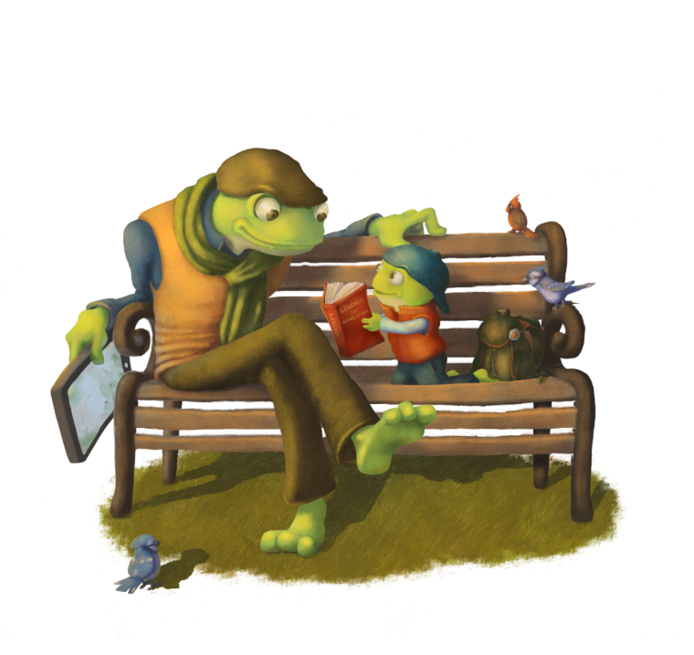
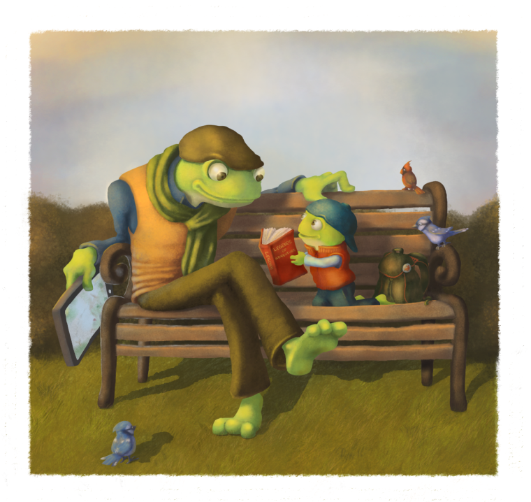
                                        0_1522387071005_Frog_4_P.png

                                        0_1522387047918_Frog_3_P.png

                                        instagram.com/jonandersonillu

                                        Gary Wilkinson 1 Reply Last reply Reply Quote 1
                                        • Gary Wilkinson
                                          Gary Wilkinson @Jon Anderson last edited by

                                          @jon-anderson such a big improvement! I think that by simplifying that background the bottom one fits in really well (the border one). A couple of last things you may want to look in on are adding occlusion shadows and softening the shadow edge of the bench as it moves away from the object. Apart from that I think you have done an awesome job!

                                          www.garywilkinsonart.com
                                          www.instagram.com/gwillustration/
                                          www.twitter.com/GWillustration

                                          1 Reply Last reply Reply Quote 1
                                          • Jon Anderson
                                            Jon Anderson SVS OG last edited by

                                            Almost done! I'll put some fresh eyes on it tomorrow to see what needs adjusting before deadline. To those of you who have helped guide this along I greatly appreciate the time you invested to help me!
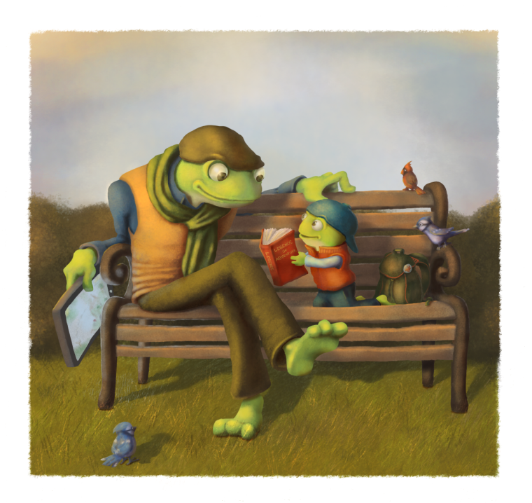
                                            0_1522473342025_Frog_3_P.png

                                            instagram.com/jonandersonillu

                                            Eli 1 Reply Last reply Reply Quote 1
                                            • First post
                                              Last post