Cover Design for Wizard of Oz -
-
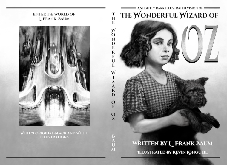
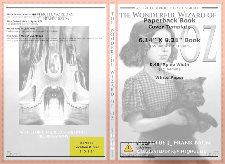
I have actually started to get a cover put together - i downloaded a template from Kindle Direct Publishing - It asks you to enter the number of pages to calculate the spine thickness - and then it generates the template based on the size that you chose to publish - my understanding is that my goal should be for the cover image to read well as a thumbnail because that is how folks will see it on Amazon - i'm thinking Dorothy and Toto are a quick read and the increased size of "OZ" make it pretty quick too - not sure if if i've wandered off into the weeds or not with this - but i was hoping for some opinions if anyone has the time - Thanks!
-
Simple, yet striking, looks great! There are a couple of things I would consider though.
The white on grey text has quite similar values, especially when comparing it to the black on Toto's body. Perhaps a slightly darker gradient might make it easier to read.
Something about the font type of OZ looks a little, microsoft wordart 1998 to me. I like the font on the top and the spine, but the "OZ" isn't really my thing.
-
@gary-wilkinson Thank you for the feedback Gary - i feel like you nailed the issues that i am having - I'll look for a complimentary font on "google fonts" for the OZ part - the font i use for the rest of the cover was too short for that space so i stretched it out and added a bit of bad design to it to make it fit
") Thanks again!
Thanks again! -
It does look very good - and yet I'm going to throw in a critical voice. The choice of Dorothy and Toto, while the painting itself is marvellous, feels somewhat "boring" to me. Maybe because the painting it's so realistic, it lacks the sense of wonder and fantasy that I associate with the book. I'm thinking about the people going online to buy a copy of "The Wonderful Wizard of Oz" and being confronted by a gazillion options (I stopped counting at 50 editions on Amazon - but there were many more) - they should be driven to buy yours rather than any other and I'm not sure this is the best choice for that goal. Part of it is maybe the black-and-white. Obviously, your art is black and white and awesome that way, but maybe you could think about toning the whole cover or adding a color detail, like the dress, just for the sake of making the cover stand out. B&W, while normal for interiors, is quite unusual for (rendered) covers.
I'm in two shoes with regard to the design and font. It does look elegant, but at first sight it looks like the cover of a magazine. Maybe there's room to play around with the size of the image vs the size of the title? -
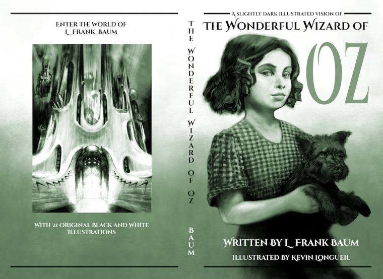
@smceccarelli Thank you Simona for the great feedback! - i was not planning on Dorothy as the cover but she has received so much more positive feedback than my other drawings that i thought i should give her a try as the cover - i understand what you mean by "boring" for sure though - i even removed the mark on her forehead which seemed to confuse folks and became an inadvertent focal point - i have been going back and forth about tinting the cover an Emerald color and your feedback made me think i should maybe go with it - this may not be enough though..... does this look any better? no worries if it does not
@Gary-Wilkinson Are the values better now Gary? I still need to figure out the "OZ" but i think the contrast might be better for the text. ?
-
@kevin-longueil I think the color already works wonders! I would try even more saturated, maybe?
-
@smceccarelli Here is a bit more saturation in the back cover image, faces and Oz....really need to sort out that OZ
Thanks again! I'll keep at it
-
@kevin-longueil It's looking good! You had some gradient in the "OZ" that I thought was working but it seems to be lost when you added the saturation. Not sure if you planned on adding the gradient back in and just haven't yet but I wanted to point that out.
-
@kevin-longueil Its really looking great. What if you left the background green but kept Dorthy and Toto black and white? It might even pop more.
-
I love these but I think you should use your green city of oz picture for the cover, just my opinion!
-
I definitely prefer the saturated green version. The idea of using the city is also worth testing. I`d also try giving more room to the title and making Dorothy smaller.
Have you tried any of your other images? Maybe Oz himself?
And (this seems like long list of questions), do you have to commit to a cover and keep the same all the time? Or could you do some testing and see which attracts more attention? -
@jon-anderson Thanks for the heads up Jon - I was thinking I needed to come up with something different than the current version of "OZ" so it has become a place holder at the moment until I can sort it out
@Chip-Valecek Thank you for the feedback and suggestion Chip - I played with that idea a bit but I'll go back to it and kick it around a bit more.
@holleywilliamson Thank you for sharing your opinion Holley - I never really considered that one for the cover but I see how it might give a better feel for the other illustrations in the book than my Dorothy drawing does - i will try a version with it as the cover and see - thanks again
@smceccarelli Thank you for letting me know if it is working better or not - I'm getting the feeling that i really need to put the breaks on and try different images for the cover. I was thinking of the idea of testing just today... that i could try out different covers over time - it looks like KDP makes it very easy to edit your books after they are published - i think i should make up several covers and put them here first on the forum - Thank you again for your help