WIP - Composition Help
-
@jon-anderson Yes, I think in terms of narrative clarity it would make more sense if it was a creek. Otherwise the story of the image gets very complex: „the boy has been to the creek to fish crawdads, but now is on the way home, he got tired and sat down under a tree and he’s looking at his catch and something about it surprises him“. It´s tricky to convey all of this story into a single image without confusing the viewer. „The boy is at the creek happily catching crawdads“ makes for a much clearer, simpler and impactful narrative.
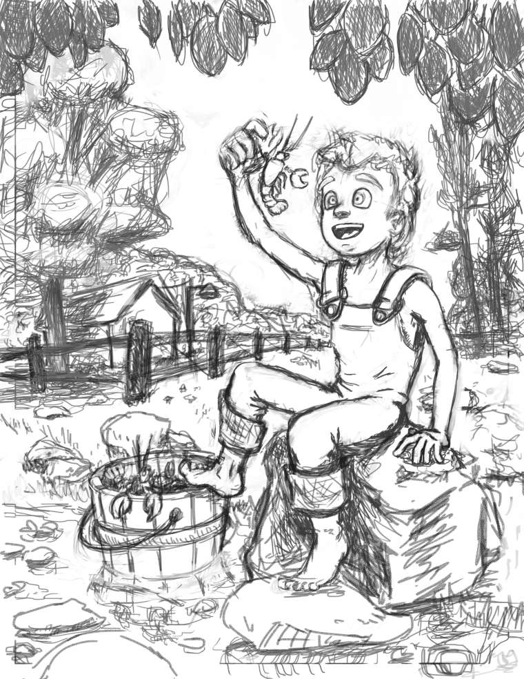
Proportions are tricky in children and it´s easy to make kids look too old. I don’t know what your target age is - maybe 8-10? If you look at photos of kids of that age, you’ll see that they still don’t have large muscles (they come with puberty), their shoulders are narrow and their ribcage tiny. Arms and legs are thin and don’t have a lot of muscle definition (I sometimes wonder how my daughter can stand and walk on those sticks). It can be really hard to get kids to look the right age, especially if you’re more used to drawing adults.
Looking forward to see the next phase! -
I really took those suggestions about the trees and proportions to heart. Are the tweaks I made actually improvements? Does the path now look more like a still creek? I also added the boarder guide after the instructions @smceccarelli gave in another thread and for some reason PS loves to snap to them so this explains the hard lines at the bottoms and sides. Those will be edited as I progress.
-
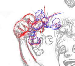
I like the composition a great deal but the way the boy is holding the crab is a bit odd. It may be what works best for the view you have but it's been my experience that boys will usually grab a crab by the body. Just a thought.
-
@jimsz That is a great point! There was a story/interaction in mind when first designing and I have since abandoned it in favor of a more natural scene. I totally forgot about changing the crawdad to fit the new direction. Thanks! Do you suppose the single finger and thumb hold as is works or would a two finger grip look better?
-
@jon-anderson if you go to the menu "View" there is an option to turn off snap. I usually turn it on when I am doing web design but when I draw in photoshop I make sure to uncheck it.
-
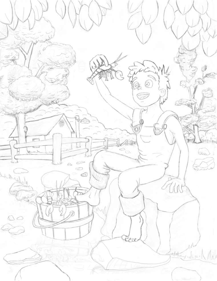
Seeing this through. I started rushing to paint and knew I shouldn't have so I slowed myself down and went back to tighten up the sketch. Posting the progress. Now I'm ready to paint.
-
Wow! Much improved. I'm looking forward to seeing it painted.
-
@jon-anderson looking good, its going to be a great piece when you are finished!
-
@jon-anderson
I think the composition is looking good! I agree with the other comments and you've done a great job at following their advice.Something that I would say could still use tweaking is the chest and waist. Kids are very straight in the torso. I think you could bring in the top of the chest all the way to where the arm/armpit line starts, and go straight down to the butt from there. The skinny arms look good for an active boy. This kid's expression is great! You've done a good job on the hands and feet as well.
-
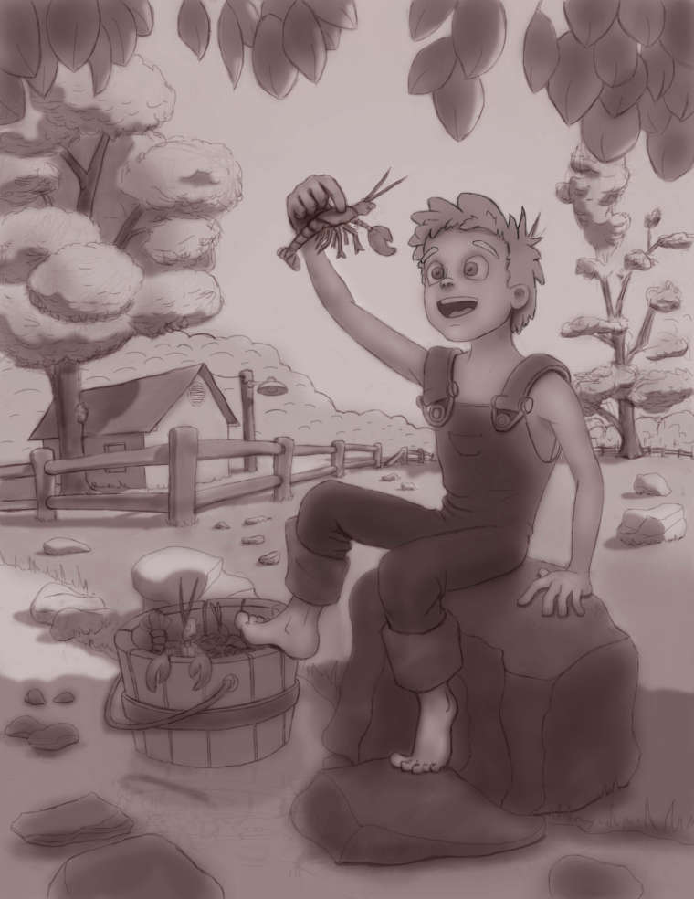
I'm trying to fight off all my rookie painting desires and do things in the proper order. Specifically, I'm trying to follow Will Terry's digital painting format. I've gotten as far as shadows and tone and I think I like the direction it's going, though I may go back and lighten the sky a bit if not the overall tone.
-
@jon-anderson This is looking really great! His foot on the left is looking a little awkward, it feels like it would be really hard to sit with the foot so turned out. You did a great job on the perspective if only his body lined up with it. I think more of a profile view of the foot would look more comfotable