Society of Visual Storytelling

    SVSLearn Forums

    • Register
    • Login
    • Search
    • Recent
    • Tags
    • Popular
    • Users
    • Groups
    • Search

    Music WIP

    Artwork
    27
    60
    6043
    Loading More Posts
    • Oldest to Newest
    • Newest to Oldest
    • Most Votes
    Reply
    • Reply as topic
    Log in to reply
    This topic has been deleted. Only users with topic management privileges can see it.
    • kylebeaudette
      kylebeaudette last edited by

      Well, it's fantastic.
      If I could critique anything, and it really doesn't need any... It would be to tone down the shapes/render on the young boy's hair. Simplify it on the interior and make the manic shapes on the edges only. It's a bit flame like, which always bothers me.
      God, that dad is excellent. Your work is so clean. Perfecto!

      Instagram- www.instagram.com/kyle_beaudette/
      Www.twitter.com/kylebeautweet
      Www.etsy.com/shop/Artofkylebeaudette
      https://youtube.com/@kylebeaudette?si=ComtMDsVyK1HPn55

      1 Reply Last reply Reply Quote 1
      • Naters.Art
        Naters.Art @braden H last edited by

        @art-of-b It looks Fantastic! The lighting is spot on. as I look at it though my eye keeps falling off the page in the bottom left corner. I feel as though the dog is out of place (which is unfortunate because I really like it) but theres three things 1. the dog is so dark it pulls attention like a void. 2. the trumpet is pointing right to it with no payoff. 3. it's the only element breaking the boarder, all the other figures are framed within the scene really well. All in all though I think it's a winner.

        my Sketch Blog
        https://www.instagram.com/naters.art/

        1 Reply Last reply Reply Quote 1
        • chrisaakins
          chrisaakins last edited by

          @Art-of-B great job! I don't even think it needs color.

          Chris Akins
          www.chrisakinsart.com
          www.instagram.com/chrisakinsart/

          1 Reply Last reply Reply Quote 1
          • burvantill
            burvantill Moderator last edited by

            WOW! You are really forcing me to step up my game. LOL! The fellow artist in me LOVES this and can't wait to see the finish. The competitor in me is putting on her painting gloves....that was a stupid metaphor, I don't have painting gloves. My Grrr face! I'm putting that on. Lol. 👍😃

            Lisa Burvant
            www.lisaburvant.com
            Instagram & Twitter & SVS: @burvantill

            1 Reply Last reply Reply Quote 4
            • lmrush
              lmrush Pro SVS OG last edited by

              Fantastic job!!!! Wow wow wow!!!!! My only comment is I was once taught your eye will go to the biggest contrast first (which is where you want your focal point to be) right now that is where the music stand meets the window. You want it to be on the boy, but not sure how to correct- Strong work you should be proud!

              Lisa Rush
              www.lisarushgallery.com
              www.facebook.com/ArtbyLisaRush/
              www.instagram.com/lisarush11/

              1 Reply Last reply Reply Quote 1
              • Gary Wilkinson
                Gary Wilkinson last edited by

                Late to the crit, but I really like this piece and there isn't a lot I can offer in terms of adjustment, a couple of things I wanted to mention though were:

                The hanging picture of the music note seems as though there could be a better option for what could go into the frame. Perhaps that side doesn't even need a picture or it could be moved slightly to the upper right as to not be as prominent.

                Also, something slightly bothers me about the foreshortening of the trombone and it's position in space.

                I think it's a great piece though and excited to see the colors added to it. I'm guessing you use a multiply layer to add the colors, but what do you use to bring the lights back out? Overlay or normal?

                www.garywilkinsonart.com
                www.instagram.com/gwillustration/
                www.twitter.com/GWillustration

                1 Reply Last reply Reply Quote 1
                • Jabbernewt
                  Jabbernewt last edited by Jabbernewt

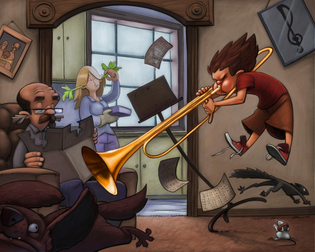
                  Loving the values, textures, and general comp, but I've noticed something about the trombone. It seems to be looped around his neck. By this I mean that, even if his neck is hidden by the shoulder, the tube of the trombone seems to snake its way around the right side and end up on the left side, which is not how the trombone is held. This might be fixed by overlapping the chin over the tubing, or by illustrating a little portion of his neck between the shoulder and head. Other than that, I remember loving the smaller details in the piece when I viewed it a few days ago. The little family photo especially, because it shows that the kid is usually pretty tame, with huge hair that covers his eyes and forehead; I just love the contrast between the photo representation of the kid and the craziness of the kid's trombone blast.

                  Also, the mouse-- what a phenomenal little detail! I love the humor!

                  Pax

                  1 Reply Last reply Reply Quote 2
                  • braden H
                    braden H last edited by

                    Thank you all for the feedback! I tried to incorporate it as much as I could.

                    @Gary-Wilkinson that darn treble clef picture does look out of place, doesn't it? I may do as you suggest later on and try and move it a little to make it a little less prominent.

                    @Jabbernewt Arggh! You're right! And I looked at so much tromboney reference, too! That may need some surgery once I've got all the colour set in...

                    1 Reply Last reply Reply Quote 0
                    • braden H
                      braden H last edited by

                      Work continues! Time for the thing I need to work at most, colour! Gosh I hate colour... Hence why I now do everything in colour.

                      Rough lighting colour study thingy
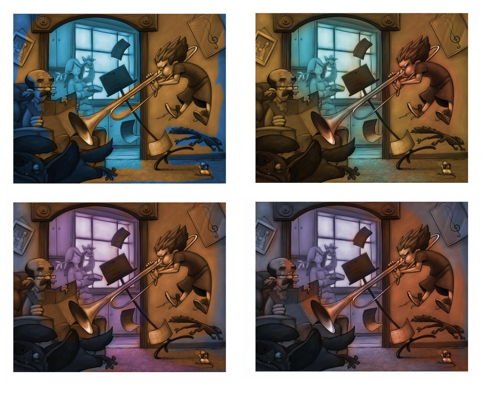
                      alt text

                      Rough colour

                      alt text

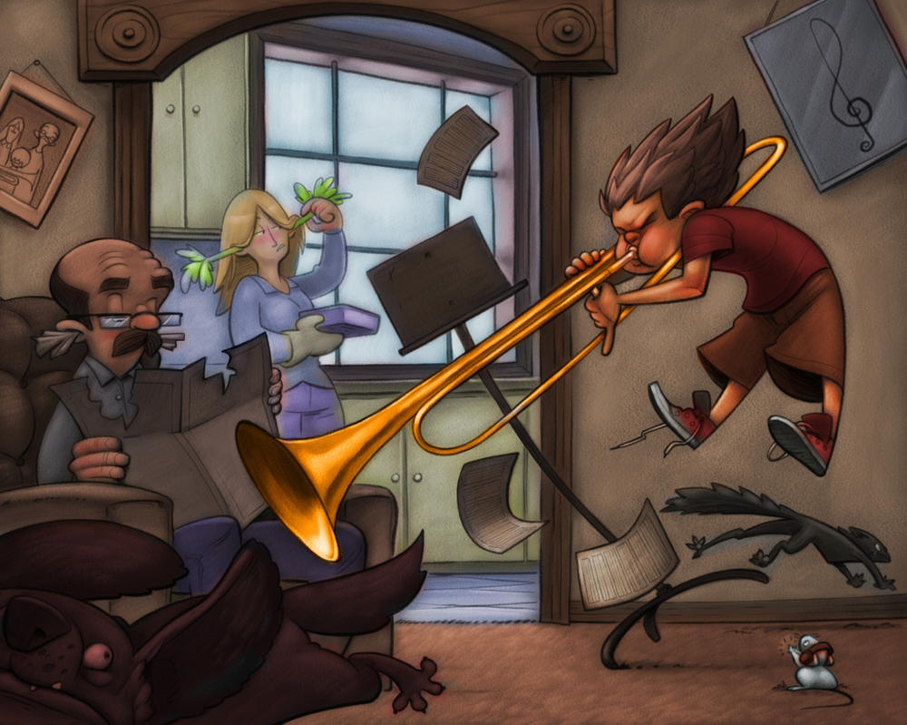
                      Aaaaaaaand colour WIP. Working from the background to the foreground. Almost finished working on the kid. Next come the animals.

                      alt text

                      Eli rachy 2 Replies Last reply Reply Quote 10
                      • braden H
                        braden H last edited by

                        @Gary-Wilkinson

                        As for colouring process, right now I use an overlay layer to throw in some light and a colourize layer for the local colour (I'm using painter. Photoshop I think has a 'colour' layer but it works a little different) Then I use a normal layer and just paint with the linework on a multiply layer overtop. Once I'm alllllmost done I'll flatten the linework and paint some highlights and stuff.

                        1 Reply Last reply Reply Quote 1
                        • kaitlinmakes
                          kaitlinmakes last edited by

                          Absolutely brilliant to show the light through the sheet music! I'm really enjoying watching this piece come together:)

                          https://www.instagram.com/kaitlin.kahn.art
                          Https://www.kaitlinkahn.com

                          1 Reply Last reply Reply Quote 3
                          • chrisaakins
                            chrisaakins last edited by

                            Love this. You really captured my struggles in 6th grade. You might want to lighten the value of the critter on the left. He is kinda hard to see. Unless it was intentional. I too think the lighting is amazing. Great job.

                            Chris Akins
                            www.chrisakinsart.com
                            www.instagram.com/chrisakinsart/

                            1 Reply Last reply Reply Quote 2
                            • Eric Castleman
                              Eric Castleman last edited by

                              Love it.

                              EricCastleman.com

                              SCBWI profile
                              https://www.scbwi.org/members-public/eric-castleman

                              1 Reply Last reply Reply Quote 1
                              • ?
                                A Former User last edited by

                                Really awesome to see you’re whole process! I agree about the dog being too dark. I know you don’t want it to be too light to pull focus from the main subject but it’s really hard to tell what’s happening in that corner and is a little distracting. Awesome work, really like your style

                                1 Reply Last reply Reply Quote 2
                                • Eli
                                  Eli @braden H last edited by

                                  @art-of-b MAN, this is good! The dog is SO funny--I agree with making it lighter because it kind of gets lost. I love the chaotic composition and the crazy movement and flow of the whole thing. So many great and hilarious little details. Well done!

                                  1 Reply Last reply Reply Quote 1
                                  • rachy
                                    rachy @braden H last edited by

                                    @art-of-b Love it! It's looking great! 😃

                                    Rachel
                                    www.ethereal-earth.co.uk
                                    https://twitter.com/racheblackwell

                                    1 Reply Last reply Reply Quote 1
                                    • braden H
                                      braden H last edited by

                                      Work progresses!

                                      Thank you all for the comments. The dog indeed was too dark as I was working from the background to the foreground and hadn't yet gotten to him.

                                      He may, however, STILL be too dark XD

                                      I've flattened the linework now, so it's just painting from here on out.

                                      alt text

                                      cam.royce 1 Reply Last reply Reply Quote 3
                                      • cam.royce
                                        cam.royce @braden H last edited by

                                        As someone who's learned an instrument, this totally makes me smile! haha

                                        1 Reply Last reply Reply Quote 1
                                        • braden H
                                          braden H last edited by

                                          Work progresses. And progresses... And progresses...

                                          That last 20% is a friggin' killer.

                                          alt text

                                          1 Reply Last reply Reply Quote 5
                                          • Nyrryl  Cadiz
                                            Nyrryl Cadiz SVS OG last edited by

                                            I love love love this one! There’s one thing i think you can work on though and it’s the little doggie at the lower left side. He just looks so dark and hard to make out. Overall, i love you work!

                                            Portfolio: nyrrylcadiz.com
                                            Instagram: https://www.instagram.com/nyrryl_cadiz/
                                            YouTube: https://www.youtube.com/channel/UCbJCF1Im8ZO7hpGWTKOJMuA

                                            braden H 1 Reply Last reply Reply Quote 1
                                            • First post
                                              Last post