TRASHED - Bologna Children Book Fair Project
-
Thank you all for your input! Maybe it was not clear, but the competition requires to submit 5 illustrations - so all of them will be done. The thumbnailing stage was before this - these are already the selected sketches.
I think I’m going to go for a mix of painterly/textured, similar to Brian´s work with some collage elements using real trash. I´ve been going to the city today collecting pieces of litter form the floor. I must have looked really weird - the things you do for art! -
Color comps....I've tried really hard to avoid using conventional ocean blues.
I'm going to try some gel-printing with acrylic for the backgrounds....first time I touch traditional media in years....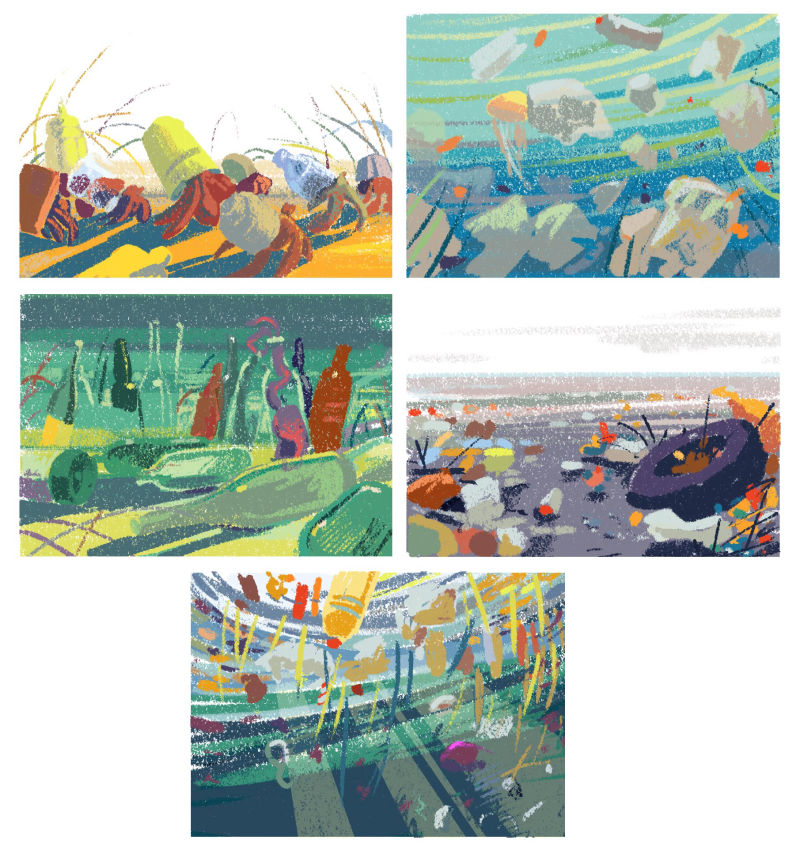
-
@smceccarelli These are really amazing, and feel so cohesive even though they're each so strong in their own right. I'm excited to see how you blend the collage elements with the textured/painterly style.
-
I love the movement and flow of all of your sketches. I think adding in some elements of collage will really make the impact of the "trash" pop off the page! Can't wait to see how it all comes together.
-
As @Annie-Barnett said, I'm also excited to see how it comes together with the mixed media. And your city is just a little bit cleaner because of you, so well done! Lol.
-
@smceccarelli Love those little touches of red and burnt orange! I understand the Simone Rea thing in an Italian show, but I also like how your work is thinking outside that particular box.
-
I love 3. I am immediately drawn to the eye. I wanted to ask though...on the Bologna website they said the fair is every two years next one 2020. Did I read that wrong? I thought they were yearly as well.
-
@lmrush The BCBF takes place every year. The dates for 2019 are already out (1-4 April 2019) and the deadline for the exhibition is October 5th 2018.
Maybe the confusion comes from the fact that SCBWI has a booth there only every two years - hence the next time SCBWI would be represented at the fair is 2020. Maybe you´ve read the dates on the SCBWI webpage?The link to the fair website is:
http://www.bookfair.bolognafiere.it/la-fiera/bcbf-2019-le-nuove-date/8680.htmlThough the server is down at this very moment....
-
That makes perfect sense! Yes I went through the Scbwi site. Thank you so much @smceccarelli
-
@lmrush @smceccarelli I'm not sure if this applies to the years SCBWI aren't presenting, but it seems like in the past, SCBWI members had an extended deadline for submissions to the BCBF too. https://bologna.scbwi.org/scbwi-bologna-book-fair-2018/bologna-childrens-book-fair-illustrators-exhibition/ Might be worth looking into.
-
@annie-barnett That's correct - I had forgotten that! I'll check if it applies also in the years where SCBWI is not represented. Seems likely.
-
I love the teal/brick red color scheme you have going on here. Reminds me of Victo Ngai and Yuko Shimizu. I'm excited to see how you incorporate the collage elements.
")
-
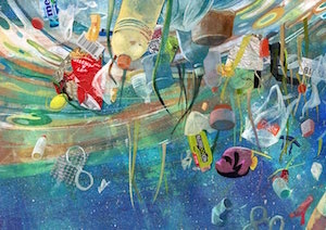
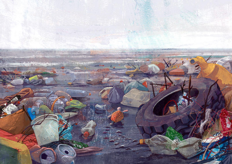
First one down!
Acrylic gel prints, found trash objects and one of my favorite Kyle's brushes: Wamazing Fat RoughWhat do you think? It certainly was a lot of fun and very liberating, but as usual, new experiment always leave me full of doubts...
@Lee-White I´d love to have your opinion - you´re the voice that pushes me to experiment
")
-
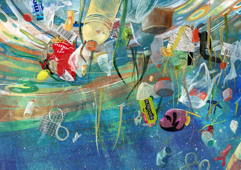
No 2!
-
@smceccarelli Wow! I'm impressed how cohesive the found objects and painting objects go together! Keep rockin it!
-
These are so good! I DESPISE litter so looking at these makes me sad, which is a proper emotion for this topic. So bravo!!


-
@smceccarelli Great work as usual. You're an awesome inspiration to me at a time when I am stuck in a seemingly inescapable rut. Thanks and good luck with your entry.
-
These look great! I love mixed media.
-
@smceccarelli I'm really liking these illustrations especially no2
-
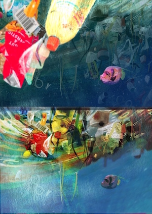
@smceccarelli Hey Simona these are looking great - there is one issue for me that i am seeing in the finals - it looks to me that in your color comps the contrast is working well and my eye can travel around the images in a pleasing manner - in the final versions the values are very close to one another with no real "light on dark" or "dark on light" to separate each part of the composition so it is hard to find a path through the image..if that makes sense? I did a couple quick and terrible thumbnail sketches to try to separate some of the elements(i put them below the original)...these are not good but i decided to share them anyways
I think that your image 2 may have the same issue - when i shrink them down very small i cannot discern the what the image is - once again i think the color comps dealt well with contrast and composition .... i hope this is not annoying feedback...feel free to ignore of course...really nice pieces!