Fall -- WIP
-
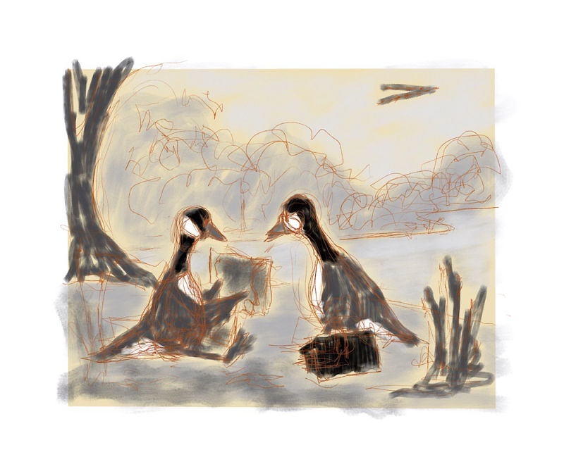
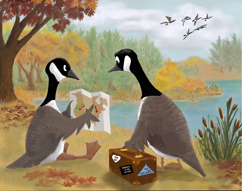
September has been a killer month at work so far so I may never get any farther on this than the sketch but I thought if I posted it, I might work harder at finding time to finish it. (In case it's not obvious, it's two Canada geese checking out a map as they get ready to migrate.)
-
Cute sketch, nice composition! Reminds me of the east side of the Turtle Pond in Central Park, wildlife included
")
-
Cute concept! Composition it balanced with movement. I like it
-
I love the idea! I knew exactly what was going on in the scene even from your rough sketch. If you have time to finish it I would love to see how it turns out!
-
The concept is really good and funny. Have you played around with a few thumbnail sketches of this scene with different poses, angles compositions etc? I can see it's quite at an early stage, but be careful or the tangents in your picture, such as the tree against the goose's back or the line of the lake through the mouth's of the geese. The group of flying geese is also very close to the edge of the image and would be framed much better by the space you made with the tree's below it.
You mention that both geese will be migrating, but at the moment it looks more like 1 goose who is about to head off to work and his partner is showing him the directions. I like the group of geese in the background who are already migrating and I think you could add to the comedy by making it seem as though they are suppose to have joined that group and have messed up their flight times (last minute travel is a rushed nightmare).
-
@gary-wilkinson I noticed the migrating geese are close to the edge after I posted it so I'll definitely move those. I was thinking of putting travel stickers on the luggage (and making it look more like luggage) but I like the idea of showing them missing their departure time. Not sure how to do that but I'll think about it some. Thanks.
-
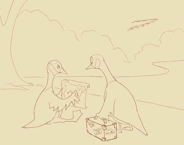
Still very preliminary but trying to get the composition down before I go any further. The first uses my original idea in which I was trying to depict a small pond and lead the eye to the migrating flock. The second makes the pond bigger in order to avoid the far shore cutting across the necks of the geese but makes the migrating flock feel less important I think. Which do you think works better?
-
The first image feels open and balanced to me, and so long as the shore doesn't go behind their faces, I think it won't cause any problems. I'd say the first choice looks great! I'm very excited to see more of this piece. Such a clever idea.
-
The geese's heads are right in the center of the page. I suggest either cropping the image or move them up in the page to make them more central to the image. Maybe even enlarging them a bit.
-
Perhaps if the page was a portrait rather than landscape orientation you could have the shoreline further away, but still keep the open sky.
As it is, I don't think the shoreline intersecting the necks is a problem. It might be if they weren't long-necked animals, though.
I love the increased energy of the sketch compared to the thumbnail. The diagonal lines from the suitcase and the 3/4 back view of the standing goose add that needed "are we lost?" tension.
-
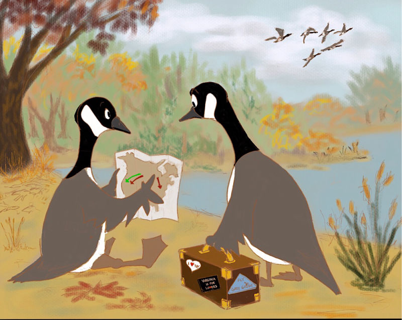
I’m hesitant to post this because it’s still very rough but I’m trying to keep myself going on it. I enlarged the foreground geese and started to choose a color palette while trying to stay with the values I chose in my original value study. I am trying to remember how to paint digitally because I’ve been teaching myself watercolors for the past four months and it’s weird going back to Procreate! Eventually, I’ll try to make the characters look less pasted on, define edges, add modeling and shadows, and put some reflects and variation in the pond to make it look more like water, but it’ll be a few days before I can get back to it because weekends are my heavy time at work.
-
I think the composition totally works with the changes you made. Color and value really change the way your eyes move around the piece. Good job.
-
Great concept! Would love to see more.
-
I’m going to sit on this for a day. I haven’t done a lot of pieces without line so I’m not sure how far to go with the rendering. Since the geese are cartoony I don’t think I should get too detailed with the background but I’m not sure how detailed is too much or too little. Feel free to critique this.
-
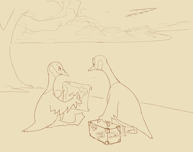
I really like this one. I think I prefer the small pond. Great execution of your idea!
-
Really love the story with this piece
I agree - I don't think you need to render the back more because of atmosphere, but you might want to adjust the geese in the back - right now their saturation is high and don't match the background/compete with the main geese.
For rendering - maybe touch up the front leaves to bring them forward. -
@kaitlinmakes Good point about the flying geese. I knew they didn't feel quite right but I thought maybe it was that they didn't look as cartoony. I'll try changing the saturation and see if that helps.
-
I love this piece.
-
I think this is the final version unless someone sees something that needs to be fixed. Thanks for everyone’s help.
Laurie DeMott
instagram.com/demotlj -
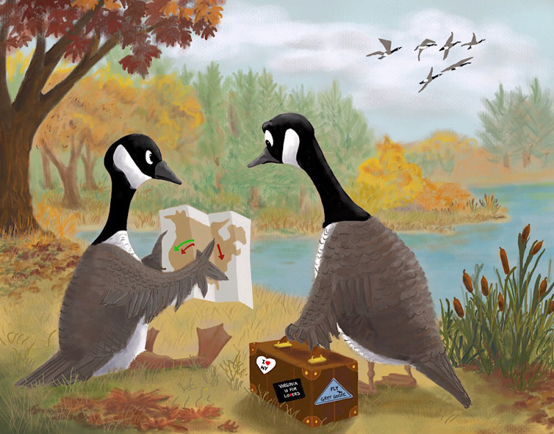
@demotlj Wow this is such a great piece! I love your style, the colors and painterly look of the background remind me a lot of impressionism and it's really well done!
I see a few really simple things that you could do to take this piece to the next level, I hope you don't mind but I tweaked it a bit in Photoshop to show you what I mean:
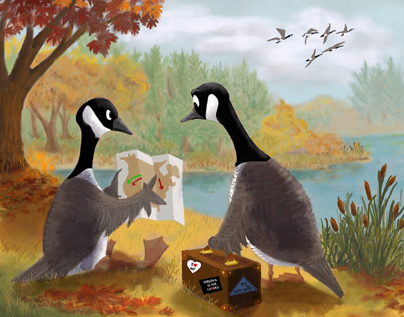
Here's what I did:
-
Added atmospheric perspective. That's the way colors will change depending of how close or far they are. The closer to us, the more saturated and bright they'll be. The closer to the sky, the more they'll start to fade into the color of the sky. In your image, all three levels has pretty similar colors which was flattening it a bit. I picked the colors of the sky and applied it in transparency over your background island. Then I desaturated a little bit the yellow in the middle island, and on the opposite I saturated more the foreground where the geese are.
-
Tweaks to the shadows. I noticed the light source is a little bit inconsistent in your painting. The goose on the right has the clearest shadow, from in front of him, but the case he's holding has shadow from the right and none of the other surroundings has any defined shadows to help us. I shaded the ground under the case, the goose on the left and the tree to all follow the same direction. Darkened the shadows in general so they're a bit more pronounced. Added the shadow of the middle island in the water. And finally, added a little bit of shadow on the case and geese that's consistent with that light source.
I hope that helps! I do think it's a wonderful image even as is without changes
Great job!vanessastoilova.com
instagram.com/vanessa.stoilova/Check out my Youtube channel for tips on how to start your career in illustration! www.youtube.com/c/ArtBusinesswithNess
-