2ND TAKE- Misunderstood Monster WIP
-
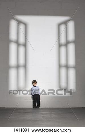
Hi, everybody! So if you’ve seen my previous post in the forum, you’d see me working on another ‘misunderstood monster’ piece. I’m not really sure if it’s working though so i decided to create another piece strive not to skip on the basics like i did on the previous one. I was so excited that i rushed into it without much of a plan, just winging it. Hopefully this second piece will be different.
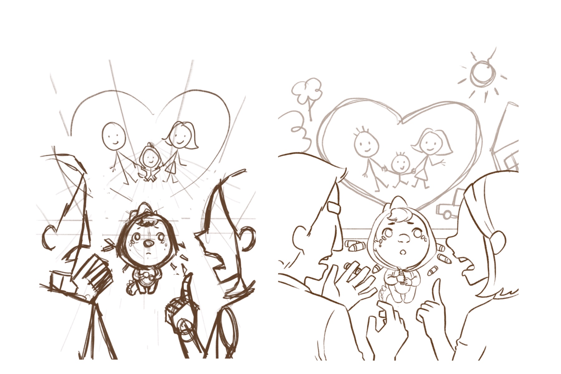
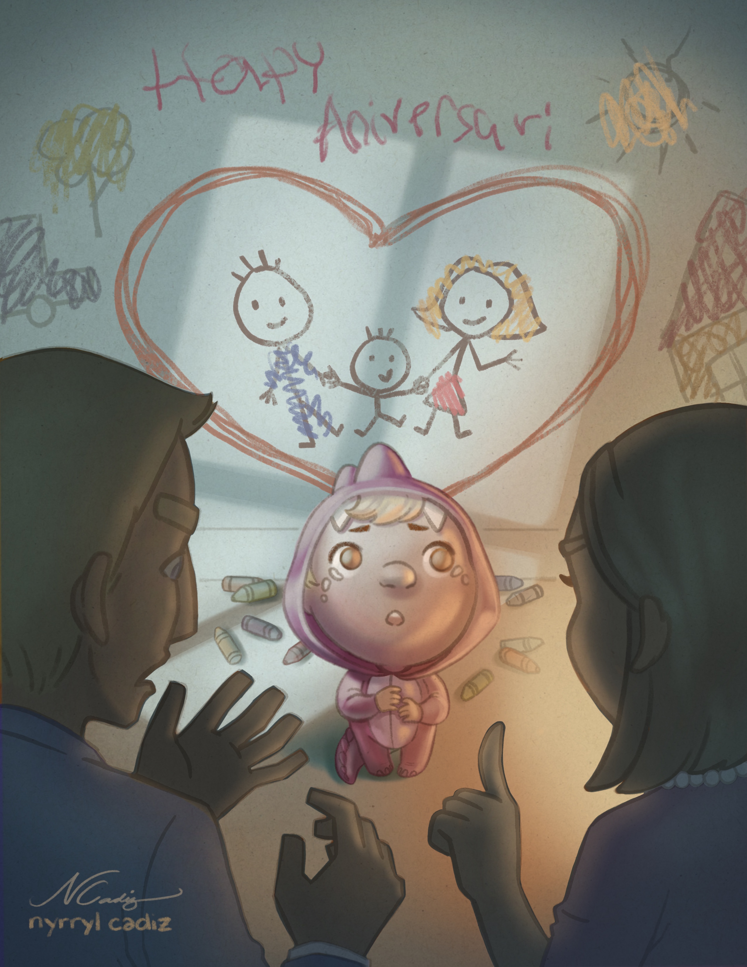
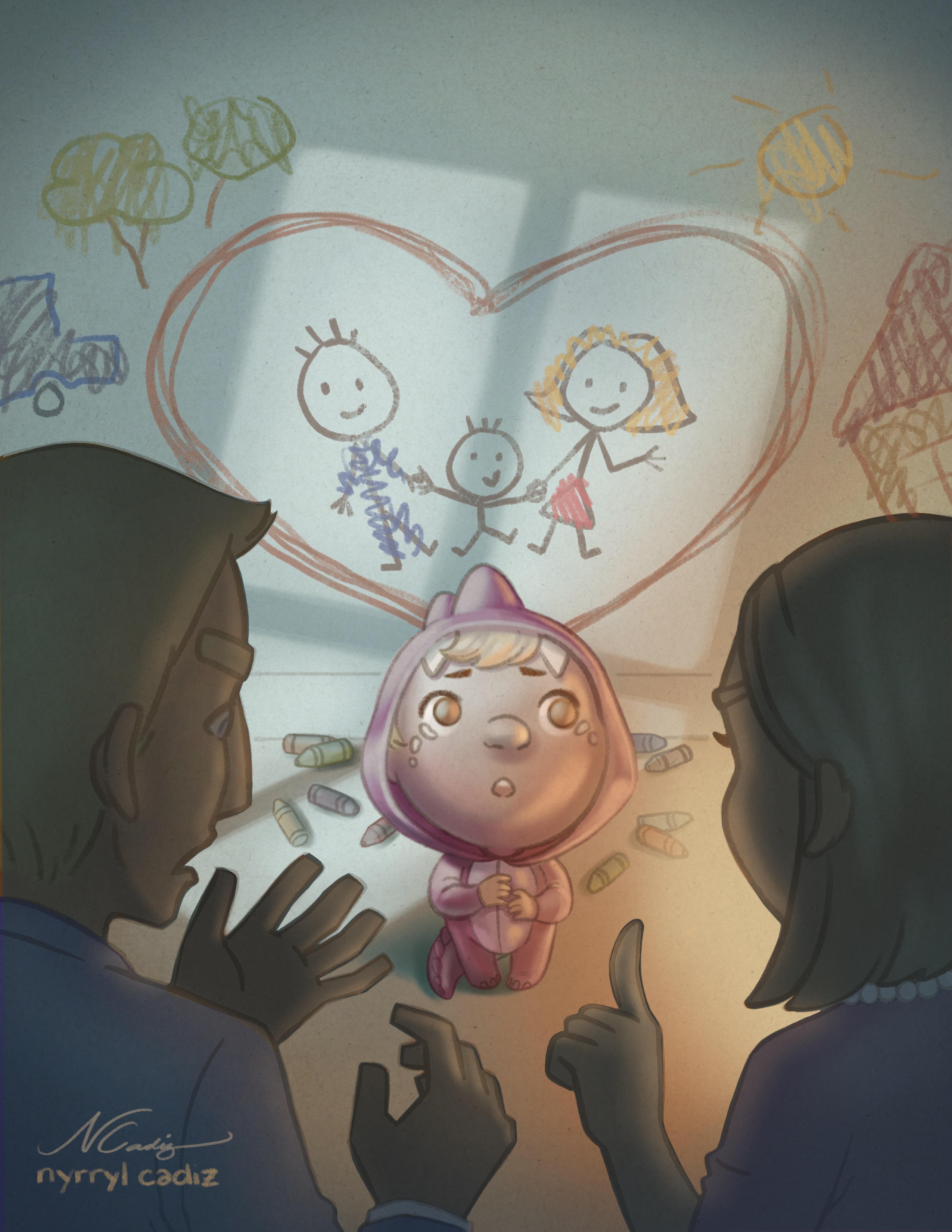
The story of this illustration is that it’s the wedding anniversary of our main character’s parents. So he comes up with the idea to draw on the walls to surprise them but when his parents arrive back from their date, they completely misunderstood his gesture and scolded him.
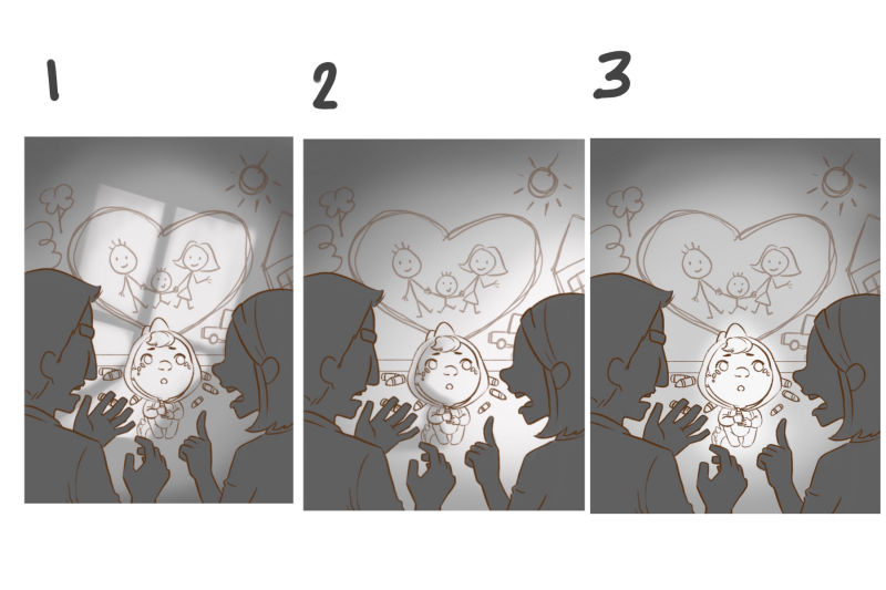
I need your help guys on deciding which lighting to use. I’m leaning on #1 because it’s something new and it gives a sense of disarray to the kid’s world, discovering his parents don’t appreciat4 what he did. However, i would love to know what you guys think. Thank so much!
Portfolio: nyrrylcadiz.com
Instagram: https://www.instagram.com/nyrryl_cadiz/
YouTube: https://www.youtube.com/channel/UCbJCF1Im8ZO7hpGWTKOJMuA -
I think this concept is great. It's simple and straight to the point and is very relatable.
Before talking about the lighting, I think the sketch is great, but you have a lot of empty space about the heart That is damaging the composition. There is also a lot of near tangents with the objects in the background and the parents faces as well as it being almost too busy, which I think could be solved by perhaps pushing the child back slightly and moving the graffiti up a bit (or adding more).
I also noticed that the child is wearing a little dinosaur/monster costume, which is insanely cute, and I think it would be good to emphasis that slightly or at least avoid de-emphasising it.
With the lighting, I would go for 1, as it adds to the drama and the sadness/heartbroken feeling of the child. It would also provide you with a great base for a nice warm/cool color combination.
btw I hope I'm not becoming the real misunderstood monster this month for you by breaking apart your work
")
-
@nyrrylcadiz What a lovely concept! The comp and storytelling are really nice! For me nr. 3 has the best lightening . Although nr 1 is fun , to me it looks as if is not working for this story ( Perhaps save this idea for a scary illu?) nr. 3 focusses nicely on the 'shame' . Have fun coloring! I cant wait to see the finished version!
-
Actually I want to change my lighting choice to 3 as well. I think 1 is better is the story is about the parents arguing between themselves
-
@Gary-Wilkinson hi! I’m very glad you like this new sketch. Yes, I wanted to make this new piece more simple yet emotional. As for the empty space on the wall, i think i’ll leave it be. I guess it would be nice to also add drawings on that part but we need to keep in mind that our main character is really short. I don’t think he can reach that high. It’s amazing to think he manage to draw that sun in the sketch. LOL!.... I agree on the tangents though. I should try to minimize them but i’m choosing to leave that mess of crayons the floor. I feel like it adds more story to the illustration. I also don’t like to back the character up to the wall because as much as possible, i want him to be under his parents’ gaze to emphasize how little and powerless he is in that situation. Atleast, i think it makes him look like he is. Lol...
Oof! I really don’t want to make the parents look like they’re arguing. I want the attention on the kid. Thanks for pointing that out. Thuogh i really like lighting #1, i guess i also need to improve it more so as not to shift the focus on the parents.
Thanks for sharing your thoughts. They’re really helpful.
@Leontine Hello! Thanks for chiming in. I really need more eyes on my piece. I agree the lighting on #3 does emphasize shame more, however, that’s sort of not the feeling i was hoping to convey with this piece. Oh, well i guess i have to tweak the image more to deliver the message better. Again, thanks! It’s nice to hear your opinion so i can gage if my idea is really working or not.
-
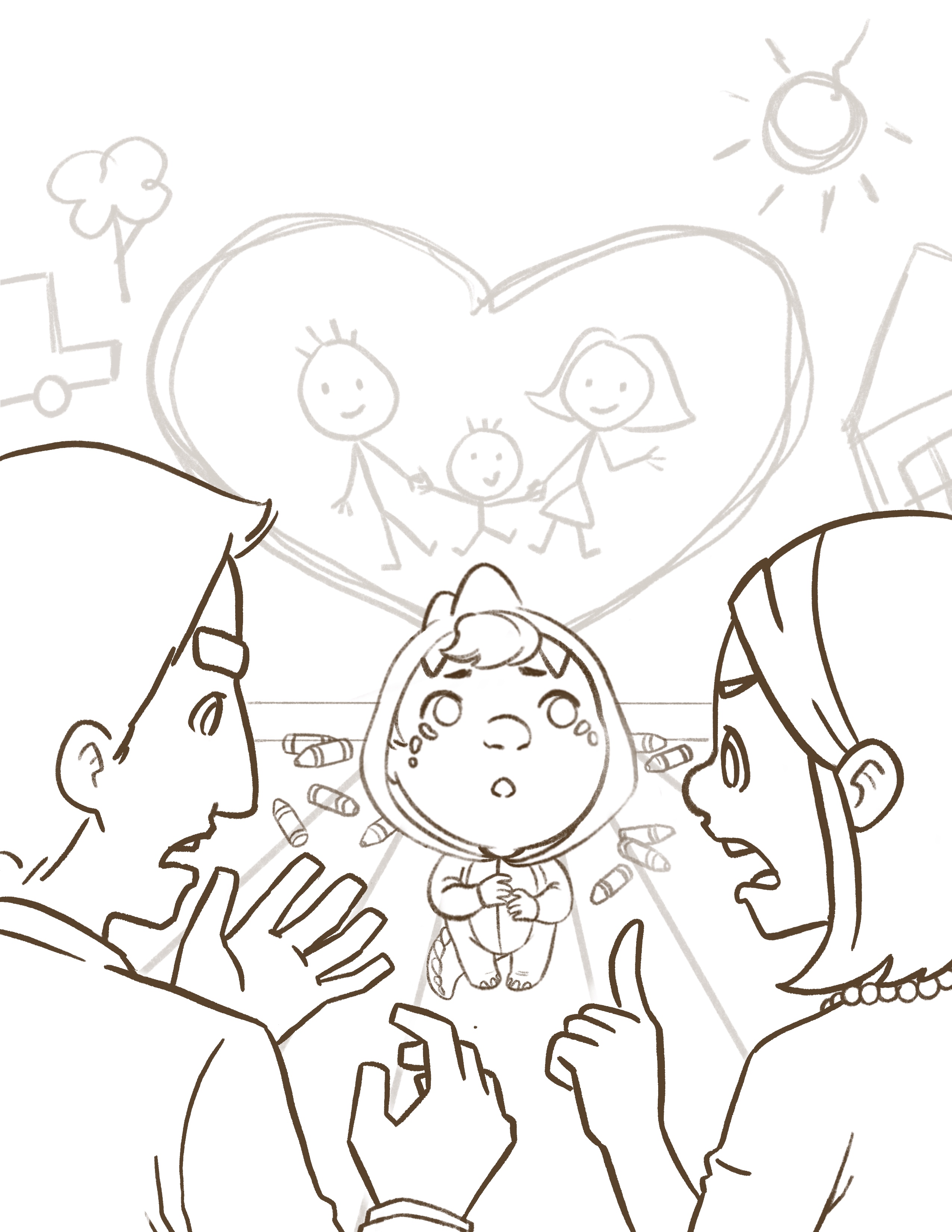
I did a few tweaks on the sketch. Here’s the newer version. I also added eyes on the parents to further emphasize that they are telling off their child rather than arguing with each other.
-
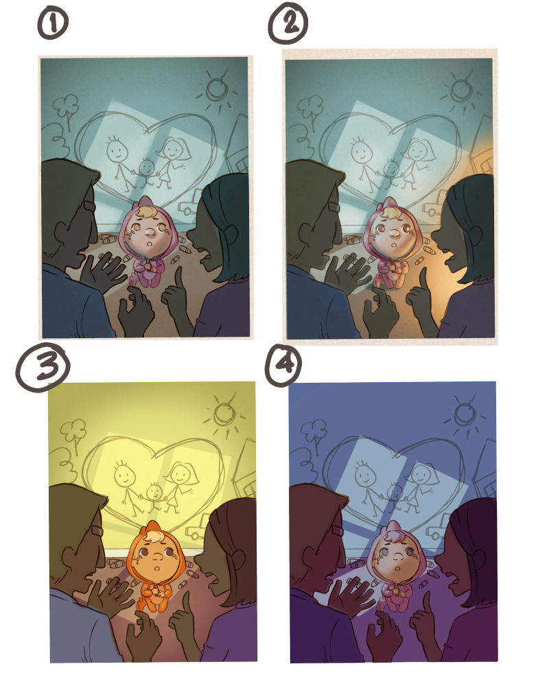
I also did some color comps. I don’t know if you’ll agree with me but i really like to go with lighting #1 as evident in the following comps. Of the four below, i’m leaning on #2. You might also notice that i’m using the older sketch. Yeah, i had already started making the color comps when i read the new comments on the sketch. Rather than begin again with the newer sketch, i just decided to go continue with the older one. After all, these comps are more to do with color and not the sketch. So without further a do, here’s the color comps.
-
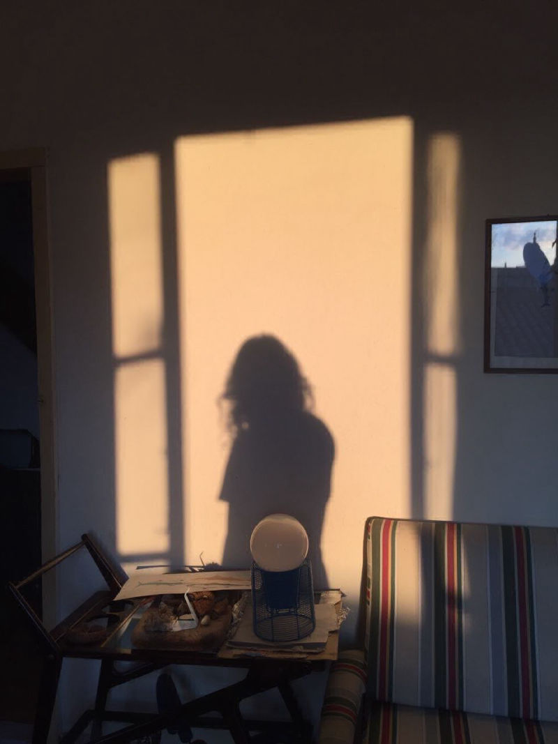
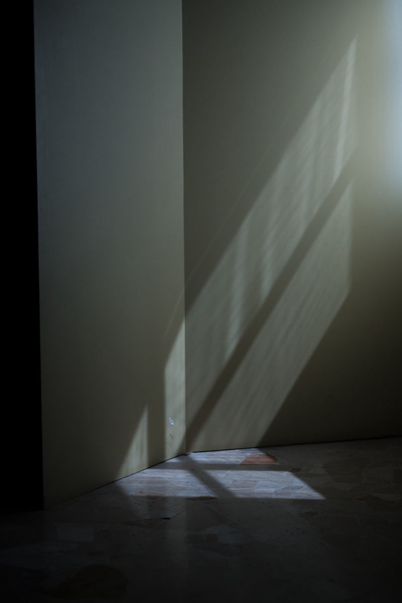
Hello, friend! Your work, as always, is amazing. I admire you for tackling the process of coming to a strong piece once again for this month. I promised myself that I'd focus on another project instead of the prompt this month, but my idea was similar to this theme, and I love that you have executed the concept so well here. I think children are misunderstood so often!
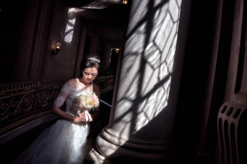
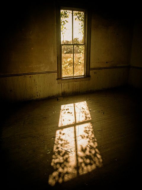
To me, your first color option looks most believable. I was curious about how light works in this setup so I looked up a few reference photos. Here they are in case they come in handy for you...
Thanks for sharing your work with everyone!
-
@kathrynadebayo hi, Katheryn! Yikes! You caught me! yeah, my window lighting is really out of whack, however, it’s actually an artistic liberty that i made inorder to further emphasize the feeling of disarray our character feels. I want to make the audience feel a sense of uneasiness with the situation. I’m not sure if it’s getting though. lol!...Anyway, thank you so much for the photo references. They’re very helpful. And it’s very thoughtful of you. I might consider changing my lighting in the future if it just doesn’t work. Again, thank you so much!
-
Just to clarify, I think your lighting is working well.
It was genuinely out of curiosity and a desire to learn that I looked up those photos. However you interpret the scene will be excellent, I'm sure. We can get so caught up in achieving a certain realism... I know I do. However, I don't think that's right for everyone's style. Show the world your thing, while being constantly open to learning, and I don't think you can go wrong. -
I was totally sold on #1 when I first saw it. But the more I think about it, and the more I look at #3, it makes more sense story-wise. I think the window lighting is such a cool idea and it looks great. But it's also taking away from the story and for me, it that's cute little kids sad face not understanding why his parents are upset at something he worked so hard on for them. So for me right now, the window lighting is making me focus on the drawing he did. Which in a way, is fine, but I think more focus on the kids face the better. With no distractions in the background.
With the window outline, the drawing, the parents scolding him.. there's too much going on for me. So that's why I think #3 is working better for the story.
Also, emphasize the dragon/dino outfit more. I didn't notice it until someone else mentioned it. And with misunderstood monster being the topic, it's so perfect.
-
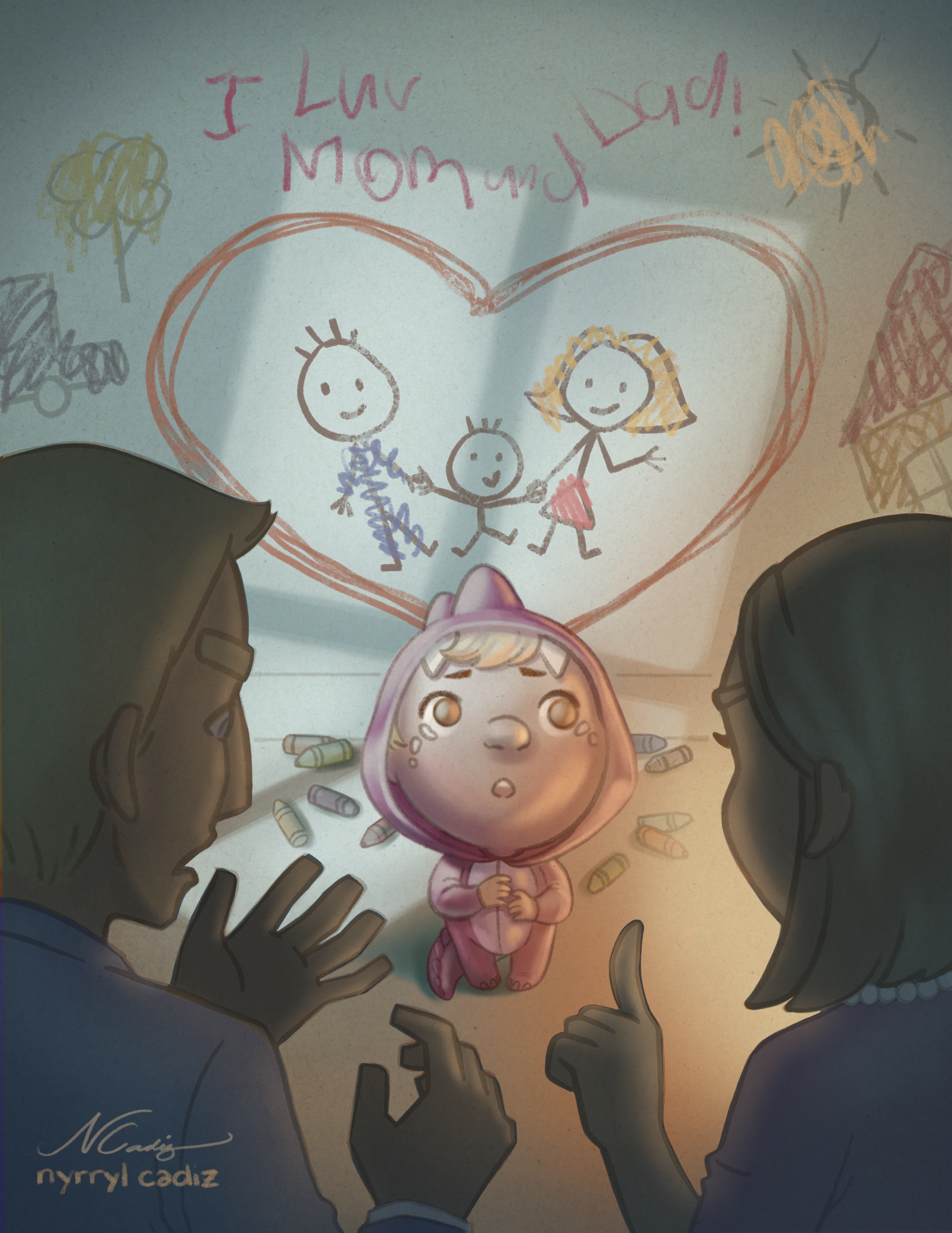
@Branden-Brushett Oh, dear... i’m really sorry, Braden. I was really busy working on the piece that i wasn’t able to read your comment. I’ve already painted the illustration using lighting #1 and i’m really satisfied with it. I’ve attached the illustration below. I hope the kid’s expression still reads through. Thank you so much for your input. Please don’t think I’m completely disregarding what you guys think. I may not execute your comments now but i’ll surely remember and re-enforce them in the future.
-
Hi, everybody! Here’s the almost-final illustration. Please let me know if there are some things that i need to work on more. Thank you very much. I hope you like it.
-
@kathrynadebayo hi! Thank you so much for your support. Yeah, sometimes i also get so technical with how things look that i get so nit-picky and frustrated. It’s nice to bend reality a bit sometimes and experiment with whacky ideas. I wish you the best with your work as well!
-
Here’s another version of the illustration where instead of the writing on the wall saying ‘Happy Anniversary’, it’s ‘I love Mom and Dad’. I think it works better.
Portfolio: nyrrylcadiz.com
Instagram: https://www.instagram.com/nyrryl_cadiz/
YouTube: https://www.youtube.com/channel/UCbJCF1Im8ZO7hpGWTKOJMuA -
@nyrrylcadiz I love this final version. It looks amazing and kind of breaks my heart a little! So well done. I think it works well without any words at all--I like the storytelling of just the picture of the happy family juxtaposed with the scolding, shadowy parents and confused, sad kid...
-
@eli hi, Eli! I’m really glad you like it! I’ve been doubting my skills lately and to have someone appreciate my work really makes me feel a bit better inside.Thank you.
-
One small thing to consider would be changing the color of the gray/brown outlines on the crayon drawings. Right now if I were to see the car, tree, sun, or house out of context I would tell you that they looked like they were colored-in by a kid, but not necessarily drawn by one. They're kind of giving off a coloring book vibe. If you change the outline to the same colors as the scribbles and maybe make the outlines a little messier I think it will look more like a kid that size drew them. Here's a cool article on kid's art at different stages of development: http://www.artjunction.org/young_in_art.pdf
Taylor Woolley
(Formerly Taylor Ackerman / StudioLooong)
Website: www.woolleystories.com
Instagram: https://www.instagram.com/woolleystories/ -
@studiolooong hi! Yes, i see what you mean. I’l definitely work on that. Thank you so much!
-
I did a quick edit on the piece. Here it is. I removed the brown outlines on the wall sribbles and got rid of the words. I hope you guys like it. Please let me know what you guys think. Thanks.
Portfolio: nyrrylcadiz.com
Instagram: https://www.instagram.com/nyrryl_cadiz/
YouTube: https://www.youtube.com/channel/UCbJCF1Im8ZO7hpGWTKOJMuA