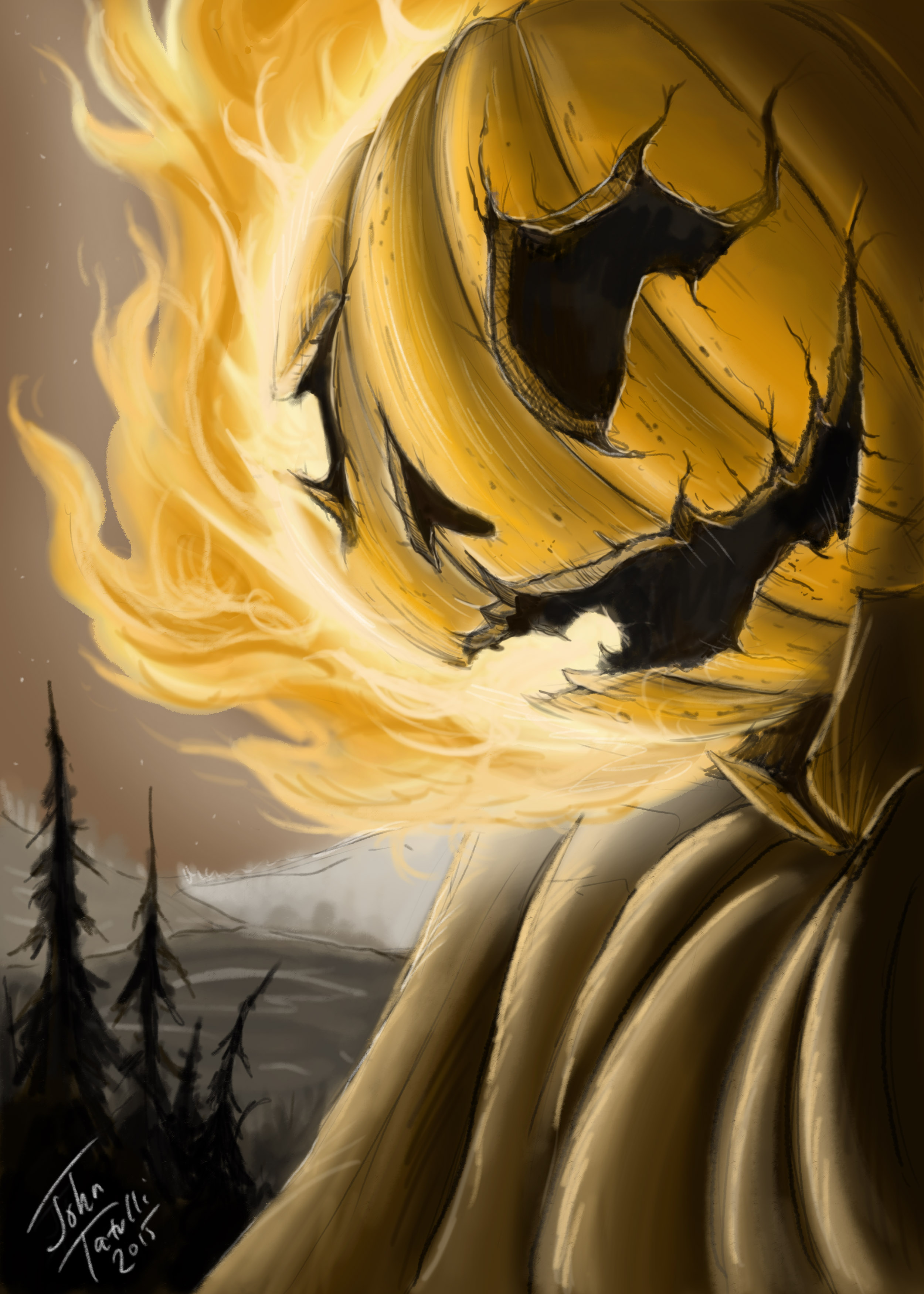
New Halloween Fan Art - Critiques Welcome
-

Just a quick Halloween inspired Illustration. Any and all feedback welcome people, we are all in this together. #Student4Life is my personal hashtag. Miss my SVS Instructors. Think a class is on hand soon.
Thanks Gang,
John -
Beautiful work! I love halloween.
Ace
-
Thanks Ace!! Me too. Especially for the Milk Duds!
-
Rad Jack-O-Lantern. Nice!
-
Thanks Jonathan!!
-
Very cool image! I like the limited palette you have used.
-
@Rob-Smith Thanks Rob!! For me, its never easy to stay basic and not throw in a hundred different values and colors.
-
Cool Piece John! Thanks for posting.
You really nailed the pumpkin and the fire looks great. I'd suggest some reworking of what is under him. Is it supposed to be clothing on a body or a dirt hill? Right now it's tough to tell. If its a body, really focus on using harder edges and simplifying the shadows. Right now they are very rounded and don't look natural. I'd put a dark coat on him and then lighten those trees to the left. That makes it easy to paint and not get lost in the fabric.
If it's a cliff or a hill, just use way less soft edges and make the shapes more definite.
All in all a great piece!
-
@Lee-White Thanks so much for the critique Lee and the brown area under pumpkin is in fact a brown cloak of some sort but obviously not where it needs to be. I will test out the suggestions and again, the time spent is much appreciated. #student4life
-
@johntatulliart I saw it as a cloak... until @Lee-White pointed out the hill theory... then it changed my whole outlook on your piece and on life itself... nothing is what it seems haha.
Ace