Trying out a new character style--critiques?
-
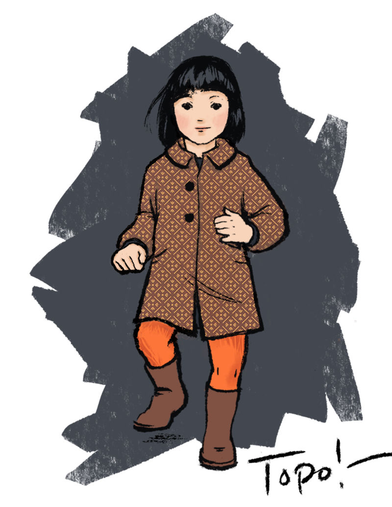
Along the lines of Gary's 100 kids, I'm trying to draw a lot of characters at the moment to work on style. One problem is that I am too slow, so I made this quick illustration based on a little girl I sometimes see in my neighborhood. Her mom was calling after her, "Topo!" which means "mouse" in Italian.
I don't think I'd always work like this, but I rather like it as an alternative to a more rendered style. I'd like to know both what you think about the style as such and whether you have any specific critiques. I have my own ideas but I'd like to hear what other people have to say independently. Thanks!
-
Great to hear you are adding to your 100 kids quota and it's a great start. I like the idea of mixing patterned textures onto the character and I think your could probably take it further by using on other areas of the clothing or background which will help it blend in more. I would also suggest exploring a few different color schemes as this one is quite an unusual choice as the leggings are the most eyecatching with such bright value and saturation, especially in contrast to the grey background.
I like how you have drawn her face, but i'm curious about what she is doing judging from her pose, it almost seems like the "i'm a little teapot" pose which I thought "topo" referred to at first until I saw what you wrote about it.
You mentioned that you were "slow" in illustrating the kids. Which part is slowing you down the most? I would be interested in seeing your process to try and speed it up, or at least be more efficient if that is what you are looking to do.
-
@lauraa I love this one
-
@lauraa I like it! I think it'd be cool to see more drawings in this style to see how it translates to different scenarios, pictures, characters etc. It seems like it'd be good for comics or some sort of visual narrative, It's bold, simple, clean, but it has some texture to it.
-
I love it. It's realistic (which I like) but also has some nice design elements like the pattern that does not conform to her form that create a modern urban feel. Good job.
-
I love her little hands and her gesture. She looks like a sweet thing. I’d love to see her in other situations too. Love the thick look to the line work. Did you drop the color on top of the black or draw the lines the way we see them? I love painting on top of black and adding the color on top as I assume the process goes for Lucy Cousins. I think that’s the way she may work. Her books are favorites of my own children and my preschool class. It’s such a cool look.
-
@lauraa hi! Your character is really cute. I especially like her eyes. The texture and the pattern look great too. I also like the muted colors. A few months ago when I was sending out emails to agents, one agent told me of how muted colors were in at the moment. I don’t know he validity of that but I do see more and more books with a muted pallete. So this is a good route to go.
-
Thanks so much for the feedback, guys!
Just so you know something about how I formed this image, I was walking home on a rainy evening and this little girl was sort-of-running-but-not-really (because her mother was calling after her to slow down) past a café window. I liked the contrast of warm light in the dull surroundings and that's where I got the basic color scheme.
@Gary-Wilkinson Funny, you hit on something I am always wondering about--saturation. I once heard that nature uses a lot of neutrals with accents of color, and that is my natural tendency as well. Obviously in an even somewhat realistic illustration, however, the face isn't going to be extremely saturated. And in real life, children's clothing often is. So what are we to do?
My first go round for the color on this piece had the face and hose a bit darker. The face was also more saturated. But when I checked it in black and white for value, I saw that it needed more contrast. So the background got darker, and the face went lighter and the hose lighter and more orange. Honestly, I liked the hose better when they were cooler and darker, but I didn't want them to go pink when lightened. And I find that this is a frequent quandary: saturated colors appear to create more value contrast than they actually do, but when you go back and adjust the value so that they look contrasty enough in black and white, they don't have quite the same appeal in color. Maybe I should go back and post the original so you can see what I'm talking about. I liked the original red better. Still saturated, but the contrast is more because of saturation than value.
My other reservation was that I thought the pose itself might need some adjustments, mostly to her right hand (I think it should be more pointed at us) and foot (higher to emphasize running or skipping). But I wanted to do a quick piece, so posted it as it was.
And I have done other pieces that were almost all scanned textures, but this time wanted to try mostly bold brushwork. That was part of the "style trial."
Posting a process might be a good idea, but I can tell you why I am slow. For one thing, I am having lots of Wacom/Photoshop problems at present, but I also have trouble dealing with all the layers, despite creating folders and subfolders and color codes. When the file gets bogged down and develops too many PS quirks, I tend to choose the layers I like at the moment and jump to a new document, but save the old one in case I want to go back. It's a mess! "Thing wanted, always buried!"
In addition, I usually try to get the anatomy reasonably correct because it can be so expressive, but it's not easy without a model. I use reference, but of course in the end there's no substitute for one's own knowledge and judgment. And I admit that in this case, the frontal nature of the pose may be causing some of the ambiguity.
I am still working out my process, trying different brushes and approaches. It's only natural that this takes longer. There's a lot of pulling out a piece the next day and being underwhelmed with it, which is why I'm trying to post here more often.
And lastly, there's just life. Among other things, I've been teaching a lot of English lately.
@robgale and @chrisaakins I do like the idea of graphic novels! This is very different from my old oil painting style, but I like the idea of something that is more clean and design-y. I don't know which will win out or whether they will somehow combine!
@JennyJones I drew a sketch from memory, then started in with the color, then added the lines on top. I don't think there's anything magic for me about doing the color before the lines, but maybe because I am a painter I wanted to see how the big shapes were going to play out before adding the final lines. In theory I would like to be able to do traditional brushwork like Yuko Shimizu or Sidney Smith, but in real life it's all Photoshop and not nearly at their stratospheric level
 .
.@nyrrylcadiz Huh! I don't know that I could ever do anything "of the moment" color-wise, but see my note to Gary above about saturation. I have always liked the way things look at night when artificial lights are shining on the street. And I think it's interesting that you liked her eyes, because it's the first time I've ever done eyes that were more black dots than real eyes. They look sort of primitive, but I actually did them over several times before I liked them.
Thanks so much for your feedback! Now I'm going to go back and try to finish the more rendered piece I was working on with the girl, dog and sausages. Version...gee, I've lost count!
-
@Gary-Wilkinson For what it's worth, Gary, I modified her pose a bit before posting it on Instagram. Hope it's less teapot-ish!