Watercolor bat - color question
-
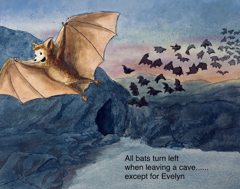
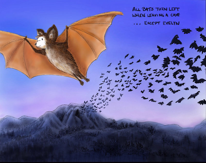
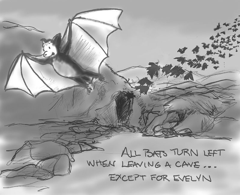
As I mentioned in another thread, I am doing illustrations that I am sending to my five-year-old niece with a story prompt and she’s writing a story to go with the picture. This month’s prompt is “All bats turn left when leaving a cave… except for Evelyn.”
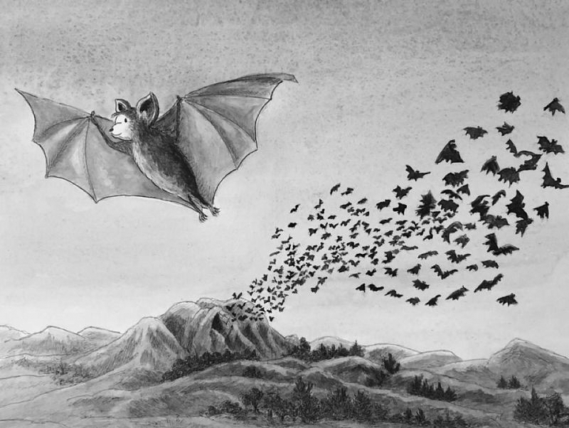
I did a watercolor but in spite of lots of thumbnails, it sill looked bland and empty to me so I enlarged the bat. Before I paint the second one, I thought I’d ask for a critique of the colors. Here’s my first painting:
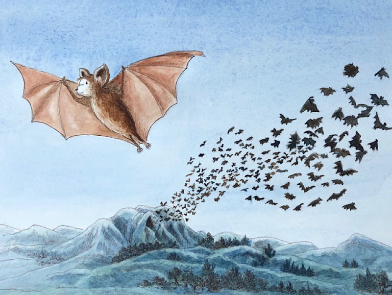
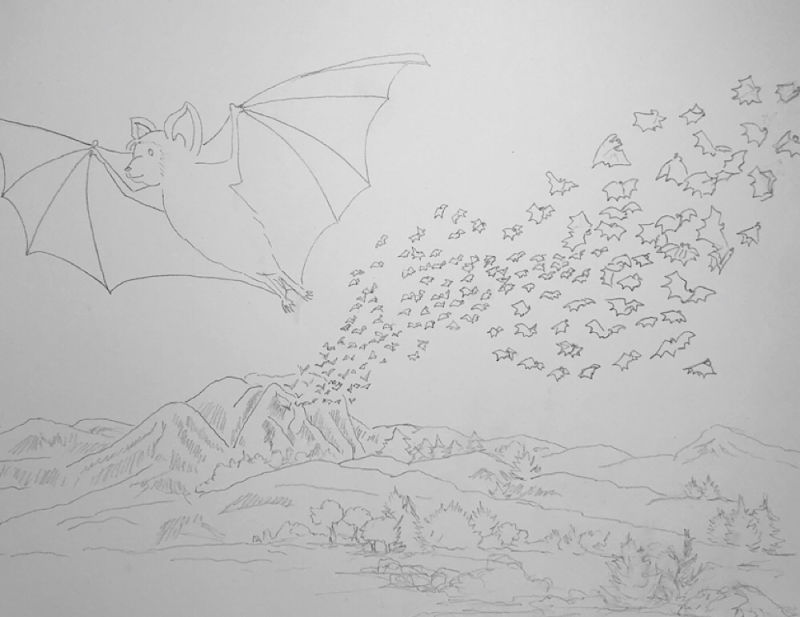
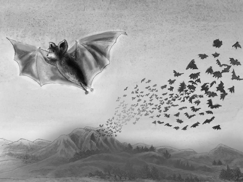
And here’s the redesign (if you can see the light pencil).
I wanted a twilight scene but not so dark that everything is just a silhouette but I don’t know that I got the colors right. Any suggestions or thoughts on the colors or the new design (keeping in mind this will be a traditional line and wash?)
-
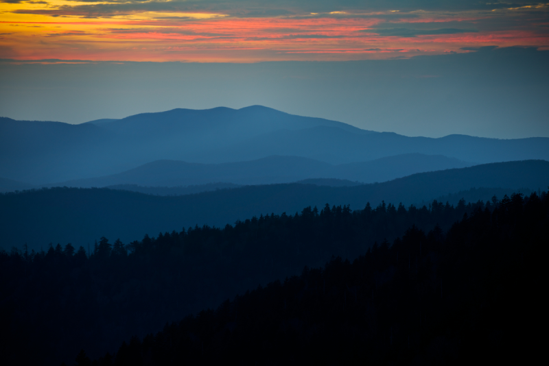
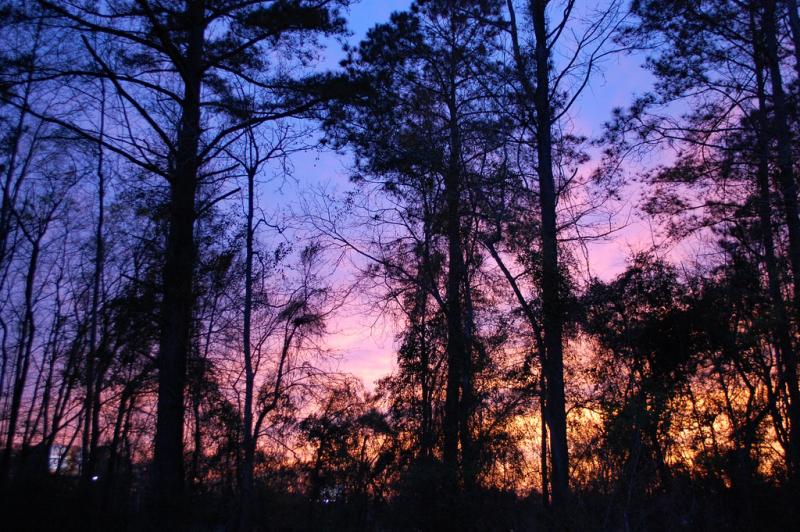
I think you may want to adjust the colors to deeper if you want twilight. The bg is really soft blue. I would go with more sunset colors
EG:
A little gouache mxed in can help with getting intense value contrast with watercolors or even straight from tube paint.
Right now if you grayscale the image you see your foreground bat has the same or lower contrast in value than the mountains behind him. I think you need to turn her up in depth or push back the mountains. If that makes sense?
You did use your warmest color on the foreground bat though. I might put a warm sunset with a cool bat thought. If you really want twilight. -
@thiskatecreates I thought about doing sunset colors but they felt like they were competing with the warm colors of the bat which I had chosen to make her look more appealing, but you are right that the colors don't look like twilight. In fact, the mountains look like they are snow covered right now. When you say "turn her up in depth or push back the mountains," do you mean turn up the contrast on the bat and make the mountains more uniformly dark?
Laurie DeMott
instagram.com/demotlj -
@demotlj There is more than one way to approach it. But the mountains would need to be less broad in value range. So the picture I posted above of mountains in the distance the atmospheric perspective makes the distance a subdued mid grey compared to the bright sunlight and the very dark foreground mountain.
So your foreground bat could have a range from deep almost black blue to a rimlight with almost white sunset color and your further away bats could be deep grey and the mountains could be mid tone grey. You could keep the bright afternoon sky and still make the background mountains almost uniform grey. They just should be soft edged, small value range, limited color.If I'd had a camera handy I would have taken a photo outside tonight. There was a perfect sky for your color needs.
Like a subdued version of this with more cool tones:
-
Does this help?
-
@thiskatecreates That does help. I’ll play around with this in Procreate before I go to the watercolors..
-
Here is my rough Procreate version. Getting closer but still not loving it and not at all sure I have the skills to reproduce this in watercolor. This may be one of those paintings I just chalk up as a learning experience.
-
That's cute. In watercolor you can use something like chinese white that has a bit of opaqueness blended into the color on the mountains to soften them over the ink and do the same over the back inked bats. Then use more watered down colors in the back and midgrounds than in the foregrounds.
You can also up your color harmony by having a bit of whatever color you use in the sky greying out the front bat's orange.
I give up on way too much stuff, so it's hypocritical, but I really think you can get it if you have time!
-
Might you put in a moon to indicate the source of light? Then you could make the mountains lighter because they're lit by the moon. If It's the whitest part of your rendering, having Evelyn contrast with it as a darker colored object might bring more attention to them both because the juxtaposing contrast will attract the eye. Just a thought...
")
-
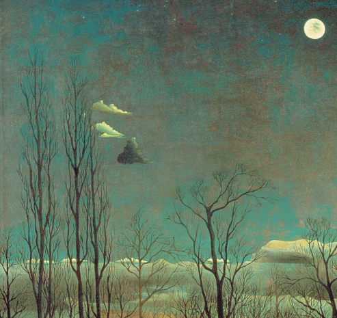
Your question made me think of Henri Rousseau's work: he painted night scenes which are very colourful and only the moon in the sky, the cool grey/blue sky and very high contrast shadows let you know it's night time. I know his art isn't for everyone's taste, but you might want to look it up for reference.
-
@laura said in Watercolor bat - color question:
Henri Rousseau
I looked him up and actually found this detail of one of his paintings ("A Carnival Night"). Is that a bat (or just a cloud?)
@Coreyartus I had debated putting the moon in there and it may help make Evelyn look less pasted on. Right now the contrast between her color and the lack of color in the background is too great I think and a source of light might pull those elements together.
@ThisKateCreates Your comments have really helped me get through my typical, "I can't paint" frustration, and instead I've decided I'm going to use this as a study and do a bunch of paintings in different styles and probably different compositions. We'll see where it goes.
Laurie DeMott
instagram.com/demotlj -
@demotlj I know that frustration too well!! Good luck. I can't wait to see the results.
-
Some great advice floating about!
I'm excited to see what you come up with ^_^
-
So I went completely back to start, watched the SVS video on sculpting characters by Dan Mortensen, made a crude clay model of my bat, and took pictures of it as if it were flying into a setting sun. I immediately saw all of the anatomical and shadow errors I had made in my previous drawing! (I had made a model before but I did it quickly and did’nt think to light it.) If nothing else, I’ve learned a lot about bat anatomy.
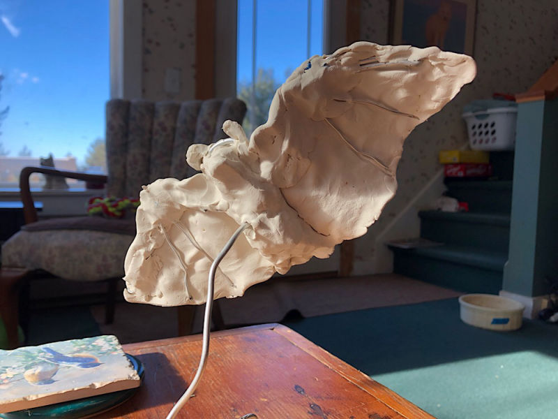
Laurie DeMott
instagram.com/demotlj -
@demotlj Very nice!
-
Here’s a redesign of the composition. I didn’t like the emptiness of the original with the bat just hanging in the air and I thought this might anchor her more. Any thoughts?
Laurie DeMott
instagram.com/demotlj -
@demotlj
Oh yes! So dynamic!
And I think you could totally do this is watercolor. It helps me to do studies about half the size, so the pressure of a final piece isn't on me. And I know we're supposed to layer slowly with watercolor, but maybe try one where put the correct value down for each part of the illustration with a single wash. For example, if the main part of the bat shadows are a level 8 dark, mix up your color and use less water to achieve that value/saturation in single strokes of shadow shapes. Just for fun! It just looks like you're a little hesitant to use a lot of color at once, as I am, and this might help push you past your comfort zones. -
@kaitlinmakes I’m definitely hesitant going too dark in watercolors because I worry that I’ll blow it and can’t undo it. I also have done better with watercolor in my sketch book than in full size paper because it’s less intimidating so I’ll try both of your suggestions. Thanks.
-
I definitely think that last one works. It has a good silhouette.
-
I tried a watercolor version which I tweaked in Procreate but I’m not thrilled with it. I’ll probably also try it as a straight digital and then I’m going to move on because I’m getting a little tired of it! (The font is just a quick placeholder.)