Does this read well?
-
@Chip-Valecek Thank you Chip! I will try your suggestions!
-
@NessIllustration I think it reads very well, I really like the way the text overhangs the leaf on the left page and as long as you can keep the contrast high, the text is easily readable. The only thing that stand out to me is the space between the leaf and the word “prefererais” on the right side of the page. There is enough space for reading, but if feels like there is not enough of a buffer space between the text and leaf. Maybe you could bend the leaf?
-
@inkandspatter Thank you for your advice! I will add some more space there
")
-
Hey! I think it reads very good.The only thing that I realize is that the column(?) on the left side, the brightest one is also catching the eye a little. The lion definitely is the focal point, right? And the eye wanders a bit from the lion to the column and back...I like the composition! Nice work
I am Lotte, theatre teacher, storyteller and illustrator exploring life through art and imagination.
www.lottemalt.com
https://www.instagram.com/lottemalt/ -
@Anna-Charlotte-Lörzer Good spot, you're absolutely right! Thank you Anna!
-
Here is how the final product turned out! Thank you everyone for your suggestions
 The editor liked it very much! This is the last full one I can show until the book is out though, unfortunately!
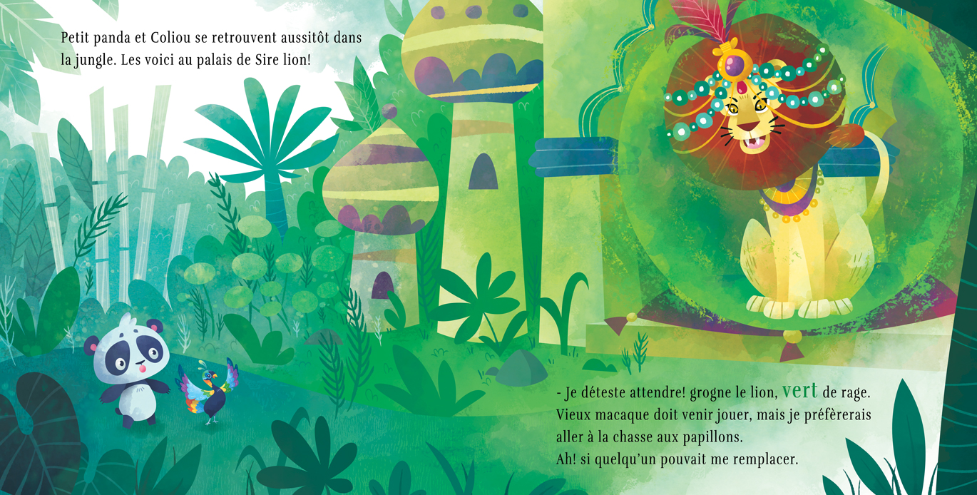
vanessastoilova.com
instagram.com/vanessa.stoilova/Check out my Youtube channel for tips on how to start your career in illustration! www.youtube.com/c/ArtBusinesswithNess
-
Lovely lovely!! I love all the textures!! Well done!!!
-
@NessIllustration aaah that is so pretty Ness.. really good job!
-
Thank you Corey and Jonas!
-
@NessIllustration It looks fantastic!