Up For A Colour Challenge?
-
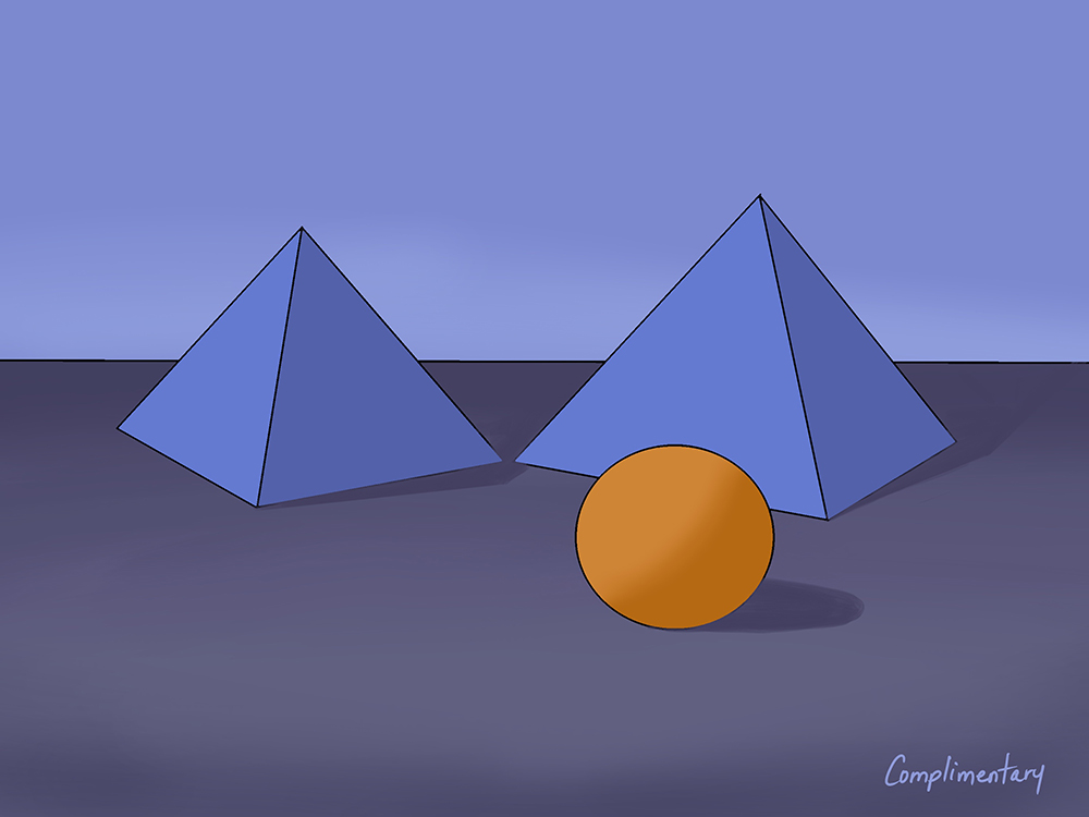
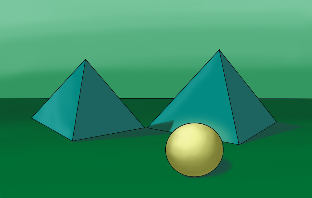
Ok, here's my attempt!
-
Nice! Very smart that you reserved the red strictly for the focal point. That did not even cross my mind, which is exactly why I way hoping to see someone else attempt it. Thank you! I am going to try my complementary scheme again with this approach.
-
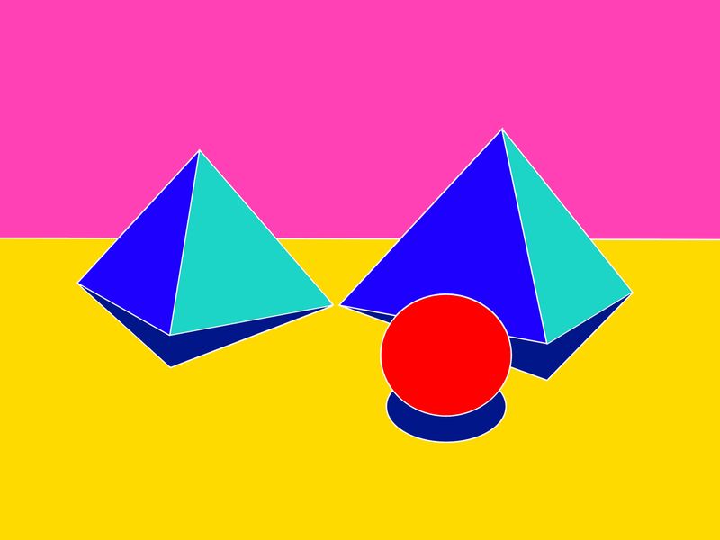
@inkandspatter Thanks! I remember Will Terry talking about how red totally grabs the attention, so I didn't try using it anywhere else. I think I'll try an analog color scheme next and see if I can work with more than two colors at a time!
-
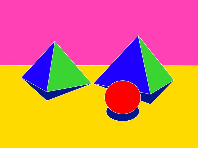
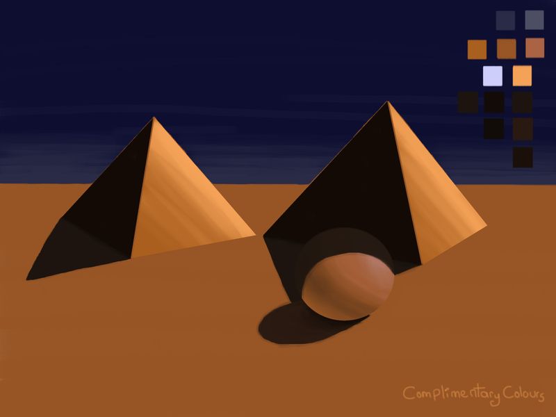
Here is another quick attempt at the complementary scheme, I think it is much more effective.
-
Oh yes, that works much better!
-
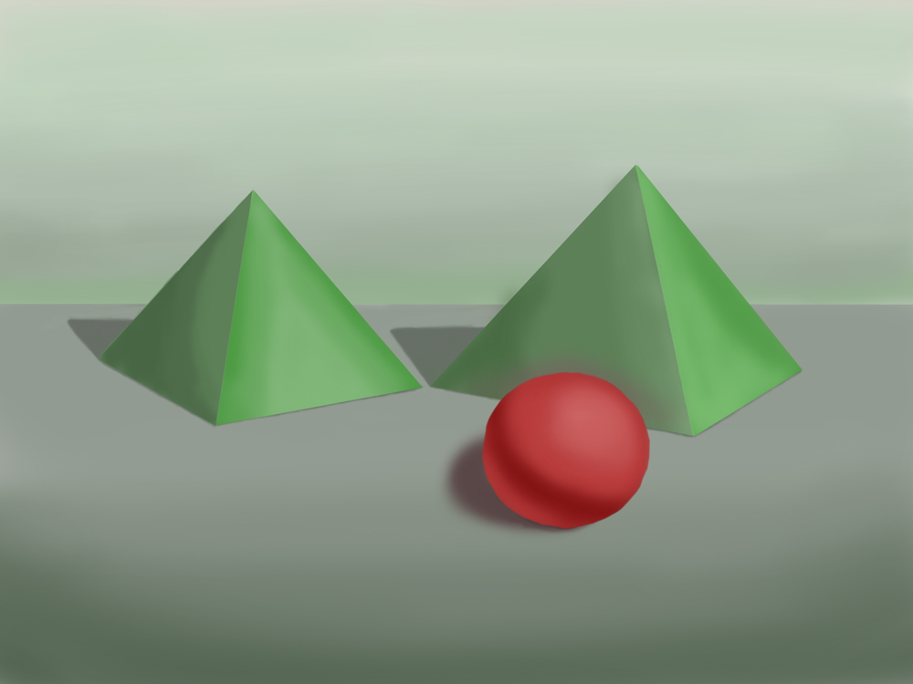
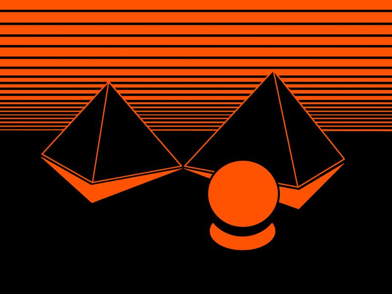
I like this challenge. It's fun to play around with colour. I've been told this is the year for going bold. So here's a couple of bold red floating orbs at dusk in the desert.
-
Monochrome
-
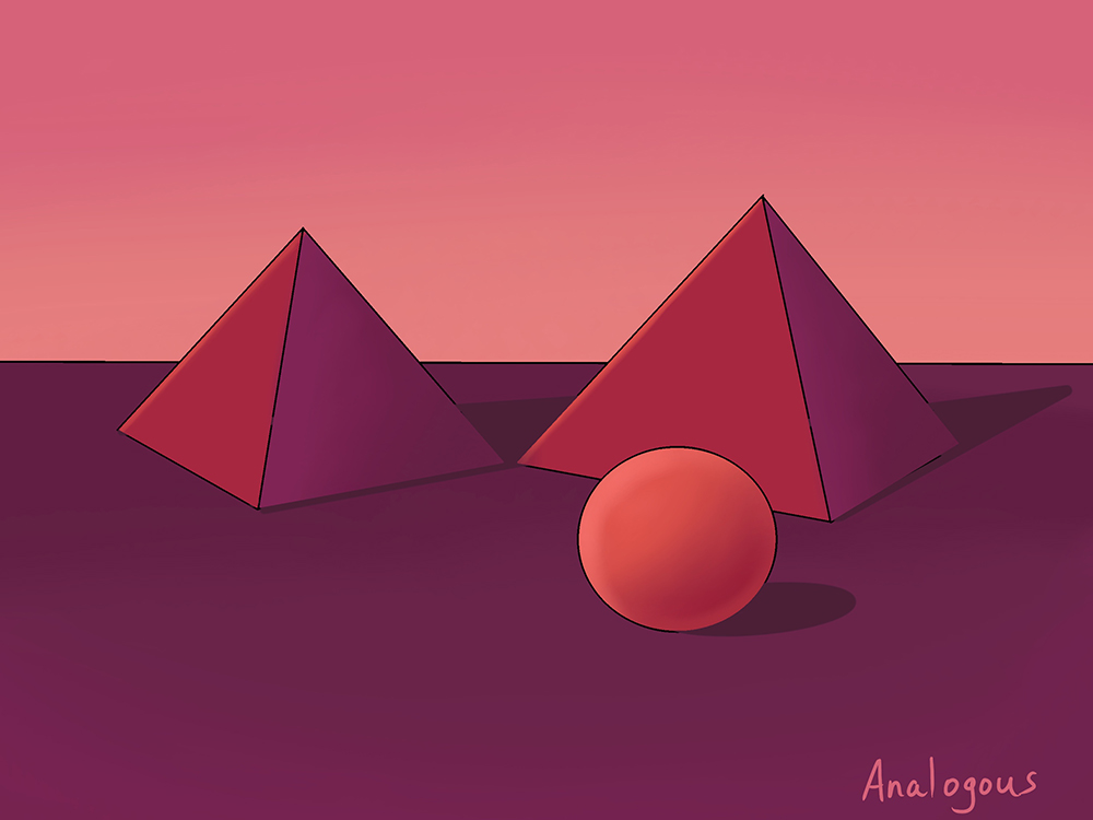
Analogous. I also tried to light it so the shadow would move up the side of the pyramid, but now I'm thinking it looks like a different light direction than the ball.
-
@sigross Very cool, I am going to try and force myself to go bold with my analogous scheme. I’m such a wimp with colour, I need to break out of that.Thanks for sharing!
-
@Kat I really struggle with cast shadows, so I can’t be of much help there, but it looks like the right direction to me. This might be a good exercise for shadows too
") Like the colours, I’m going to try analogous next!
Like the colours, I’m going to try analogous next! -
@inkandspatter do you ever get paint or ink and mix it together in cups with a spatula? It's so satisfying doing that - just whisking it at high speeds!
-
@sigross I have never done that, but I can see how it would be very satisfying. I need to get more playful with colour, that’s a good thing to try.
-
@Kat I think if you're softening the edges of the ball, then soften the other objects shadows too. Softer shadows can result from diffused light. Try it with a bit of tracing paper held slightly in front of your phone camera torch and shine it on an orange or something round, then on a box.
I got a book that Jake recommended Perspective Made Easy by Ernest R. Norling. Every time I get on the tube now, I read it and then look down the carriage to see how the shadows shift and move in perspective.
-
Here is my next attempt. I feel like the process is becoming quicker and easier which is a relief. To challenge myself, I am going to do all of the colour schemes a second time but reverse my approach - dark if I went light the first time, using colours on different objects.
-
So I used a Square Charcoal brush and a Square Pastel brush. I also like to further challenge myself and needed to cast my pyramid shadow over the sphere. I have not worked with the cast shadow of pyramids so I looked over some references. I watched part of the Creative Composition 1 class and listen to the warm colours draw you forward and cool colours push you back and so I made my sphere a more salmon orange (yes I did find the colour in the orange section, lols) . I hope you like it!
My first time including colour swatches to the side.
Instagram: www.instagram.com/heatherboyd.illustration/
Website: https://heatherboydillustration.ca
Shop: https://www.inprnt.com/search/products?q=HeatherBoydIllustration
Ko-Fi: https://ko-fi.com/heatherboydillustrationBe blessed,
-
@Heather-Boyd Nice colours! Smart to look at reference first, I ended up going back and revising all of my pyramid shadows this afternoon.
-
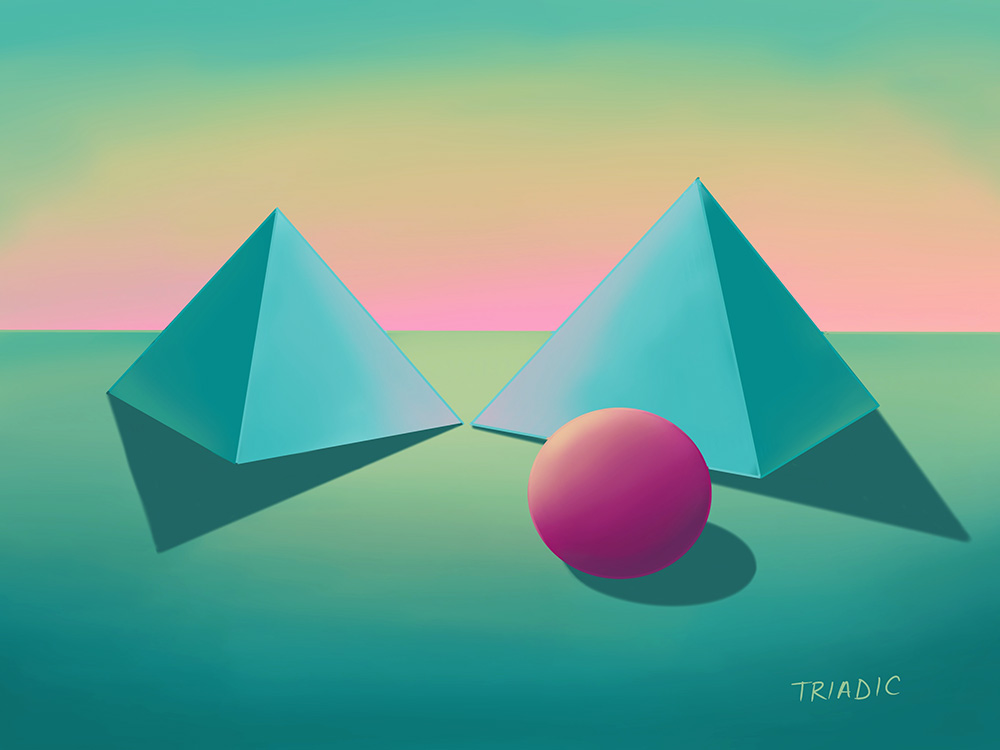
Here is my final attempt. I did a triadic colour scheme this time. I tried to be a little more adventurous and explore a variety of different options.
-
@inkandspatter What does Triadic mean colour wise?
Instagram: www.instagram.com/heatherboyd.illustration/
Website: https://heatherboydillustration.ca
Shop: https://www.inprnt.com/search/products?q=HeatherBoydIllustration
Ko-Fi: https://ko-fi.com/heatherboydillustrationBe blessed,
-
@Heather-Boyd Triadic uses three colours that are equal distance from each other on the colour wheel. If you drew lines connecting the colours you would draw a perfect triangle on the colour wheel.

-
@inkandspatter Oh that's nice, thanks it's really helpful!