Society of Visual Storytelling

    SVSLearn Forums

    • Register
    • Login
    • Search
    • Recent
    • Tags
    • Popular
    • Users
    • Groups
    • Search

    Composition Question

    Artwork
    9
    13
    664
    Loading More Posts
    • Oldest to Newest
    • Newest to Oldest
    • Most Votes
    Reply
    • Reply as topic
    Log in to reply
    This topic has been deleted. Only users with topic management privileges can see it.
    • sheri_p79
      sheri_p79 last edited by

      Hello
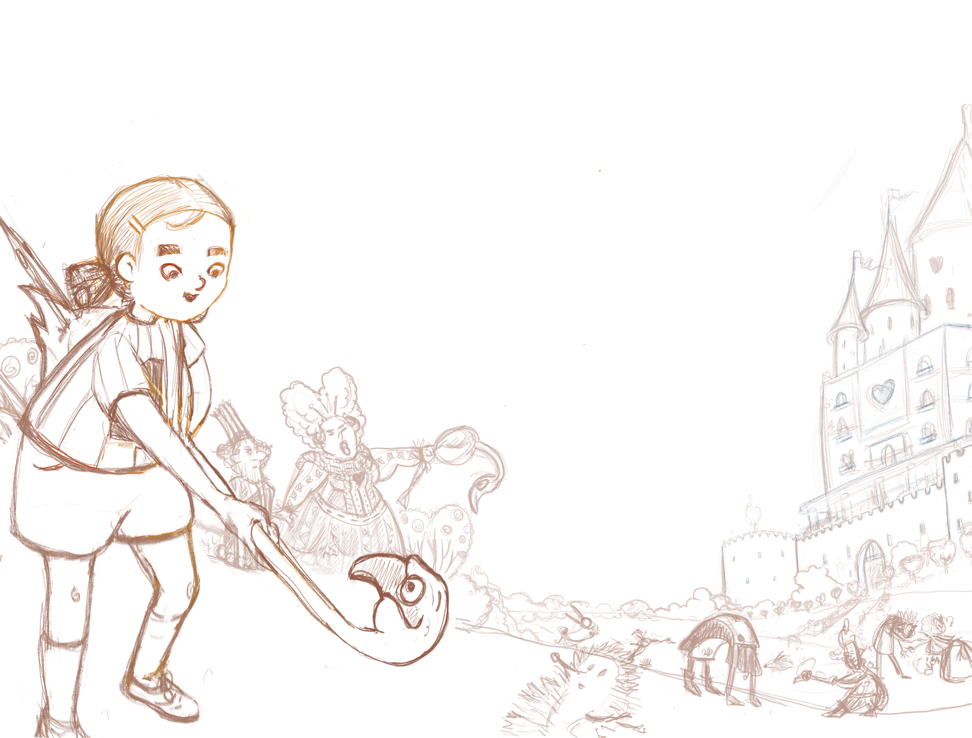
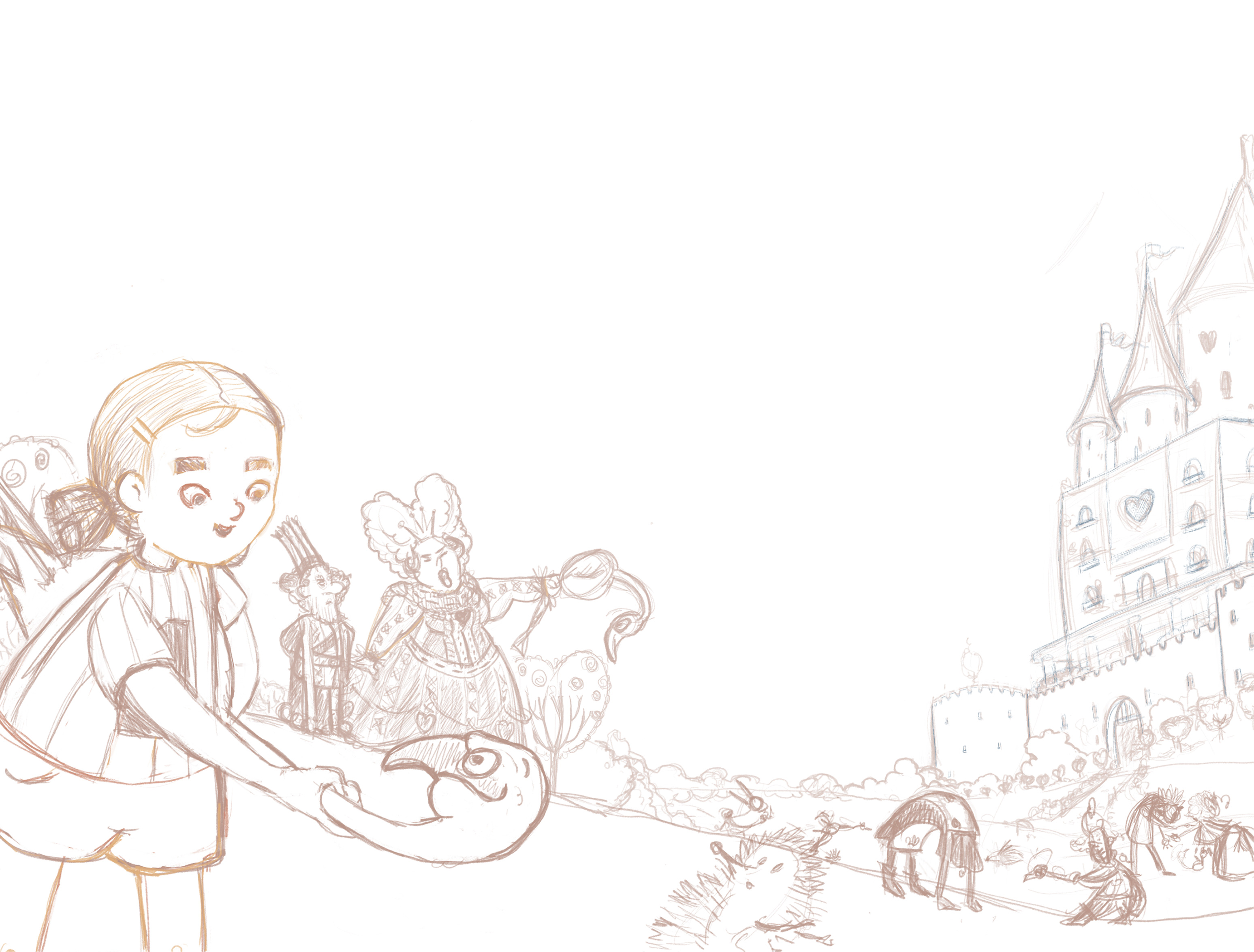
      I'm working on some roughs for a contemporary Alice in wonderland spread, and wanted to get some on opinions on what composition works best, the version Alice Is cropped closer or the full body version? Thanks in advance!
      full body cropped

      http://sheripalmerillustration.com/
      https://www.instagram.com/sketchybears

      Coreyartus peteolczyk Heather Boyd 3 Replies Last reply Reply Quote 1
      • Coreyartus
        Coreyartus Moderator @sheri_p79 last edited by

        @sheri_p79 In my opinion, the full version looks better. The "mallet" that Alice is using looks like a baseball bat in the lower version because we can't see the ground. The hedgehog is clearly the target in the fuller version, but it's not so clear in the lower cropping. Compositionally, having the lower one cut through Alice's knees where it does makes the image feel "chopped". You could even go so far as to finish Alice's foot in the upper version so it grounds her a bit more... Just my 2¢ 🙂

        Children's Illustration Portfolio: https://www.coreyartusillustration.com
        Art Portfolio: https://www.coreyartusimagery.com
        Mastodon: https://mindly.social/@Coreyartus
        Pixelfed: https://pixelfed.social/Coreyartus

        1 Reply Last reply Reply Quote 3
        • peteolczyk
          peteolczyk @sheri_p79 last edited by

          @sheri_p79 I prefer the first one because of the way the image reads. It looks like things are ready to happen, with the way her legs are poised, soft at the knee. And the position of the flamingo, looks like he’s ready to be used or cause havoc or something with that expression .
          ( I love the look on that flamingos face)
          Which was the first version?

          www.peteolczykillustrations.com

          www.instagram.com/pete_illustrations

          1 Reply Last reply Reply Quote 1
          • sheri_p79
            sheri_p79 last edited by

            Thanks @Coreyartus @peteolczyk The cropped version was first and it was my preference ( not just because i didn't have to worry drawing the feet! I liked the way it flowed ) but after some feedback from my husband (who i didn't want to believe 😬 ) I thought i'd best get a second opinion. I get what you guys are saying it does read better - I've probably just been looking at it too long! Thanks again 🙂

            http://sheripalmerillustration.com/
            https://www.instagram.com/sketchybears

            peteolczyk 1 Reply Last reply Reply Quote 1
            • peteolczyk
              peteolczyk @sheri_p79 last edited by

              @sheri_p79 I’m the same every time I do a drawing and my wife is my best critic, she always tells me what I don’t want to hear.

              www.peteolczykillustrations.com

              www.instagram.com/pete_illustrations

              1 Reply Last reply Reply Quote 1
              • jennyeickbush
                jennyeickbush last edited by

                I like the first, full bodied, version as well. Having Alice in that larger empty space of sky seems to give the character more room to breathe. It felt a little too scrunched in the cropped sketch. This is such a great idea! I love where you're going with it!

                1 Reply Last reply Reply Quote 1
                • Sas
                  Sas last edited by Sas

                  I like the first version better too. It makes Alice pop more while in the second more crunched one, she blends in with the queen and her entourage. Love your idea! And the flamingo 😂

                  https://www.instagram.com/sasmakkinje/

                  1 Reply Last reply Reply Quote 1
                  • Heather Boyd
                    Heather Boyd @sheri_p79 last edited by Heather Boyd

                    @sheri_p79 I like the first one because I feel like there is more breathing space for Alice. I just finished reading Alice In Wonderland! Wonderful and a bit cluttered dream she had, similar to mine lols.

                    However watch out for the end of the croquette mallet it looks too tangent close to the edge of your paper.

                    Instagram: www.instagram.com/heatherboyd.illustration/
                    Website: https://heatherboydillustration.ca
                    Shop: https://www.inprnt.com/search/products?q=HeatherBoydIllustration
                    Ko-Fi: https://ko-fi.com/heatherboydillustration

                    Be blessed,

                    1 Reply Last reply Reply Quote 2
                    • sheri_p79
                      sheri_p79 last edited by

                      @jennymwine @Sas @Heather-Boyd thanks for your feedback all! Yeah I'm not sure what to with the end of the flamingos legs , looks like I'm determined to avoid drawing feet 😃

                      http://sheripalmerillustration.com/
                      https://www.instagram.com/sketchybears

                      Heather Boyd 1 Reply Last reply Reply Quote 0
                      • Heather Boyd
                        Heather Boyd @sheri_p79 last edited by

                        @sheri_p79 perhaps wrap it around Alice -like the flamingo has a tight grip on her. 🙂

                        Instagram: www.instagram.com/heatherboyd.illustration/
                        Website: https://heatherboydillustration.ca
                        Shop: https://www.inprnt.com/search/products?q=HeatherBoydIllustration
                        Ko-Fi: https://ko-fi.com/heatherboydillustration

                        Be blessed,

                        1 Reply Last reply Reply Quote 0
                        • RobinCampbellArt
                          RobinCampbellArt last edited by

                          Hi Sheri- The top image is the better one. You’ve got lots of good action happening. The queen is stealing the show just a little because she’s so expressive with her yelling in the middle ground and taking attention away from Alice. Perhaps make Alice more dramatic, either concentration on hitting the hedgehog, or surprise at the bird head club coming to live. Great composition going on.
                          🙂

                          1 Reply Last reply Reply Quote 0
                          • Lucelfo
                            Lucelfo last edited by

                            I think the first image works better. I would move the queen group slightly on the right as to me it feels closer to Alice... Good work! I like how the flow of the composition brings the eye round!

                            1 Reply Last reply Reply Quote 0
                            • Kristin Wauson
                              Kristin Wauson last edited by

                              I like the first one better. Cool scene! Can’t wait to see how it turns out.

                              1 Reply Last reply Reply Quote 0
                              • First post
                                Last post