Society of Visual Storytelling

    SVSLearn Forums

    • Register
    • Login
    • Search
    • Recent
    • Tags
    • Popular
    • Users
    • Groups
    • Search

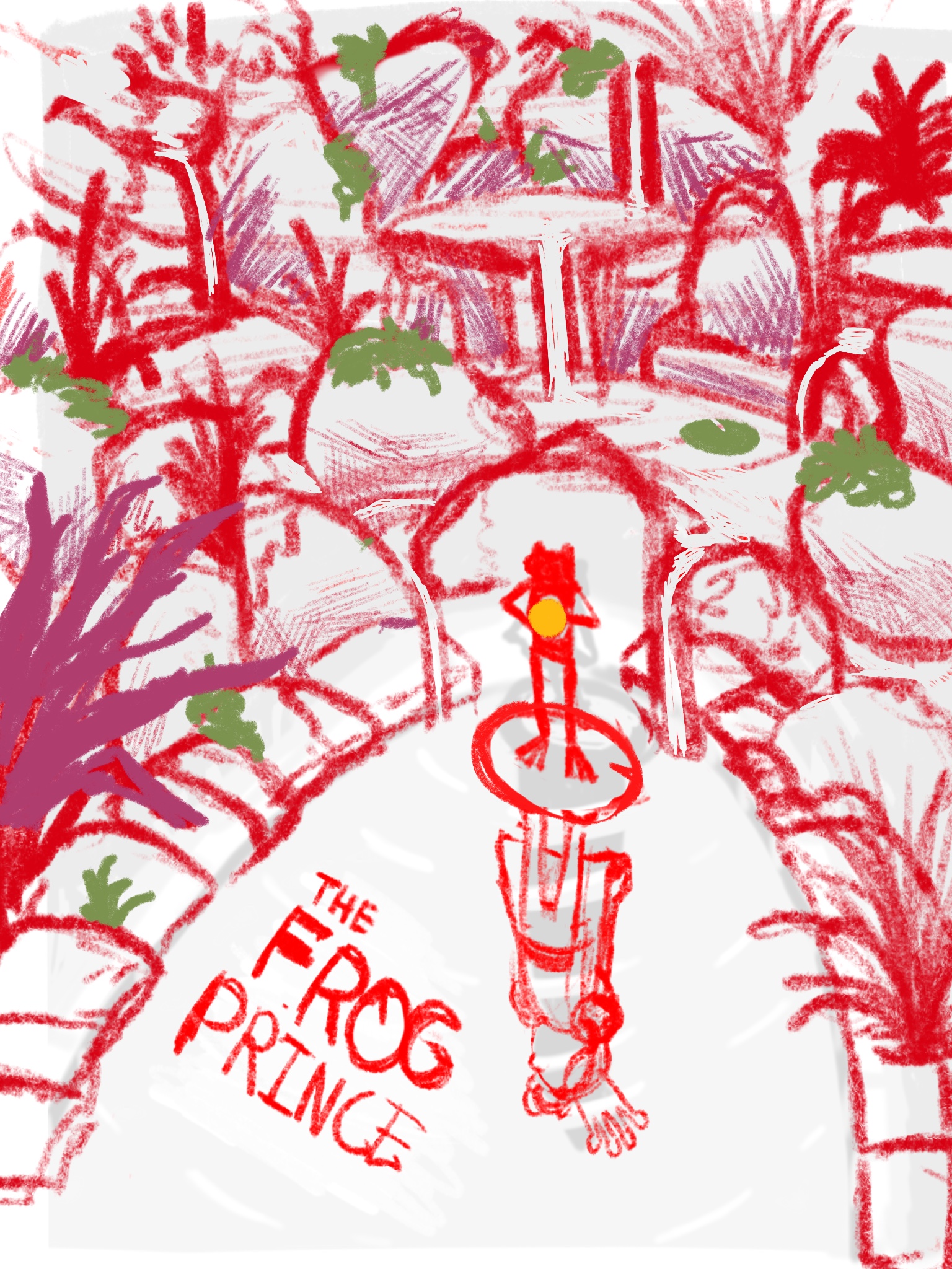
    WIP March book cover composition. Critiques welcome.

    Artwork
    21
    79
    4650
    Loading More Posts
    • Oldest to Newest
    • Newest to Oldest
    • Most Votes
    Reply
    • Reply as topic
    Log in to reply
    This topic has been deleted. Only users with topic management privileges can see it.
    • ArtofAleksey
      ArtofAleksey @CobaB last edited by

      @CobaB no i will color digitally. I will eventually learn how to paint better but because of time I’m only inking traditionally then coloring on my ipad

      instagram and twitter: @artofaleksey
      alekseyillustration.com

      1 Reply Last reply Reply Quote 1
      • ArtofAleksey
        ArtofAleksey last edited by ArtofAleksey

        So the last couple days I’ve been doing some research and asking people I know that understand art and art history better what it is they like about my art. Trying to hone in on when does my art “work” and some of the feedback I’ve been getting on my pieces is that it reminds them of older illustrations done in the 1900s but more cartoony so After doing some research and a few renditions I think I understand it a tiny bit better.
        So here is my rough sketch, what iz thoughts?
        F11A54C2-CC67-4153-BD32-A92A69C47088.jpeg

        instagram and twitter: @artofaleksey
        alekseyillustration.com

        Sas CobaB andersoncarman 3 Replies Last reply Reply Quote 2
        • Sas
          Sas @ArtofAleksey last edited by

          @Aleksey This looks great! I cant wait to see you work on this further.

          https://www.instagram.com/sasmakkinje/

          1 Reply Last reply Reply Quote 1
          • CobaB
            CobaB @ArtofAleksey last edited by

            @Aleksey looks good, but I hope the background won't distract from the main detail and title x

            ♥ Illustration : https://www.instagram.com/coba_illustration/

            ArtofAleksey 1 Reply Last reply Reply Quote 0
            • ArtofAleksey
              ArtofAleksey @CobaB last edited by

              @CobaB if i do this right it should draw your eye to the pond firsr. But even if it doesnt im having lots of fun with this piece

              instagram and twitter: @artofaleksey
              alekseyillustration.com

              1 Reply Last reply Reply Quote 1
              • andersoncarman
                andersoncarman @ArtofAleksey last edited by

                @Aleksey I like this most recent thumbnail except for one thing. The title. I love this as an illustration if you take the title out. but when you add it in, it just becomes too bottom heavy. As an illustration, I like that it has that breathing room on the top third but it is so overcrowded down at the bottom now. I would suggest placing the title up in the top third. not just because that is where title normally goes, but your composition is made for it! you could even make the title out of the rocks and have the water flow around them into the pond! Also, don't forget the author "Brothers Grimm"

                Love this! such a clever idea! can't wait to see it complete!

                Cheers,
                Anderson Carman

                https://www.andersoncarman.com/
                https://www.instagram.com/andersoncarman/

                ArtofAleksey 1 Reply Last reply Reply Quote 0
                • ArtofAleksey
                  ArtofAleksey @andersoncarman last edited by

                  @andersoncarman these are some good points. Thanks ill try that out. Leaving the bottom open makes it look a lot better.

                  instagram and twitter: @artofaleksey
                  alekseyillustration.com

                  1 Reply Last reply Reply Quote 0
                  • Laurie
                    Laurie last edited by Laurie

                    So interested to see how this turns out! Love all the changes you have already made and I really like the reflection concept!

                    www.facebook.com/LMuggliArt
                    www.instagram.com/lmuggliart/
                    www.lmuggliart.etsy.com

                    1 Reply Last reply Reply Quote 1
                    • ArtofAleksey
                      ArtofAleksey last edited by

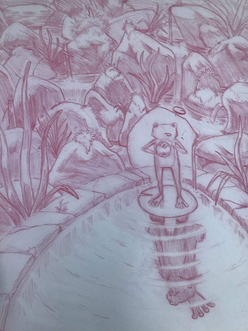
                      Ok so here is the pre inked rendered pencil version.
                      Im slowly learning what my preferred drawing process is. It seems that it’s banging my head against something until i figure it out 😛 anyone else share that process?

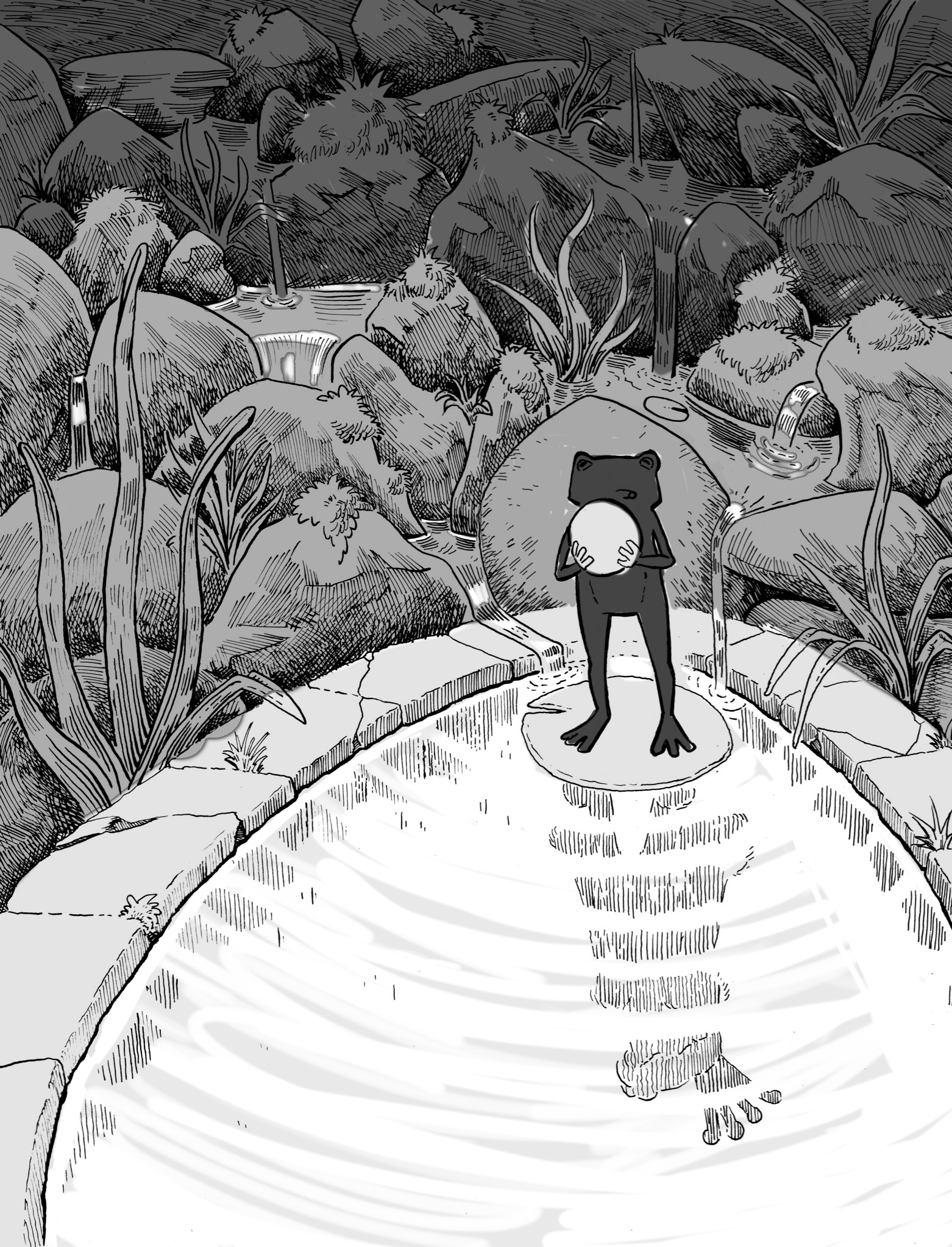
                      So what im going for is im trying to surround the scene with lots of details and tones to make the eyes focus on the frog/reflection because the frog is surrounded by less detail and tone.

                      Is that working? If not, what is working?
                      CD141A85-09FF-48A3-97BB-4CDAB967FA95.jpeg

                      instagram and twitter: @artofaleksey
                      alekseyillustration.com

                      Heather Bouteneff 1 Reply Last reply Reply Quote 2
                      • Heather Bouteneff
                        Heather Bouteneff @ArtofAleksey last edited by

                        @Aleksey I love this, especially the clever reflection, the ripples on it like it's representing disturbed life (like interrupted from being a human) and especially that you put the pond up against a natural little waterfall.
                        My only other comments are so nitpicky and probably just me so honestly you can ignore them- but I wish the ball was bigger, unless this is a person size frog the Princess has lost her golden marble. I am not convinced his expression matches the personality he had in the story either. Here he looks lost and timid and sweet and I love him, but the frog prince was a bit more like a clever bargainer

                        https://heatherbouteneff.com

                        ArtofAleksey 1 Reply Last reply Reply Quote 1
                        • ArtofAleksey
                          ArtofAleksey @Heather Bouteneff last edited by

                          @Heather-Bouteneff these ar good point! Yeah he was but there have been several adaptations apparently sometimes the frog doesn’t suck.

                          instagram and twitter: @artofaleksey
                          alekseyillustration.com

                          1 Reply Last reply Reply Quote 1
                          • ArtofAleksey
                            ArtofAleksey last edited by

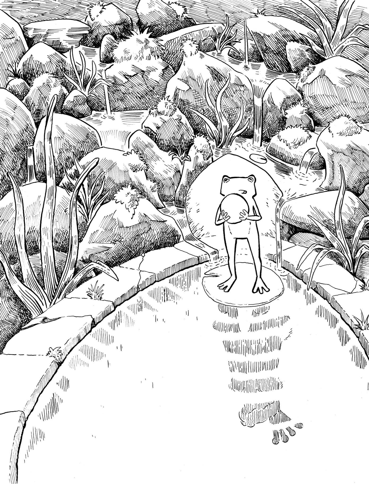
                            Ok here is the inked version. D7EFA302-69EF-47C0-998E-706C448D4103.jpeg

                            instagram and twitter: @artofaleksey
                            alekseyillustration.com

                            1 Reply Last reply Reply Quote 1
                            • ArtofAleksey
                              ArtofAleksey last edited by

                              And value guesstimates 930B6633-EBCA-4999-AD0C-AA89E4E49391.jpeg

                              instagram and twitter: @artofaleksey
                              alekseyillustration.com

                              NessIllustration 1 Reply Last reply Reply Quote 5
                              • NessIllustration
                                NessIllustration Pro @ArtofAleksey last edited by

                                @Aleksey I think there is an opportunity here for you to be much bolder with your values and make contrasts that stand out from afar (as a book cover should). The pool can be a brilliant white, the frog a much darker figure standing out over it. I'm also not sure I understand the shape behind the frog. Is this a rock? It seems to be melting into the water of the pool, but it's not water because on either side we see trickles of water. What is that?

                                vanessastoilova.com
                                instagram.com/vanessa.stoilova/

                                Check out my Youtube channel for tips on how to start your career in illustration! www.youtube.com/c/ArtBusinesswithNess

                                ArtofAleksey 1 Reply Last reply Reply Quote 0
                                • ArtofAleksey
                                  ArtofAleksey @NessIllustration last edited by

                                  @NessIllustration thanks for the feedback. it is a rock yeah I’m trying to use it as a framing device I for the frogs figure. Is there another way you would approach that?

                                  instagram and twitter: @artofaleksey
                                  alekseyillustration.com

                                  NessIllustration 1 Reply Last reply Reply Quote 0
                                  • NessIllustration
                                    NessIllustration Pro @ArtofAleksey last edited by

                                    @Aleksey I think what's throwing me off is that the rock is a different value than the other similar rocks around it, and is instead the same value as the pond and its surrounding tiles. I'm also not sure of the rock's structure. The lines of where it lays on the ground are enveloping it and hiding the structure of its base. The lack of lines inside of it (while I'm guessing you omitted them to clarify the frog) makes it hard to see what kind of volume this is, and which parts are jutting in or out.

                                    vanessastoilova.com
                                    instagram.com/vanessa.stoilova/

                                    Check out my Youtube channel for tips on how to start your career in illustration! www.youtube.com/c/ArtBusinesswithNess

                                    ArtofAleksey 1 Reply Last reply Reply Quote 1
                                    • ArtofAleksey
                                      ArtofAleksey @NessIllustration last edited by ArtofAleksey

                                      @NessIllustration yeah that makes sense I did that intentionally but maybe I can add a bit more tone onto it with line I want to keep it minimal.

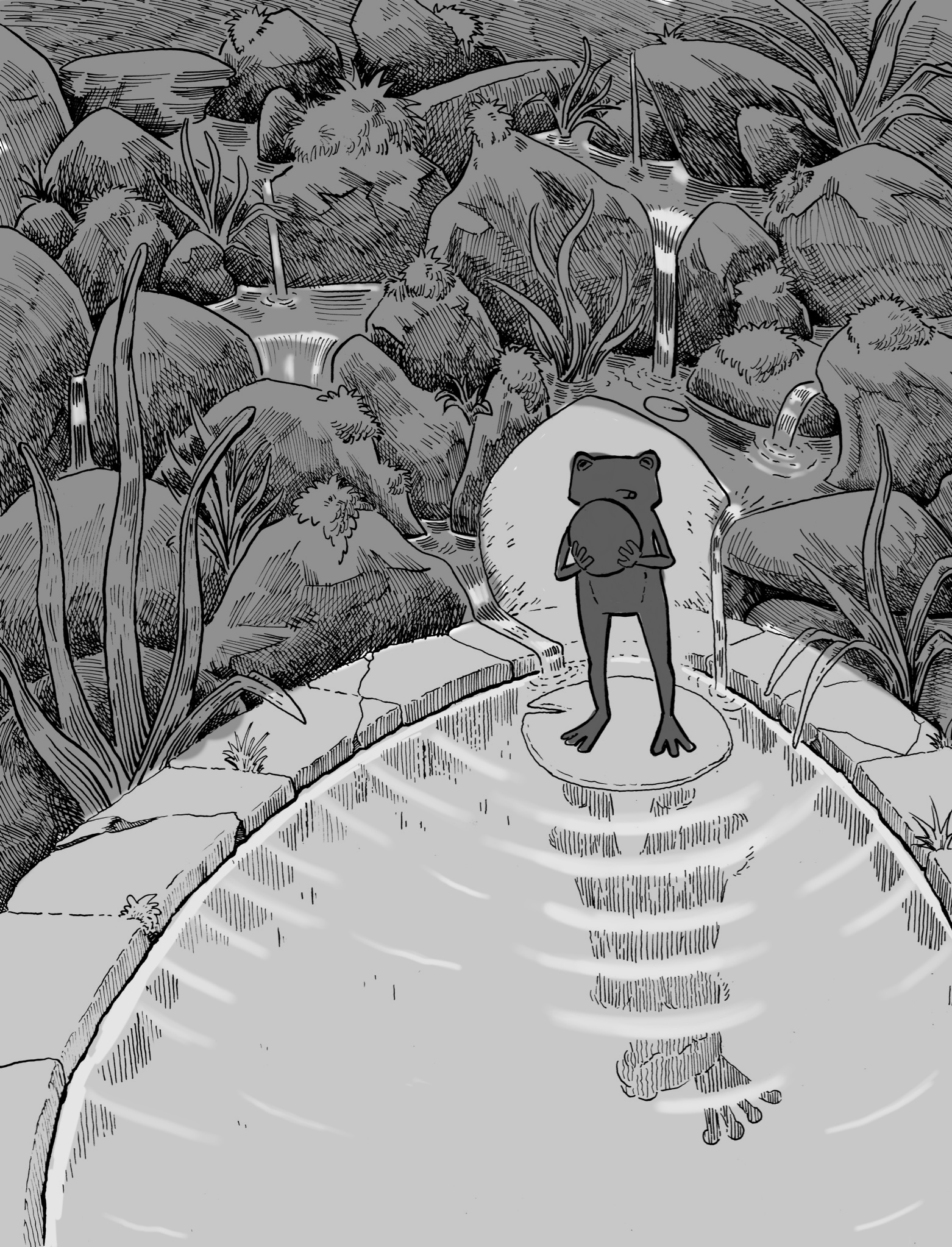
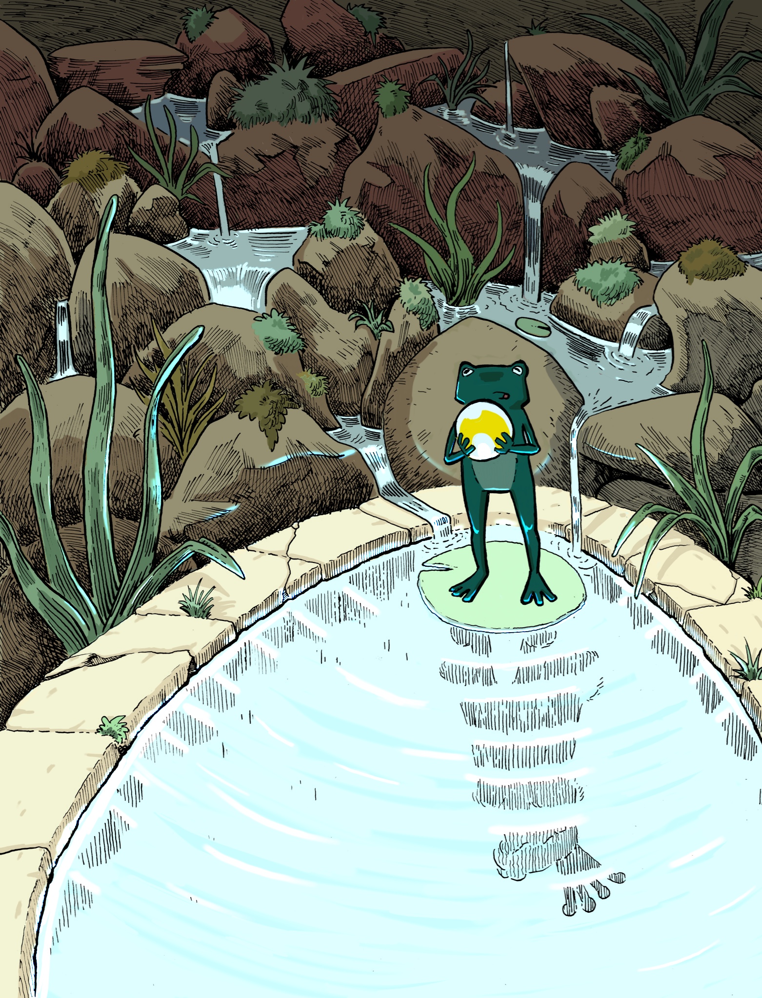
                                      What do you think of these values? I might darken it On the top rocks

                                      325BC175-107C-48E9-935D-BC6D7EC9929C.jpeg

                                      instagram and twitter: @artofaleksey
                                      alekseyillustration.com

                                      MichaelaH 1 Reply Last reply Reply Quote 5
                                      • NessIllustration
                                        NessIllustration Pro last edited by

                                        @Aleksey Ohhhhh nice, that pops so much more!

                                        vanessastoilova.com
                                        instagram.com/vanessa.stoilova/

                                        Check out my Youtube channel for tips on how to start your career in illustration! www.youtube.com/c/ArtBusinesswithNess

                                        1 Reply Last reply Reply Quote 1
                                        • MichaelaH
                                          MichaelaH @ArtofAleksey last edited by

                                          @Aleksey I like the new value also very much, looks great

                                          https://www.instagram.com/michaelaheimlich/
                                          https://www.heimlich-illustration.de/

                                          1 Reply Last reply Reply Quote 1
                                          • ArtofAleksey
                                            ArtofAleksey last edited by

                                            Ok whew.. what do you guys think? I had some trouble with the shining water because I ended up inking with a different light source in mind.p but I like this too

                                            8B99DA1D-B611-483B-A942-88419999F678.jpeg

                                            instagram and twitter: @artofaleksey
                                            alekseyillustration.com

                                            MichaelaH 1 Reply Last reply Reply Quote 3
                                            • First post
                                              Last post