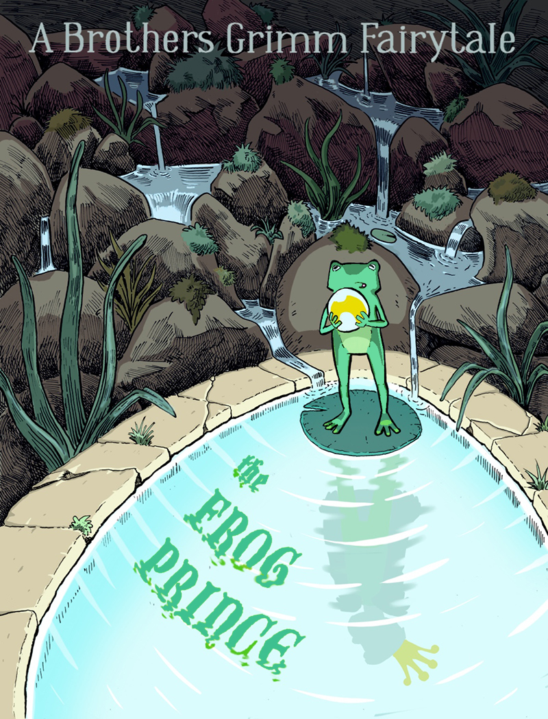
WIP March book cover composition. Critiques welcome.
-
@Aleksey Good question! Does a book cover get a pass on the rules which generally avoid symmetry?
I appreciate your next attempts-but I don't think they're as strong as the first one. I didn't pick up on it in the first one that the shadow of the frog has such a long narrow silhouette, perhaps because you drew more detail on it. In your next attempts, it reads off to me. Does a shadow ripple out so long? Yes, perhaps, but I think it gets thinner and weaker as it extends out. Maybe there's something off with the perspective a bit. The vantage point is up above the top of the frog, looking down at him. From that angle, what would the shadow look like? (consider my comments on perspective to be coming from an avid novice!) -
@Susan-Marks yeah I actually thought about this a lot and ended up making it look less obvious. This wasnt on putpose i had trouble figuring out how to make a reflection with ripples that organically extended from the lilipad, communicated that its a prince, and didnt seem out of place. So im gonna try and play with it just a tiny bit, maybe the crown, to make it look more obvious. Because it does not look like how i initially intended
-
Ok I’m actually really happy with this.
I’m gonna figure out the font next.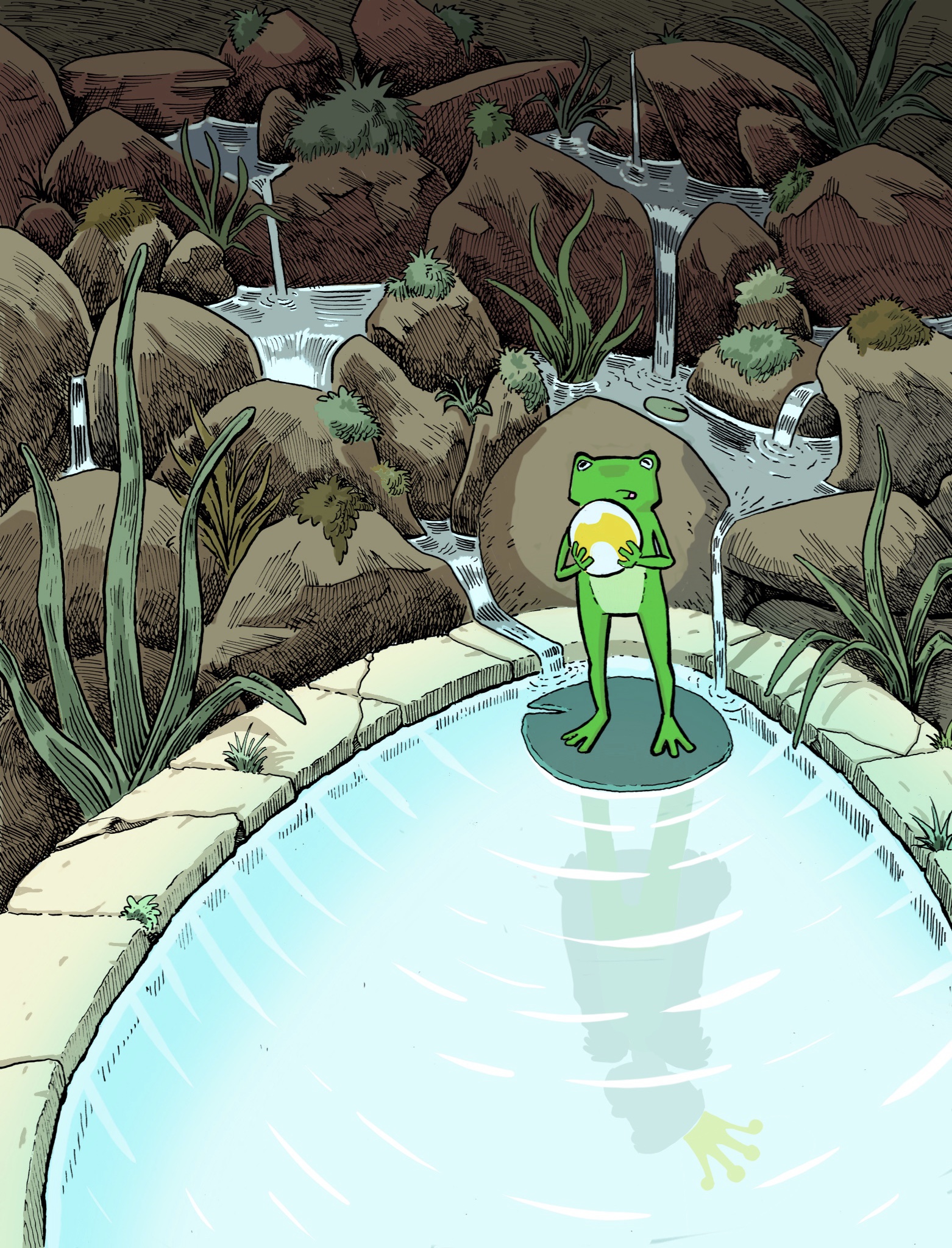
instagram and twitter: @artofaleksey
alekseyillustration.com -
Hi! Thanks so much for sharing your process with this. It's so helpful to learn from. I noticed in your sketches that the title is to go in the water, but as I was looking at the progress you've made here, the thought came to mind to suggest playing around with the title above the frog, and the author/illustrator's name in the water. At this point, the rendering you've done on the trickling water and rocks is so awesome that after I see the frog, my eye wants to look at all of that detail (even before looking at the reflection in the water). It brings the question to my mind, "What role do the rocks play in the story?" because they are given so much area of the cover. If they're not important, I would crop the page differently or put the title on top of them. Perhaps this is already your plan, in which case, thank you for reading through this message even though it doesn't give you a new topic to think about.
")
-
@KathrynAdebayo oh no thank you you’re the second person to suggest this. This helps me think about my choices more. The reason i rendered it so much was because I talked to my partner about children’s books and one of the things she told me was that when she was little she really enjoyed looking at books with lots of lines and details. When her mom would read to her she would take the book from her and look at all the details and pictures. They read a lot of old fairytales that were very rendered. So I started looking at drawings from the early 1900s for inspiration. I want people to look at the cover and not want to look away until they’ve absorbed the different parts then I want them to wonder if they saw it all. I’m gonna play around with the title because im not so good at fonts.
-
@Aleksey I like this so much better (or yes, subsequent drafts make a difference). Now the shadow reads much better to me and enhances the image rather than making my mind say "what?"
I love the texture in the background, and how it also shadows the stone wall of the pond into the water.
So, your main focal points (frog, lily pad, pond water) are in a different color palate (much more primary colors) and are without texture. This works for me in the sense of contrast, but I'd like some kind of texture in the focal points so that they seem as cared for as the background. I could see "bubbles"-some kind of roundish texture in the pond. Maybe something subtle on the frog body.
I see that others have suggested something similar.
(And I'm one who loves the lines and details like your partner. Woodblocks are among my favorites.) -
@Susan-Marks thanks! Interesting point i will try to do that without overdoing it. I changed things about a bit and will try to upload an updated version tonight.
-
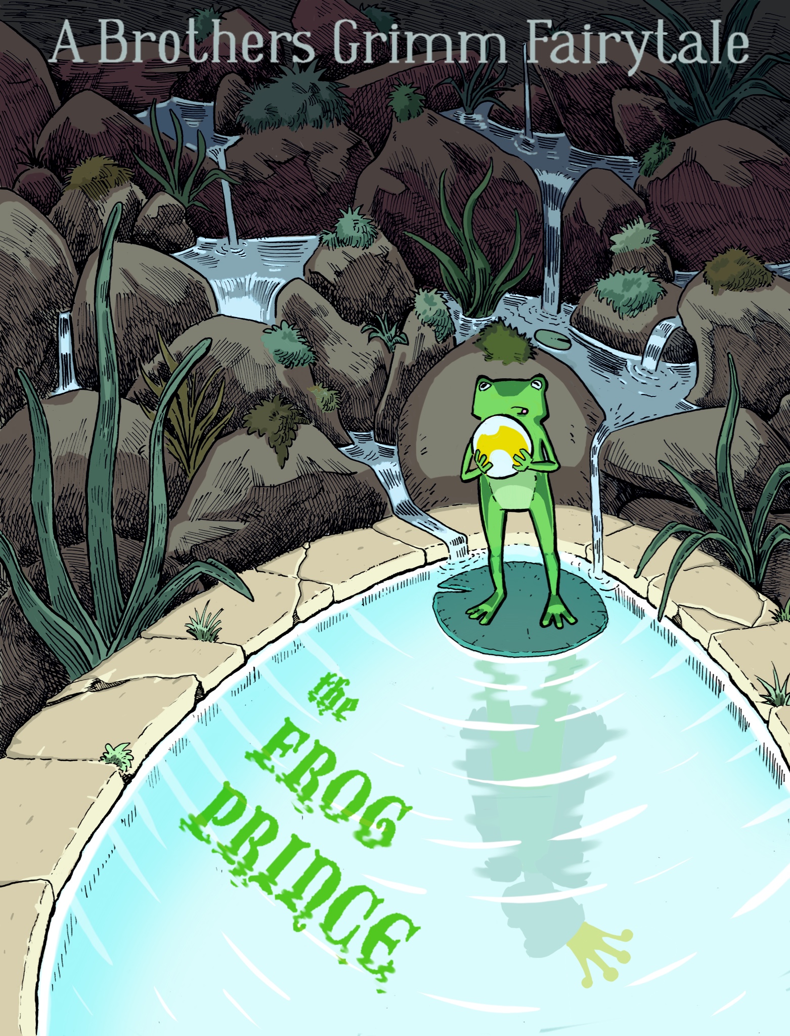
@Susan-Marks blorg ok I think this color palette matches better (maybe?) I tried to add some texture on the frog but hated it! I also got rid of the tones on the inner side of the bricks and reverse the tones so that it looks like the water is a bit glowy. I’m not very good at colors so this was definitely a struggle. I didn’t wanna overdo the font in the water so I only made the bottom of the font look watery so it’s still separate. Is the crown I. The water saturated enough? Do the colors work better?
Does this look done?
instagram and twitter: @artofaleksey
alekseyillustration.com -
I personally don't like the font so much, I read "bridge" and not "prince" at the first time and the "the" is not readable for me, maybe with partitial black lines it will fit better and be better readable?
But more, I would prefer, if the font goes with the arcs of the pond, not so straight, all your design is about arcs.
Or better, somebody already said it, how would it look with the text above the frog? -
@Aleksey This is so beautiful! The frog really stands out and i love how you worked his green little silhouette into the prince. So creative!!!
-
@Aleksey I say DONE! Love how the font gets extra ripples underneath. It makes it look as if theyre flowing on top of the water. Beautiful work. So much fun to see you develop this piece of art. All the best luck in the competition!

-
@MichaelaH hmm interesting i will try to arc it and see what happens
instagram and twitter: @artofaleksey
alekseyillustration.com -
@Aleksey Maybe only little bit arc and little bit lines? After second look I like it more and more. Also like the bluring of the font in the water
-
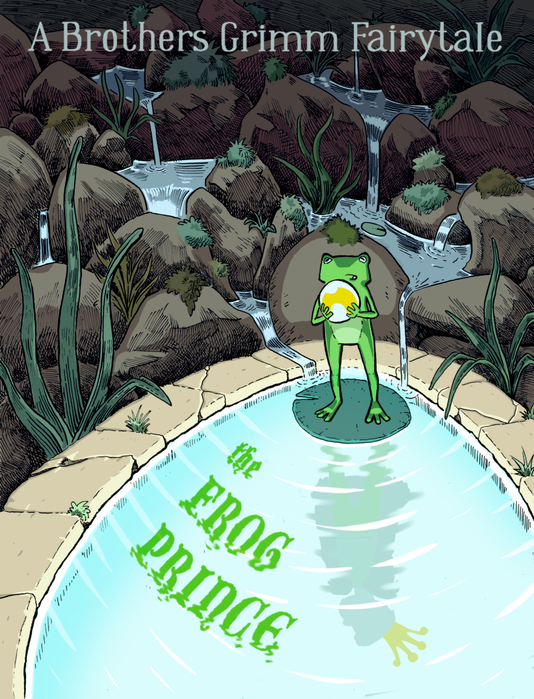
@Aleksey The colour of the frog and title are very jarring against the background. When I cover the frog and title and view only the background, it is very peaceful and balanced. I think it is the hue that is the problem.
-
@inkandspatter hue? You mean green? Like is it too bright?
instagram and twitter: @artofaleksey
alekseyillustration.com -
@Aleksey I think it is the specific green that you chose, it does not seem to play nicely with the other greens. Your other greens seem a little closer to blue on the colour wheel, where this one I think would be closer to yellow. It could also be the saturation though, the background colours are all very desaturated and the frog and title seem highly saturated. One reason I was thinking hue rather than saturation is because the blue around the edge of the pond is highly saturated but still works beautifully.
-
@inkandspatter yeah i want that contrast between the spaces. I’m trying to make the well and frog feel mystical and out of place from the environment because they’re magical. Im worried its not working
instagram and twitter: @artofaleksey
alekseyillustration.com -
I’m comparing the colors on procreate and the jpg I uploaded and the colors are weird and different on the jpgs, I’m gonna try the png let me know if the colors look different to you guys, I feel like I’m seeing things
PNG:
JPG:

instagram and twitter: @artofaleksey
alekseyillustration.com -
@Aleksey Maybe you could get that effect with high contrast lighting rather than high contrast local colours? Wait, I think I see exactly what you are trying to do. The highly saturated greens do not read like they are from lighting, they look as though they are the natural colour of the objects. Maybe you need some softer edges to make it look like a lighting effect?
-
@Aleksey After looking at your drawing again I realized that you don't have any soft edges, so they may look strange to add. Instead maybe you could shift all of the green hues on the frog and title toward blue so they would look like they were picking up colour and light from the pond. Here is a rough example of what I mean...(I added some blue to the surrounding grass too)