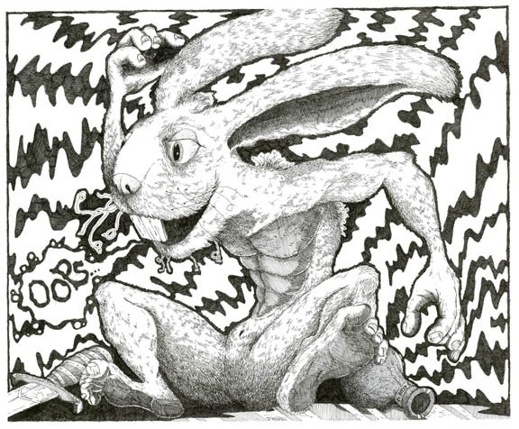
Past work up for comments/critiques!
-

Just posting some of my past pen and ink work from when I was younger. I love the critiques and comments. Student4Life
-
the detail on the muscular rabbit is awesome, I really like the design of the character as well. I would separate the teeth a bit, I see three teeth maybe a darker line in the mid should help. Your rabbit is really drunk haha (go home). Very cool.
-
Love your rabbit. To me it seems like the background is competing with him though. Could be the higher contrast and the super big/busy shapes. I think if you toned down those two aspects a bit he would really pop out and get the attention he deserves.
-
@johntatulliart nice concept, I agree with @Jonathon-B. the background is a bit distracting. You can push up the contrast on the rabbit as well. that will help. Fun piece!