Society of Visual Storytelling

    SVSLearn Forums

    • Register
    • Login
    • Search
    • Recent
    • Tags
    • Popular
    • Users
    • Groups
    • Search

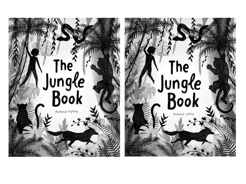
    WIP Book Cover „The Jungle Book“

    Artwork
    16
    27
    5174
    Loading More Posts
    • Oldest to Newest
    • Newest to Oldest
    • Most Votes
    Reply
    • Reply as topic
    Log in to reply
    This topic has been deleted. Only users with topic management privileges can see it.
    • saciia_
      saciia_ last edited by

      Before and after:

      3B5D1204-8002-4948-9684-310D64159798.jpeg

      Instagram: saciia_

      Laurasketches Sas 2 Replies Last reply Reply Quote 1
      • Laurasketches
        Laurasketches @saciia_ last edited by Laurasketches

        @saciia_ I love the values on this cover. I think the silhouette design is very strong. One thing I don't know if you have considered--every silhouette is equal in importance--You might be fixing to change this with the addition of color, but if you want to create visual heirachy---maybe all the silhouettes are pointing to the boy...? , then something might need to give. If you are striving for harmony, you nailed it.

        1 Reply Last reply Reply Quote 1
        • DaveLeekArt
          DaveLeekArt last edited by

          I really like this. The bold silhouettes contrast nicely with the background/foreground. I appreciate the balanced composition to this piece as well. Great work!

          Instagram: @daveleekart

          1 Reply Last reply Reply Quote 0
          • MichaelaH
            MichaelaH last edited by MichaelaH

            Hi @saciia_ Laura said, that all animals are pointing to the boy, what about changing the direction of the wolf, so that it also goes in this direction.
            About the hanging, love the new position of the liana and boys lower body, I would make his right hand little bit more straight hanging. I an happy that You didn't changed Bagheera, I liked his pose also. Try to make the authors name bit bigger.

            https://www.instagram.com/michaelaheimlich/
            https://www.heimlich-illustration.de/

            1 Reply Last reply Reply Quote 0
            • Christine Garner
              Christine Garner last edited by

              This is a beautiful composition, I like all the details in it. Second one is a subtle improvement on the first.

              website: https://thimblefolio.com

              1 Reply Last reply Reply Quote 0
              • Sas
                Sas @saciia_ last edited by

                @saciia_ Yeaah this is the stuff! To see what a huge difference one small change can make. Love it!

                https://www.instagram.com/sasmakkinje/

                1 Reply Last reply Reply Quote 0
                • C
                  cbrocke last edited by

                  This looks great @saciia_ ! I wonder if making the boy smaller might add a bit more interest. If you want to try that I would suggest thickening the tree beside him to keep the visual balance. It looks great as is though. This style really suits the book. Good work!

                  1 Reply Last reply Reply Quote 0
                  • First post
                    Last post