WIM Book Cover "The Wind in the Willows"
-
@Squirrelsize The straight edges look nicer to me as the jagged edge is a bit distracting. Good work!
-
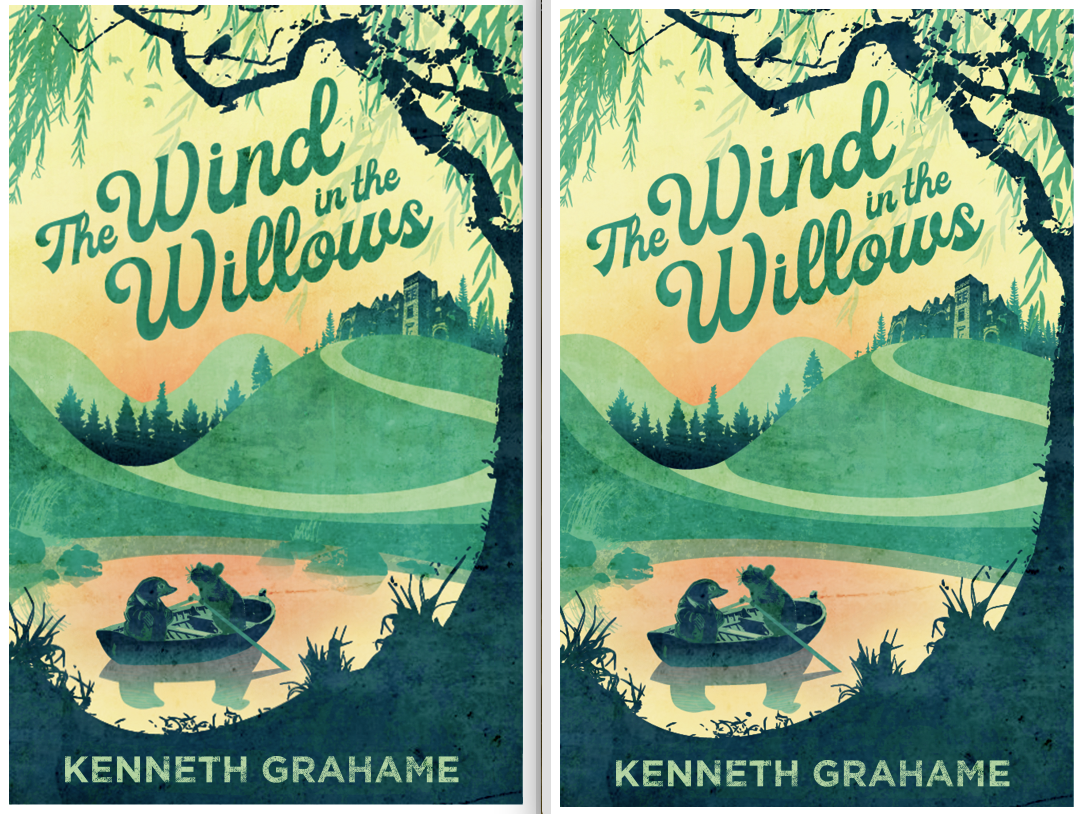
Added some river rocks! Should I add more?

-
I think the composition on the right (with less rocks) is more effective. It leaves a nice amount of negative space for the eye to rest and move a little more freely. For some reason the composition with more rocks diverts my gaze to the top of the hill very quickly. This is really beautiful, I love the colours, and textures.
-
@inkandspatter Okay! Cool! I totally see that now. Good advice!
-
Your version with less rocks looks like a finished work to me. So nice.
 Though maybe the value of the bottom of the background trees is a bit strong? This is really looking amazing.
 -
@KathrynAdebayo Cool, I'll try lighting up the background trees and see how it looks

-
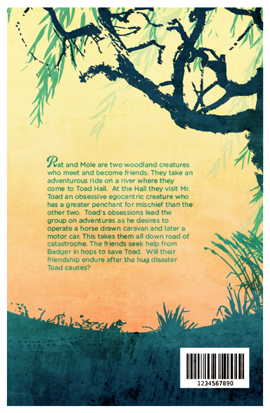
Okay! Working on back now. What you all think? I was thinking about putting in some more elements, but I've been finding this piece likes to be simple. Maybe add a bird or two in the branches?

-
@Squirrelsize Beautiful! Your design is very well thought out and very nicely balanced.
-
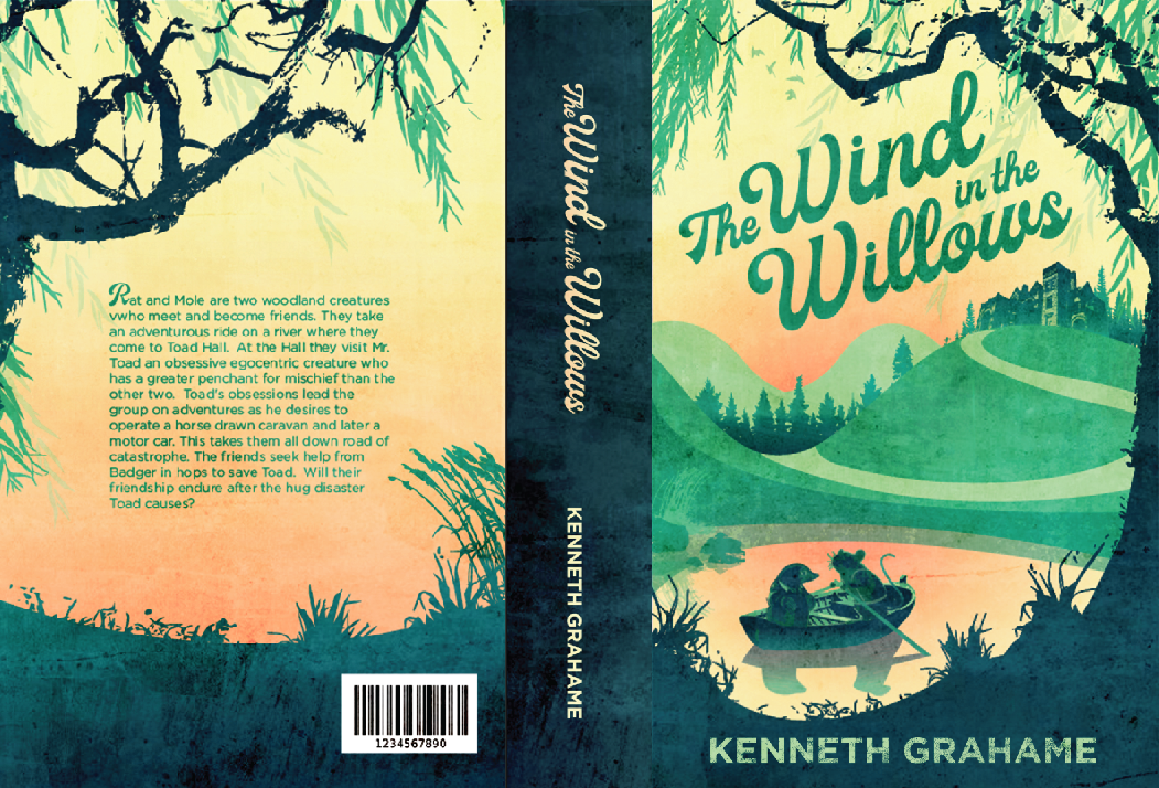
Yey! I'm getting really excited! This has been a fun piece! Still open to changes however. You all see anything that bothers you that I should change up?
These are my edits from the last several post:
I lighted up the background trees on the front cover.
Switch the willow tree on the back to the right side of the page.
Put clothes and a tail on Ratty
-
It looks really good!!!
-
@MichaelaH Hahaha, Thanks

-
Wow, I can't believe how far this piece came. You've really worked hard on this and it shows. Really beautiful work, you should be proud!
-
@djly AWE, thanks so much girl!
-
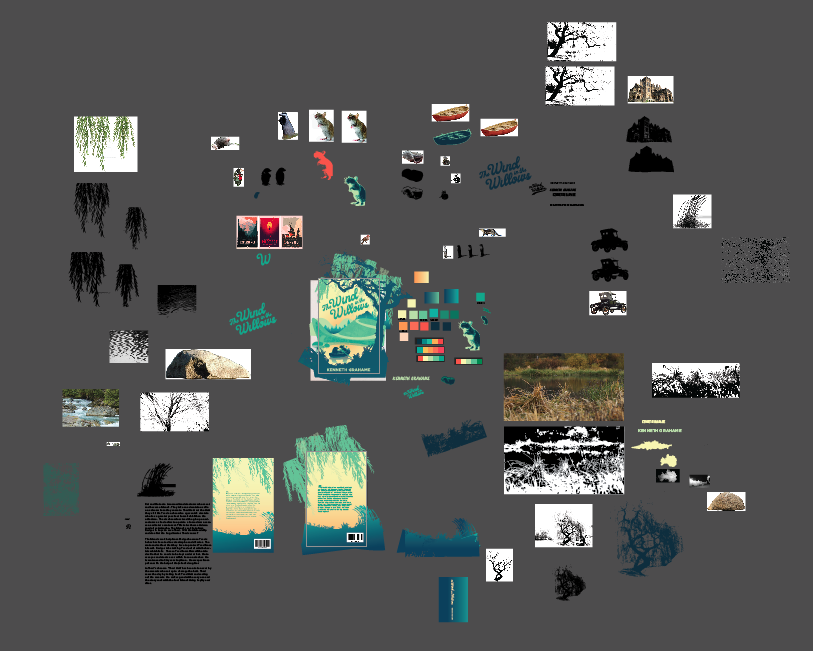
This is what my Adobe Illustrator art file looks like right now lol
