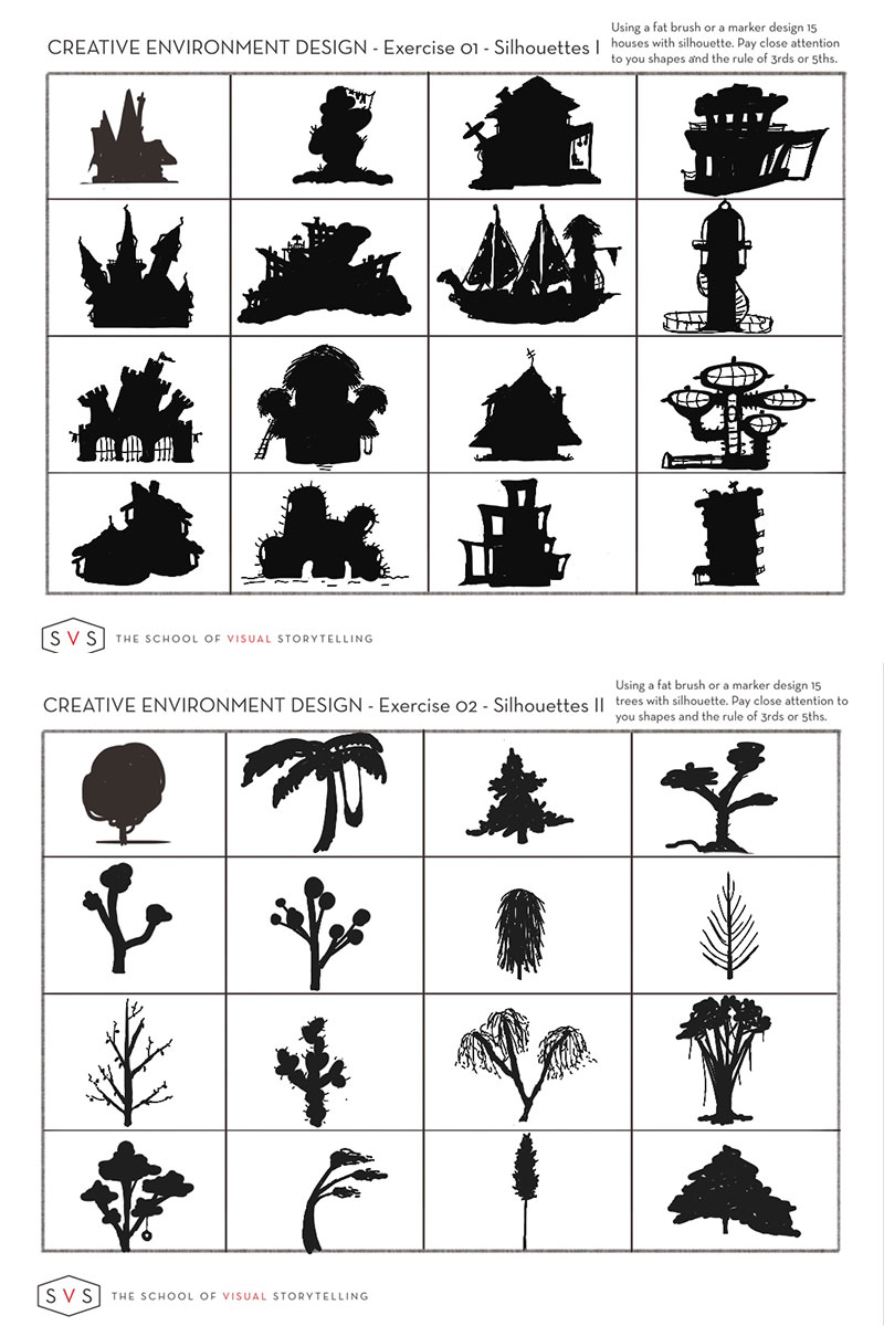
Group run through creative environment design week 1 art and feedback
-
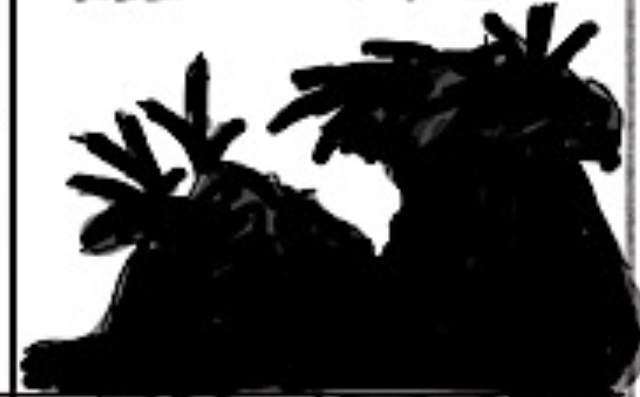
@JerrySketchyArt I like the Mars Habitats, they mostly follow the 3/5 rule. Some of them can still be divided in half, I'm not sure if that is what you are going for.
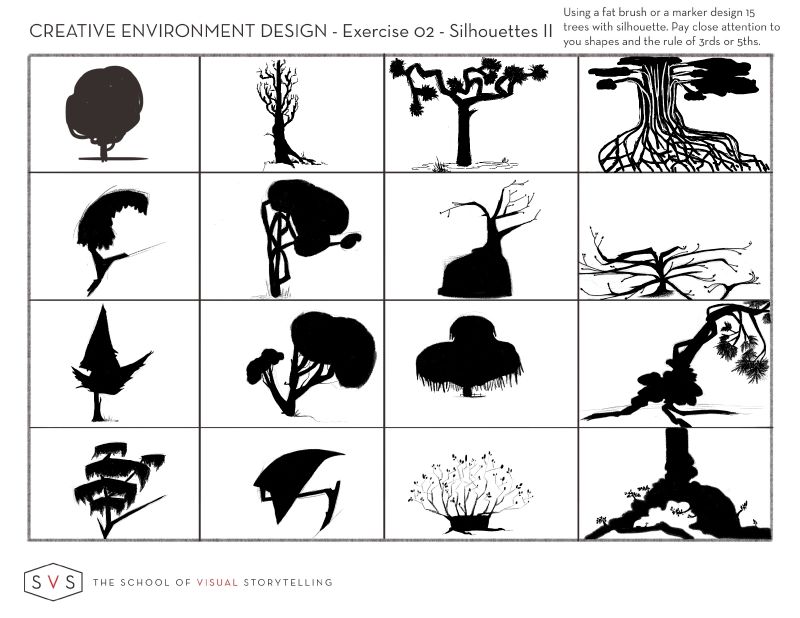
I can give the same comment for the trees, but there I feel the 3/5 rule is missing for most of them.
To be honest I think the tree exercise is harder than the houses. It's the 'symbol thing' Jake talks about in the class. Our brain just wants a tree to look a certain way. (I haven't posted my trees yet, because I want to redo them if I find the time. I made the same mistake
 )
) -
@demotlj Nice work. These look good. The buildings are interesting especially if you don't like drawing them.

-
@MichaelaH Nice!!! I have so many favorites :smiling_face_with_open_mouth_cold_sweat:
-
Here is my second attempt at the thumbnails, I managed to loosen up. It really does seem counterintuitive though, I had to fight the urge to draw familiar structures, through all of them.
Thank you @Braden-Hallett @JerrySketchyArt, brilliant advice to just put a mark on the page or draw some random shapes, it really worked for me!
-
@ErinCortese Nice! Just wingin' shapes and lines around can really help to shake out of a design rut
")
I'm seeing a lot of nice thirds goin' on!
-
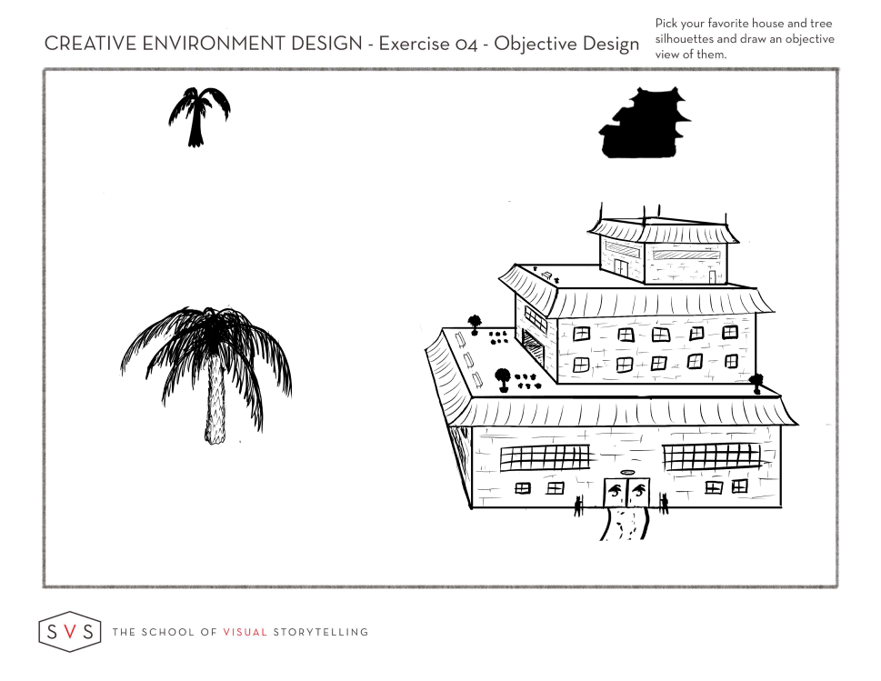
Here is my Exercise 4. I was drawn to this thumbnail because it is outside what I would usually do...loose and not overly structural. I am finding that I feel more relaxed working on things that are more stylized and less structural, but it still feels strange.
-
Exercise 4
-
@murielle I was going for a mix of "boring" and "interesting" in those thumbnails. They mention in the class that sometimes you want boring, and since I often need to make background elements that blend in the boring stuff is important for me too.
I don't disagree on the trees. I probably could have made more of those interesting. I tend to try and make my distinctions on the vertical shapes for those. I think the problem is that trees tend to be pretty evenly distributed (at least horizontally) in real life.
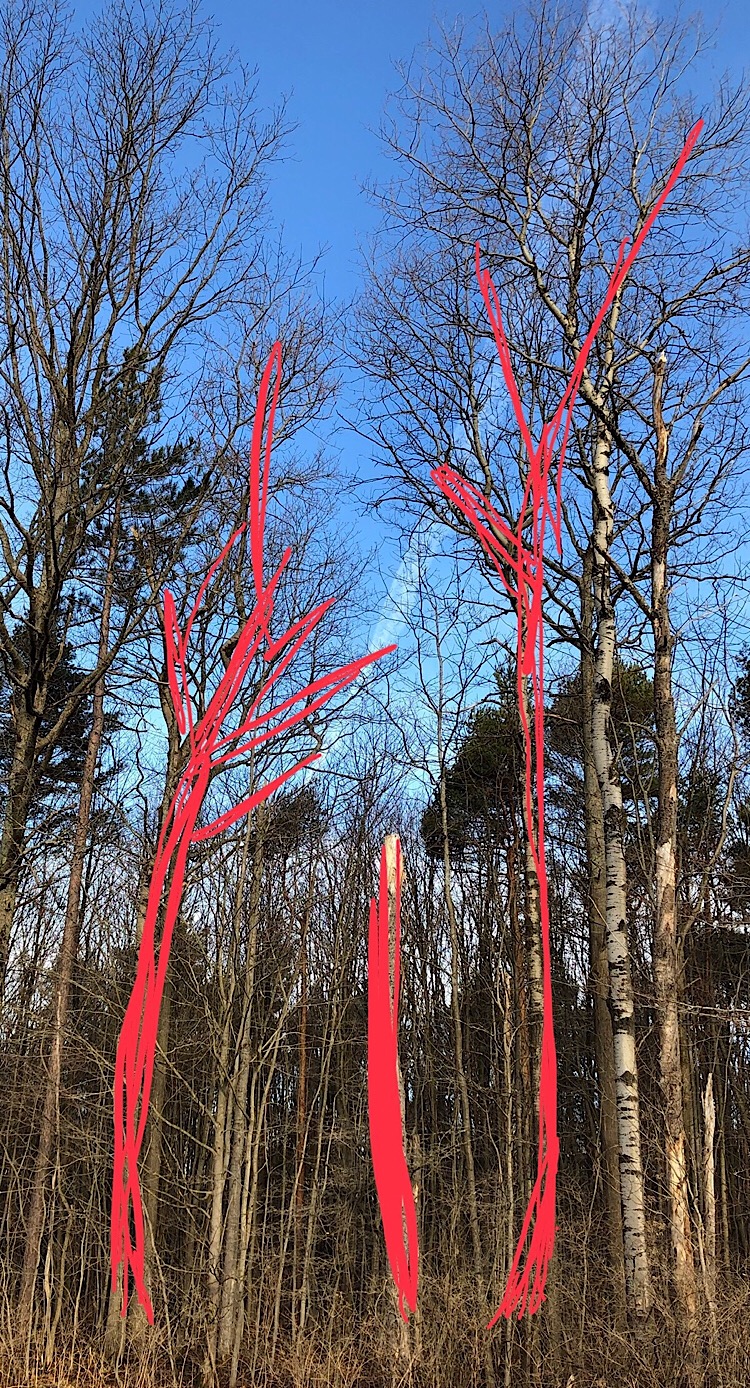
I went for a walk after reading your comment and took a good look at all of the trees. Noticed that they are amazingly symmetrical in general. Pretty much all of the asymmetrical ones I spotted were forced that way by cutting. I guess being different would be what makes those one's interesting though.
-
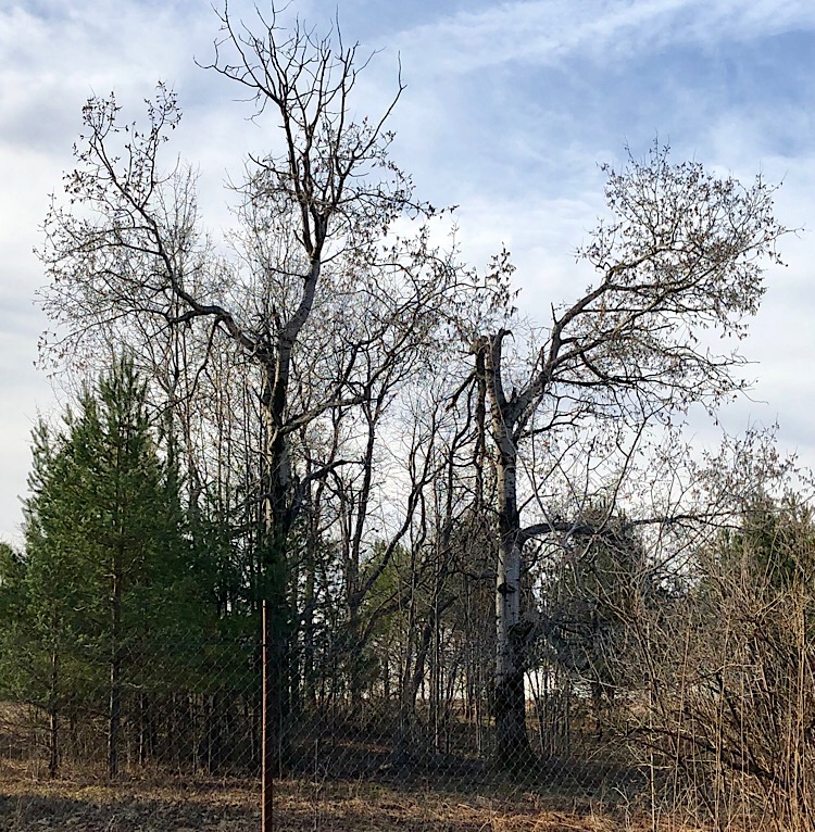
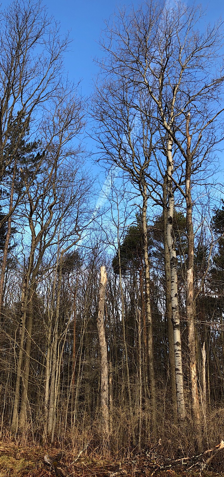
@JerrySketchyArt Do you live in a residential area? I think it’s true that trees in a residential area will be more symmetrical whereas in a woods, they are rarely symmetrical because of crowding and wind damage. I took these pictures on a walk down my road lined by State forest. Even the trees in the open have damage from winds. Thinking about this is helpful because the shape of the trees in a drawing then could help signal the setting.
-
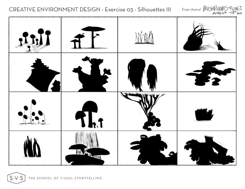
Remember ladies and gents that the intention of this course is not necessarily to design things that are real (though that's fine
) it's to design things that look good. -
Also (watching Jake's exaples in the 'reference' video at about 50 minutes) a great way to make sure that you keep the awesome silhouette for your building/tree is to take the black silhouette, resize it (and lower the opacity) then draw overtop of it on a new layer. I've found that if I don't do that I tend to de-exaggerate my silhouette.
-
1-3 Exercises completed this week.
Just squeezed in. I loved doing these. But houses were the hardest -master perspective class after this.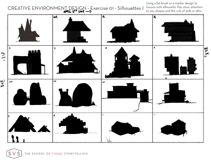
Instagram: www.instagram.com/heatherboyd.illustration/
Website: https://heatherboydillustration.ca
Shop: https://www.inprnt.com/search/products?q=HeatherBoydIllustration
Ko-Fi: https://ko-fi.com/heatherboydillustrationBe blessed,
-
@Heather-Boyd Perspective is haaaaaard! But i do find it easier in thumbnail form
It's a lot easier to extend those imaginary lines waaaaaaay off the page when what you're drawing is tiny -
@Braden-Hallett
You make it look easy.
-
@Heather-Boyd These are great! Very creative.
-
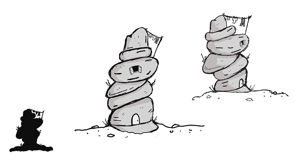
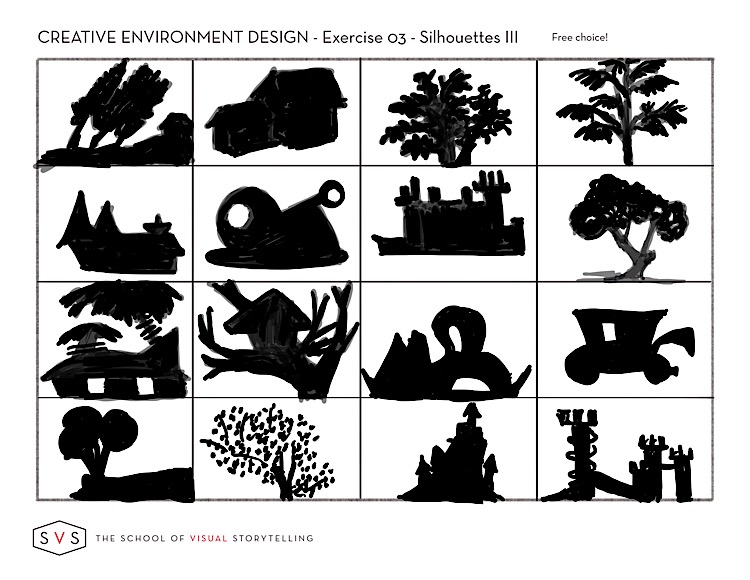
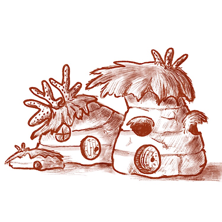
Here is my third silhouette page which I don’t love but it’s done and my objective view of one of my silhouettes. At least, I think it’s the objective view if I’m understanding what that means.
Laurie DeMott
instagram.com/demotlj -
@demotlj Neat design!
Which silhouette were you using for it?
-
@Braden-Hallett it was my first set of building silhouettes second row farthest right.
Laurie DeMott
instagram.com/demotlj -
@demotlj Oh nice! I missed that page
") You stayed nice and true to the silhouette!
You stayed nice and true to the silhouette! -
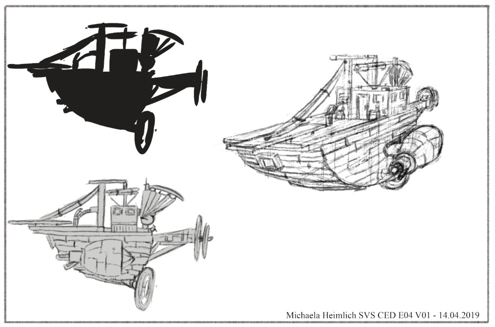
So I think I am finished, not perfect. It was very difficult, because I never do such perspective. It is only one raw sketch, would like to do one clean sketch with better perspective (after it is finished I see many parts lacking..but as Jake said, it is good to go some more times over the design after time passes), but after 2 hours doing this exercise, I need some break. But I am proud of me, that I did some environment and one I never usually do...