How my SCBWI Portfolio critique went
-
I am going to the SCBWI Spring event in NorCal in May and I signed up for a portfolio critique. Originally it was to be a review of my portfolio in PDF format and then an email from the art director with his or her comments. But we got lucky and the art director wanted to speak with us directly, so we all scheduled phone appointments and mine was this morning. I thought I would share how it went, maybe you could get something useful from it.
The art directors name is Laurent Linn. He was very pleasant to speak with. His criticisms were delivered skillfully with tact and thought. Just so you know, since I did not record this conversation, I will be paraphrasing his comments filtered through what I believe he was trying to tell me.
First, here is a low res compilation of the 15 images that were in the pdf portfolio so you know what I'm referring to.
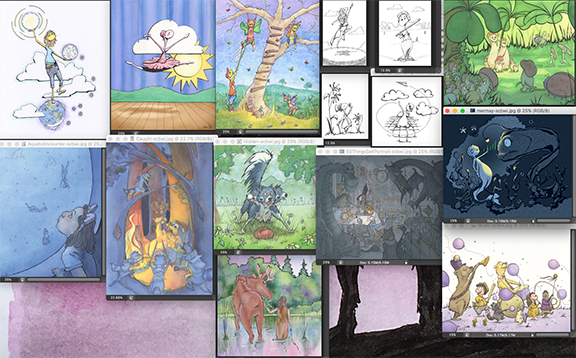
First off, I asked him about my Kin•der People. They are the creatures in the first 7 images (from top left to right). I have been drawing them my whole life and asked if they were appropriate to include in a "children's book" illustrators portfolio. He said that it was good to have a few different styles to show on my website, but for now not to include so many in the physical/digital portfolio.
•Then he began his critique. Right off he said that the raccoon warriors image was a strong piece and wondered why it was on the last page. I took this to mean that even though I wanted to end strong, I should probably put some strong stuff at the beginning. People open a book and if they don't like what they see they move on. He warned to be careful of portraying weapons and he laughed as he said that the fact that the bear is lunching on the raccoons may be a little horrific for children.
•The self portrait piece (aka draw 50 things), he also thought was a strong piece. He mentioned that many people will put fan art in their portfolios to show off how they would do it and its okay since we aren't intending it for sale.
•The marching band animals: He said that it was a bit too cartoony, meaning that the children and the animals were caricatured so they come across as more fantastical and less realistic. He said that he would like it more if I had made the children and animals more real looking. Then he referenced the girl in the blue aquarium piece as being the more realistic that he was referring.
•He liked all my line work and wished I would push that further. I was happy to hear this as I have actually be pulling back on my ink thinking that I was scaring people away with all the black.
•The border collie and squirrel. He loved the expression on the dog's face(s) but cautioned that children are very literal and would probably see him as a multi-headed dog (ie, Fluffy from HP series) and advised that a motion blur would work better in this particular case.
•He didn't think that the moose and girl was a strong piece. It was a pleasant image but lacked narrative.
• He thought the first image with the kin•der style me balancing my universe reminded him too much of Seuss. And though I wanted to take that as a compliment he meant it as, you don't want your images to make someone think of someone else.
•We had run out of time by then, 15 minutes was definitely not enough time, but he graciously listened to one more question. He was bummed by the short duration as well.
I asked what does my portfolio lack? His answer was, I need to show children and animals. Granted there are children and animals in this portfolio, but he said more realistic, and in narrative scenes in everyday real life.So there it is. Time to go adjust my lineup and put together my physical portfolio for the Spring Conference. If you have the opportunity I highly recommend doing something like this. I had to pay for it, and it was worth it.
I hope that this helps someone. Happy Hump Day!

-
I'm trying to put together a website, as well as a portfolio to showcase on the website, so this was very helpful. Thanks for sharing!
-
Thanks so much for sharing! Your recount was really insightful! There is a LOT in there that is really really useful! Thanks so much!
-
@Coreyartus @Justin-Moss you are very welcome. I’m glad I was able to help.

-
Thanks for sharing all of this. It was really so helpful to me as I prepare my work. Good luck as you take the advice and put it to use. How exciting to be taking steps in the right direction! Keep us posted on your progress. Thanks again for sharing your experience.
-
Thank you so much for sharing your experience! That is some awesome feedback. This is helpful for us as well as you and you certainly didn't have to share that experience. That's very kind of you! If I may, did he elaborate on the realism vs cartoon dynamic? Did it seem like a personal preference or an industry trend? Thanks again!
-
@Jon-Anderson said in How my SCBWI Portfolio critique went:
If I may, did he elaborate on the realism vs cartoon dynamic? Did it seem like a personal preference or an industry trend?
As an example, he mentioned the girl in the blue aquarium image as being realistic and the children and animals in the marching band as being cartoony. Unfortunately we didn’t have a lot of time to really get into it, but personally i took it as, even though I have a definite ink outline style, which is common for a “cartoon”, the girl herself is still realistic looking. Proportionally realistic as opposed to the little human muppet faces of the children marching
 . I have read in the past, when researching submissions, that art directors ask for realistic children, not cartoony. Now I know what they mean by that.
 -
Really useful information... Is it typical that portfolio reviews are so brief?
-
@Laurasketches I have one coming up at the nescbwi spring conference and it is also 15 minutes if that helps
-
Thank you for sharing!
-
@Laurasketches This was my first but I think so. I talked to the woman who organized it, and she said that if they go longer they would have to charge more to pay the AD. Not a bad gig if you ask me
