Dummy illustration how to seperate from background
-
This is a pretty loud illustration from my picture book dummy but I still want to make my chef salamander pop out a bit more. I have tried changing the opacity of the background and putting more shaded stroke around him but I still don't think it's working? Should I just outline him in a really darker color again?
I asked my husband but he is color blind and he said this image almost totally blends together for him.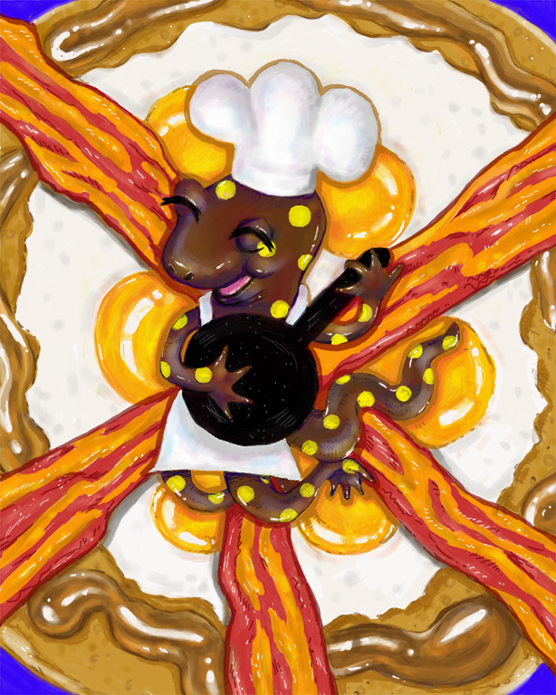
-
Use your husband's eyes to your advantage! What determines an images readability isn't the color, but the value. If it all blends together for him (being colorblind) that tells you that your values aren't separated enough. If you want the salamander to stand out, make it dark on an overall lighter background OR light on an overall darker background.
-
@Heather-Bouteneff I often have this same issue. It's hard to think in terms of value instead of hue.
Here's a grayscale version of your image. You'll notice the salamander almost completely blends in with the bacon strips.
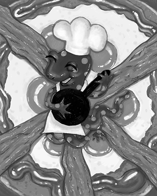
There are lots of ways to approach a solution--either you can change the angle/perspective, or you can change the value of the breakfast food by making it a higher/lower key than the salamander, or you can change the value of the salamander.
Another method is to reconsider where your source of light is coming from and articulate its direction a bit more which would create more shadows and such and might, in the end, help the salamander "float" a bit above the food. Your highlights/reflections off the shiny and wet parts of the food are very white. I don't see commensurately dark shadows (cast and occlusion) on the other end of the value scale--instead it's the food itself that is doing the heavy lifting of providing darker values.
Or maybe decrease the saturation of the background's color intensity, leaving your salamander the most vibrant part of the image?
Just some thoughts.
")
-
Could you make the salamander green?
-
Nothing like a bit of Gaussian blur to distinguish background from foreground!
Create two layers, the underneath one you blur. The above one you delete partially with a spray tool around your foreground object. But the disadvantage is that your sacrificing great work you’ve created. So maybe don’t blur anything near as much as I have.
Lovely piece, btw.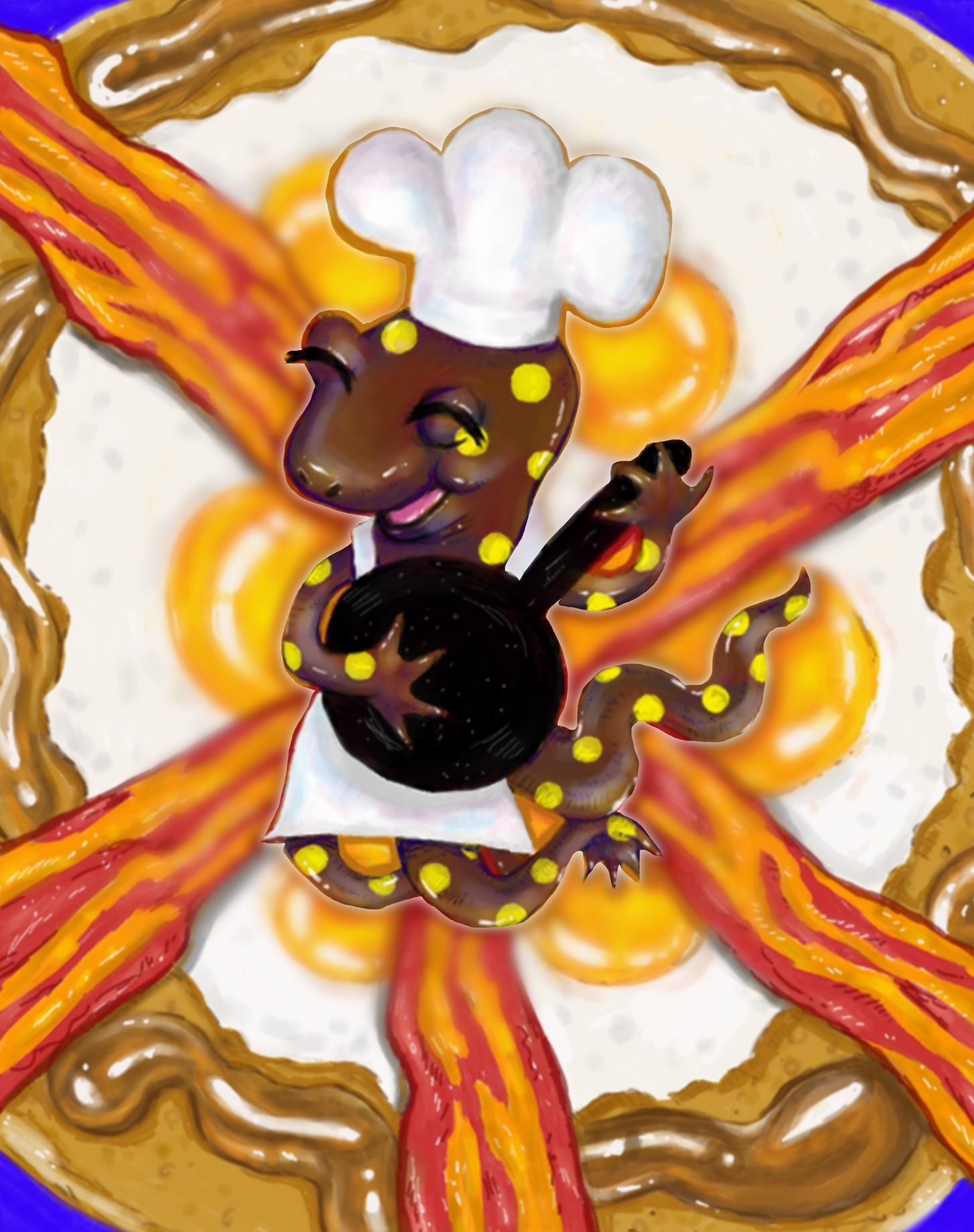
-
@Heather-Bouteneff this is tricky. What the others have said will work, but I would kindly advise against a few of them. Nothing will zap the energy out of a piece quicker than digitally blurring the background.
The real thing to learn with this piece is planning for values and focal point. To get to the finished piece and then have to try to solve it will probably always be a band-aid at best. I would recommend cutting out your salamander and then figuring out the background design using gray scale. You will have to alter your design, saturation, and level of detail to pull this off.
Don't be afraid to start over either. It may sound harsh to recommend that, but I've repainted images dozens of times in order to get them to work. Just gotta stay in that design mode and keep working it until it hits just the right note you are looking for.
Good luck!
SVS Faculty Instructor
www.leewhiteillustration.com -
@Lee-White I think this is absolutely a learning piece and I will have to redo it to get it to fit. Ironically I am just about to do that with the text for the book dummy too because it's my one rhyming one and apparently rhyming books from beginning authors are like a big joke.
I literally painted myself into a corner with it by doing the background as food that is supposed to look good. Changing almost any of it made it look unappetizing and this is supposed to be the part of the book where he's just so in love with cooking it's like 70's flower fest. I have to admit I just ended up Lisa Franking it for now just to put it on the shelf and be able to face a redo.