Society of Visual Storytelling

    SVSLearn Forums

    • Register
    • Login
    • Search
    • Recent
    • Tags
    • Popular
    • Users
    • Groups
    • Search

    MerMAY challenge WIP Critiques wanted...

    Artwork
    10
    35
    1819
    Loading More Posts
    • Oldest to Newest
    • Newest to Oldest
    • Most Votes
    Reply
    • Reply as topic
    Log in to reply
    This topic has been deleted. Only users with topic management privileges can see it.
    • karolifo
      karolifo last edited by

      Hi Chris 🙂 I like your merman! I think the problem with the neck anatomy is mainly because of the direction of the muscle in the neck that is fastened in the collar bone and right beneath the ear. And maybe the head is a bit far to the left.... You could try making your own reference by taking a photo of your own head in the pose you want, to get an idea of how the anatomy will work in that pose (this is what I do when I run into specific anatomy problems 🙂 )

      09CA3680-FDEB-434B-B5CD-8DDCCD2EB210.jpeg

      www.instagram.com/karolifo

      chrisaakins 1 Reply Last reply Reply Quote 3
      • Chip Valecek
        Chip Valecek SVS Team SVS OG last edited by

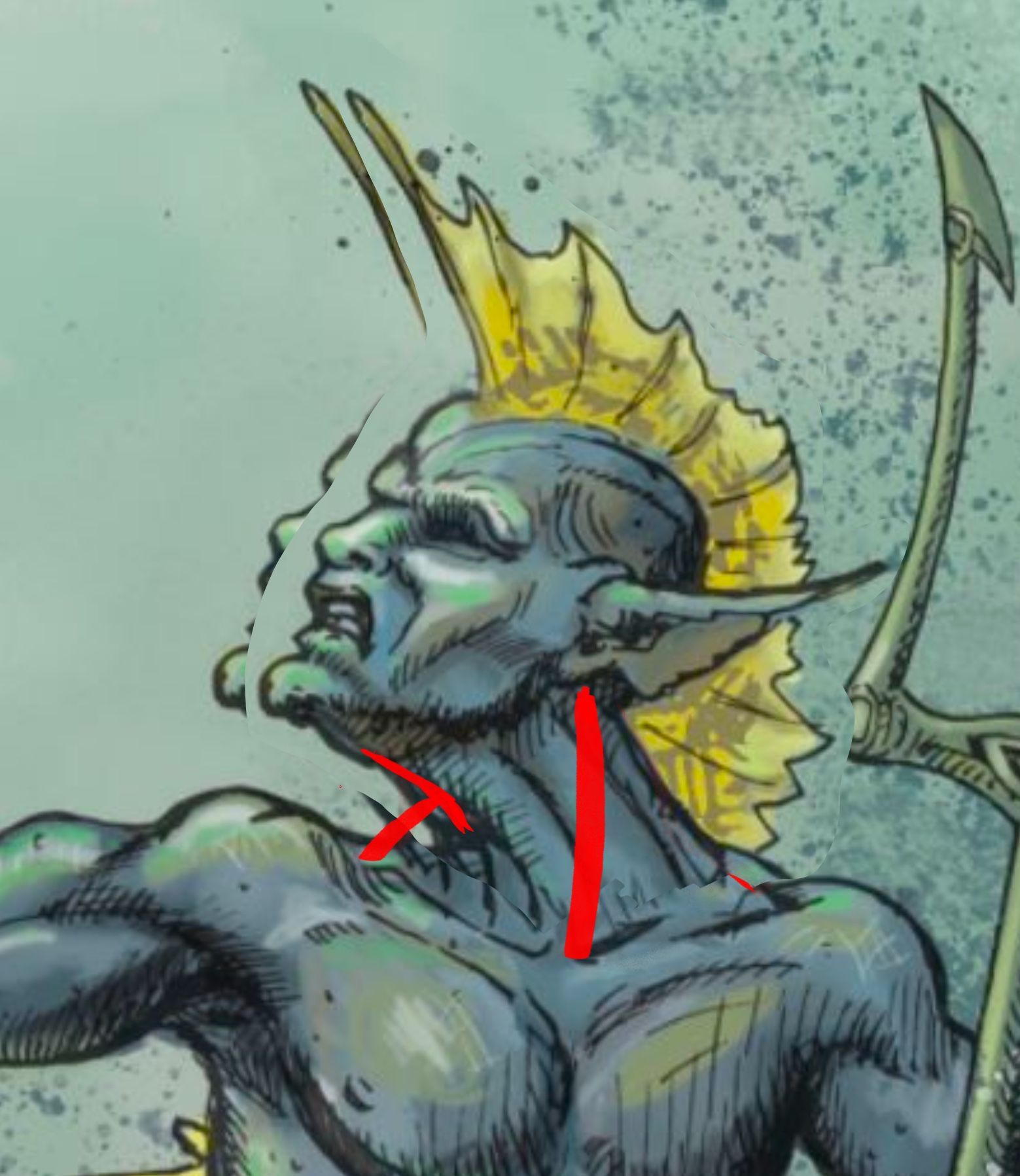
        Great piece to start with. Lots of great advice already. I like the pose that @Jason-Bowen did with it. In terms of graphic novel style, I can see this fitting right in. I prefer to punch the colors up, but that is personal preference though.


        https://www.instagram.com/chipvalecek/
        https://www.facebook.com/cvalecek
        http://www.cshellmedia.com/

        Jason Bowen 1 Reply Last reply Reply Quote 1
        • Jason Bowen
          Jason Bowen SVS OG @Chip Valecek last edited by

          @Chip-Valecek yeah I agree with the colour punching, I have started doing that too 👍

          https://www.instagram.com/jasonbowenoils/

          1 Reply Last reply Reply Quote 1
          • chrisaakins
            chrisaakins @karolifo last edited by

            @karolifo good call. I will try and fix that.

            Chris Akins
            www.chrisakinsart.com
            www.instagram.com/chrisakinsart/

            1 Reply Last reply Reply Quote 0
            • chrisaakins
              chrisaakins last edited by

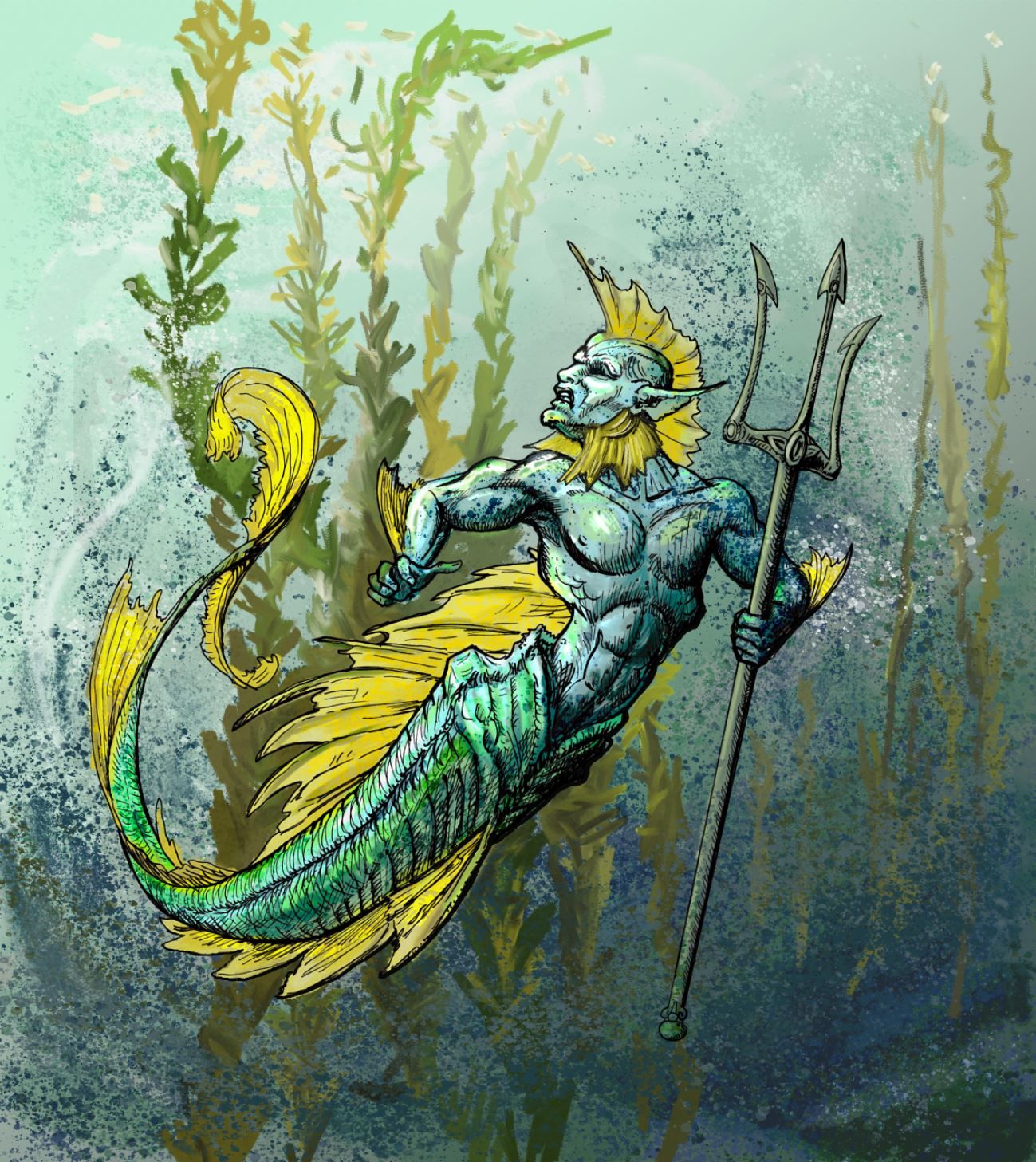
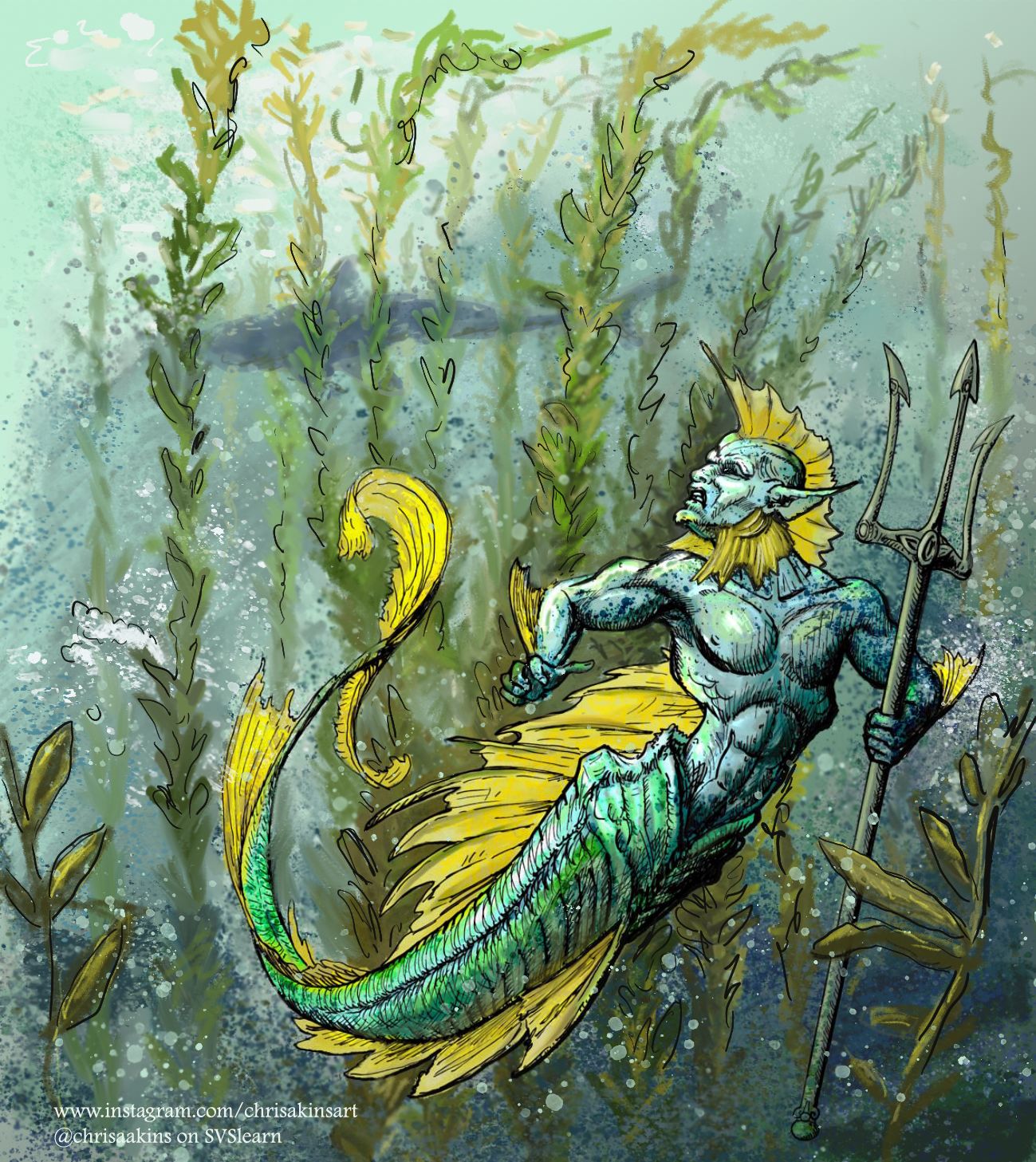
              So I made some changes. I tried to punch up the color but decided to put a vivid light on it instead. I darkened the background and added a kelp forest. I think it reads better now that he is hunting for someone or something in the forest. I tried to fix the neck but decided to hide it with a gill cover. Oh well. Is it better?
              Merman WIP 3.JPG

              Chris Akins
              www.chrisakinsart.com
              www.instagram.com/chrisakinsart/

              Sara Hickman 1 Reply Last reply Reply Quote 4
              • Sara Hickman
                Sara Hickman @chrisaakins last edited by

                @chrisaakins I like the vibrant colors. I think if the seaweed was darker it would pop even more.

                1 Reply Last reply Reply Quote 0
                • Jason Bowen
                  Jason Bowen SVS OG last edited by

                  Have a go at putting your character in different poses than you can choose your favourite one. Just a thought. 👍

                  https://www.instagram.com/jasonbowenoils/

                  chrisaakins 1 Reply Last reply Reply Quote 0
                  • chrisaakins
                    chrisaakins @Jason Bowen last edited by

                    @Jason-Bowen I actually did many thumbnails before I drew it. I like the sinuous feel of this pose. A sort of swirling coiling eel feel. So I think I'll keep it. I hope that once it's finished it'll make sense.

                    Chris Akins
                    www.chrisakinsart.com
                    www.instagram.com/chrisakinsart/

                    Jason Bowen 1 Reply Last reply Reply Quote 0
                    • Jason Bowen
                      Jason Bowen SVS OG @chrisaakins last edited by

                      @chrisaakins oh ok, looking forward to seeing it finished 🙂

                      https://www.instagram.com/jasonbowenoils/

                      1 Reply Last reply Reply Quote 0
                      • alicia
                        alicia @chrisaakins last edited by

                        @chrisaakins This is so great! Love the detail & colors! I think the issue with the pose is it pulls your eye to the left, but then there’s nothing catch it or to pull it back onto the canvas. What if you scoot him over to the right & have something appearing in the direction he’s looking. A small school of fish (swimming back toward the center), an ominous light, etc. it doesn’t have to give away the surprise of the prey.

                        chrisaakins 1 Reply Last reply Reply Quote 0
                        • chrisaakins
                          chrisaakins @alicia last edited by

                          @alicia that is a good point. I will see if I can do that. Can you merge just three layers on PS?

                          Chris Akins
                          www.chrisakinsart.com
                          www.instagram.com/chrisakinsart/

                          alicia 1 Reply Last reply Reply Quote 0
                          • chrisaakins
                            chrisaakins last edited by

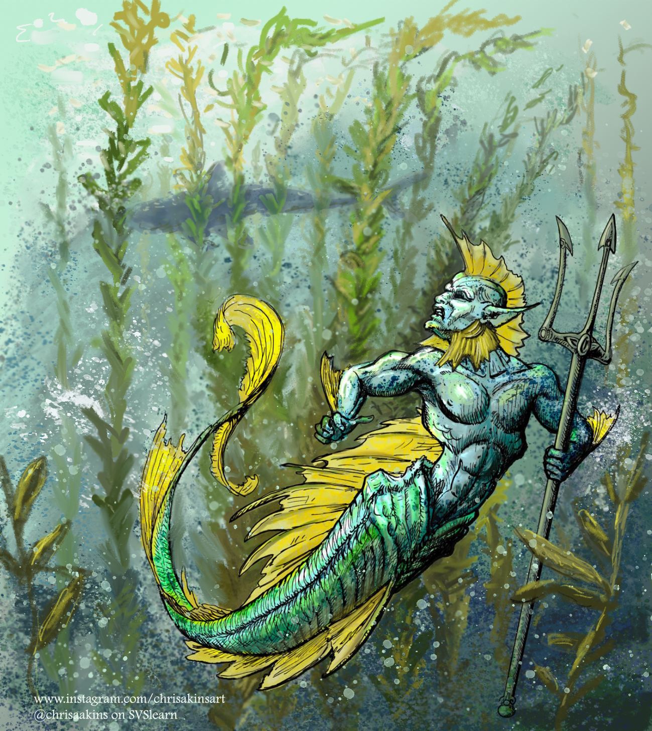
                            Thank you @alicia , @Sara-Hickman @Chip-Valecek and @Jason-Bowen and others who provided feedback.

                            Here is the final version I hope. I think I may need to be done, at least for a little while.

                            BIG QUESTION: How does it read? What story is it telling?

                            Merman WIP 3.jpg

                            Chris Akins
                            www.chrisakinsart.com
                            www.instagram.com/chrisakinsart/

                            MOO Johanna Kim 2 Replies Last reply Reply Quote 1
                            • MOO
                              MOO SVS OG @chrisaakins last edited by MOO

                              @chrisaakins I see him looking anxious, peering over at a shark that is stalking him. The moment before! AAAGGGHHHH! Really nice drawing!

                              Marsha Ottum Owen

                              1 Reply Last reply Reply Quote 2
                              • Johanna Kim
                                Johanna Kim SVS OG @chrisaakins last edited by

                                @chrisaakins In answer to your questions:
                                How does it read? It's easy to read. But I wish I could see the Merman's eye better.
                                What story is it telling? Agree with @Marsha-Kay-Ottum-Owen's comment. There's a feeling of lurking danger and suspense with the shark shape and the hiding merman.

                                Other thoughts: The merman's style and that of the background are very different. Both styles are great, but together, they compete with each other. Is there a style you prefer?

                                One way to blend the styles better would be to take the color palette of the background, and the painterly style, and apply that to your merman. I hope you don't mind that I did a sample drawover to show better what I mean. Doing this means sacrificing your detailed line work, however. On ther other hand, I also think going with the merman's style and applying that to the background could look cool, as well. But that might take more time.forum_drawover.jpg

                                http://www.johannakim.com
                                http://instagram.com/johannahkim/

                                chrisaakins 1 Reply Last reply Reply Quote 2
                                • chrisaakins
                                  chrisaakins @Johanna Kim last edited by

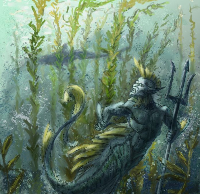
                                  @Johanna-Kim I do see what you mean. I was trying to emulate a comic book style. Often they have painted backgrounds and inked foregrounds. I may add some ink to the background since I don't want to lose the line work. to see if that works. As far as the eye goes, I was thinking deep black.

                                  Thanks for the input!

                                  Chris Akins
                                  www.chrisakinsart.com
                                  www.instagram.com/chrisakinsart/

                                  chrisaakins 1 Reply Last reply Reply Quote 0
                                  • chrisaakins
                                    chrisaakins @chrisaakins last edited by

                                    @Johanna-Kim Good call! I added just a touch of inking and I think it helps define the space a little more. I also added a sparkle of reflected light and that too increases the angst of the piece. Thanks! What do you think?Merman WIP4.jpg

                                    Chris Akins
                                    www.chrisakinsart.com
                                    www.instagram.com/chrisakinsart/

                                    1 Reply Last reply Reply Quote 0
                                    • chrisaakins
                                      chrisaakins last edited by

                                      Well, I thought it looked better. Now I am having second thoughts. The lines look like an afterthought. Argh. I may need to just come back to this...

                                      Chris Akins
                                      www.chrisakinsart.com
                                      www.instagram.com/chrisakinsart/

                                      Johanna Kim 1 Reply Last reply Reply Quote 0
                                      • Johanna Kim
                                        Johanna Kim SVS OG @chrisaakins last edited by

                                        @chrisaakins Yes, I think that if you're going to go with the line work style, you'll need to develop the background more intentionally in that style. I can empathize as this has happened to me before and it took a lot of work, time and experimentation to resolve.

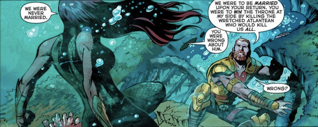
                                        It might help to take a small section of your illustration that includes the merman and the background and experiment on that. For inspiration, you could also Google underwater comic book/graphic novel images and see how the line work is treated there. Here's one from DC Comics that shows how the line work in the background is defined, though simpler than in the figures, and the line is a color lighter than black. Also the overall color of the background is more subdued and more monotone.
                                        Screen Shot 2019-05-06 at 1.21.18 PM.png

                                        http://www.johannakim.com
                                        http://instagram.com/johannahkim/

                                        chrisaakins 1 Reply Last reply Reply Quote 1
                                        • chrisaakins
                                          chrisaakins @Johanna Kim last edited by

                                          @Johanna-Kim Yeah I was thinking the black ink looked too much. I think the color is otherwise okay. I have looked at pix of Kelp forests before and it seems okay to me but I will play around with it. Thanks for your help.

                                          Chris Akins
                                          www.chrisakinsart.com
                                          www.instagram.com/chrisakinsart/

                                          1 Reply Last reply Reply Quote 1
                                          • chrisaakins
                                            chrisaakins last edited by

                                            @Johanna-Kim And now that I have the other pic you posted, mine looks especially messy on the line work. I was going for a more Karl Kopinski look. 4f80ecf7-4c24-4657-bacb-d4b3e9f31e27-image.png 
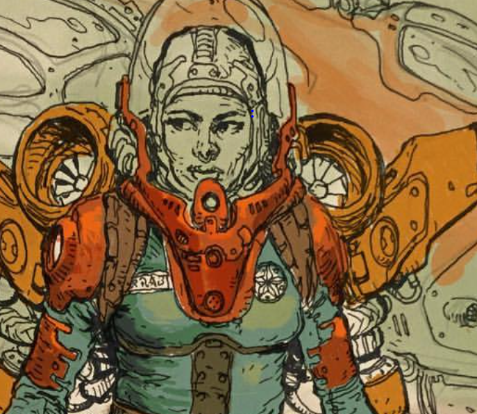
Picture credit: Karl Kopinski

                                            Chris Akins
                                            www.chrisakinsart.com
                                            www.instagram.com/chrisakinsart/

                                            1 Reply Last reply Reply Quote 1
                                            • First post
                                              Last post