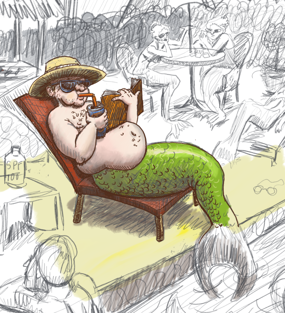
MerRetirees...hahaha
-
@Aleksey yeah. I confess I mostly added to fill the negative space.
-
@chrisaakins oh ok. What else can you do to fill in that space?
-
If you want a Florida retirement home, you need a shuffleboard court.
-
@JerrySketchyArt true, but how do merpeople play shuffleboard?
-
@chrisaakins shuffleshell? Maybe volleyball with their fins?
-
@chrisaakins I don't even know how humans play shuffleboard.
 I've got the Floridian down, but not the retired part.
 -
I’m just picturing you spying on the elderly in retirement homes with a notepad and pen
-
So I don't really know what I am doing with Photoshop. I really want to get the blended gradient effect that others create in their forms, but I don't know how to do it aside from the wet blender brush tool. Even then it works better on pencils than the "oils". Any suggestions how to make the nice blended forms that people like @Eric-Castleman gets on his forms in PS?
Here is the WIP. I am sort of jumping all over the place. I know some people work methodically but and finish each layer but I am really just playing around and experimenting.
Also @Chip-Valecek when you say "punch up the color. How does one do that in PS?
One more thing. I really love the complaining Granny in the background. She is probably my favorite character here.
Lastly, this is a cropped version. Just to show what I have been working on,
-
@chrisaakins the last few things I do to any painting...
Create a layer and fill it all with black. Set it to color dodge and then take a cool bright blue color and with 20% opacity on the brush I will hit some of the colors I really want to pop. This is a Will Terry trick I learned from his Digital Painting course.
After I add my texture layers my colors seem to get muted, so I add an adjustment layer for levels and an adjustment layer for hue/saturation. I will play around with those till I like what I see. Most of the time the saturation slider goes up to about 12+ and with the levels I make sure to bring out my whites again.
-
@Chip-Valecek thanks! I will try that! Is the digital painting course one of the live classes or is it a video course?
-
@chrisaakins it was one of the first one's they put out. I think its called 10 steps to digital painting. Its not a live course.
-
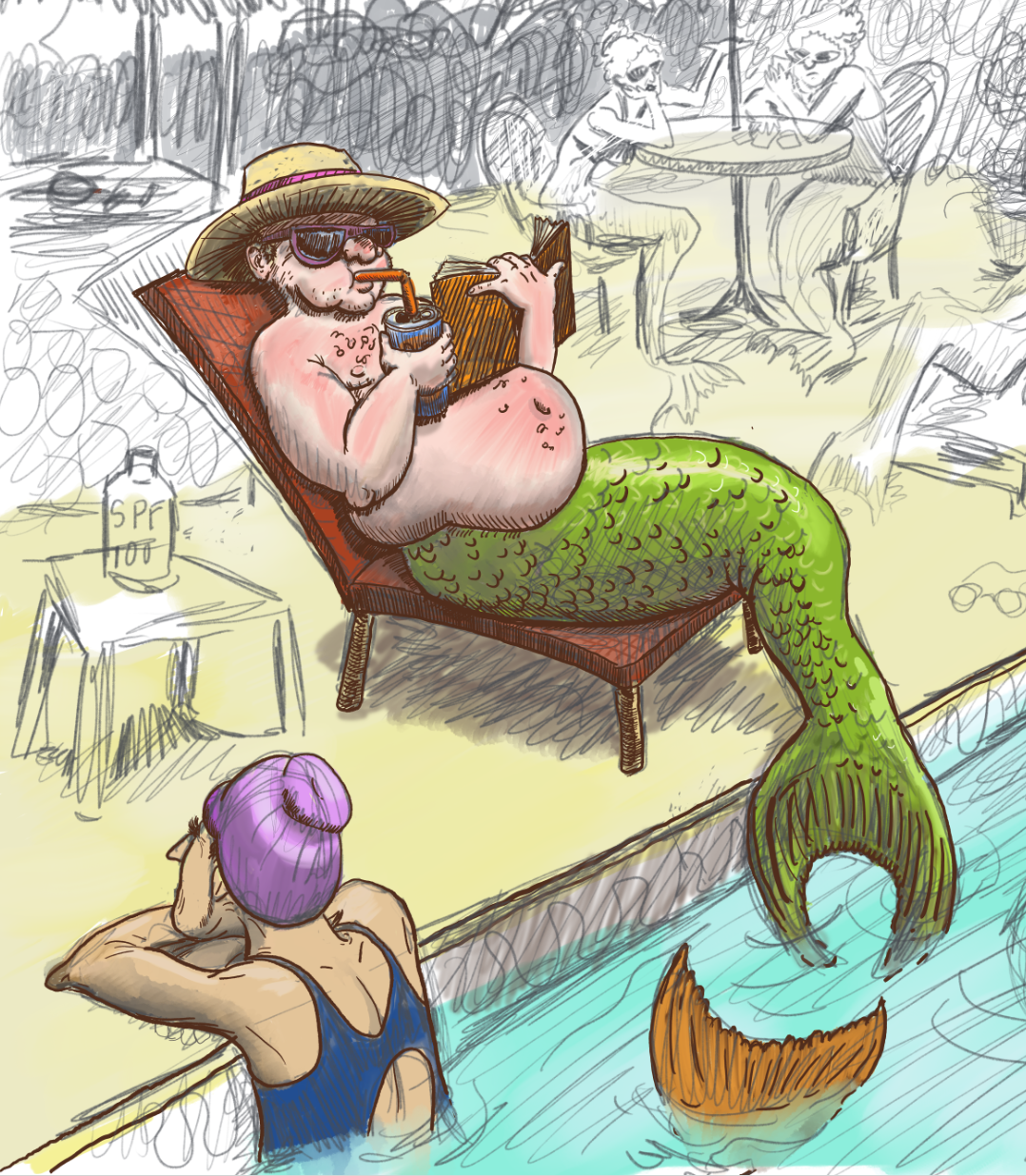
Here is my progress so far. I am cracking up at the fat merman getting a sunburn. Must be a good book. Any ideas for titles? I was thinking Old Man and the Sea... hehehe.
I am having a good time working slowly on this work. How are you liking it so far?
-
Those sqiggles in the baack what are they??
instagram and twitter: @artofaleksey
alekseyillustration.com -
@Aleksey a hedge of bougainvillea. To keep the riffraff out.
-
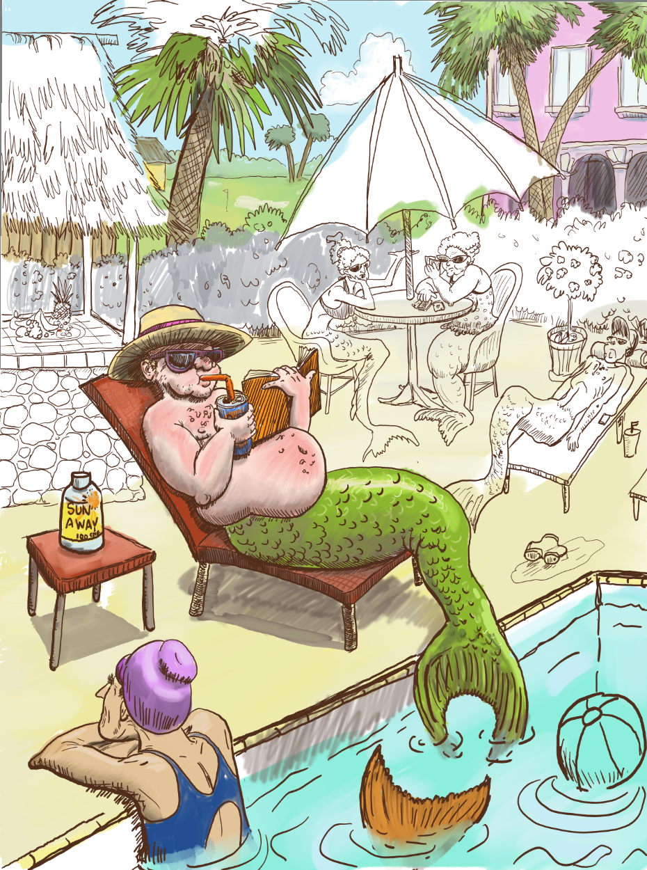
More work on the background. I am wondering if this may be a stronger piece than my merman that I already posted. I don't know at this point.
-
Here is some more progress. I really like the umbrella. I am not sure I captured the light and shadow under the umbrella but when I darkened the faces of the mergrannies under the umbrella it looked weird, so I lightened up their backs instead. Did that work?
-
@chrisaakins You have such great depth in this composition! I am tempted to say that you could push the shadows further on the grannies under the umbrella, but I also think it works the way you ha e them now.
-
@Erin-Cortese thank you so much! I am genuinely surprised by how much depth I created, but I was hearing @Will-Terry's voice in my head as I worked on the values in the background. I never realized how much a difference graying down the values worked or going big to little. I am so thankful for the composition 2.0 class.
-
I love it. I still think that potted plant looks out of place though. It’s the only one that’s in a planter.
You could get rid of it and move those bush plants forwards so that the ubrella table line isnt tangential with the bottom of the bushes. What you think?
-
I really like your painting. There's so much to see, I love the contrast between the fat, sunburned merman and the skinny merman on the stretcher in the back! I agree with @Aleksey about the potted plant though, I'm not sure you actually need anything in that corner, the plant looks a bit busy against the bushes behind it. Maybe just some details in the floortiles, or cracks in the pavement would do the trick of filling the negative space?