burvant ill VS the dream portfolio
-
@burvantill That’s the Cintiq! I have a smaller Wacom pad with no screen. I mostly use it for layer masks and cleaning up files and not drawing or painting. Jago says he no longer uses PS - he’s using just Procreate right now which means maybe that big Cintiq is getting dusty?!
-
@Amber-Lynn-Benton a dusty cintiq. that’s the saddest thing I’ve heard today.

-
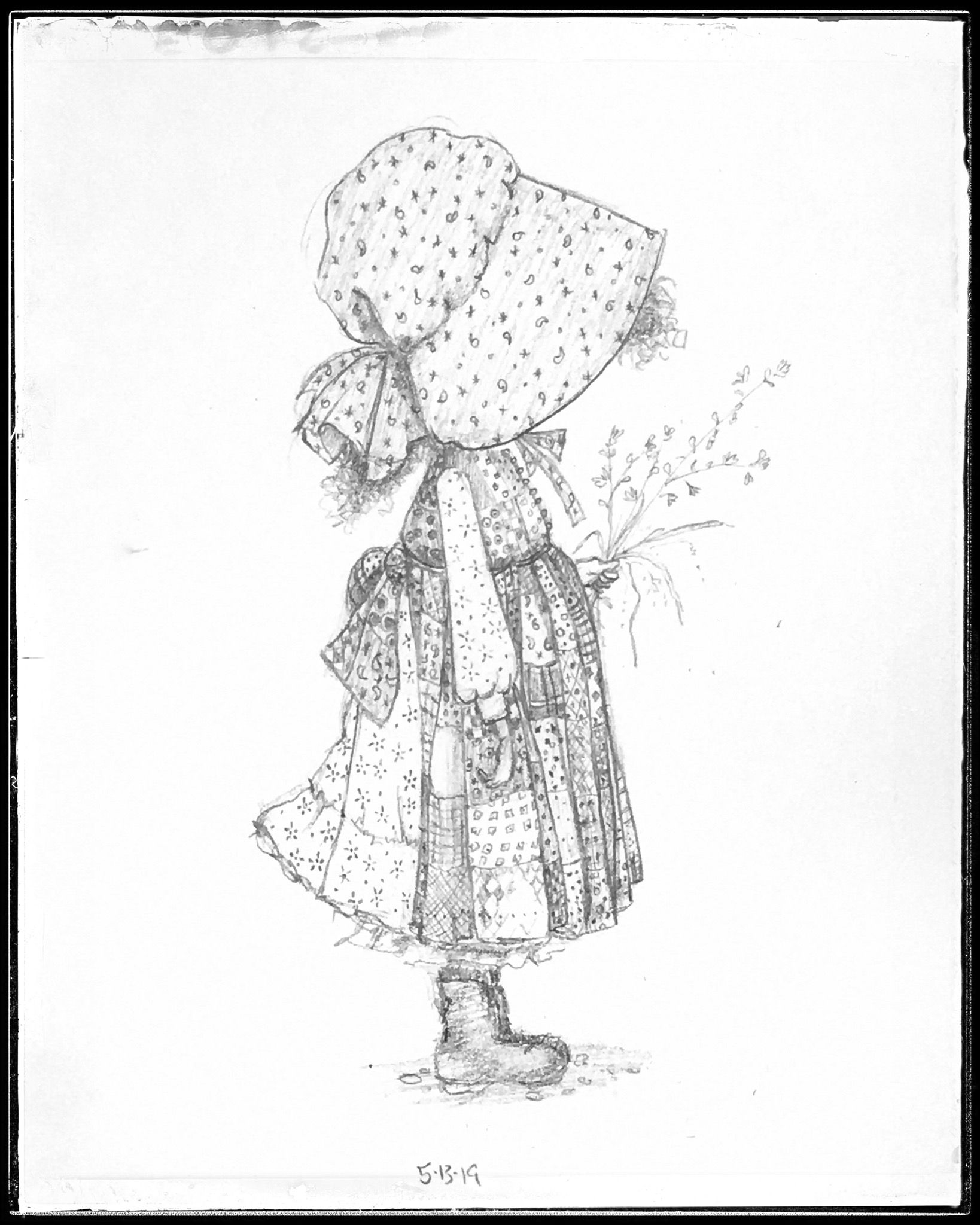
My first master copy. I went with just pencil because that’s what I had time for today. I’m learning that copying isn’t just about making an exact reproduction but looking so hard at a painting that you really see how it was done. The tiny details that would just be background noise or insignificant, become important.
-
hello! I think it is very brave from you to expose your art against your ideal portfolio to everyone's view. Thank you very much! It made me feel less isolated (whatever I draw, I am displeased with my own style... which comes on top of my lack of technique).
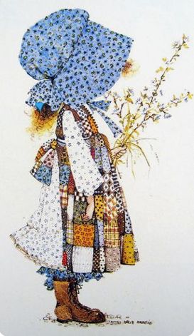
Coming back to your portfolio, I join the others : it is not much, maybe more values and contrast here and there. For example, your copy is fantastic (really! great job!) but I think you could push the dark (the shoes, the hat a little bit).
In any cases, this is very inspirational and I will certainly collect arts that I like and try to reproduce it for heading to the right direction too.
Thank you so much!
-
This is such a cool thing to do! I want to do the same, it's probably difficult to see the differences, but facing your style wishes and current realities must be real good step in the right direction, so I reckon you're on the right path!
Also joining the others, some higher darkness and contrast will do a lot, and maybe working in photoshop, texturing could be a lot easier so you could push those a bit too. Looking forward to the rest of your master studies, and I might join you in opening a thread like this when I am mentally prepared!
-
@Nathalie-Kranich @Julia
Thankyou for chiming in. I was not expecting a critique, so it was a nice little surprise to hear from art friends. I agree about the contrast and darker values. That is my trouble area. I am going to revisit it today and punch up those darks. I was so focused on the fun calico that I thought I was nailing it. Duh.
Duh. Lisa Burvant
www.lisaburvant.com
Instagram & Twitter & SVS: @burvantill -
@Julia @Nathalie-Kranich
I took your advice and I Thankyou for it.
I’m much happier with this one
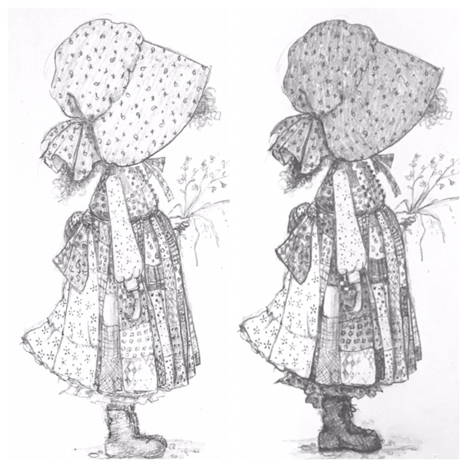
Just for comparison I put them side by side with a bw version of the original. I could still go darker but I’m going to move on to the next.
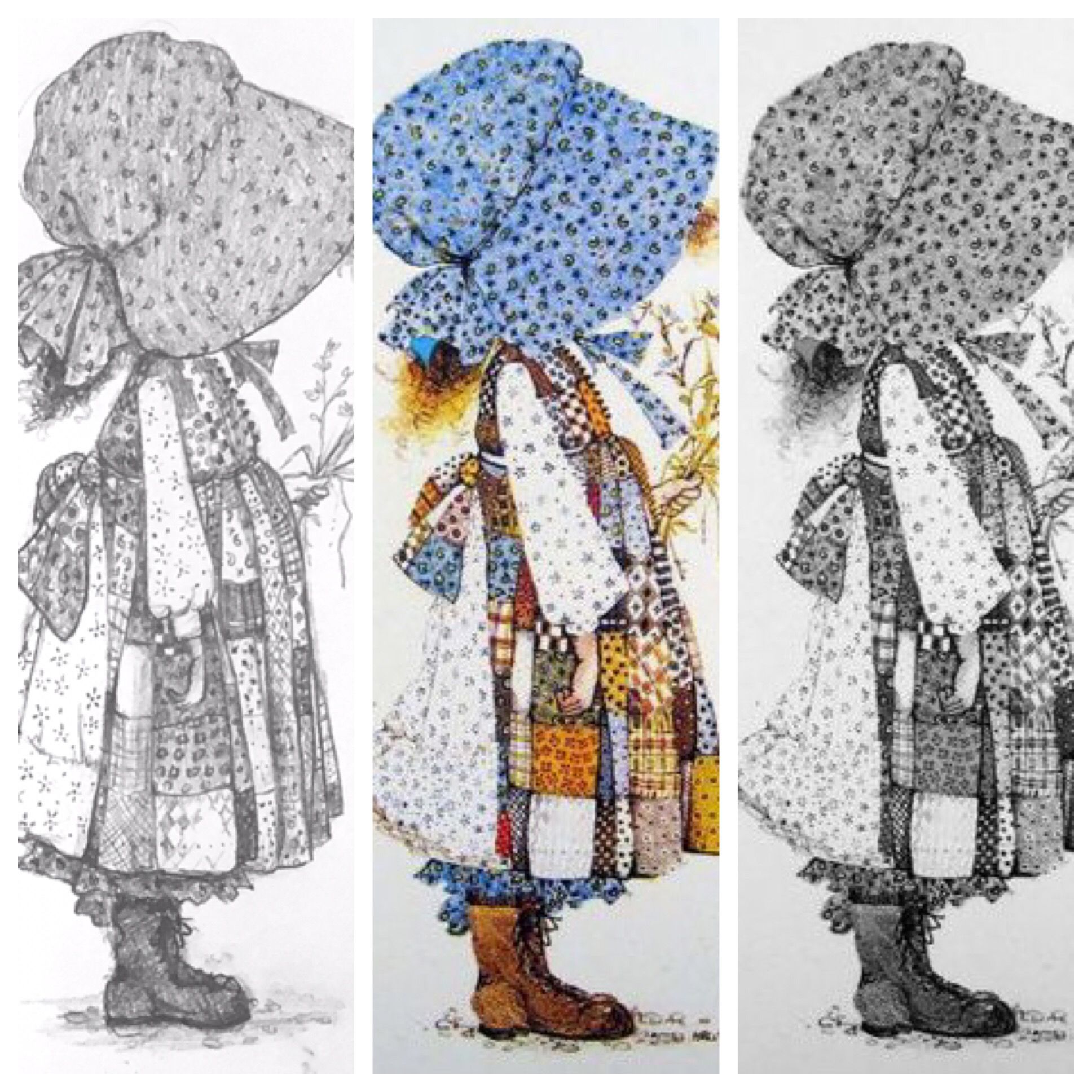
My before and after
-
@burvantill it is the perfect copy now! You can be proud. I am sure that your portfolio will go where you want to direct it in no time!
-
@burvantill it's a lovely copy, you did a great job with the many different textures on the clothes.
-
@burvantill Great job! You really managed to capture the linework and the values. I need to copy this exercise and the dream portfolio exercise.