Mermay Contest Critique - Tourism
-
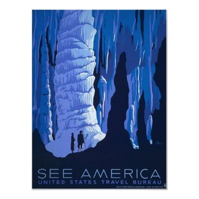
@Aleksey do you have any favorites? There is a local restaurant that has them and I can't get the following image out of my mind every time is see it.
-
I actually really like the fantasy ones nasa did
https://www.jpl.nasa.gov/visions-of-the-future/instagram and twitter: @artofaleksey
alekseyillustration.com -
@Aleksey yeah, I love those ones as well. They are very fun and so well done!
-
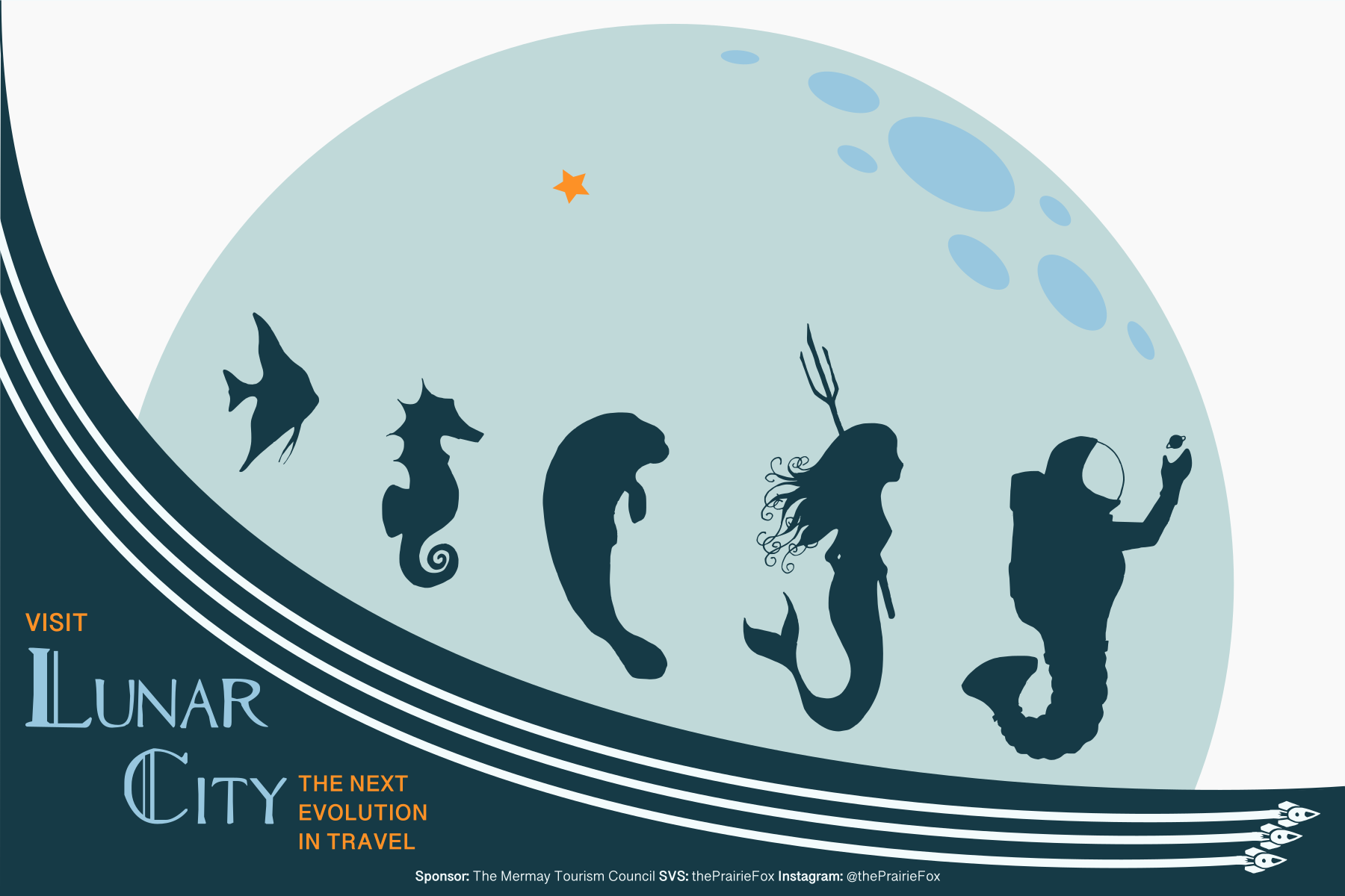
I think this is close to the finished version. Thanks for the feedback all.
I modified the moon shadow to make it feel like craters and I think think it definitely reads as a moon better. Thanks @KathrynAdebayo for that comment on how the moon wasn't quite reading. I also changed the text slightly.
Let me know if you have any other feedback. If not I will post it.
-The Prairie Fox
https://www.instagram.com/theprairiefox
https://www.theprairiefox.com -
@theprairiefox This image looks really great. If I were to give any critique maybe it would be... When you look at the cavern picture you shared above, what makes you want to look at it again and again is the cavern's detail. It makes you have awe for the environment and its natural beauty. Going back to your artwork, right now I only see pictures of the people of Lunar City (the animals or mermaids that live there, etc). What does the environment look like that makes you want to be there so much?
But again, your picture is looking great! This is just an extra idea if you wanted one.
-
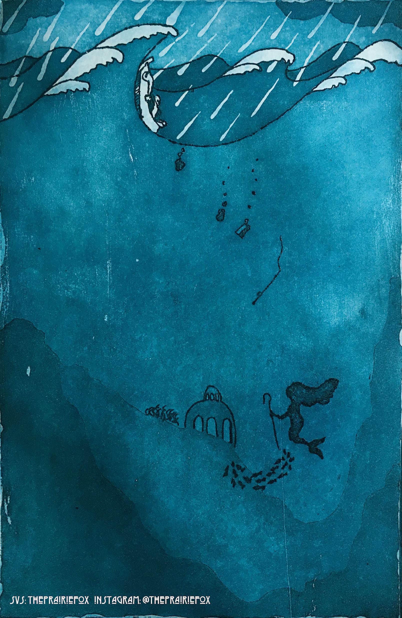
I just finished a second mermaid picture (an etching this time) and now I am having trouble deciding which to submit to the May's contest.
Which do you think is stronger Lunar City or Chaos and Calm? Let me know so I can post tomorrow.

-The Prairie Fox
https://www.instagram.com/theprairiefox
https://www.theprairiefox.com -
@theprairiefox If you submit Chaos and Calm, be aware that the image size the forums post it as makes a person have to scroll through the image to see it all if they don't click on it to see it in its entirety. I don't know if the judges use the forums to look at each image or whether they use @Chip-Valecek 's scroller. As it is, the distance between the Chaos at the top and the Calm at the bottom is quite a ways--you really have to see the image as a whole to appreciate your use of that verticality for the image to make sense.
That being said both are lovely images. They both use shape in different ways, but the textures tell very very different stories. The top seems more graphic in ways that feel less "child-like" (if that makes any sense?), and the bottom feels like it has more opportunities to fit into a children's market. But they both have a strong sense of narrative to me--they build in a story that makes the mind drift into imaginative "what if" responses. At least my brain goes there. I wonder if it's more about what you feel is stronger.
Maybe this didn't help so much... hehe...

Children's Illustration Portfolio: https://www.coreyartusillustration.com
Art Portfolio: https://www.coreyartusimagery.com
Mastodon: https://mindly.social/@Coreyartus
Pixelfed: https://pixelfed.social/Coreyartus -
@Coreyartus thanks for the input.
I am struggling deciding because they both seemed very narrative to me (exploring the what-ifs). So different, but so interesting in their own way. We will see what anybody else has to say.
I believe the judges actually don't view them on the forum but @Chip-Valecek downloads them for the judges (weeding out any extra comments and duplicates.) That is what it looked like on April's critiques at least. Though I would agree with you that the forum format does a serious disservice to any vertically oriented piece.
-
@theprairiefox Both images are beautiful and are sound concepts, IMO, but Lunar City is something I haven't seen before. I like the outside-the-box approach, and I LOVE the retro and graphic style of the image.
-
@Eli thanks I was leaning toward the tourism one... My wife voted for that one as well.
Off we go to Lunar City!