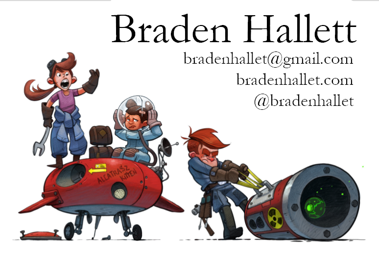
If you saw this as a portfolio title page, what would you think?
-
I'm gettin' all my ducks in a row for the SCBWI conference next week. If you opened up a portfolio and saw this as the title page, what would your initial gut reaction be? Good? Bad? This person can't pick fonts :smiling_face_with_open_mouth_cold_sweat: ?
This is the first time I've ever actually put a portfolio together. Thanks!

-
@Braden-Hallett I really love your characters and style. I would add more kerning in your name. To me the same rules apply with tension with letters. A few of your letters are touching and feels squished. There is a lot of white space up there and I think you can space them out some. Best of luck!
-
I would say “Now that’s a pro”. My one issue is with your sub text. Perhaps choose a less bold font style or perhaps choose a lighter grey color for the text. Or choose a strong color for your name. Your name and contact info are just so similar that they look like they’re figthing for attention or blending in too much with each other, no one element standing out. I hope this helps.
Portfolio: nyrrylcadiz.com
Instagram: https://www.instagram.com/nyrryl_cadiz/
YouTube: https://www.youtube.com/channel/UCbJCF1Im8ZO7hpGWTKOJMuA -
No it’s good. Nothin wrong with those fonts. Besides, the picture is awesome. So even if you had weirdo fonts they will probably still Iove it.

-
I agree with Chip. A little bit of letter spacing would help. Looks great regardless. Good job.
-
@Chip-Valecek Kerning fixed. Thanks, Chip!
-
@nyrrylcadiz That's a good idea. I like the idea of greying out the contact info a little to have it fade back a touch. Thanks!
-
@burvantill @JerrySketchyArt Thanks guys

-
This would make me want to see more! It is really nicely rendered and the characters and subject matter do a great job of piquing interest. After reading the other comments I realized that I did not pay any attention to the text. I agree with the other comments, but also, I don’t think the font choice suits the image.
-
 After reading the other comments, maybe I’m not the best source for opinions. I’m biased. I like your work too much.
-
I would say definitely childrens book or comic book. The art speaks for itself. Yeah you could fiddle around with the typeset a bit but honestly it seems like if the art directors dont like the font you’re using they’ll just tell you so i wouldnt concern yourself as much with that. It says your name it says your contact info and site, they arent gonna not choose you because of they font.
instagram and twitter: @artofaleksey
alekseyillustration.com -
I echo @Chip-Valecek & @nyrrylcadiz and say I absolutely love that this title page image has a story going on and isn't just static characters. Good job! Make sure to update us how the conference goes. Is this the main summer conference or a regional one?
-
@Braden-Hallett
I wouldn't miss your name that's for sure lols. It's funny how the one character is yelling in the direction of the audience -calling out your name - if in fact the guy struggling with the engine, name was Braden Hallett haha.
Instagram: www.instagram.com/heatherboyd.illustration/
Website: https://heatherboydillustration.ca
Shop: https://www.inprnt.com/search/products?q=HeatherBoydIllustration
Ko-Fi: https://ko-fi.com/heatherboydillustrationBe blessed,
-
Thirds thoughts. After looking at this AGAIN, lol, I think that because it IS a title page, it's okay to make your name prominent. That is the whole reason for a title page. I do agree that it may be too bold, cutting back to a lighter version of the same font and spreading the letters out a bit so they are easier to read at a smaller size.
Like this maybe,

-
I love that you show kids with all emotions. It makes the world you created richer and more interesting. I would guess the artist is working with comics for young adults (thinking about Raina Telgemeier, Luke Pearson and Vera Brosgol - not in terms of art style, but in terms of the target audience).
I kind of feel the personality of the typeface does not match with the art 100%. The current typeface is very legible, which is very good. But it feels a bit too serious, a bit like a newspaper headline. Maybe you can try to take a look of the comics that inspired your artwork, and see what kind of typeface they use for the cover page?
-
Fonts matter! Fonts matter! Lol. Ok as a graphic designer I obviously look at fonts and typography differently than most, but they really do affect the overall presentation. When I taught web design I saw so many good designs ruined by bad font choices, and so I spent an entire section of the class making my students focus on typography. It made a big difference. Fonts may seem like an afterthought, but they are such an important part of presentation that they will either enhance your illustration or detract from it. Your work is too good to use bad fonts
-
Lovely choice of character images! I'd agree that the fonts aren't quite right yet. I'd pick something else for the web addresses, maybe a non-serif font that's a little simpler, so the main heading has the serif readability and elegant impact. Personally I'd like to see a little heading, like 'character artist', or so on, but the image you picked does give a nice indication.
Kerning is better now, as already pointed out -
@Aleksey said in If you saw this as a portfolio title page, what would you think?:
they arent gonna not choose you because of they font.
Most likely true, but you're talking to someone who has the uncanny ability to pick the ugliest most inappropriate font possible for any task at hand
-
@Jon-Anderson said in If you saw this as a portfolio title page, what would you think?:
Is this the main summer conference or a regional one?
It's a regional one in Seattle. Not quite ready to make the leap into the deep end with the big conferences yet
-
@xin-li said in If you saw this as a portfolio title page, what would you think?:
Maybe you can try to take a look of the comics that inspired your artwork, and see what kind of typeface they use for the cover page?
That's a good idea. However it would probably involve me hand-writing the words instead of using a font (or downloading a Bill Waterson font which, if I were looking at the portfolio, would raise some red flags). In my experience hand-written fonts often end up looking terrible unless you REALLY know what you're doin' :smiling_face_with_open_mouth_cold_sweat:
I'll try it though, thank you!