critique - storytelling problem?
-
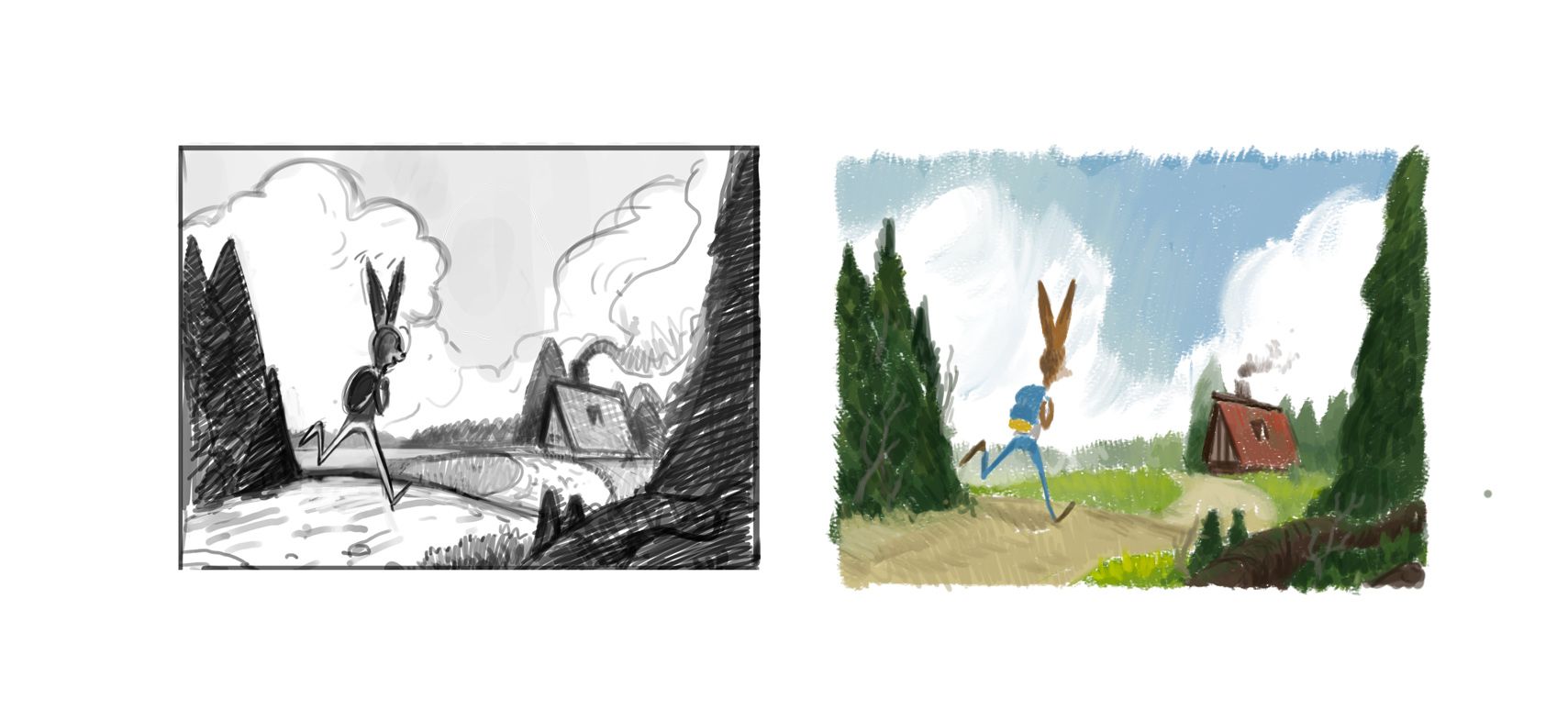
Moving on with the colors. I might do some color variations before going further.
-
Wow, the value sketch shows the trees framing the picture beautifully. I personally really enjoy the latest development. Others might have some further pointers on improving it that I might be missing, of course.
") Are you also happy with the latest version?
Are you also happy with the latest version?https://www.instagram.com/sooryajart/
The Beatles: "Roll up, roll up for the Mystery Tour!"
-
@animatosoor Thank you! appreciate it!
 Yes I am but I know there is always room for improvement
 -
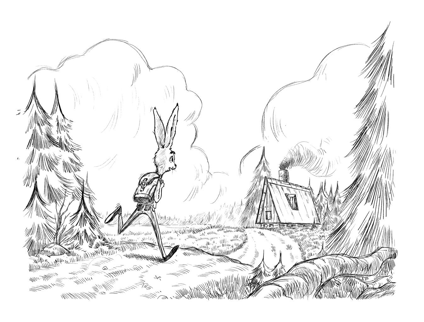
@Jonas-Zavacky I really like this one (the black and white value). With the colour one - I find the house being red competes with the rabbits attention. I am not really good with applying colour but that is one thing I noted. I also liked the line shapes in the black and white clouds which I felt you lost in the colour version.
Instagram: www.instagram.com/heatherboyd.illustration/
Website: https://heatherboydillustration.ca
Shop: https://www.inprnt.com/search/products?q=HeatherBoydIllustration
Ko-Fi: https://ko-fi.com/heatherboydillustrationBe blessed,
-
@Heather-Boyd Mmmmh yes you are right. The thing is the red roof is typical in the area I am creating it from. Maybe I can tone it down or shift it more toward brown.
Thanks for the feedback Heather!
-
@Jonas-Zavacky I really like your latest version, the movement conveys the message of "finally there" or "I can't wait to get there" and the colours in this version are light and friendly. In my opinion, there is no competition between the rabbit and the house, since the house has a more brownish red and the rabbit builds with the lighter clouds in the background (compared with the house) a great focal point. I am looking forward to seeing you further progressing
. -
Thank you! @mellebluesworld that is good to hear
I will post an update soon. -
@Jonas-Zavacky this is looking fantastic! A much stronger narrative!
Taylor Woolley
(Formerly Taylor Ackerman / StudioLooong)
Website: www.woolleystories.com
Instagram: https://www.instagram.com/woolleystories/ -
I agree with @StudioLooong , you can imagine a story emerging from the image!
-
@StudioLooong Thanks a ton!
@shinjifujioka That is great to hear! I am glad you think so! Maybe later I can do a couple of illustrations following this one

-
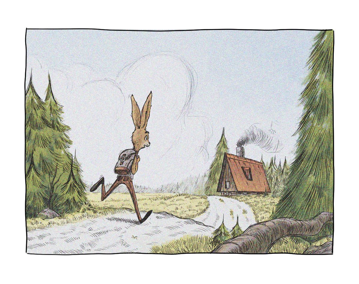
Ok, I think this will be it for linework. anything that is bugging here? also, I see this as children illustration. Do you see this would fit in that world? I wanna really play out the colors, but I am not sure how the linework goes (I love doing it tho)
-
@Jonas-Zavacky I think it looks great! Nothing jumping out at me that I feel should be changed. I'm wondering if maybe the big pine tree to the left of the house will cause composition problems once you add colour? But then again it probably won't if the values are different enough. Well done!
@abhainn_fionn
-
@ShannonBiondi thanks a lot! Yeah i will make sure it is separated enough - like in value sketch. Thanks for feedback again!
-
@Jonas-Zavacky I've been away from the forums focusing on a class for the past week or so-so imagine my delight when checking in and seeing what you've done--when last I left off, I thought you were going to stick to your original idea and continue with the very sweet girl and bird. I know sometimes I don't want to go in the suggested directions--and then maybe after some time, I can hear the suggestions in a different way.
This rabbit running totally conveys the happiness to get home. The only suggestion I have might be to play around with cropping-and see if the image you have is/not the most successful. Right now, it feels 50/50--half of the action on the left, and half on the right. If you're interesting, you might find that shifting it to the left or to the right would push things off-balance and maybe up the energy even a bit more.
-
@Susan-Marks aaah
thanks a lot for your kind words.I tried to crop it, but I couldn't come up with something that would look better. :I Maybe i just don't see it.
Maybe I will when I will come back to it in the evening.Thanks a lot again and welcome back to the forum
-
I could totally see this as a children's book illustration. The difference in storytelling between this image and your earlier one in the thread is huge. Love the line work. The expression on the bunny is so good, as well as his running pose.
In regards to the 50/50 issue that @Susan-Marks brought up, I can kind of see that. I think a quick solution might be to just reshape the clouds so that they aren't 50/50. There is a large shape framing the rabbit, and another one framing the house. Maybe that is adding to the 50/50 feel.
I really like the piece!
shinjifujioka.com
https://www.facebook.com/shinjifujiokaart
IG: @shinjifujiokastudio -
@shinjifujioka Omg thanks a lot!

Yeah that might be it
I will jump on the clouds when I am at home.Appreciate the comment and I am happy you like it !!
-
This is so lovely and really suits childrens illustration! I love your composition
I hope you do revisit your other illustration with the girl and the bird as it was so beautiful.
I personally preferred your first rabbit character with the short legs, to me he had more personality but that's only my opinion! Your rabbit character works really well too His face is just brilliant and your detail is beautiful!
I can't wait to see this in colour -
@hannahmccaffery thank you!!! :smiling_face_with_open_mouth_smiling_eyes:
Yeah maybe I will.. I would like to see interaction between them, but in diferrent scene maybe.
Haha yeah I see what you mean about the rabbit . But the current one was better fit for this imo.Haha mee too
color is not my strong avenue so I will fight with it before I will land on something showable. -
So this might be it... the colors are laid and that is the final touch for me.
any comments on that before I call it done? I basically am, but I would like to hear some opinions on the colors first !!
anyways this whole process was really long so far and loved working on that and I am so thankful for every advice and comments I've got for it so far. It is a really supportive group here...