Mermay: "For you are worthy." (Need your feedback)
-
@MichaelaH I love the red too. Unfortunately it got too dark..making it lighter would be a challenge with the background being light as well with the glowing light..love the opinions & feedback
")
@shinjifujioka welcome back! thank you for the positive support ..wish I could do them all..haha..can't wait to see your piece !
@Chip-Valecek you are never late to the party Chip! B & E do look pretty interesting..thanks!
However guys,
As I was working on it, I had a different idea. What if instead of being crowned, she is being bought back to life?
A work in progress..
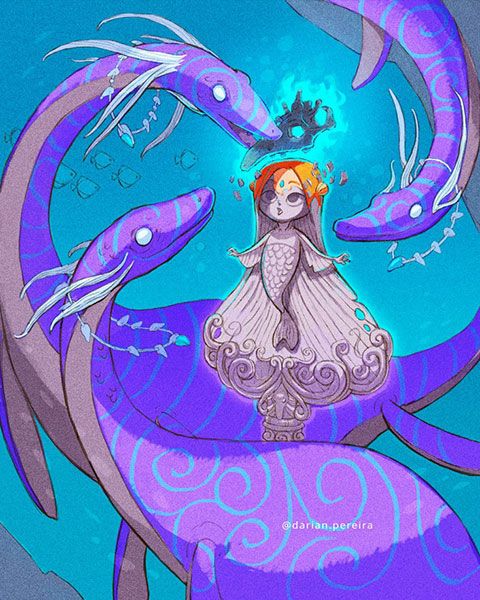
Is the idea coming across? I wanted to avoid showing the cracking of the statue to reveal the mermaid (i.e keeping the statue intact) to add more drama, but wasn't not sure if it would convey the concept..
-
@Darian I love the new idea, what I would change, eyes in this grey color like the face or the white of the eyes, letting only the stroke stay, so that she looks like stone statue. Now the darker eyes is giving bit feeling of looking.
After that I would make the "alive" part till one eye (half of it) so that you see the color of the eye. -
How fun is that! Super cute idea. Love it.
-
Love the concept. That statue design is really awesome. I'd consider putting a couple of fractures/chips in the statue to sell the idea of stone more. Like an old, weathered statue you find in old, weathered gardens.
-
l like B and E the best!
@abhainn_fionn
-
@ShannonBiondi But you've updated it now!
 Love the new concept. I love how the warm colour at the top of her head really makes it seem like she's being brought back to life...
 -
@Darian This is very cool! I do think the original concept is excellent though - the concept comes across clearly to me and i really like the diaphanous part of the mermaid design.... the new concept would need text i think for it to come across but the original does not - thumbnail A with mermaid from B would be my favorite of all of these - it will be great whichever way you go though - really nice!
-
@Darian my best bet is on B/C
-
@Darian nevermind, this new concept of yours is way cooler. I love it.
-
@MichaelaH very interesting inputs! thanks! The pupils of the eyes were the same color of the rest of the statue initially..I made them darker for readability :smiling_face_with_open_mouth_cold_sweat: The visible eye would be in the area of the shadow?
@Whitney-Simms thanks!
@shinjifujioka Will be adding grunge textures on top for the statue..would adding deterioration help if she's being brought back to life
 maybe a little? thank you!
@ShannonBiondi Glad that's coming across! that is the focus of the illustration!
@Kevin-Longueil Ah yes. I have been feeling the same about the clarity. If only we could submit two entries! @Lisa-F
@nyrrylcadiz awesome!
-
@Darian Hi hi hi, yeah, I would make the eye the same color, like you did before, it looks more like statue than. ANd the living part, i Would make her left eye coming partly to live.
-
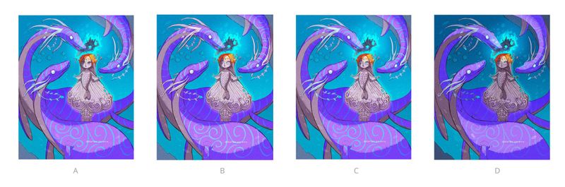
So which one will it be?
A. is the original composition
B. has the eyes lightened to the statue color
C. is B with part of the left eye visible.
D. is a darker version, emphasizing focus on the skull & the mermaid's head. -
Personally, I prefer D. The dark helps emphasize the magic of the helmet, which is really what the crux of the story is about. This image is about her transformation, and you're pulling the attention to that fact by helping the rest of the image recede into the background. That makes it easier to understand, in my opinion. So D's my favorite.
-
I Like D also, the darker values makes the skull really visible, like magic.
-
Yes! I liked the mood of D as well so thought I'd share it. Wondering if it's too dark for a children's illustration.
Will be adding more of the glowing light hitting the dinosaurs as rim light..