Finishing Drills for a Chronic Dabbler.
-
@MichaelaH Aww, thank you, haha. I did paint her on a different layer and lower the opacity, but that doesn't show very well here. XD I shall give the see-through look another go. I'm also not entirely happy with the overall colour scheme yet, so I'm going to give that another go as well.
-
This is a colour scheme I'm slightly happier with. The last one I did was a little too muddy for my liking. I'm going to take this a bit further and up the contrasts.
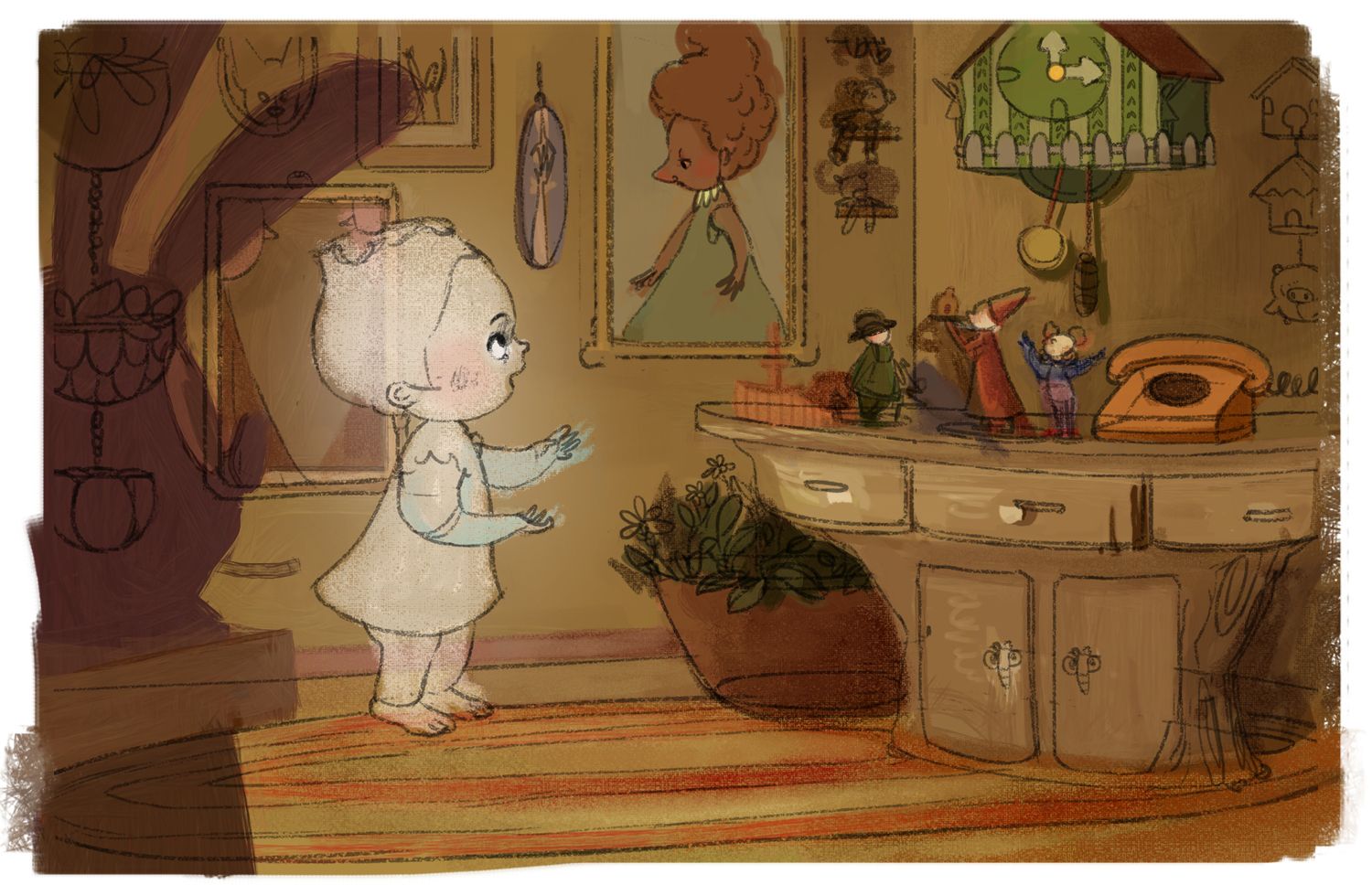
I've also made her a little bit transparent, @MichaelaH! I'm going to work on this some more to see if I can exaggerate the effects a little more.
Is it clear what the character is doing, by the way? XD
-
Progress:
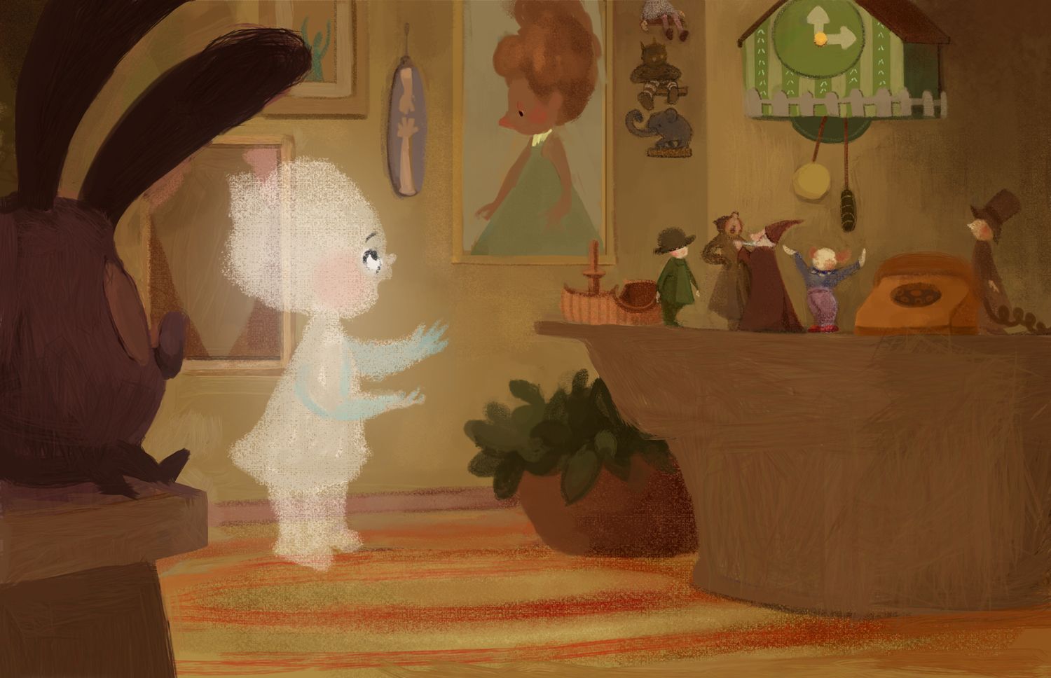
I'm going to put in all the darks - I feel like it would look better with them?
-
This reminds me a lot of an old 1977 Disney TV movie called "Child of Glass". Maybe it can guide you regarding how much of the dark lines to put in? Please note it's bad 1970s special effects... hehe...
The soft halo glow around her helps with her ethereal quality. I wonder if maybe she has a bit of shading but not lines? That soft blue you've got works. Maybe that's the color of her shadows? I wonder if you have enough specific shading you won't need line to outline her shapes... Hm...
-
@Coreyartus I've never heard of this movie. I love hearing about stuff like this, so thank you!
I'll take a look at how I can work those darks in. And yeah, I do want this painting to be without lines, which is just something I want to try out before I choose to go with any specific style. It's adding a lot more hours to the painting process, but I really want to figure this out, lol. I'm going to see if I can shade her with blue just a little more and see how it works out.
-
I think this is really nicely done so far. You asked if it is clear what the character is doing and to me it looks like she is waiting for the cuckoo clock to chime. I’m looking at it on my phone though so if that’s not your intent, I might just be missing it due to size.
-
Thank you, @demotlj! It is not what I intended with the story, but don't worry about it - I really appreciate the guess! It tells me what's not working.
I went and changed it a bit to see if I can get the story to read clearer:
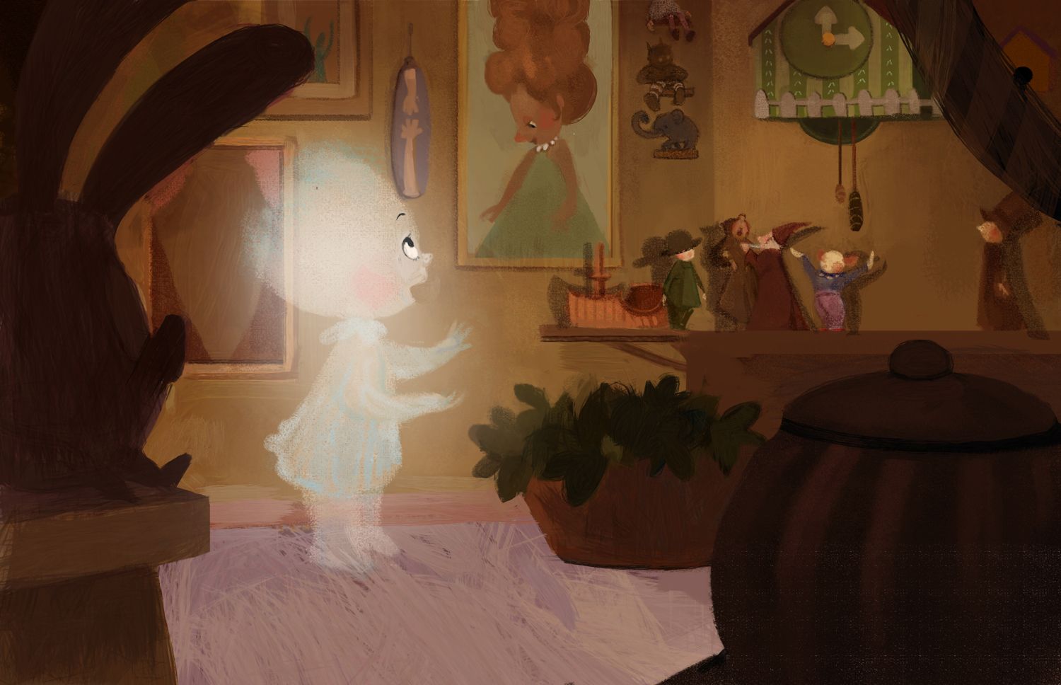
Does it still look like she's interacting with the cuckoo clock?

-
Yes and no, after I read the comment I can see her looking at the clock...or also communicating with the picture lady...Where does she has to lool?
And it is lovely without the lines, have the same problemn, would like to draw more without lines...Great colors and love the litle figurs and the clock also, has many great details -
@MichaelaH Hahah my intention was to have her talking to the lady in the picture - that’s where she’s supposed to look. I wasn’t intending for her to look at the clock at all, but I think my previous picture wasn’t very clear. Is this reading clearly?
Thanks for the note on the rendering! Ditching the line work was making me a bit nervous. I’d love to see your explorations without lines as well!
-
Maybe it is the bodylanguage, she is talking to the lady in the picture, but her right feet is back, usually if I am talking left, I put my right foot also infront that I am more aiming for the lady. What about doing some small magic, making the lady in the picture little bit brighter? Like shining from the ghost light?
-
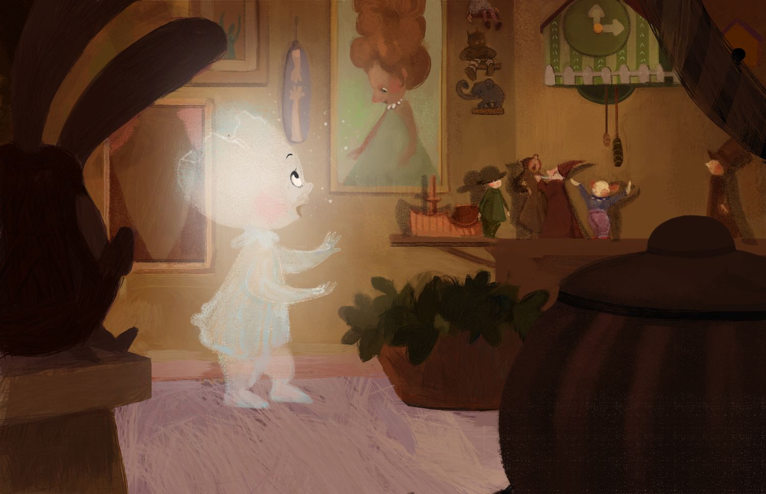
Ohh my, thank you so much for these tips, @MichaelaH! Great ideas that I'd not thought of. Here's my altered version after taking that feedback into consideration:
-
Adding the white to the eye of the lady in the picture really helped because I hadn’t noticed the direction of her eye before. I agree with @MichaelaH about the body direction but when you changed it, I think you changed it in the opposite way she was suggesting though I may not be able to see it clearly on my phone. Her body should be angled slightly toward the picture so her right foot would be farther to the right, with the left foot slightly back. The eyes, however are much more clear.
-
@demotlj You're right - I only realised after posting it that I'd put the opposite foot forward from what @MichaelaH had suggested, haha.
Just so I'm clear, the suggestion is to angle her body a little bit more towards the picture, and also to have her right foot forward, yes? I shall experiment with that and post an update soon.
-
Yeah her right foot forward and left behind, so that her stance is toward the picture lady. I would make the picture lady little bit more glossy
-
I don't think you need to angle her much because you don't want to lose the view of her face. I really struggle with camera angles like this when the character is standing between the "camera" and the thing he/she is looking at. Even a 3/4 back view loses so much of the character's face. I think shifting the feet slightly as @MichaelaH said would be enough. It's such a charming picture overall.
-
Thank you, @MichaelaH and @demotlj!
@demotlj You're right about camera angles to effectively show both the character and the thing they're interacting with. 3/4 back-views definitely show too little of the character's face. I feel like the ideal camera angle in these situations would be either over one character's shoulder (as in movies), or if the character's expression is crucial, almost a full-on side view. The angling, then, can happen in the perspective of the environment, a little bit of twisting of the body, etc.
This is my latest update. I'm nearly done!:
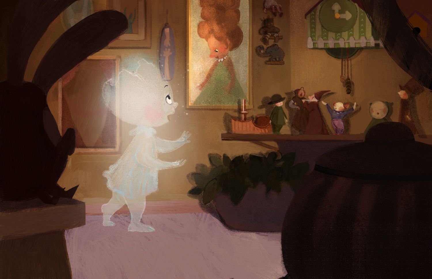
-
Insecure journal entry incoming:
My art - for a project I’d completed half a year ago - is displayed at this event, and I wish I could go back and improve on it, but it’s too late. All I see are the flaws, unfortunately. Great project, though. -
@animatosoor that's alright! It helps you see how far you have come now
 Can we see it? ( It's perfectly ok if we cannot )
 -
@animatosoor It looks beautiful, love this "highlighted" lady in picture, now you see their communication much better. also the feet, great work as usual...I think I have to start this also, week or 2 for one picture and my portfolio
-
@Darian That's true, and I've got to try and keep that in mind. Thank you so much for the encouragement.
Yes, I can show you the work I was referring to. They were a collection of portrait paintings for a local history book. In my opinion, some of the portraits turned out better than the others, and I cringe at some of the bad ones. Some of the paintings I did for this book last year are over here: link.