Finishing Drills for a Chronic Dabbler.
-
@animatosoor Really loving the expressions on the animal characters. Fantastic! Followed you on Insta too
 You can do it
 -
Hi @NelsonYiap - thank you for being so supportive! I really appreciate it.

On days like these I tell myself "Just keep truckin'." I'll continue doing the work I need to do, haha.
-
lols Right now I am working on 3-4 works I am happy with. Your 12 is definitely in a league ahead of me. If you love it and you grew from it (and it's consistent -haha my issue) include it.
-
@Heather-Boyd Aw it's great that you're happy with the pieces you're working on so far! All the best - I'm sure you'll develop a lovely portfolio.
Nah, I'm not ahead in any way, hahaha - with my nagging self-doubt it often feels like I'm stagnating, strangely. You're right that if we get growth out of this process, that's an indicator that we're doing something right. As for consistency, that's something I need to keep in mind for my work as well.
-
Thank you, @demotlj.
 This is my first time working on anything like this, so it's been a bit unnerving.
 -
It's Monday here, and this is my full-bleed art!
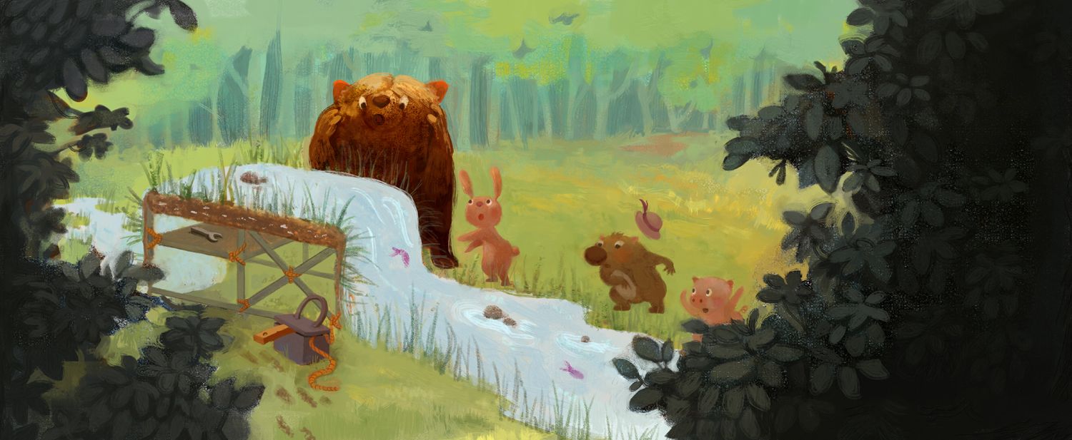
With this one, I went through phases of hating it, and then sort of liking it, and then hating it again, and now I've settled on a middle ground: "Painting, you were a new experience, and you've taught me a lot."
While this was meant to be my final, I would still like to hear any views on how this might be improved.
-
@animatosoor I would reduce the right plant, so that you can have place on the top of the right Page for the Text. Maybe little more detailed lines on the animals? It is bit different in style than the other pictures. But the style is lovely for a children’s book.
-
@MichaelaH That's great feedback - thank you. I'm going to work on those changes.
As for the style: you're right, this one is completely without line work, which makes it quite different from the other pictures I've made as of late. I'm going to see if I can give it another pass to keep it more consistent. I'm still finding my footing when it comes to painting style, that's for sure.
Thanks once again.

-
Oops, I just realised that I'd completed two paintings the last week, but had only posted the double-page spread above. This was the other one.
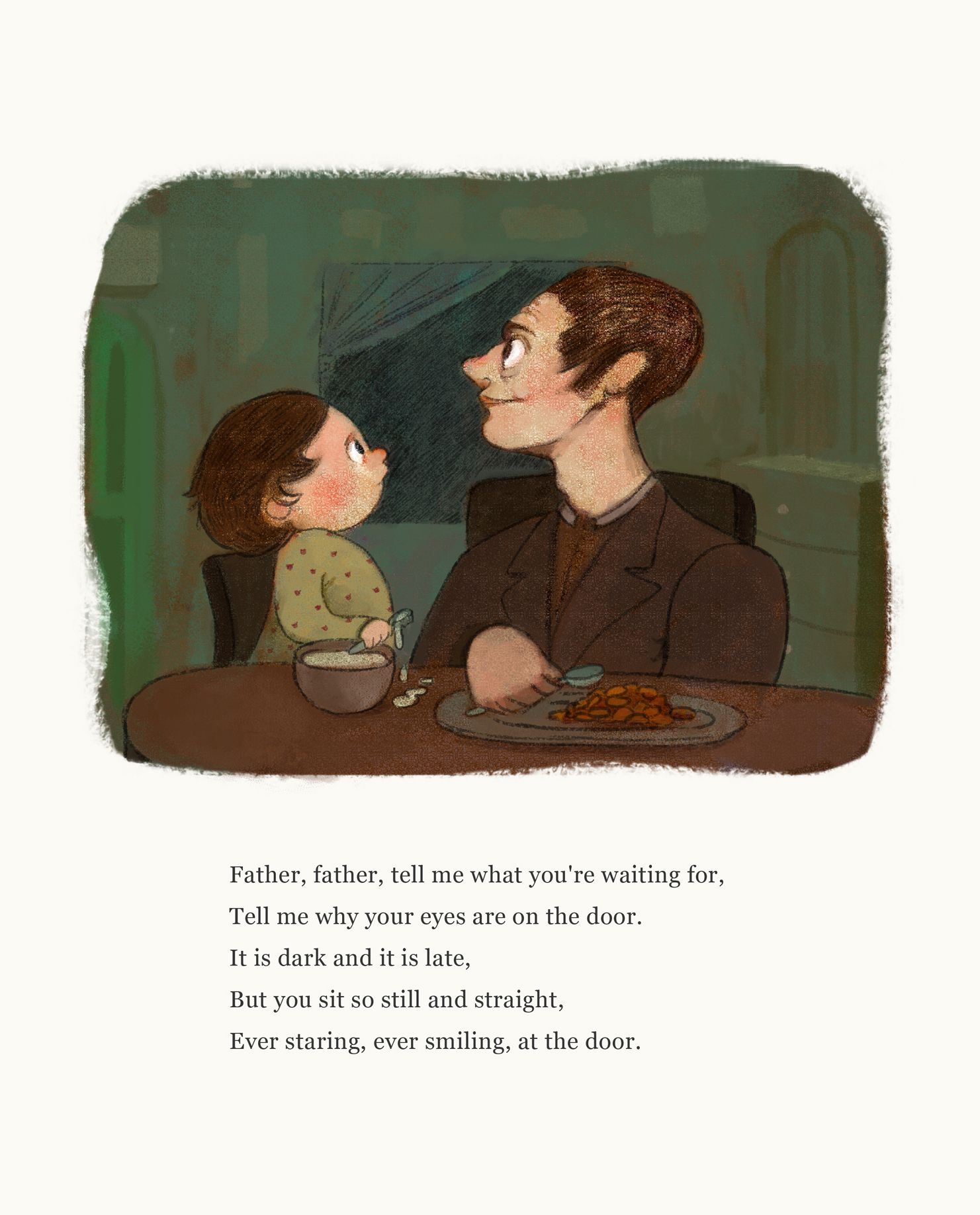
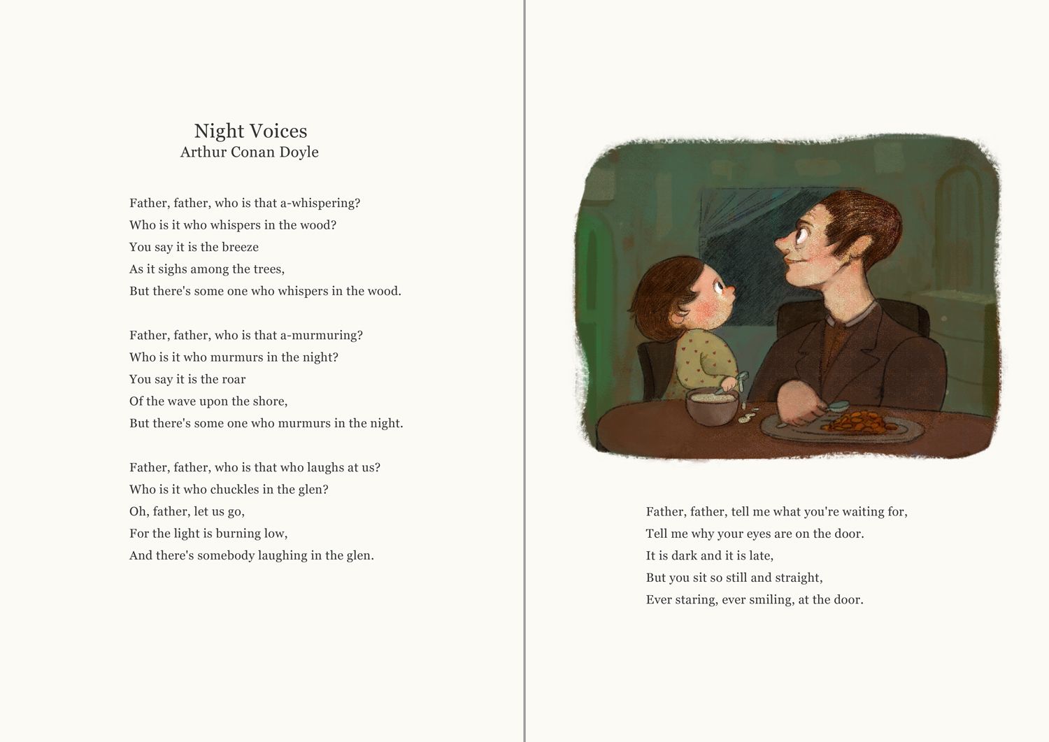
-
Week 4:
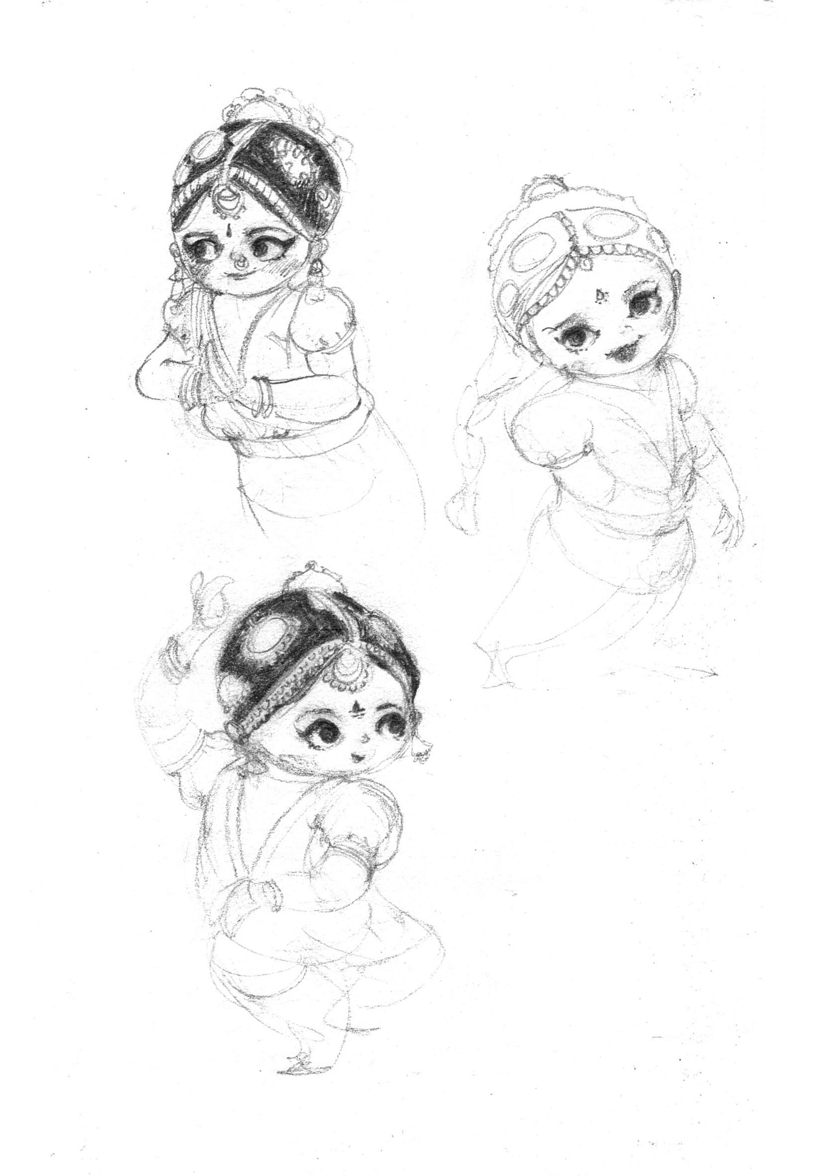
For this week, I will be taking this page of character drawings in my sketchbook to a finish!
-
I have this sketch so far as part of my progress for this week.:
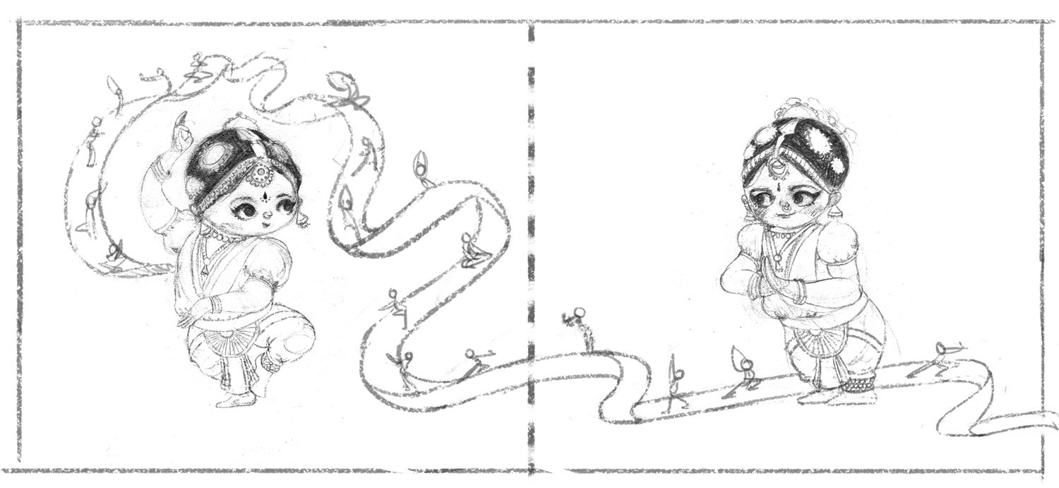
One thing that's becoming increasingly clear to me about my ideation stage is that whenever I start with something vague and attempt to draw more details in without knowing what the story is going to be about, it almost always feels lacklustre. This at the moment feels vapid to me because I've no idea what this little girl's story is! She's a wonderful classical dancer, and that's all I know of her story right now.
In other news, (since this has become my sketchbook/journal), I feel like I need to change my IG handle to my name. "animatosoor" can't stay, I think, despite it having part of my name in it. My options are: sooryaart, sooryaillo, sooryaillustration.
The same will go for my website name:
sooryaart.com, sooryaillo.com, or sooryaillustration.com -
@animatosoor I like the first one: sooryaart the most
-
@MichaelaH Thank you! The only thing stopping me from going with that is the fact that it's taken on FB, haha. My next choice would probably be sooryajart, "j" being my initial.
-
@MichaelaH I've settled on sooryajart! Thank you for your input.

I'm ditching the little dancer illustration this week, and replacing it with this one, which is my interpretation of the poem "Our Little Ghost." I'm shooting for a series of three illustrations with this one, to complete over the coming weeks.
Thumbnails and linework:
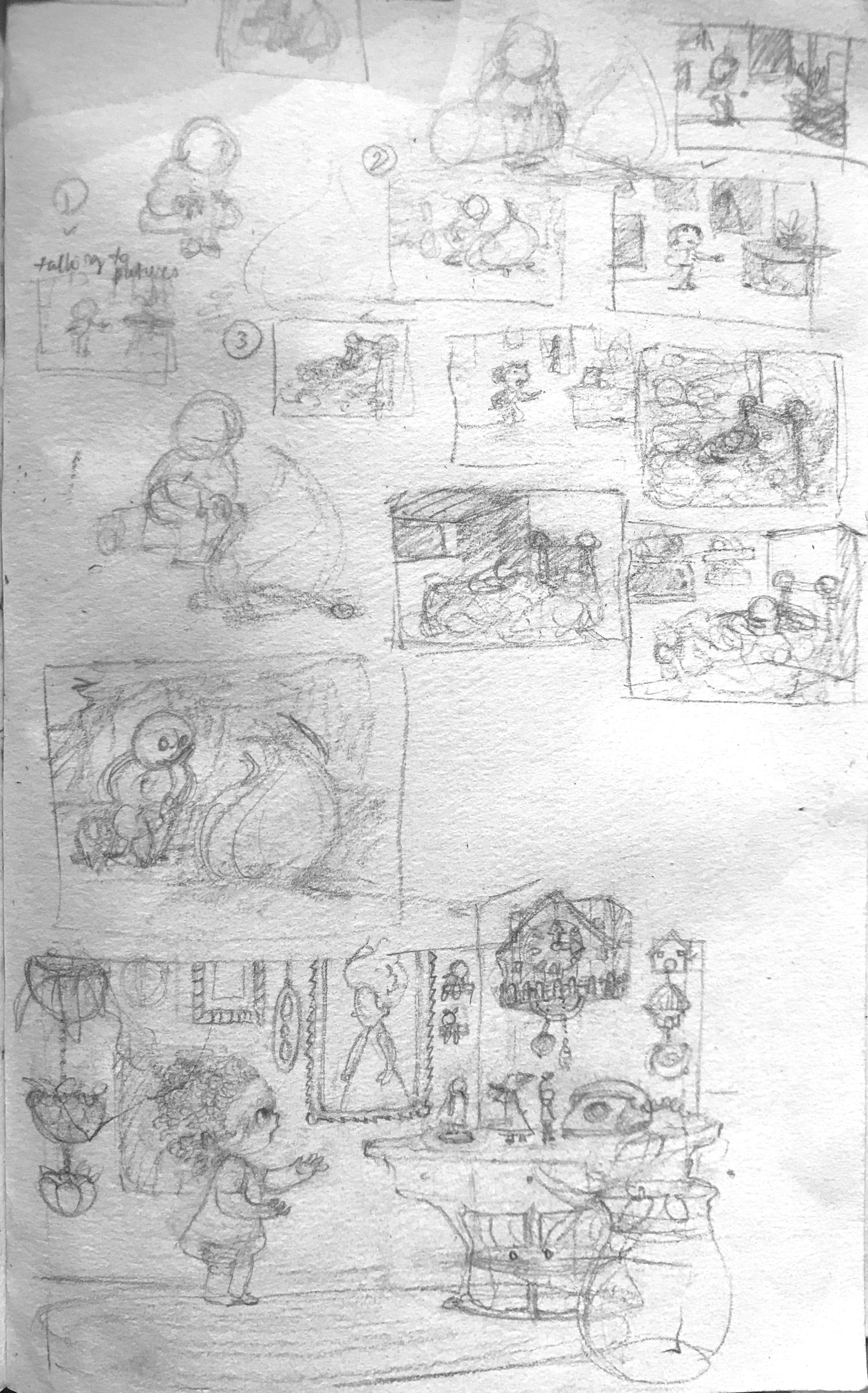
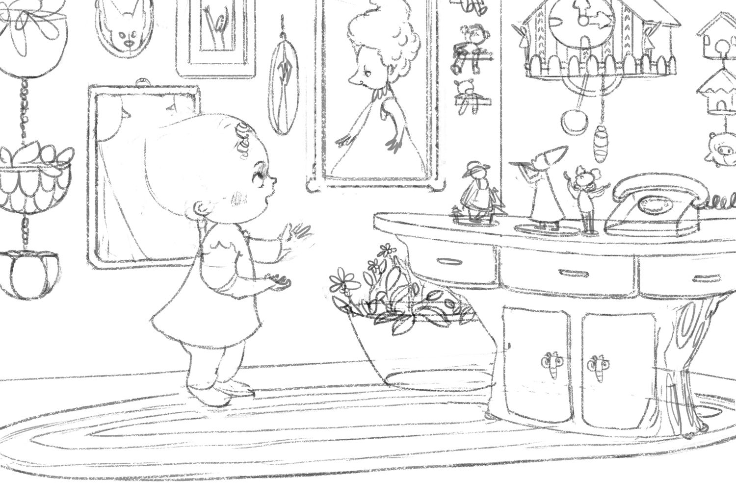
I'm still fleshing this out - especially the girl (who's going to be a ghost) - but if anything stands out as being problematic at this stage, please do point it out!
-
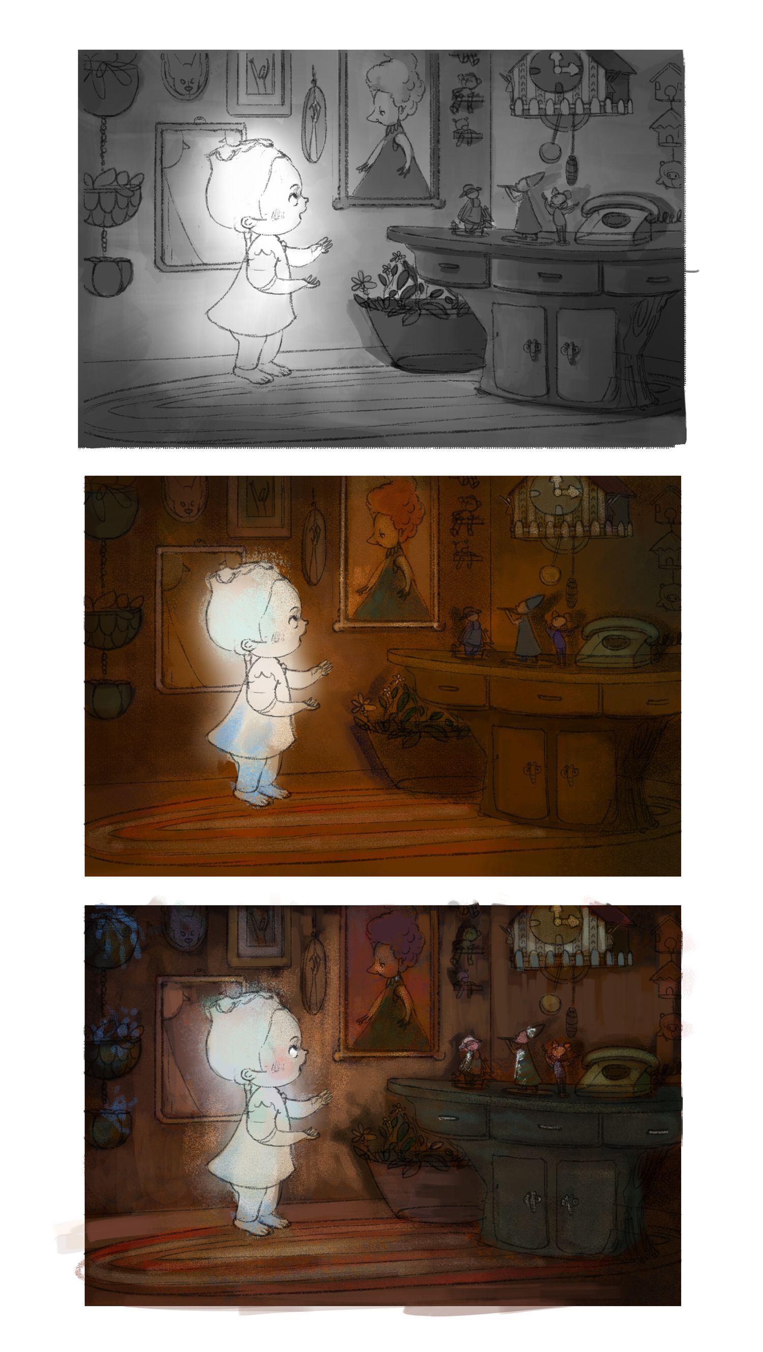
Value and colour studies:
I was really struggling with the first colour study, and I think it was only in the second one that I started to figure things out a little more. I know I want the colour palette to be warm for this piece, and felt a bit stuck on how to use colours correctly while sticking with that palette.
If anyone is able to chip in, I'd love to hear if 1) the story reads clearly, and 2) you've any tips on improving on the colours/lighting?

-
@animatosoor Shee looks beautiful, what about looking little bit through her?
-
@MichaelaH Aww, thank you, haha. I did paint her on a different layer and lower the opacity, but that doesn't show very well here. XD I shall give the see-through look another go. I'm also not entirely happy with the overall colour scheme yet, so I'm going to give that another go as well.
-
This is a colour scheme I'm slightly happier with. The last one I did was a little too muddy for my liking. I'm going to take this a bit further and up the contrasts.
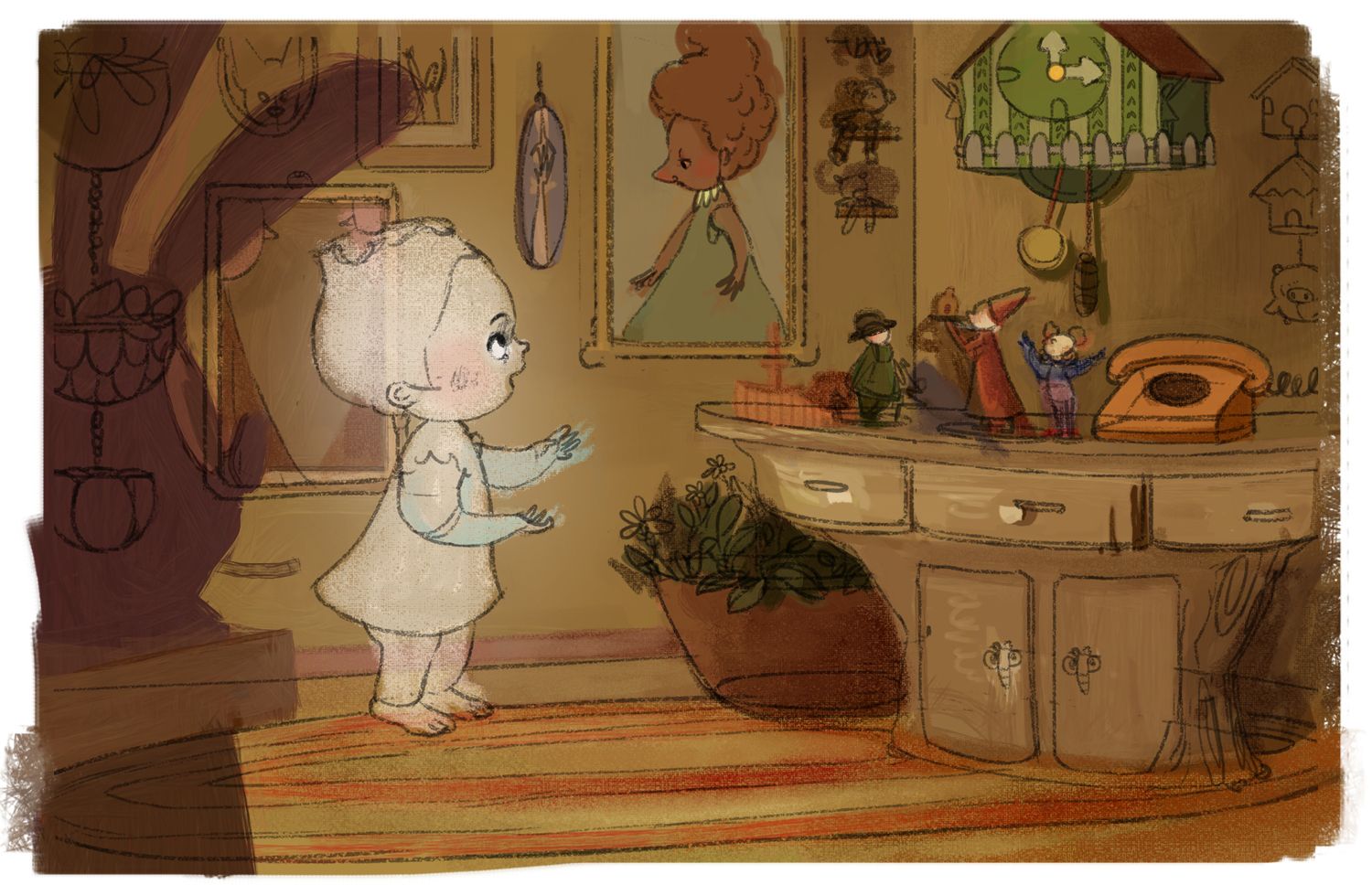
I've also made her a little bit transparent, @MichaelaH! I'm going to work on this some more to see if I can exaggerate the effects a little more.
Is it clear what the character is doing, by the way? XD
-
Progress:
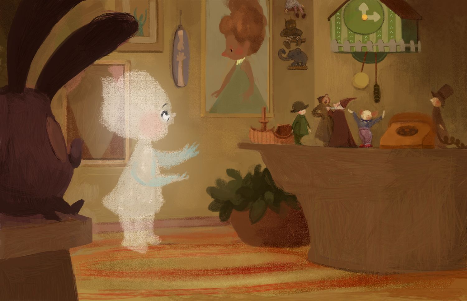
I'm going to put in all the darks - I feel like it would look better with them?
-
This reminds me a lot of an old 1977 Disney TV movie called "Child of Glass". Maybe it can guide you regarding how much of the dark lines to put in? Please note it's bad 1970s special effects... hehe...
The soft halo glow around her helps with her ethereal quality. I wonder if maybe she has a bit of shading but not lines? That soft blue you've got works. Maybe that's the color of her shadows? I wonder if you have enough specific shading you won't need line to outline her shapes... Hm...