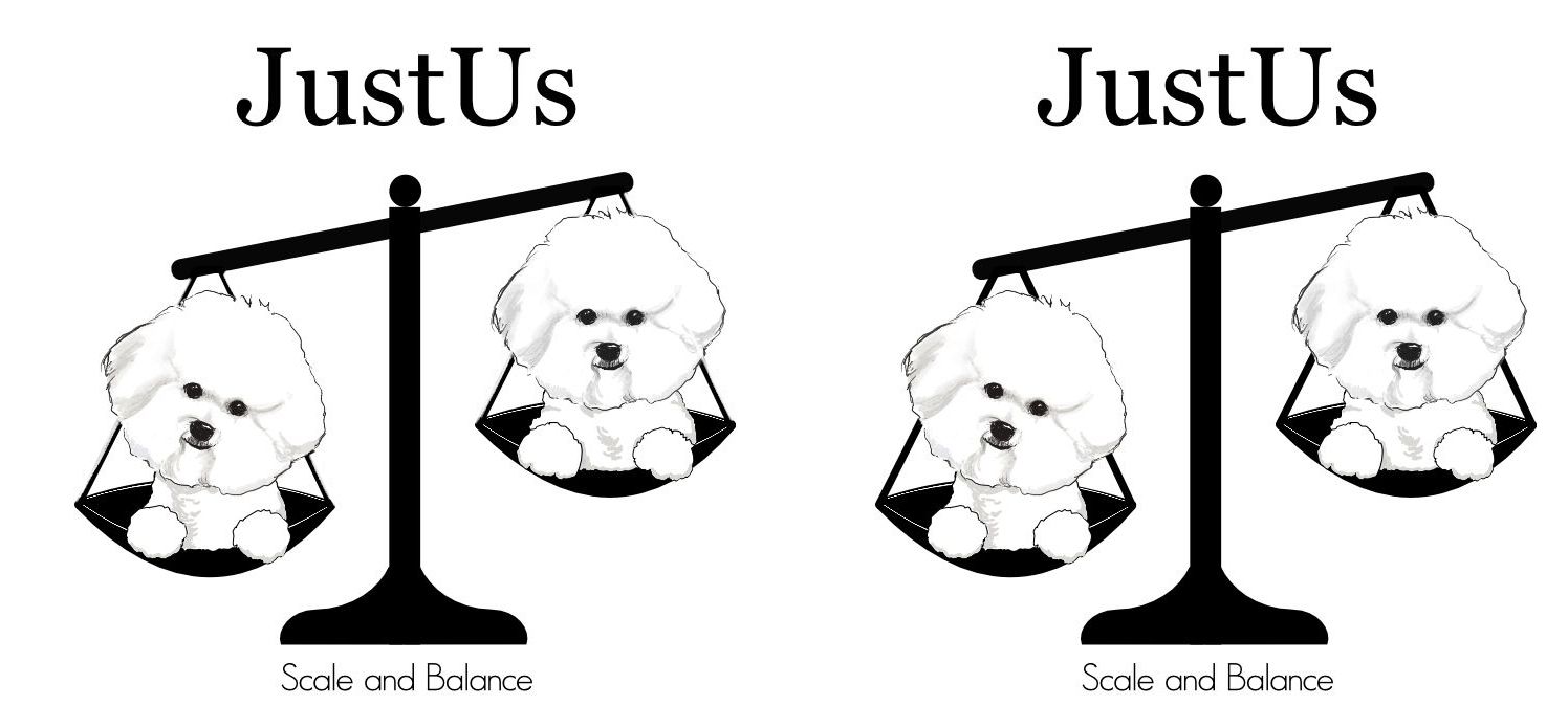
logo design
-
This post is deleted! -
This post is deleted! -
This post is deleted! -
This post is deleted! -
This post is deleted! -
This post is deleted! -
This post is deleted! -
This post is deleted! -
This post is deleted! -
This post is deleted! -
Oh, boy. This is tough.
-
@NessIllustration this is very helpful.
-
This post is deleted! -
This post is deleted! -
This post is deleted! -
This post is deleted! -
@BichonBistro While I was still in college I had a part time job in a prepress department redrawing logos for hours on end. We received them in every type of format imaginable, and we always made it work. To avoid a back and forth with the client, I would just supply multiple files types: high-res JPG, PDF, and SVG should be fine. I found the most requested file types to be EPS or PDF set to “editable” in export settings, with PDF being by far the most requested. For the logos, I personally prefer the first one because the base is more round and seems to have better flow.
-
I like the first logo as well.

-
Maybe thin the chains a bit. Just an idea.

-
@Erin-Cortese Thanks Erin, I hope this will not be a major headache for the person in the pre-press department, but it’s good to know it can work even if I can’t get the head vectorized. Your experience as a designer has been so helpful!