still painting mud
-
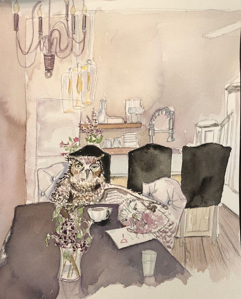
Trying to push myself with values and lighting and I am still creating pieces that are muddy and bleed together, so frustrating.....Maybe I should go back to black and white for a while. What books videos helped you all?
-
Maybe it is your choice of colours -there on the brown/tan side. Refresh my memory -can you layer watercolour -same colour to make it darker and different colours without blending??
Unless you like the pencil lines which is fine of course -use a lighter pencil (H/harder and less blending pencil) it may be contributing to your murky/muddy colours.
Your black chairs are the most distinct being black in a light room -consider rearrnging what areas you want to be read first -let colour help you. And I think doing a value practise first and then scanning it on your computer, whatever digital program you use select/teardrop the values and find the corresponding colours and the try to make them traditionally.
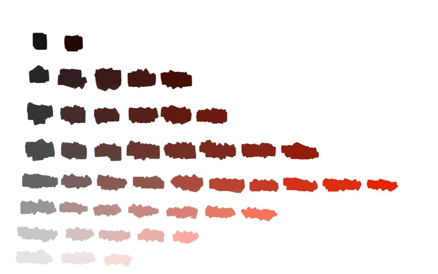
I will attach my red value experiment if that would help -turning b/w values to colour is a struggle for me as well -but this way is helping me -however I am using digital so it cuts the time in half but none the less. You get the idea -unlike Photoshop I had a tin bit more trouble converting these in Corel.

Anyways I hope something helps you,
")
Instagram: www.instagram.com/heatherboyd.illustration/
Website: https://heatherboydillustration.ca
Shop: https://www.inprnt.com/search/products?q=HeatherBoydIllustration
Ko-Fi: https://ko-fi.com/heatherboydillustrationBe blessed,
-
I understand your dilemma. I have the same problem that I am trying to work through. I think that watercolor is a tougher medium to learn how to do that with, because the thought is always in my brain, "If i make it too dark I can't fix it." I really have to PUSH myself. It's all mental. I am going to try something that may help. I figure if I don't love the image too much then I won't be worried about "wrecking" it. I'm going to make multiple copies of the same sketch and just go for it... as soon as I am done with the one I'm struggling with right now. LOL.
Lisa Burvant
www.lisaburvant.com
Instagram & Twitter & SVS: @burvantill -
While the colors are muted, I don't find this particularly muddy, but perhaps your intended lighting effect didn't turn out the way you wanted? What was your intention with the lighting? As far as values go, Creative Composition is pretty helpful in terms of helping you to control values to help with focal points.
Website: www.tessawrathall.com
Instagram: www.instagram.com/tessawrathall_art/
-
@Heather-Boyd That is awesome! Thanks!
-
@burvantill That is a fun idea-and no pressure!
-
I know what you mean watercolours are best when you charge them full of pigments. I did loads of paintings that looked washed out and I kept going back to gouache because my paintings looked pale then I thought I would use more paint and that worked for me... anyway years later here is an example that you could do just using more pigment. I think it looks better, see what you think it might help.
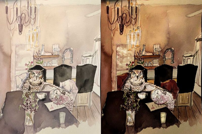
Ps. I used curves on photoshop to darken everything then removed some dark where the characters are.
-
@lmrush Have you watched Marco Bucci's watercolor sketching video on here? He creates really vibrant scenes with watercolors (and a little gouache).
-
@TessaW Thanks! I will go back and re watch, it has been a while since I saw it. My intention was to use proper lighting, proper shadows from the light source-successfully
-
@Jason-Bowen WOW! Thanks, load more paint, I will give it a try!
-
@Jason-Bowen
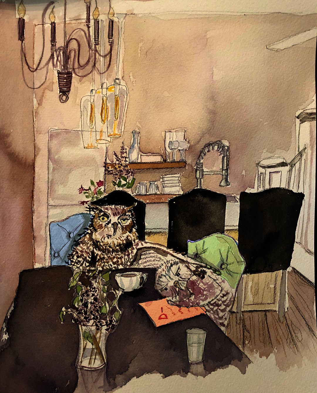 Jason, I had trouble replicating the curves you did, but had fun plying around with a bit of color, thanks!
 -
Nice I like it
-
This looks charming. Wouldn't call it muddy though. Maybe cause a lot of the colours are very earthy/warm? It could also be the use of black (payne's grey?) which could be bringing the colours toward it. It's definitely harmonious enough though with the exception of the very black chairs, but that's a real nitpick. Keep it up!
-
@NelsonYiap Thank you for your kind words, I feel like 2 steps forward 20 back sometimes
-
Maybe you’re already doing these, but I thought I'd mention these painting tips because they changed my watercolor practice.
Use two big water cups for rinsing your brush. Keep one for getting the the brush mostly clean and use a second for getting that last bit of pigment out before switching colors.
Also, start with a fresh pallet and clean paints. Watercolor pallets have a tendency to get pretty 'cruddy'. All that paint hiding in corners and at the edges of old mixing areas can easily contaminate a bright color making it mud before you ever get brush to paper.
Take your tube of black paint and toss it in the bin. Adding black to any color turns it into mud. Mix your shadows by adding a dark blue or brown.
Use a limited pallet (this is one I am still working on
 ) pick the colors you will use and isolate them on your pallet. For instance, you will be amazed at how much you can paint with just burnt sienna and deep ultramarine.
And finally, you might want to make a mixing chart to help you find colors that play well together and those that don’t. Every brand is a little different here, so you’ll want to do it yourself with the paints you’ll use rather than depend on one you find on line.
Hope this helps you wade through the muddy shores of watercolor out into the crystal clear watercolors beyond.

-
@sketchbook I can’t begin to tell you how much I appreciate all these tips. Here’s to clearer watercolours!