Society of Visual Storytelling

    SVSLearn Forums

    • Register
    • Login
    • Search
    • Recent
    • Tags
    • Popular
    • Users
    • Groups
    • Search

    Thinking I am done, therefore I am sure it can be taken further

    Artwork
    7
    16
    773
    Loading More Posts
    • Oldest to Newest
    • Newest to Oldest
    • Most Votes
    Reply
    • Reply as topic
    Log in to reply
    This topic has been deleted. Only users with topic management privileges can see it.
    • Sara Hickman
      Sara Hickman @ArtofAleksey last edited by

      @Aleksey said in Thinking I am done, therefore I am sure it can be taken further:

      The issue with the color is the clothing. Super Saturated blue and red is making the rest of him wash away. Tone down those colors and it will looks smoother.

      When I did that everything looked gray and not alive. So instead I upped the saturation of the skin and a little of the hair. I hope I didn’t go too far. 🙂

      Thanks for the input!

      1 Reply Last reply Reply Quote 0
      • Sara Hickman
        Sara Hickman last edited by

        C0D87476-865B-471D-B59A-D42B404967C2.jpeg

        Here he is now. Still losing the nose a little. Maybe I should just make it a smidge bigger so it covers the far eye just a little more, that might help.

        Thanks for all the input!

        1 Reply Last reply Reply Quote 0
        • ArtofAleksey
          ArtofAleksey last edited by

          Oh that looks much better good job

          instagram and twitter: @artofaleksey
          alekseyillustration.com

          1 Reply Last reply Reply Quote 1
          • M
            Marta Kitka last edited by

            Yes! Everything is much better now! His hands matches the head!
            If it comes to color the only thing I would suggest to work on are the blackest parts. Instead of pure black in this mouth I would use very dark red/pink maybe and add a little bit of saturation to his tongue. In his eyes you could use very dark blue.
            Using pure black in drawings like this makes and impression that there is a hole in the drawing. the solution is to mix black with another color.

            1 Reply Last reply Reply Quote 1
            • M
              Marta Kitka last edited by

              I wouldn't worry about the nose, I think it matches his face and it doesn't have to be bigger or more prominent.

              1 Reply Last reply Reply Quote 0
              • Nyrryl  Cadiz
                Nyrryl Cadiz SVS OG last edited by

                Hi! I just find the boy’s clothes too saturated, the red and the blue are clashing with each other. Perhaps desaturating the shorts in order to ease up the tension.

                Portfolio: nyrrylcadiz.com
                Instagram: https://www.instagram.com/nyrryl_cadiz/
                YouTube: https://www.youtube.com/channel/UCbJCF1Im8ZO7hpGWTKOJMuA

                APHOTICMOTH 1 Reply Last reply Reply Quote 0
                • APHOTICMOTH
                  APHOTICMOTH Moderator @Nyrryl Cadiz last edited by

                  @nyrrylcadiz The shirt isn't too bad, but the shorts are a bit blinding.

                  Idea:
                  alt text

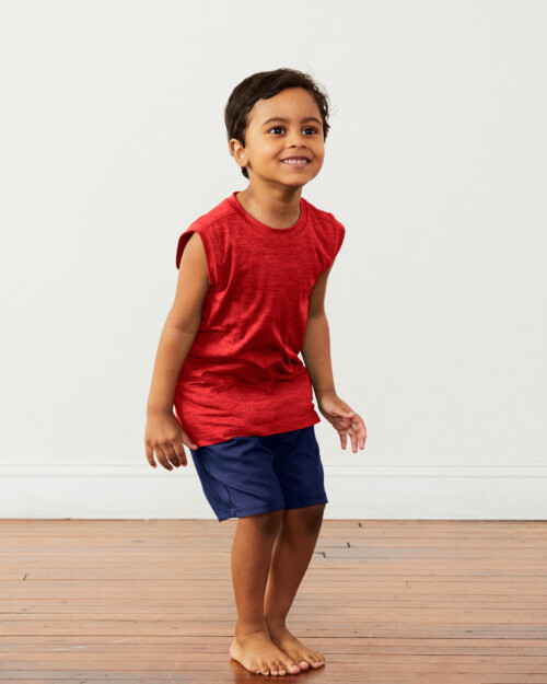
                  Knock the saturation down on the shorts maybe. Even a saturated color works, when there is some shading/shadowing.

                  All my links: https://APHOTICMOTH.carrd.co/

                  Nyrryl  Cadiz 1 Reply Last reply Reply Quote 0
                  • KathrynAdebayo
                    KathrynAdebayo last edited by

                    Just wanted to pop in and mention my admiration for how you're using this critique to your advantage and improving your character by considering the suggestions given. To me, it is really a great example of colaboratoon and individual expression working powerfully together.

                    Sara Hickman 1 Reply Last reply Reply Quote 0
                    • Nyrryl  Cadiz
                      Nyrryl Cadiz SVS OG @APHOTICMOTH last edited by

                      @CLCanadyArts exactly

                      Portfolio: nyrrylcadiz.com
                      Instagram: https://www.instagram.com/nyrryl_cadiz/
                      YouTube: https://www.youtube.com/channel/UCbJCF1Im8ZO7hpGWTKOJMuA

                      1 Reply Last reply Reply Quote 0
                      • Sara Hickman
                        Sara Hickman @KathrynAdebayo last edited by

                        @KathrynAdebayo I do really appreciate it too! I really didn’t see how washed out his skin was until it was pointed out to me. I still might mess with the saturation of his shorts some.

                        1 Reply Last reply Reply Quote 0
                        • First post
                          Last post