Society of Visual Storytelling

    SVSLearn Forums

    • Register
    • Login
    • Search
    • Recent
    • Tags
    • Popular
    • Users
    • Groups
    • Search

    Godzilla's next challenger WIP

    Artwork
    7
    22
    1676
    Loading More Posts
    • Oldest to Newest
    • Newest to Oldest
    • Most Votes
    Reply
    • Reply as topic
    Log in to reply
    This topic has been deleted. Only users with topic management privileges can see it.
    • rachy
      rachy @ArtofAleksey last edited by

      @Aleksey tee-hee! Yay it's there! I kinda wanted to play with that a little bit but not too literally 😀

      1 Reply Last reply Reply Quote 1
      • ShannonBiondi
        ShannonBiondi SVS OG last edited by

        I really like your C thumbnail. I like the conjuring idea but also like how everything works together in this one in term of composition. You get a good sense of everything that's going on.

        @abhainn_fionn

        rachy 1 Reply Last reply Reply Quote 1
        • rachy
          rachy @rachy last edited by

          Untitled_Artwork.jpg

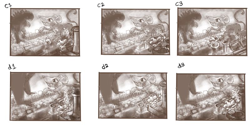
          I've played with the thumbnails a bit more here to try out different placements of the fairy mouse. I quite like C2 or D1 what do you think?
          Xx

          ShannonBiondi Heather Boyd 2 Replies Last reply Reply Quote 1
          • rachy
            rachy @ShannonBiondi last edited by

            @ShannonBiondi thanks Shannon! 😊

            1 Reply Last reply Reply Quote 0
            • theprairiefox
              theprairiefox last edited by

              I think I like C2 over D1. I like having godzilla's shape. It helps it read.

              -The Prairie Fox
              https://www.instagram.com/theprairiefox
              https://www.theprairiefox.com

              1 Reply Last reply Reply Quote 1
              • ShannonBiondi
                ShannonBiondi SVS OG @rachy last edited by

                @rachy I love D3 but I think the Godzilla silhouette from C1-C3 would work better. So a combination of C1 and D3 basically!

                @abhainn_fionn

                rachy 1 Reply Last reply Reply Quote 1
                • Heather Boyd
                  Heather Boyd @rachy last edited by Heather Boyd

                  @rachy C1/D1 are my favorite of your changes because their is space from your fairy mouse and the edge of the paper (helped by the smoke stack). I wish C1 fairy mouses wand zapper more closely resembled D1's -coming out closer to the fairy mouse. I agree though I prefer seeing Godzilla in C1!

                  🙂

                  Instagram: www.instagram.com/heatherboyd.illustration/
                  Website: https://heatherboydillustration.ca
                  Shop: https://www.inprnt.com/search/products?q=HeatherBoydIllustration
                  Ko-Fi: https://ko-fi.com/heatherboydillustration

                  Be blessed,

                  rachy 1 Reply Last reply Reply Quote 1
                  • rachy
                    rachy last edited by

                    This post is deleted!
                    1 Reply Last reply Reply Quote 0
                    • rachy
                      rachy @Heather Boyd last edited by

                      This post is deleted!
                      1 Reply Last reply Reply Quote 0
                      • rachy
                        rachy @ShannonBiondi last edited by rachy

                        @ShannonBiondi @Heather-Boyd @theprairiefox thank you 😊 I'm going to take C1 and mix some of the other bits in like the wand from D1 , I'm trying to work out how to make the conjured mouse look a bit more monsterous here's how that's going so far...

                        Untitled_Artwork.jpg

                        1 Reply Last reply Reply Quote 2
                        • rachy
                          rachy last edited by

                          Untitled_Artwork.jpg
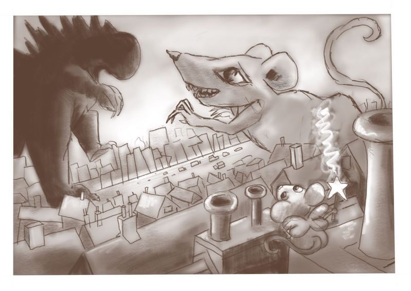
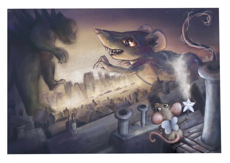
                          I've been colouring it in, I want to give the feeling that it's in a polluted city and have tried to use colder colours for the mouse and her magic to highlight her a bit more.
                          I could just keep painting and painting this one so knowing when to call it done is hard! I kinda want to keep the city loose, but how loose? I'd be grateful if you have any thoughts or if there are any glaring mistakes?

                          Thanks
                          Rach
                          Xx

                          theprairiefox 1 Reply Last reply Reply Quote 0
                          • theprairiefox
                            theprairiefox @rachy last edited by

                            @rachy this is coming along nicely. I wanted to let you know that initially I didn't read that the smoke from the wand was what was creating the large mouse. I saw it as smoke from a smokestack or something. I think it might be to do with the perspective and that the electricity lines are the same width even as they travel away from the viewer.

                            I think if you played with that a bit it might read more powerfully.

                            Good luck!

                            -The Prairie Fox
                            https://www.instagram.com/theprairiefox
                            https://www.theprairiefox.com

                            1 Reply Last reply Reply Quote 1
                            • K
                              Kat SVS OG last edited by

                              I think the city looks good - muted colors, not too many details. I'm thinking that the expression on the large mouse doesn't quite seem challenging. With a small smile and the eyebrow shape, it almost seems placating, like the mouse doesn't want godzilla to get mad or something. Maybe tweak that, add a little more vibrance to the fairy mouse so she doesn't fade into the surroundings. I love the angle you used, very dramatic 🙂 Nice work!

                              rachy 1 Reply Last reply Reply Quote 0
                              • rachy
                                rachy @Kat last edited by

                                Thank you @Kat and @theprairiefox I've tweaked it from your suggestions 🙂

                                I've tried to give more perspective to the magic and tried to make the conjured mouse/rat avatar thingy a bit more angry and challenging looking.. Untitled_Artwork.jpg

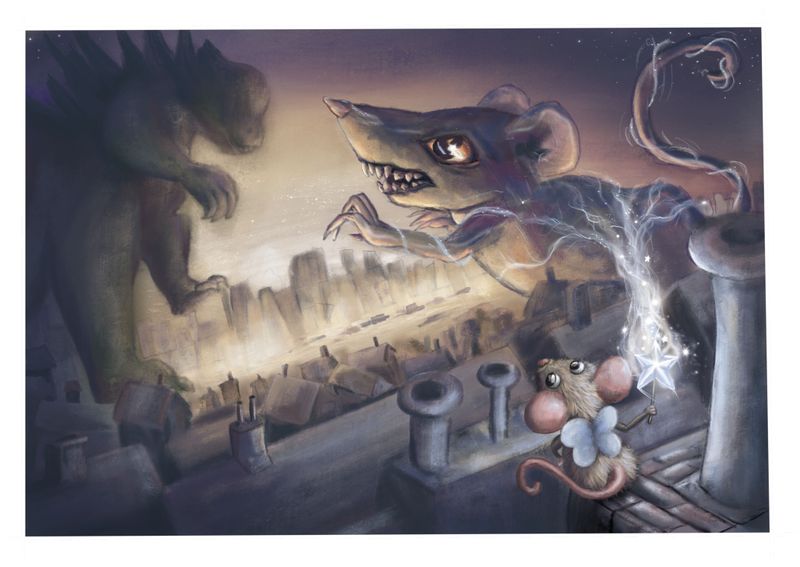
                                What do you think are there any other tweaks you would make?

                                Xx

                                theprairiefox 1 Reply Last reply Reply Quote 2
                                • K
                                  Kat SVS OG last edited by

                                  That definitely looks more challenging, good job!

                                  1 Reply Last reply Reply Quote 1
                                  • rachy
                                    rachy last edited by

                                    Thanks so much for your thoughts everyone it's really helped me push this one and learn some things 😃 xX

                                    1 Reply Last reply Reply Quote 0
                                    • theprairiefox
                                      theprairiefox @rachy last edited by

                                      @rachy the magic is coming through much clearer. Good job!

                                      -The Prairie Fox
                                      https://www.instagram.com/theprairiefox
                                      https://www.theprairiefox.com

                                      rachy 1 Reply Last reply Reply Quote 2
                                      • rachy
                                        rachy @theprairiefox last edited by

                                        @theprairiefox thank you! It's so helpful that you pointed that out xX

                                        1 Reply Last reply Reply Quote 0
                                        • First post
                                          Last post