Society of Visual Storytelling

    SVSLearn Forums

    • Register
    • Login
    • Search
    • Recent
    • Tags
    • Popular
    • Users
    • Groups
    • Search

    Little Red Riding Hood Thumbnails - Feedback wanted :)

    Artwork
    8
    10
    654
    Loading More Posts
    • Oldest to Newest
    • Newest to Oldest
    • Most Votes
    Reply
    • Reply as topic
    Log in to reply
    This topic has been deleted. Only users with topic management privileges can see it.
    • nadyart
      nadyart last edited by

      Hi everyone!

      So I’m giving myself 6-7 months to create an entirely new portfolio, kid lit illustration to be specific, and then I hope to reach out to publishers. I’m following SVS classes of course, and I would really like to get some feedback on these thumbnails. They’re preparations for a Red Riding Hood themed illustration for my portfolio.
      They’re not quite there yet, I haven’t finished the composition class. But the idea popped up in my head and I wanted to put it on paper.

      What do you think? Is there a possible candidate between these comps?
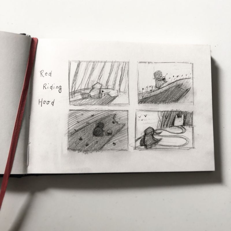
      CC6356F6-0237-4702-9CA2-3526AAB10680.jpeg

      Lovely greetings,

      Nadya

      http://www.instagram.com/nadyart
      http://www.nadyart.me

      ? Nyrryl  Cadiz 2 Replies Last reply Reply Quote 5
      • sarahlawrence
        sarahlawrence last edited by

        I’m torn between 3 and 4. I love the feeling of 3 with the wolf’s shadow and I like the angle of 4 and the way it leads your eye.

        Excited to see your work, good luck for the epic revamp 🤗

        https://www.instagram.com/artshouldsqueak

        https://www.facebook.com/artshouldsqueak/

        1 Reply Last reply Reply Quote 0
        • DOTTYP
          DOTTYP last edited by

          I like 4 they are all cool

          scribbles.artstation.com
          www.instagram.com/dottypaints

          MichaelaH 1 Reply Last reply Reply Quote 0
          • MichaelaH
            MichaelaH @DOTTYP last edited by

            @DOTTYP They are all great, like the simpliness of the. The most the 1,3,4.

            https://www.instagram.com/michaelaheimlich/
            https://www.heimlich-illustration.de/

            1 Reply Last reply Reply Quote 0
            • ?
              A Former User @nadyart last edited by

              @nadyart thumbnail number 3 is very sinister looking and Red riding hood being completely enveloped in the wolfs shadow is a great way to express the danger she's in. I'm looking forward to seeing which one you choose to go ahead with. 😍

              1 Reply Last reply Reply Quote 0
              • Nyrryl  Cadiz
                Nyrryl Cadiz SVS OG @nadyart last edited by

                @nadyart they’re all so good! What I like best the one at the bottom left. It’s just so ominous. Good luck on your portfolio.

                Portfolio: nyrrylcadiz.com
                Instagram: https://www.instagram.com/nyrryl_cadiz/
                YouTube: https://www.youtube.com/channel/UCbJCF1Im8ZO7hpGWTKOJMuA

                1 Reply Last reply Reply Quote 0
                • nadyart
                  nadyart last edited by

                  Thank you everyone for your input and feedback! I think I may go for number 3 😃

                  http://www.instagram.com/nadyart
                  http://www.nadyart.me

                  1 Reply Last reply Reply Quote 0
                  • nadyart
                    nadyart last edited by

                    Hi everyone!

                    It has been a little while since I worked on this illustration since I kept hesitating about the thumbs and I also was (am) following @Will-Terry 's Composition class.
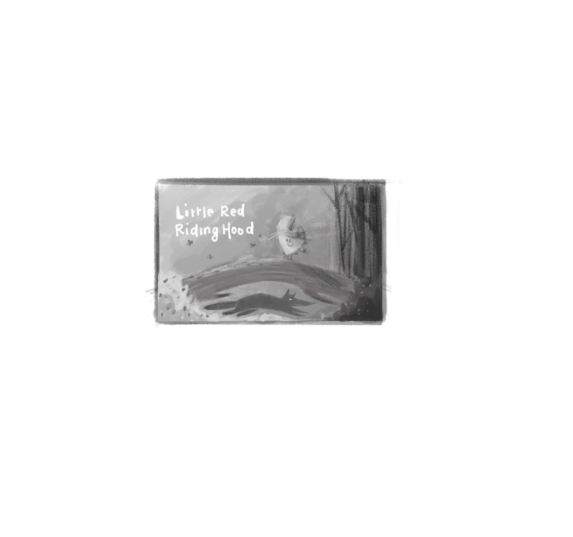
                    So I started from scratch and created a new thumbnail sketch and after that, a value thumbnail for the composition. The shadow did not quite work for me, since I did not want to make the cover too scary for little children.

                    I would really like to start working on the final illustration and I'm very curious about your opinion and feedback for the new comp :).

                    I wanted the focus to be on little red riding hood, the wolf being visible at a second glance, fitting right into the space underneath the tree. I also wanted do create a contrast between the right and the left side of the illustration: the further Little Red reaches the forest, the darker the image becomes. The image feels heaver in the right side, but I wanted to even this out by adding the title text on the left. I hope this all comes across 🙂

                    Red Riding Hood COMP.jpg

                    http://www.instagram.com/nadyart
                    http://www.nadyart.me

                    1 Reply Last reply Reply Quote 0
                    • Su
                      Su last edited by Su

                      Fantastic comps! Wasn't it mentioned in the portfolio class that it's good to have a series to show you can carry a story? I'd pick 3, even all 4 and include them. Just make sure each clearly covers a different part of her journey. It's reading to me right now as a wordless story and it's brilliant!

                      1 Reply Last reply Reply Quote 0
                      • MOO
                        MOO SVS OG last edited by

                        I like the way the path winds into the woods in 4. I think I would like to see more trees further up toward her though.

                        Marsha Ottum Owen

                        1 Reply Last reply Reply Quote 0
                        • First post
                          Last post